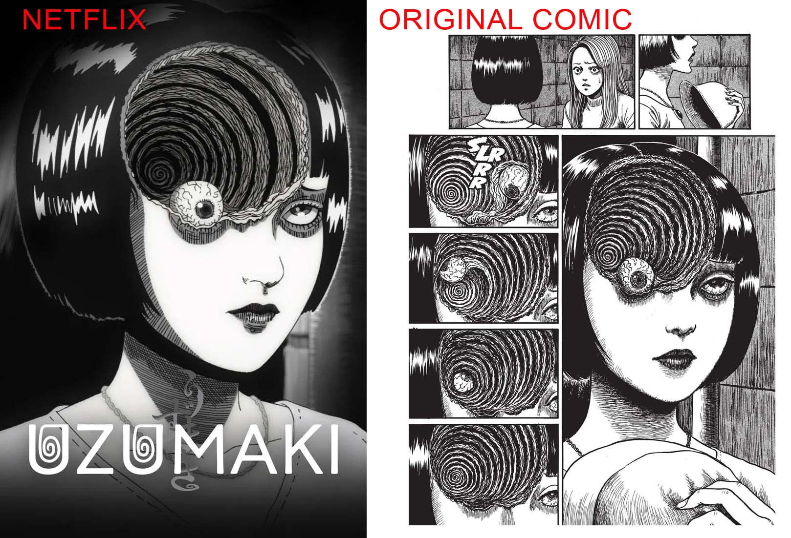
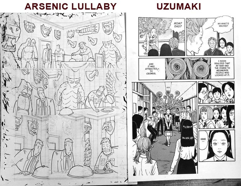
Some of you may have seen the animated feature Uzimaki" on Netflix, and in case you were unaware it was adapted from the graphic novel of the same name by Junji Ito. It is a must have comic book, in that there is nothing else like it and uses the medium of comic book storytelling to it's full advantage. Horror and Comedy really do benefit from being in comic book form, when done by someone who understand it's advantages...
This may be a longshot, but I'm putting the word out here, if anyone has a damaged copy we can work out a trade for some A.L. merch or...
_"ARE YOU F_CKING KIDDING US?! Is this a mass email out to who TF knows how many thousands of people... to get a 20.00 book?! You are beyond doubt the CHEAPEST MUTHERF*CKER I ever met. I'll GIVE you the 20.00, go buy one. It's a GREAT Book."*
I knowWWWwwW it's a great book. I already did buy one, I've bought three. One for me and two others as gifts. I want one that's DAMAGED. Because I need to cut it up and I can't bring myself to to that to a perfectly good copy. It just seems...i dunno...it'd break my heart.
I need to dissect one for motivation, I'll explain in a minute.
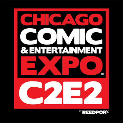
First, a convention announcement. I'll be in Chicago for C2E2 in April.
Second, We were about to take the temporary online store back down, but Joe pointed out that I only have like six books left so...I'll just leave it up til they're gone...Figure out how to disable it next week, and pat myself on the back for getting everything out on time for like two months.
Online store- https://arseniclullaby.square.site/s/shop
Anyways...
Protect your art from AI with Glaze or Nightshade
...back to trying to get motivated. The sheer joy of creating something has only ever accounted for a percentage of what motivates me. The rest being a competitive streak or maybe reactionary is a better word. Some other creative might be able to explain this better...I'll see or hear someone's creative work and be impressed by it and want to make work of my own that has an equal or greater affect on an audience. It's partially competitive if it's something I also do...wanting to draw better than the next guy, tell a funnier joke than the next guy all of that, but it boils down to more of a means to learning. Why is this person so good, why did that work so well.
Which brings us to a protip and a theory I have for you...which will be helpful if you're an illustrator and maybe interesting if you're not.
First the protip- Have examples around of others peoples work, blown up to the size you draw.
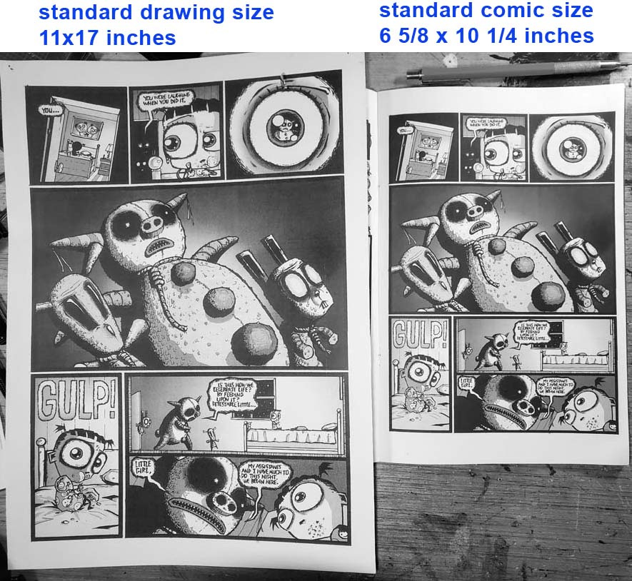
When drawing a comic book page, the standard is drawing about 160% larger than the actual printed book, so 11x17 drawing size for a 6 x10 comic (see below). Drawing that much larger makes it REALLY easy to lose perspective on how it's going to actually look to someone reading it. and real easy to hyper focus on details to the detriment of the overall page. Like...making sure the shine on a hubcap looks great, but having the overall page be a complicated mess.
What I do is have a few pages, examples of great work by other illustrators, up on my wall. When you have other pro work blown up to the size you're working, the first thing you'll notice is that there's plenty of mistakes on that wonderful page that you never noticed. No page is perfect and everything has stark flaws if you blow the f*cker up to 160% of the size it'll actually be printed at, and stare at it long enough. So, having those in front of you as you work, reminds you to stop worrying and trying to make every last little thing perfect...it's fine.
I'm not saying start letting yourself get lax...I'm saying the page as a whole is the concern.
It also gives some sort of baseline. Trying to judge for yourself if you nailed an illustration or not, without a comparison is tough, and your opinion will be largely based on how your own ego is doing on any given day. Having blown up pages of others handy is a solid way to assess ...how good, really, is this page I'm doing?
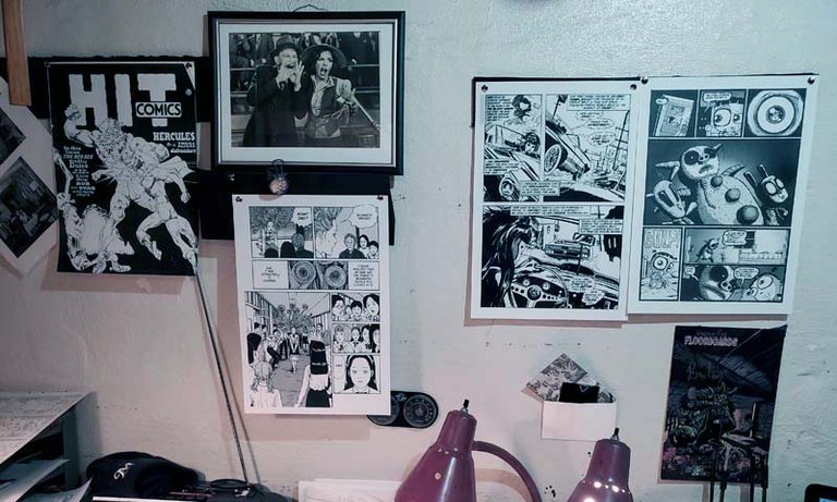
It doesn't need to be anything similar to what you are doing or to your style. It just needs to be a good page that got the job done. It may seem like an apples vs oranges comparison but it's actually not if you remember what the point is- capturing the imagination. Up on my wall are pages that capture the imagination...at any point while drawing I can hold mine up and ask myself if my page captures the imagination as well...does it grab the reader as well...is it as compelling? as charming? as visually interesting?
Here's a few side by sides ( mine on the left ), you can judge for yourself. And probably don't tell me.
I think they stack up pretty well, though if you asked me on a less caffeinated day I might conceded defeat.
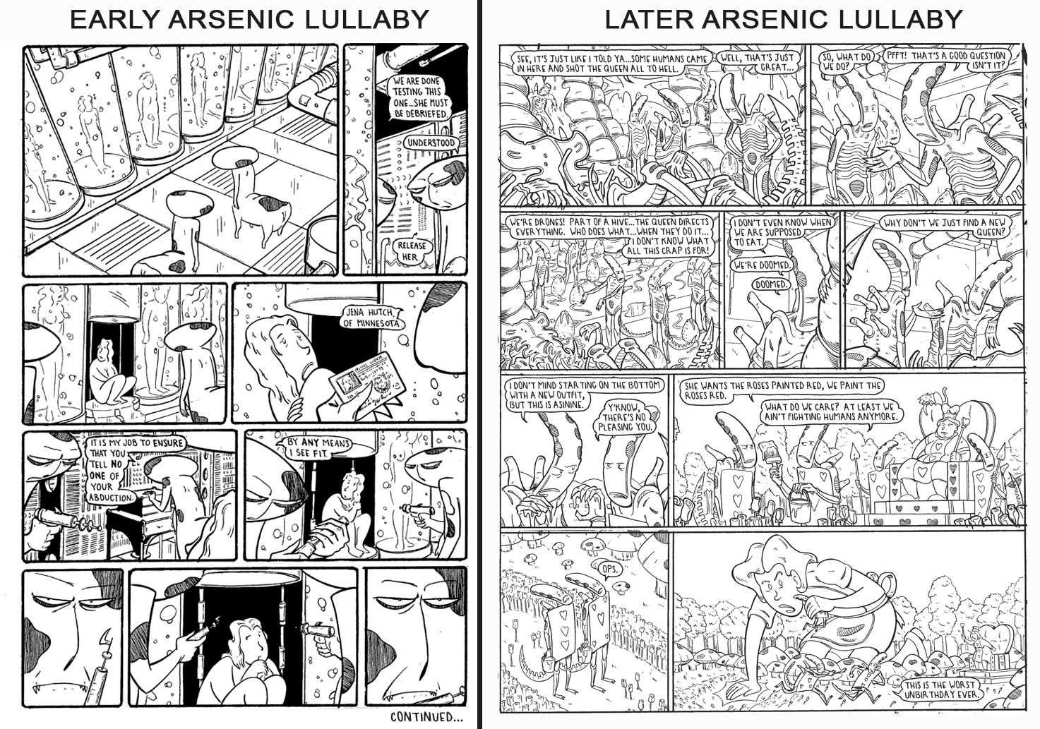
Right off the bat...we can see that other guys use way more "spotted blacks" (large sections that are ...black. Shadows, sides of things, hair ect). Actually, I don't use any spotted blacks. I had been using some and forcing myself to learn how to make that work in the composition of a page, but right after I started doing work for Mad, I just said "meh, it's gonna get colored anyway, I don't need to learn that". (see black and white versions below)
when looking at my pages, side by side against people who did learn how to add spotted blacks to great effect, and against my own older page with spotted blacks...I think should probably go back to learning how to do that. That fairy page on the right is a more skilled illustration, but it don't grab you like the one on the left.
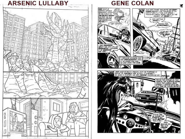
Up on my wall currently is this page by Gene Colan who drew a lot of great books for Marvel Comics in the 70's and 80's and his style is hell and gone from what I do. Which is why he's up there. His work was all about flow and action and impact and big sweeping movement. All things I rarely have in my pages. Good to have that up so maybe my brain might subconsciously absorb something as I'm plotting out pages. He was big on dynamic images and less concerned with precision and intricate details.
Which brings me to a theory I have that, which I half hope I am wrong on. That being, maybe too much detail can keep a reader from getting engrossed in the story...as in, it's a barrier to capturing the imagination. A good story teller knows how to get to the point, and a bad storyteller talks to too much. I think perhaps it's the same with illustrating.
Let's look at two pages by two guys of wildly different levels of detail.
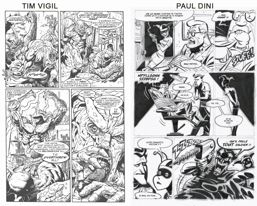
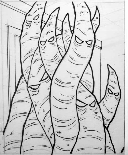
That Tim Vigil page is amazingly intricate. Yet...do we not find ourselves doing a bit more marveling at that detail, than being drawn into a story?
That Paul Dini page though, sucks us right in. We are looking at something happening, not looking at an illustration.
Not really an apples to apples comparison...so I've go a better one. Below are two examples of Wally Wood's work. He is what you'd call a legend. Did a ton of work on horror and sci-fi comics in the 1950s, and later in his career did some super hero work for Marvel comics.
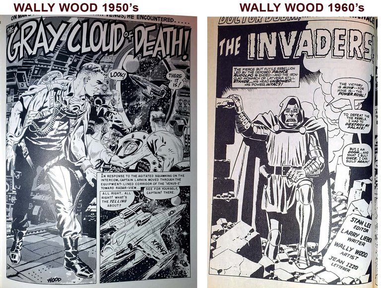
That page from the 50's is leaps about bounds more detailed and better rendered...but it does take a bit to absorb all don't it? It's almost...exhausting? overwhelming? On the other hand, with that less detailed page you just mentally jump right into the story.
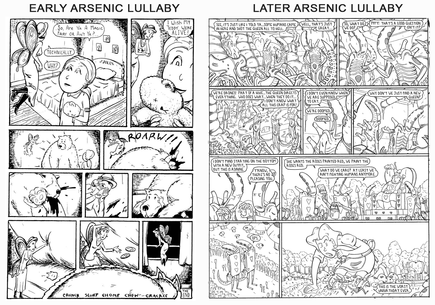
There may be a point where, if the goal is to tell a story, too much precision and too many details is actually harmful. It boils down to a matter of too much visual information for our brains to process, to be just swept into the imaginary world. It's a theory that makes my blood run cold now that I have, after decades of practice, reached a level of illustrative skill where I do things like this...
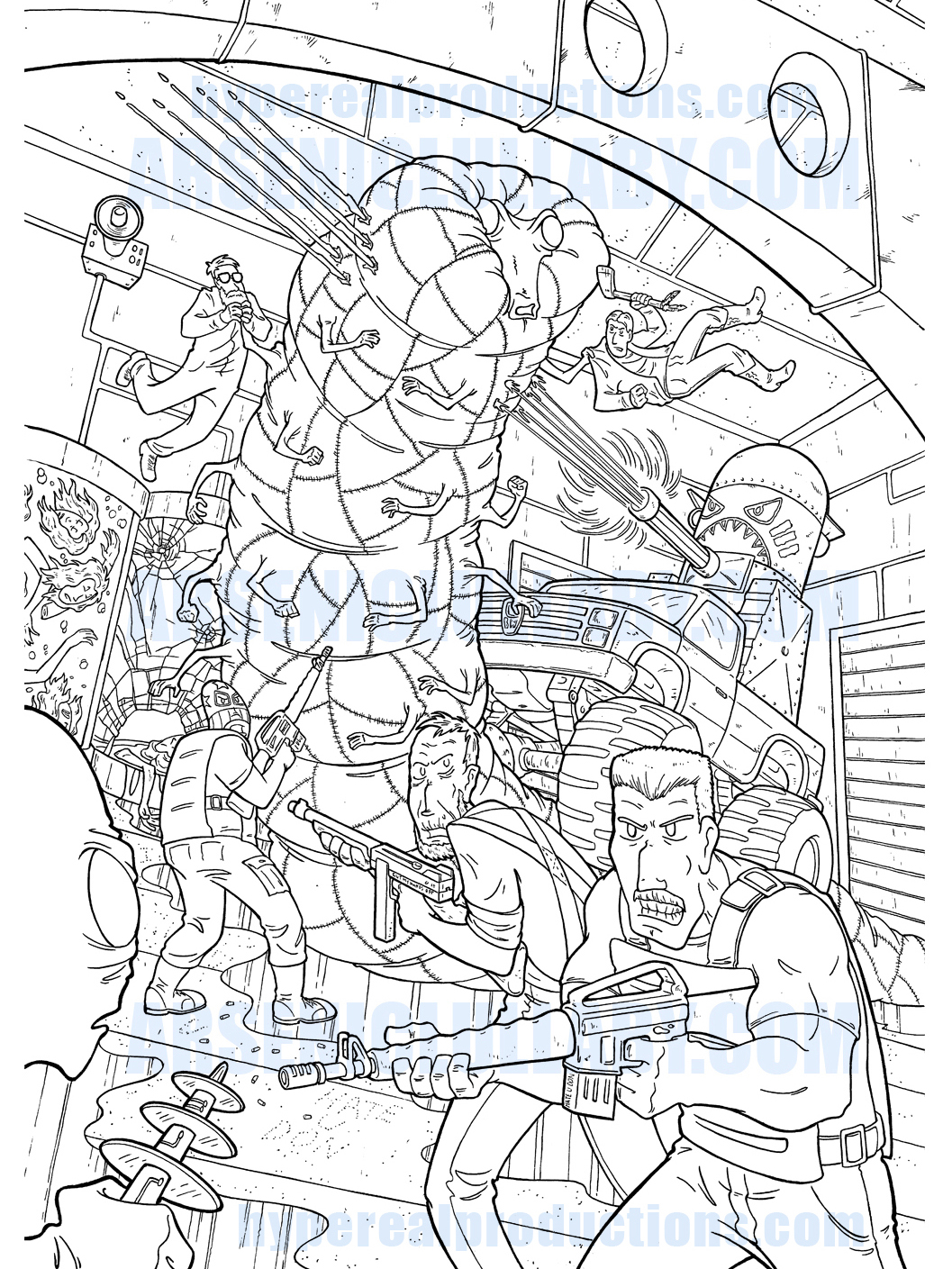
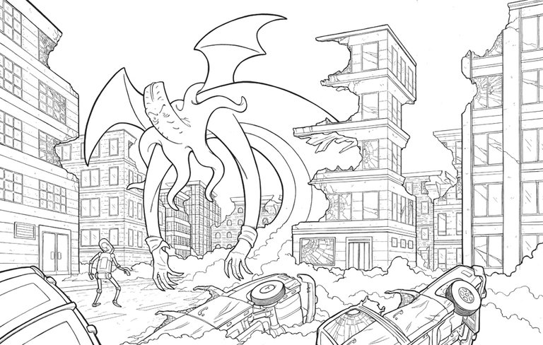
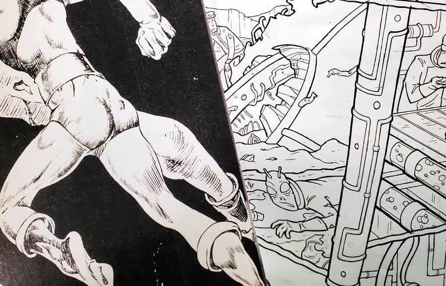
I fear I am edge of that tipping point, (maybe over) even though my style is very cartoony. I may have gone so far down the road of focusing on how well I can draw, that my pages talk too much. Good examples below of a time where I was solely focused on telling a story, and a time where I was feeding my own ego/showing off how detailed I could make the aliens...
Protect your art from AI with Glaze or Nightshade
The newer one is better rendered, far more detailed...but is it a better page? Nope. and of the two, my brain is more interested in reading the first one. Just...too much going on in the second one to grab me. I am very concerned about such things at the moment because the story I'm working on has a main character that is visually complicated all by himself.
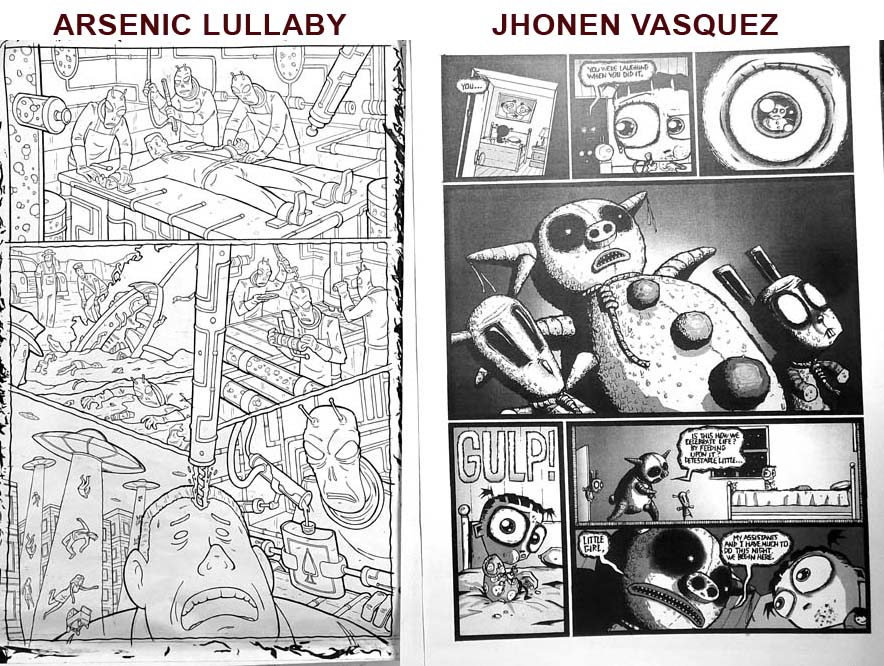
Rather than grow as an artist, and not allow my ego take the wheel by polluting pages with details...I am on the look out for examples that prove my theory wrong. Which brings us back to the book I mentioned in the beginning by Junji Ito.
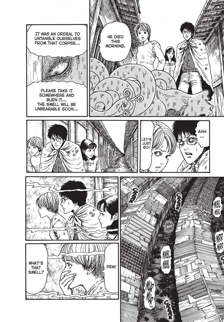
His work sucks you right in, and yet it is very intricate, and fairly detailed. How is it his detailed work does not impede your imagination yet other peoples equally detailed work does? I fear the spotted blacks have a lot to do with it. _Although..._The Wally Wood and Tim Vigil pages I showed had a decent amount of black. So...his pages need to be up my that wall, and I'll let my subconscious suss it out while I work. First I gotta get a clean high resolution scan/copy of some particular pages of his. It's gotta be hi res, because I'm also going to be looking at line thicknesses.
Seeing the line thickness of other people's work, at the size you are working, is less about inspiration as it is pragmatically, visually important.
I, for example, am prone to making very delicate (sometimes TOO delicate) line work. I have to really force myself to not have all my lines so thin and so similar in thickness that they have no perceptible difference once the page is shrunk/printed down to print size. Jack Cole (police comics) had no issue with that, and Lou Fine (hit comics) was terrible about it.
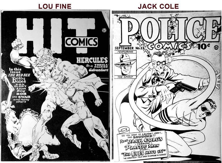
Lou fine was a master, and also his own worst enemy. He made lines so thin that a lot of it did not reproduce properly when sent through an industrial printer...he was making HD quality and getting it spit out in 420k. About 10-20% of his lines barely showed up at all once reduced and printed.
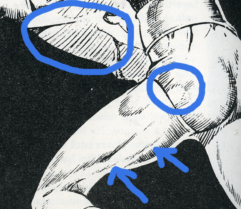
A little inside baseball talk here, it appears to me that Lou used a crowquill/dip pen for his work. That's what the strokes look like, and generally the tool you'd use for the kind of shading he does here (lots of thin strokes). and you simply can not make very large lines with a crowquill. I don't know hardly anyone who uses them because they are a giant pain in the ass unless you have a specific kind of paper. What happens is, that sharp point will randomly dig itself into the paper and flick ink everywhere. Then you swear and smash it into the table.
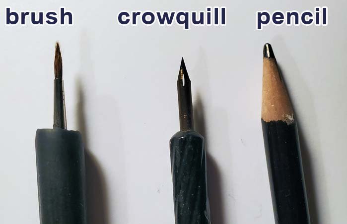
Anyways, a lot of his linkwork, and skill and effort, just never made it to the printed page properly. I try to keep that in mind and make sure my lines are a good deal thicker than his (which they usually are)...
...and try to make sure my lines are as thick as Jack Cole's...(which mine usually are not). Jack, like myself, used a brush for most of what he did and it's really easy to lay down a nice think line with a brush ( even though I usually don't). You can see below, some of my lines are comparable...but in the backgrounds/buildings, I'm making them too thin and delicate for a printer to deal with. Which can amount to hours of work, looking like crap in the actual physical printed book.
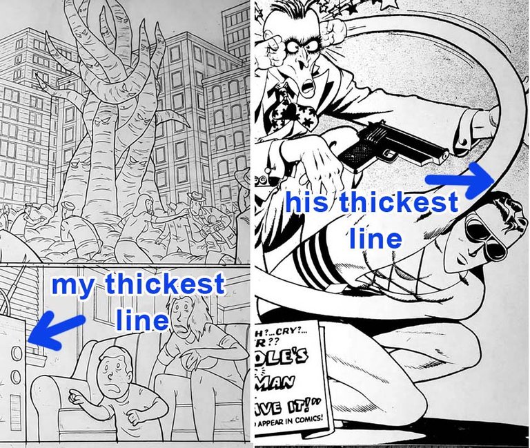
...yeah...I think i'm reworking that page. I see now, most of those lines in the foreground need to be twice as thick. It has not enough pop. The last panel for example...the lines of the tv, the kid and the mom should be starkly different widths. That outer line on the TV should be as thick as Cole's thickest line, the kid's lines slightly thinner and the mom could be of lines as thick as the kid's lines are right now. Same principal with the crowd in the top panel...it all needs more line variation.
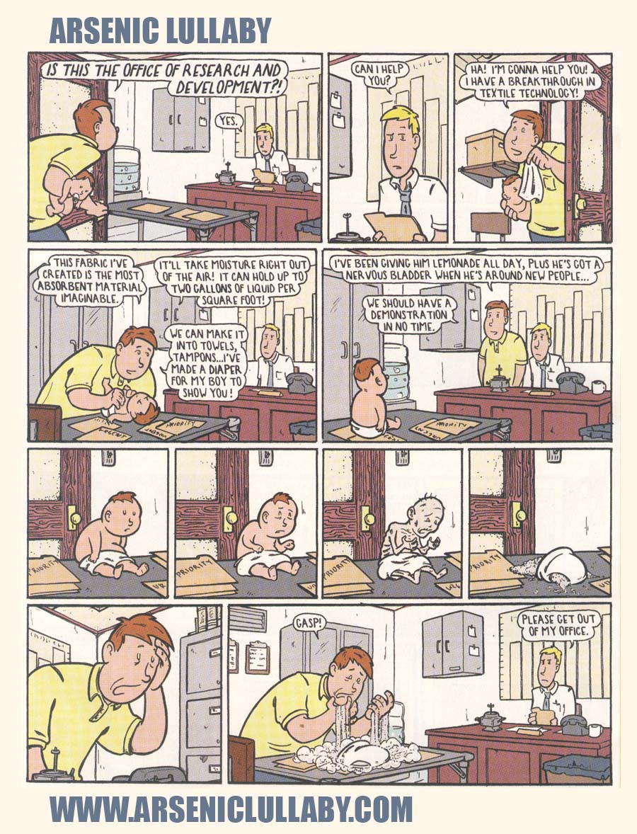
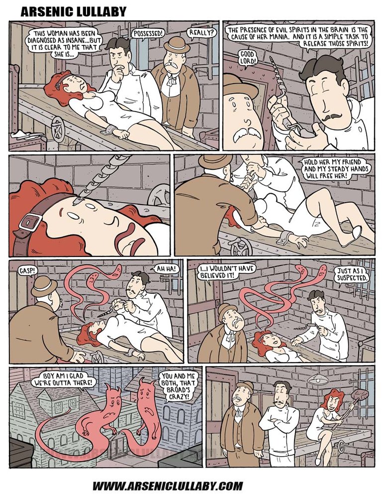
Anyways, now that you've sat through all that, here's another comic, then I gotta go...
Arsenic Lullaby homepage here- https://arseniclullabies.com
sign up for the Arsenic Lullaby email udates - https://arseniclullabies.com/phplist/?p=subscribe