Hello!
Thomas_fahrer the CEO of heyapollo.com today published this chart:
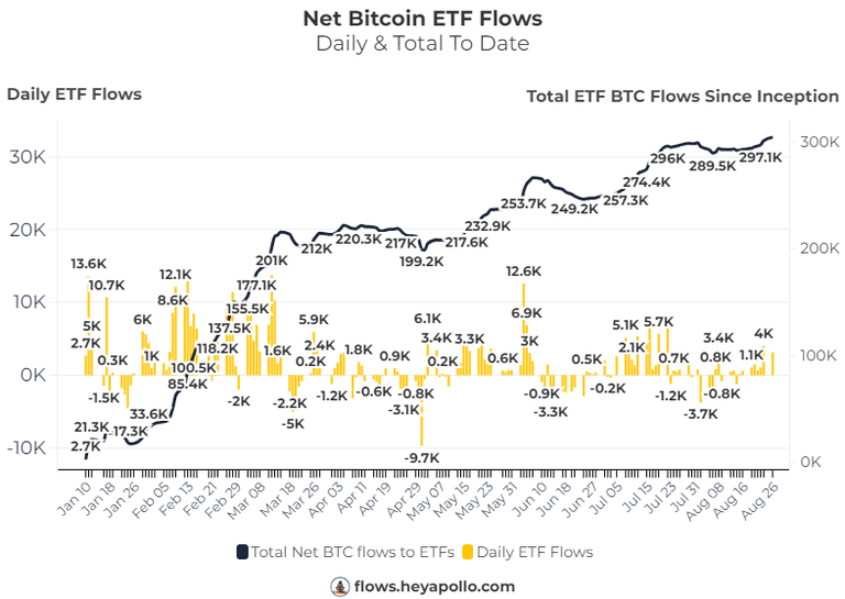
You can find this chart updated daily on their website for free.
Do you see any pattern? The inflows to the Bitcoin ETFs are not stopping, we are at all time highs.
Yesterday alone they bought a little bit more than 4,000 Bitcoin. This is huge!
There are just 450 new mined Bitcoin daily, they yesterday bought 9x the amount of the new supply.
Do you know 1st grade economics?
The supply of Bitcoin on exchanges is flat or shrinking + the new demand is higher than the new supply. We have a perfect recipe for an explosion in price.
It feels somehow weird that we are still at $60,000. I don't think the price movements of Bitcoin are natural at all. If I had to bet I would say that there are big players trying to maintain the price at these levels.
At some point they will either be liquidated or be forced to close their positions, and then, the move will be very fast. In a short period of time we will witness an explosion in price.
I would love to know if what I imagine is true. I've been watching the price of Bitcoin daily since 2017, and I'm sorry, but the recent price action doesn't feel natural to me.
I hope you had a great day!
Be patient, just a little bit more...
Posted Using InLeo Alpha