It's been a while since i last post here, how are you guys. Looks like the competition is getting harder now. Deymn lots of cool arts in the competition.
Well I'm back to share arts win or not and i hope you enjoy my arts too.
My theme starting now is NBA Cards vibes fan art. I'll do it in same size ratio and if you like it you can print out my art for your own collection. I'll include the back side of the card collection on my next post.
My art for this week is an Earth Splinter Waifu Beatrix Ironhand.

I created 3 kind of pose for her, those choices is all good for me but i choose the one with hear in heart sign.
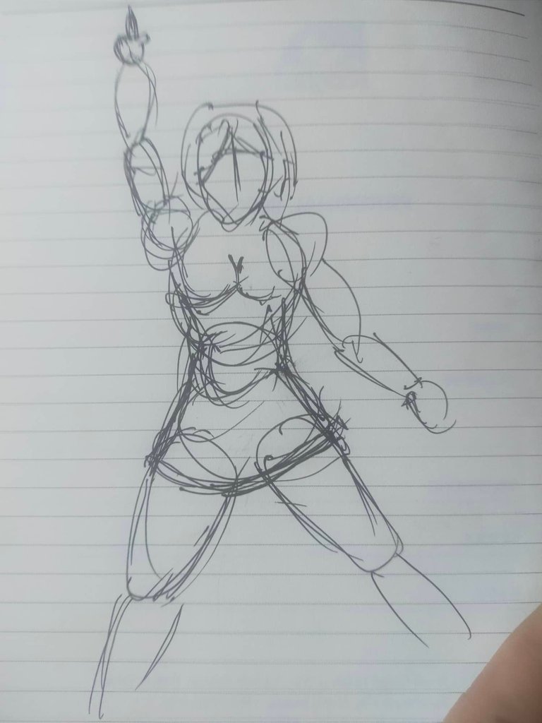 | 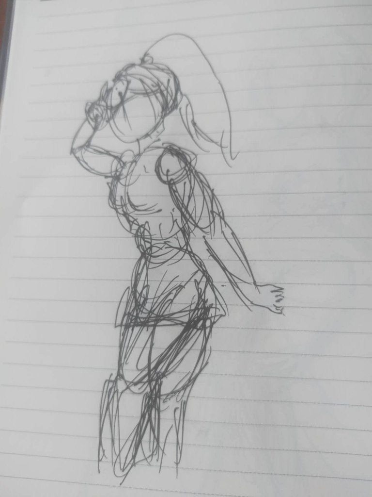 | 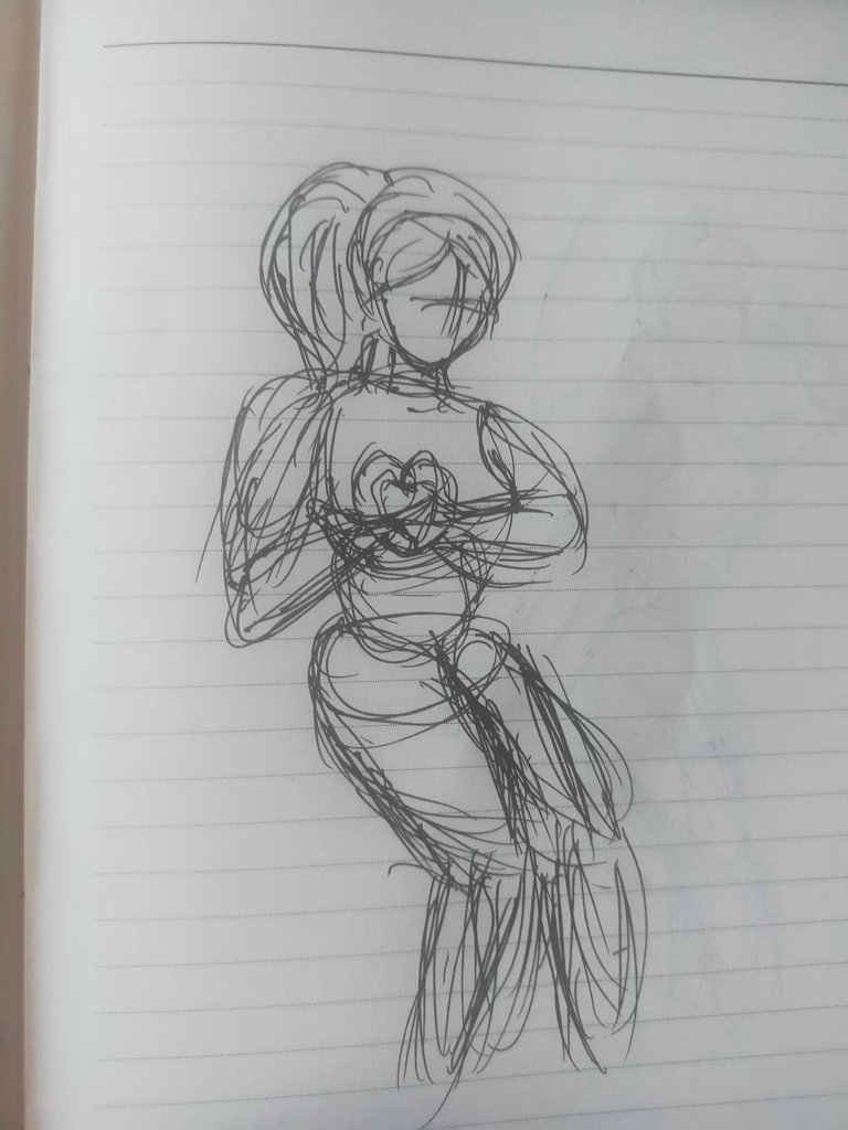 |
|---|---|---|
After choosing the pose I started doing the outline. I change a lot specially the hair part. My first design of hair is fluffy but i remake it to fall down type of hair. I also make her thicc chick cause why not, this is how i make waifu girl illustration. Remember my Mimosa Nightshade and River Nymph
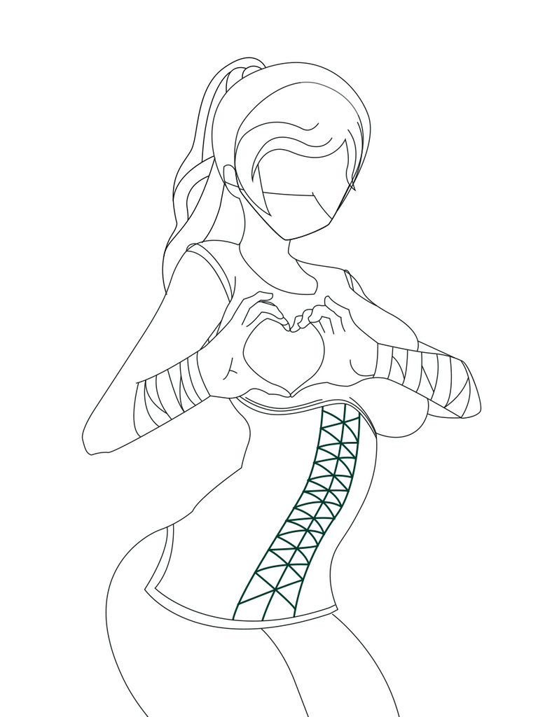
With these outline I added the base color easily. I also make sure to make it in the Splinterlands art version of Beatrix Ironhand color-way as much as posible. This blode chick will make guys fall in love for sure.
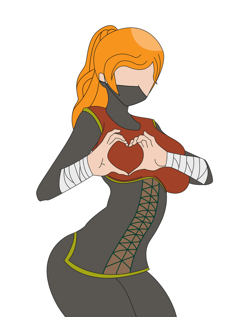
Next will be the highlights, yes I created the highlights separately to the shadows cause at this point I don't have the lightning position on my mind yet. This part didn't make the art alive yet but it will when i add the shadow.
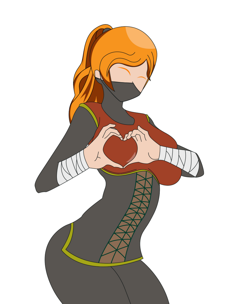
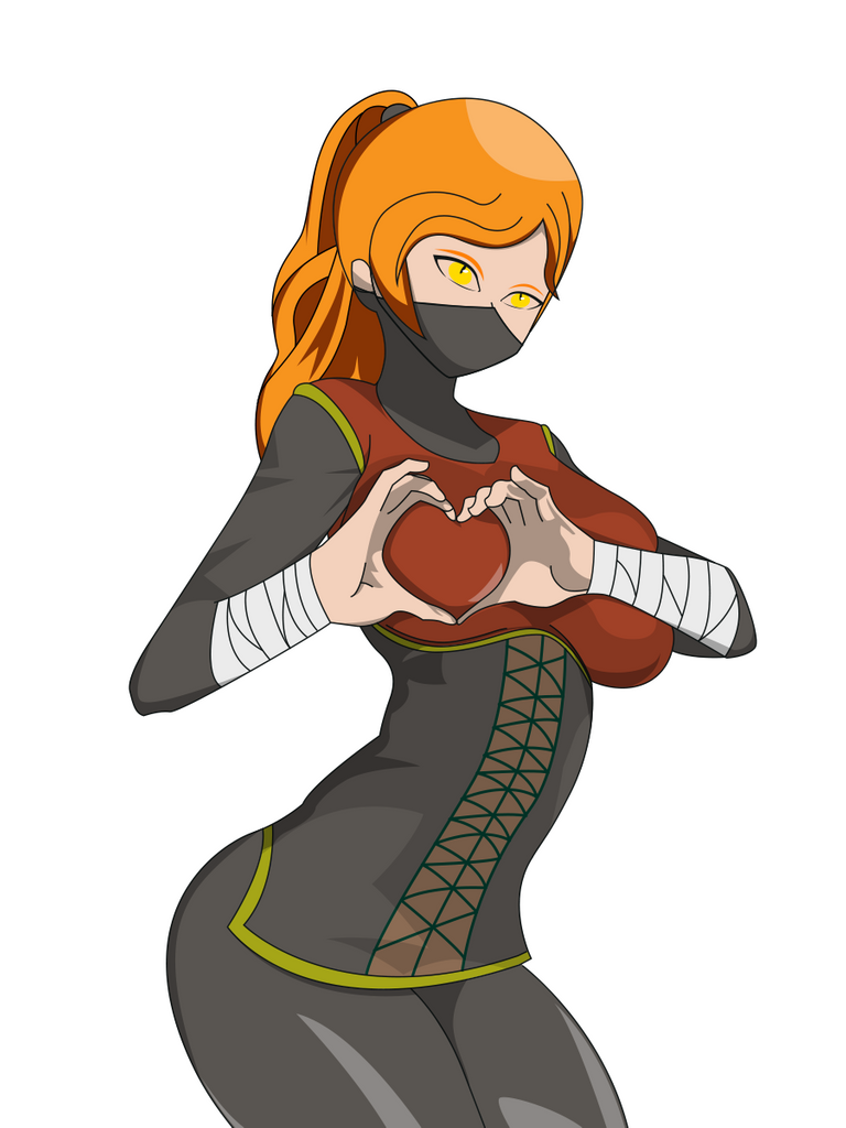
Now the shadow and other details. This would be the last step on my main subject "Beatrix Ironhand". This time we can see how lovely she is. And we have the main subject finished.
But wait I also show you what are my steps in making it in NBA Card vibes design and if you still reading at this point I want to say thank you for staying. I will also do this kind of art once or twice a week so make sure to check me out once in a while.
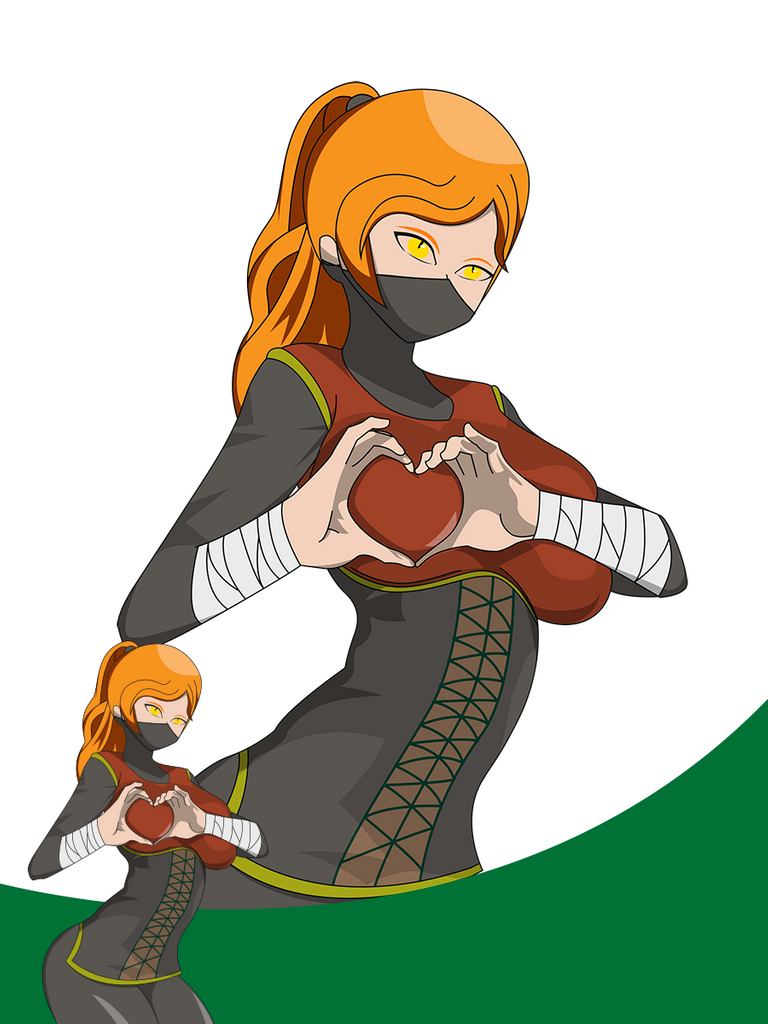
In this step i created a small copy and big copy of the subject. Nothing much in this step I just duplicated the subject then make them a smart object, by the way I am using photoshop for this project.
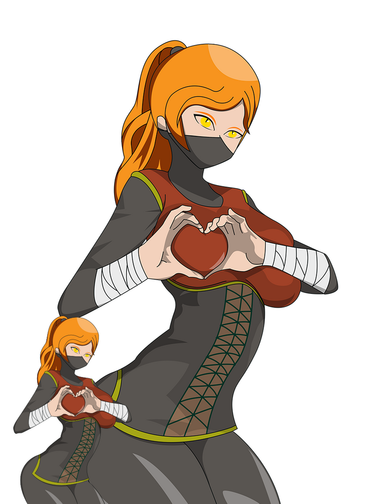
Then I created a divider like layer to make the two of them look in different plane.
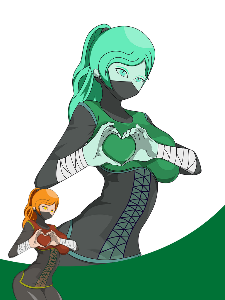
Then i use smart filter with color balance, hue and saturation and curves to make the large subject dull and green vibes.
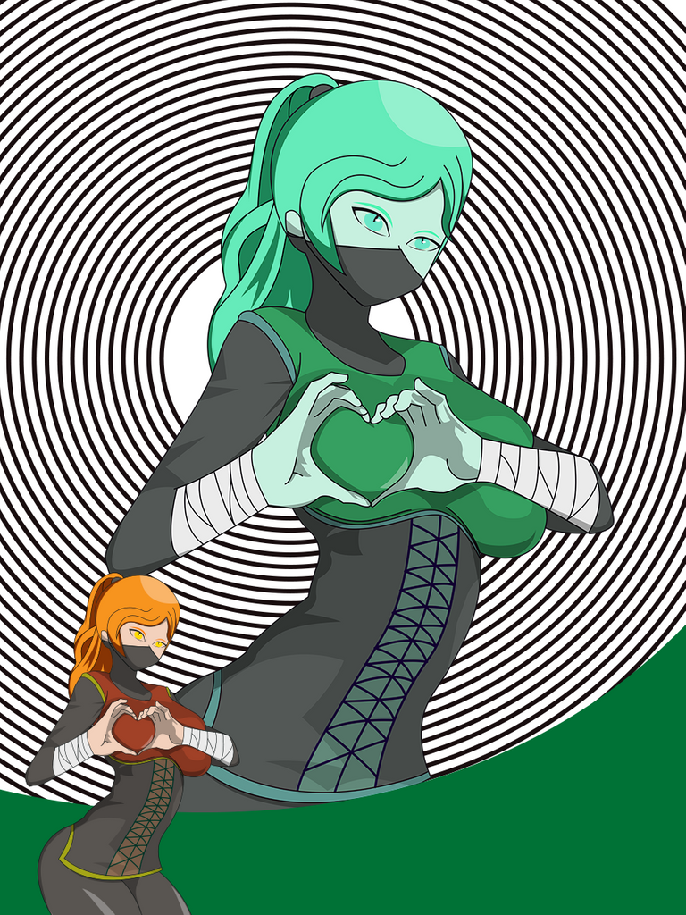
This step i created concentric circles. Don't get hypnotized by it.
And the last step is to put some gradient color on the circles and give it a name also in same gradient color as the concentric circle.

This is the final result of this project. Thanks for reading till this part. I know you missed my divider Rexxie so ill put him as a footer.


