My proposal for the SPK Network Tokens Logo Contest

in #hive-1120193 years ago

speak tokens tapa-14.png

Greetings friends, today I come to present my proposal for a visual identity system for the SPK Network tokens.

In my case I decided to make a system proposal that encompasses the three tokens so that they work together harmoniously in a visual and conceptual way.

All the proposals contained in this post can be applied to any context and need that SKP Network may require, both digital and analog.

For the creation of these designs I have used only pencil sketches and Adobe Illustrator for digitalization. All designs are vectorized, so they can be scaled to the desired size without losing quality. The colors applied in these proposals are not necessarily definitive and may be changed at SPK Network's request.

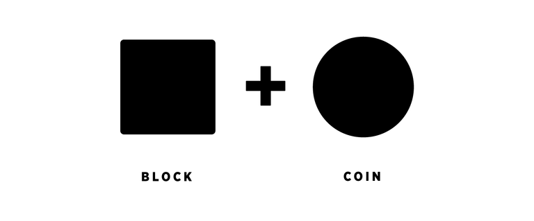
As a concept I have made cross-sectional use of two figures:

  1. The square that represents the blocks of the blockchain.
  2. The circle that is the most efficient representation of a coin.

The union of different forms of these two cross-cutting elements, plus the addition of others, give life to the three proposals for graphic identifiers that constitute this post.
concepto-15.png

As in all high quality design, emphasis has been placed on the ease of reading and recognition of graphic identifiers, which by having transversal graphic elements look and feel related as part of the same thing. This familiarity is necessary to facilitate an intuitive user experience, and at the same time to facilitate the addition of new graphic pieces in the future, counting on a solid visual base with a well-defined character.


The following is the presentation:

Square version

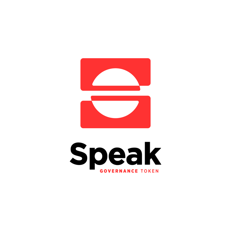
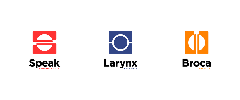
For the Speak Token I have added to these elements a synthesis of the letter S that results in a minimalist, modern, easily identifiable and stable identifier.
speak tokens-04.png

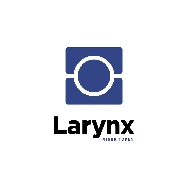
For the Larynx Token I have generated subtle changes in the structure of the square to create two surfaces between which rests the circle inside a mold, which graphically represents the generation/mining of the token.
speak tokens-05.png

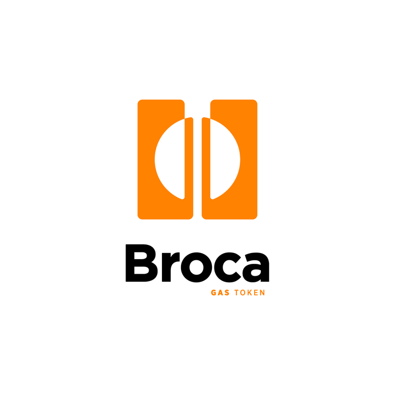
For the Broca Token I have used the same element as the Speak Token as a mirror and rotated 45 degrees, resulting in a distinctive shape in keeping with the visual character of the Speak Token and the Larynx Token, which marks a central division referring to the gas function of the Broca Token, which will "burn" and then reload.
speak tokens-06.png


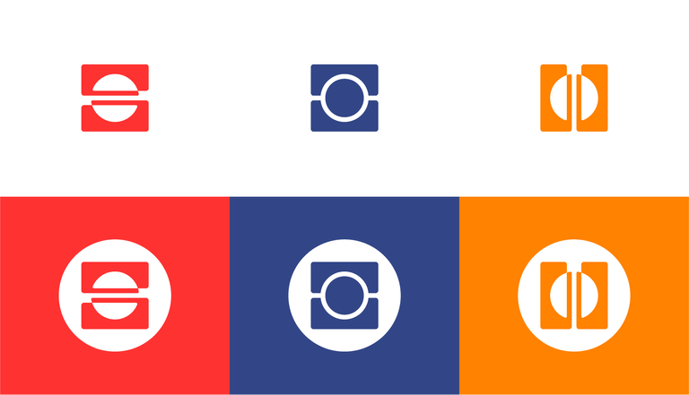
Identifiers and their application within circles:
spk aplicacion-16.png


Applications: Color | Black | Negative
speak tokens-03.png
speak tokens black-10.png
speak tokens negative-12.png


Round version

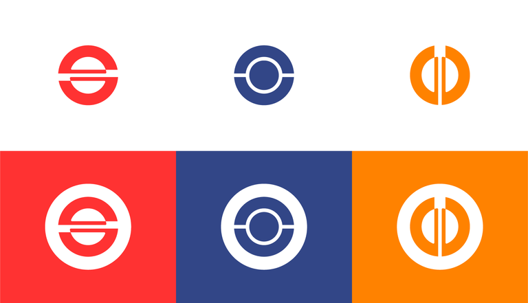
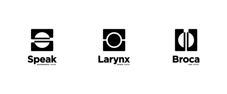
Since the requirements of the contest included the creation of a round version of the graphic identifiers, I have created these versions that preserve the central idea of the concept of the designs in a circular context.

speak tokens-07.png

speak tokens-08.png

speak tokens-09.png


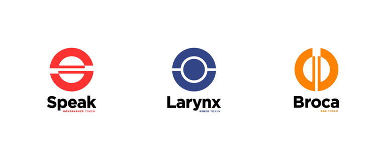
Identifiers and their application within circles:

speak tokens uso-17.png


Applications: Color | Black | Negative
speak tokens-02.png
speak tokens black-11.png
speak tokens negative-13.png


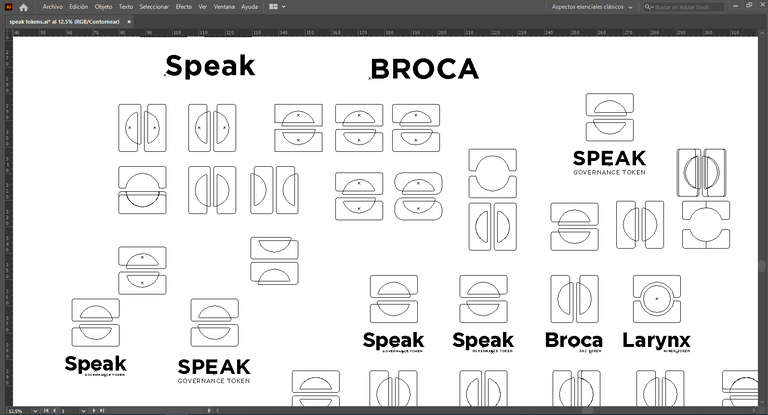
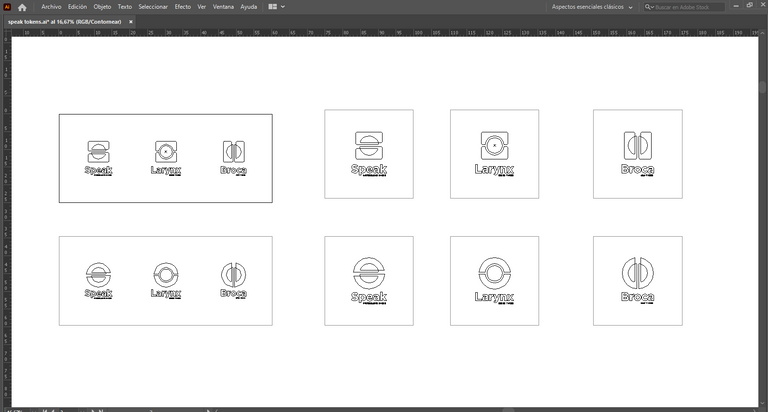
Screenshots (Proof of work)

image.png

image.png

I hope you liked my proposed identity system for SPK Network tokens. Thanks for reading me.

If you want to request my services as graphic designer, leave your request in the comments of this post.

Sort:  

Stop the contest, we have a winner!!!!

@pastzam I didn't make it, but thank you very much for your support. I really thought I would win.

I was visiting your blog and I notice you are not very active in Hive. Let me know if you would like to join the curational trail and fanbase of my project @celf.magazine or support us in any way. I would be very grateful and our community too.

I'm active doing manual curation

👍👍👍👍👍 thanks

LOL thank you very much for those kind words! I hope it becomes a reality

your welcome!!!

You should part of the jury 😀

Good work! God bless!

Thank you very much!

Excelente amigo, muy buena tu propuesta, bastante creativa.

Es mucho lo que se puede sacar de tan solo un círculo y un cuadro, lo has demostrado con tu diseño 😎

Gracias por tu apoyo, ciertamente hay demasiadas posibilidades siempre que se trabaje con un buen concepto generador.

I like the Broca ones, well done!

Thanks Gabriela! ❤️

For a moment there, I was wondering what you could possibly achieve with just the square and circle but you really did a great job there.

Several creative and suitable logos. Weldone!

Thank you very much! It was a lot of fun and hard to achieve

Weldone! @camiloferrua

I like the simplicity of each design and its minimalist character. That quite attractive and representative. Good luck friend.

I'm glad you like it. Thanks a lot

Good luck. This are great creation. :D I love them actually.

Thanks man! I'll need that luck

I feel like you have great chances

❤️

Brou tus diseños están super bien!
Me gustan mucho, Simples y directos al punto!
Si gustas pasa por mi blog y en la parte de reblog mira en el trabajo que yo participe también del diseño de los logos para los tokens c: me alegra saber que eres de Caracas!

Hey! qué bueno que te gustaron y qué chévere que cada vez somos más usuarios de habla hispana y de la comunidad venezolana. Si te gusta el tema del arte y la cultura te invito a unirte a nuestra comunidad CELF Magazine

@camiloferrua seguro hermano! Gracias por la recomendación!

Wow excelente trabajo! Me encantaron los logos y sus aplicaciones!!

Muchísimas gracias! Qué chévere que te gustaron 😊


The rewards earned on this comment will go directly to the person sharing the post on Twitter as long as they are registered with @poshtoken. Sign up at https://hiveposh.com.

Moderno, preciso y elegante. Me parece un gran diseño para un gran proyecto!

!LUV

Gracias, esperemos lo mejor.

Me encanta el desarrollo que has elaborado.

¡Todo un trabajo profesional!

Salud y saludos.

Muchas gracias Xavi, esperemos los resultados. Ojalá sean los elegidos.

Me parece genial, a pesar de lo sencillo y concreto. Felicidades 🎇

😉😉😉😉😉

nice proposal it might make spk more advance

Yeah! Thanks, that's the idea 🙂

Wow, excellent proposal, I really liked the design, I think it unites in a harmonic, easy and simple to understand way everything that a good logo should express. My congratulations to artistic achievement.

My friend, thank you very much. It's my intention to create efficient solutions for this kind of need.

I love your design concept and creativity, my friend.

Awesome logo designs. Much love 😍

Thanks, thank you so much for your support!

Excellent design propositions for SPK tokens. Very simple, dynamic, flexible and representative. Good luck, @camiloferrua.

Thanks my friend!