Hi everyone,
I finally completed my entry into the spk network token logo contest. It was an interesting challenge to take on and I must say I am excited about this.
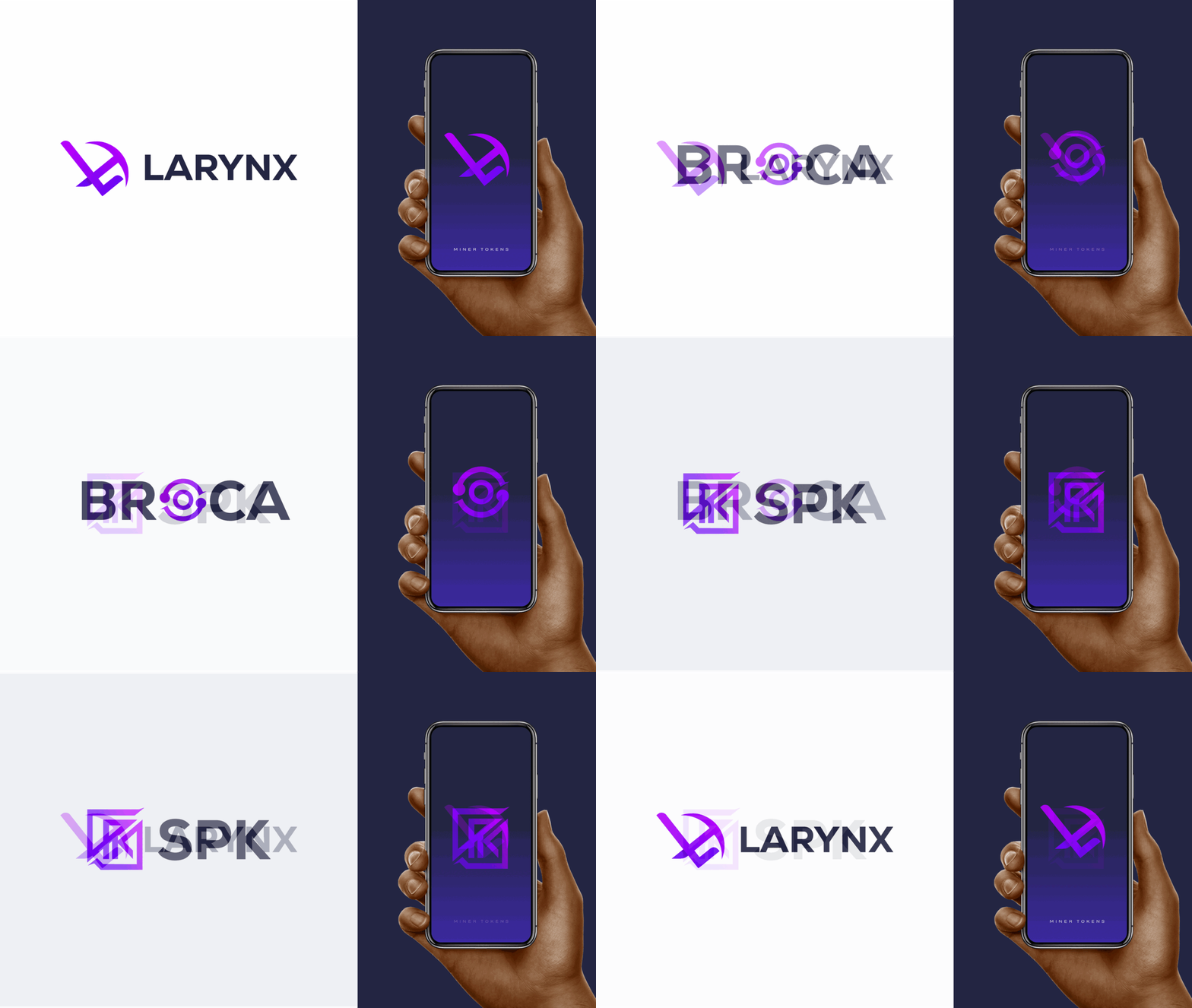
I created logos for LARYNX MINER TOKEN, BROCA AND SPK TOKEN
After hours, days and nights of putting my ideas together, I am happy to present these logos to you and the work process.
LARYNX MINER TOKEN LOGO DESIGN PRESENTATION
WORKFLOW
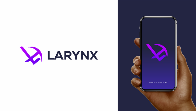
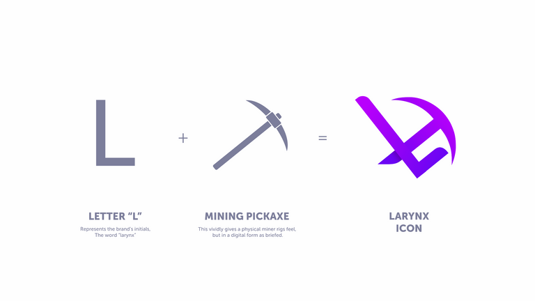
The images show the thought process towards the design of the proposed LARYNX MINER TOKEN LOGO.
Leonardo Da Vinci said “simplicity is the ultimate sophistication.”
With this in mind, the Logo revolves around the identity of Larynx and incorporating the idea of a physical miner based on the logo specification and vision.
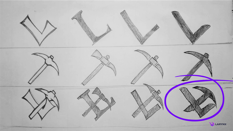
Using the sketch pad to visualise the idea ... The process brought this into reality.
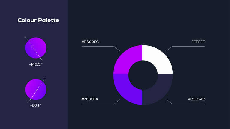
Here are the details of the Colour Palette
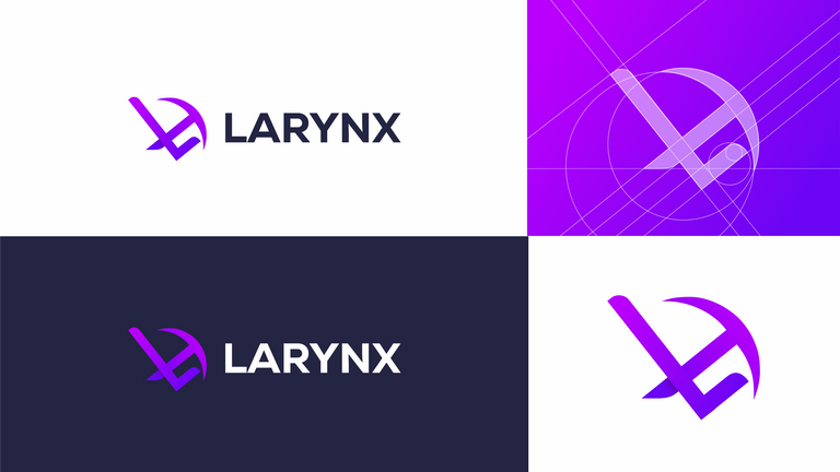
The result of the colour spectrum brought this concept into reality. A modern elegance of logo display.
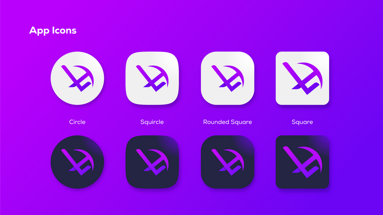
Application Icons in both square and circle shapes.
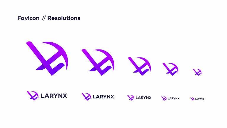
Here are Favicon//Resolutions for the logo.
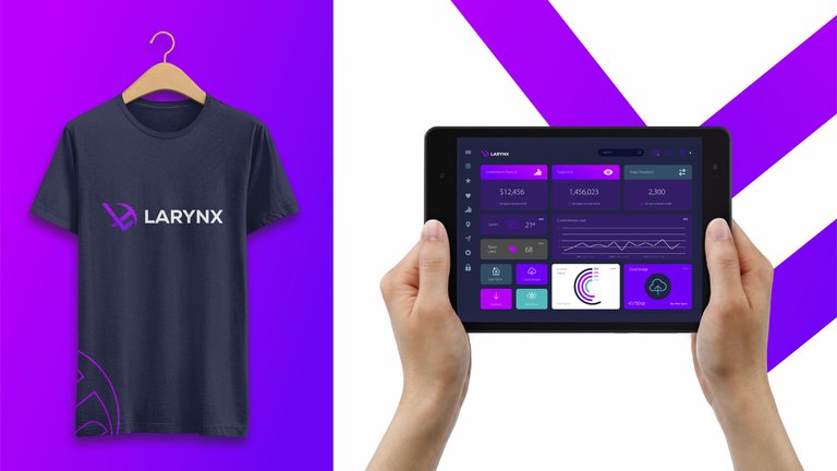
Merchandise Ideas and a mockup view of the logo in use
Note
This presentation is also available in pdf, vector designs are also available including raw file of the design.
BROCA DESIGN PRESENTATION
WORKFLOW
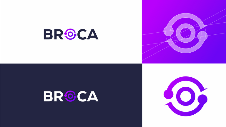
The images show the thought process towards the design of the proposed BROCA LOGO.
The quote by Leonardo Da Vinci on simplicity is one of my favorite because it emphasizes that being simple isn't boring; rather, it's elegant.
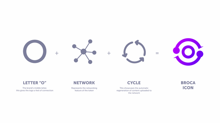
The formation of the BROCA logo revolves around the elements that defines BROCA. The letter" in BROCA O" is in the middle of the word which shows great attraction and evokes the power of connectivity.
Leveraging on this, the element of network comes to mind when you understand that the BROCA gas token when consumers regenerates everyday. This is a cycle which brings us back to O.
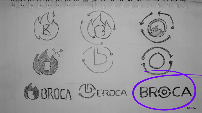
Using the sketch pad to visualise the idea ... The process brought this into reality.
Here are the details of the Colour Palette

The result of the colour spectrum brought this concept into reality. A modern elegance of logo display.
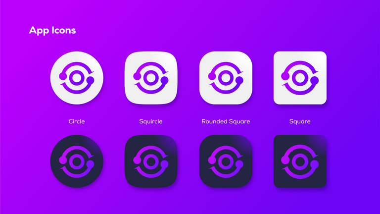
Application Icons in both square and circle shapes.
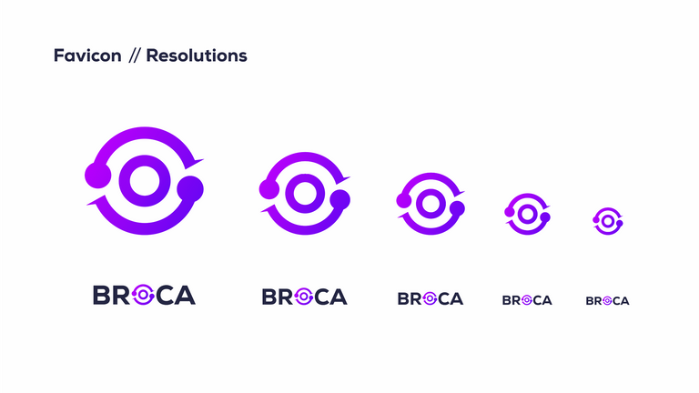
Here are Favicon//Resolutions for the logo.
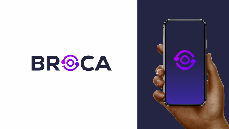
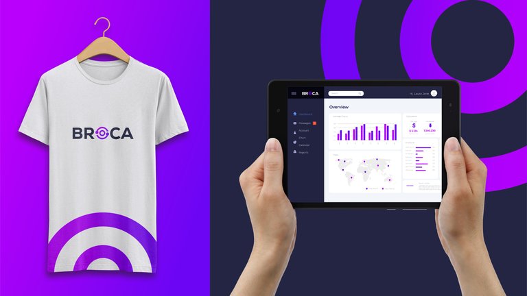
Merchandise Ideas and a mockup view of the logo in use
Note
This presentation is also available in pdf, vector designs are also available, including raw files of the design.
SPK TOKEN LOGO DESIGN PRESENTATION
WORKFLOW
The images show the thought process towards the design of the proposed SPK TOKEN LOGO.
Leonardo da Vinci was self taught and he was diverse in skills and knowledge. As a self taught designer with other various skills I have developed over the years I have come to understand that indeed “simplicity is the ultimate sophistication"
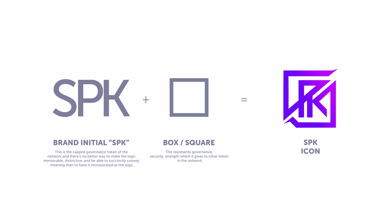
This "SPK" is the brand initial for the SPK token. This is the capped governance token of the network and there's no better way to make the logo memorable, distinctive and be able to succinctly convey more meaning than to have it incorporated as the logo.
The addition of the box represents governance, security and strength which it gives to the other tokens in the network.
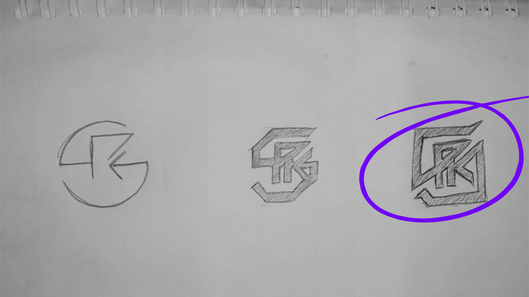
Using the sketch pad to visualise the idea ... The process brought this into reality.
Here are the details of the Colour Palette

The result of the colour spectrum brought this concept into reality. A modern elegance of logo display.
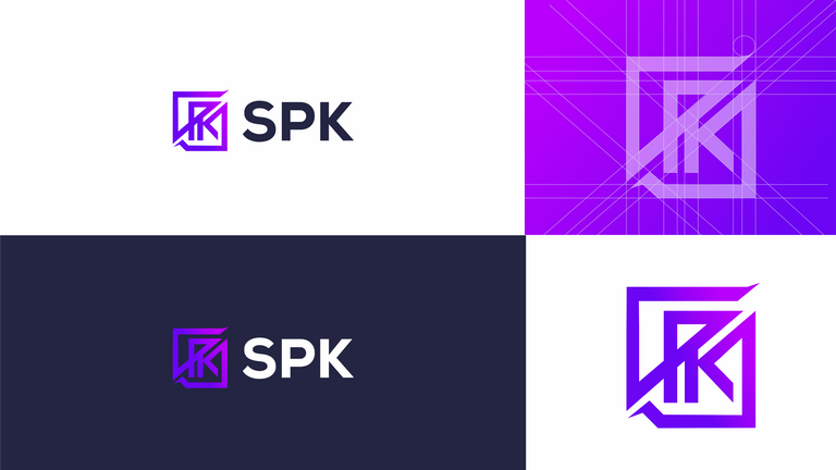
Application Icons in both square and circle shapes.
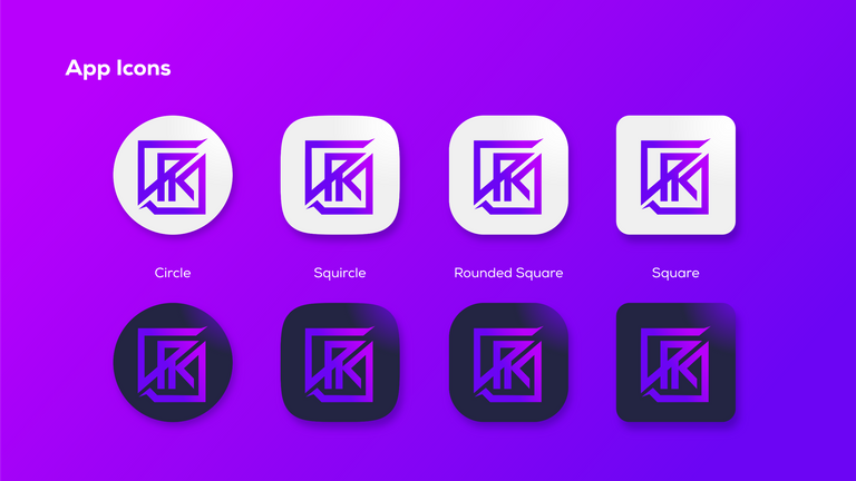
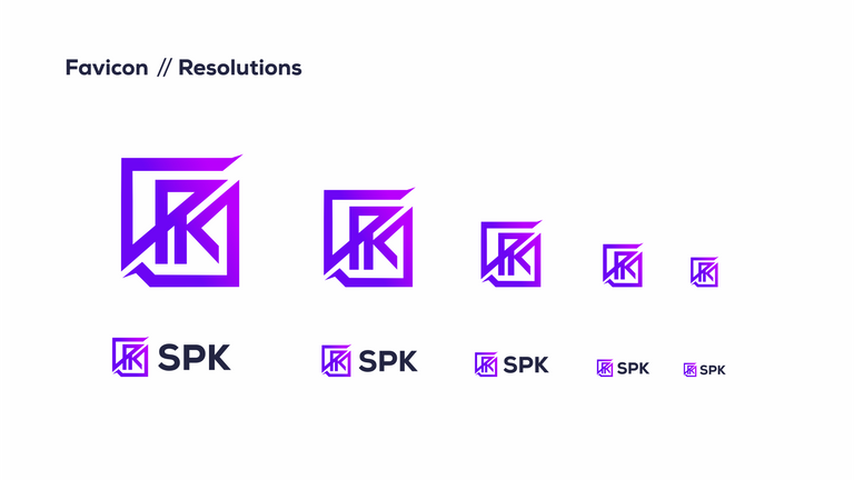
Here are Favicon//Resolutions for the logo.
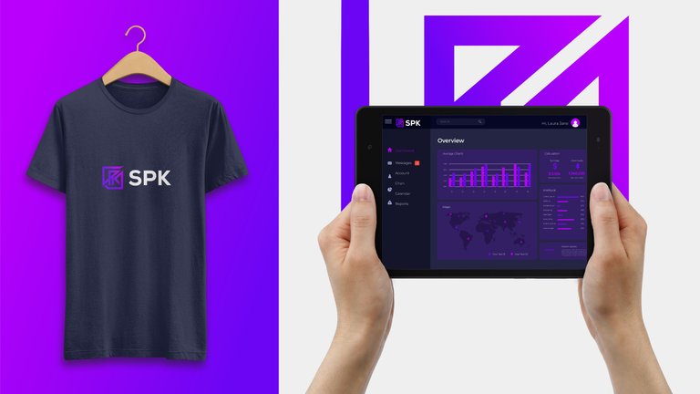
Merchandise Ideas and a mockup view of the logo in use
Note
This presentation is also available in pdf, vector designs are also available, including raw files of the design.
