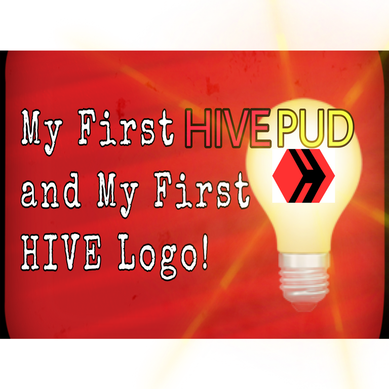
This is my first post celebrating HIVE Power Up Day!
My power-up will be about 20to 21 HIVE. As I write, today is 30 of March. This power-up could break 20 in a few days. Isn't there a way to estimate? I figure that out later. I should be applying for unemployment. I should be applying for ASCAP also. Instead I'm preparing for HIVE PUD.
I've known about Hive Power Up Day for a while but miss it every time. Most of the hive I have accumulated comes from posts and winning a weekly community contest. The rules are simple. I didn't make the time to read the rules before. I've been content knowing it was a legitimate contest run by a legitimate Hive neighbor.
@traciyork's participation in anti-abuse activities on the HIVE encouraged my participation. She understands curation involves up-voting and down-voting as well.
Creating My Own HIVE Logo
While reading through a HivePUD posts, I noticed @traciyork's links/affiliations. Canva was one of the links and I remembered using it on my phone. In the past, Canva didn't work out too well for me on my phone. Cracked screen protector and too many layers created frustration while trying to edit. I switched to PicsArt and I used it almost exclusively. So, years later, I decided to give it another try on my laptop via web browser. It's much better for me now. Sign-in worked and all my old projects are available.
True to form, I wanted to create my own Hive logo. It was kind of fun yet not as easy as I thought. Also, I'm not gonna lie, I was in a hurry when I created it. Symmetry usually means a lot to me in many forms of art.
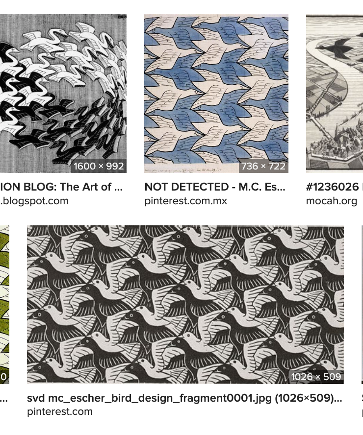
I've loved M.C. Esher's work since childhood. Don't we all?
Thinking all art needs to be symmetrical is an absurdity. I'm not hard-line on the subject. In my humble opinion, a command of symmetry "separates the men from the boys", as they say. Practicing symmetry seems like something healthy for an artist to go through. Performing music "within a box" as they say, has allowed me to progress and create with a healthy mindset.
Caution, don't try this at home.
This is not artistic advice.
Beware of poor symmetry and lots of brain ouchy.
Here's my logo and process after repeatedly saying, "Ahh f¨ck it. Good enough for now."
I started out with a black hexagon followed by a red diamond shape.
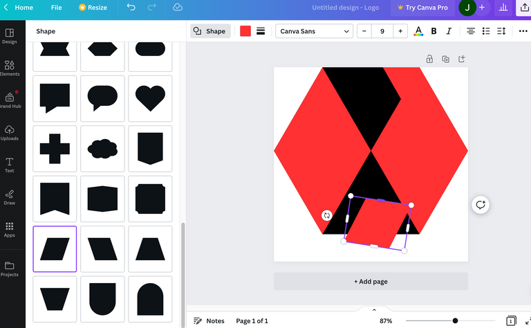
Canva offers many shapes. The shapes helped me to create the red sharps and the black spaces in-between the reds. The shapes can be transformed, but there are limitation.
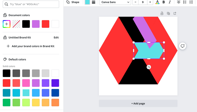
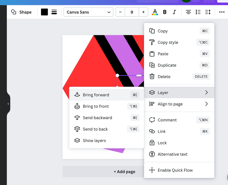
Thankfully there are layering options in Canva. Layering is not as easy for me in PicsArt. Asset's hot spots are too small sometimes.
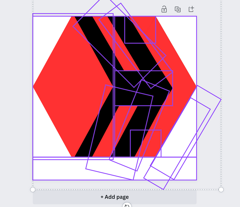
Looks crazy with those odd colored shapes. That's how I eyeballed it and created various sections. I wonder if this process would've been easier if I had simply used half of a hexagon, a triangle with it's top cut off...
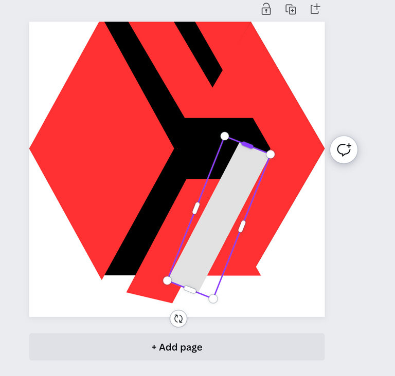
Notice the black centerpiece in the image below.

This little black centerpiece gave me lots of trouble. Next time I will use a rectangle and customize triangles to create the point on the right side of the rectangle.
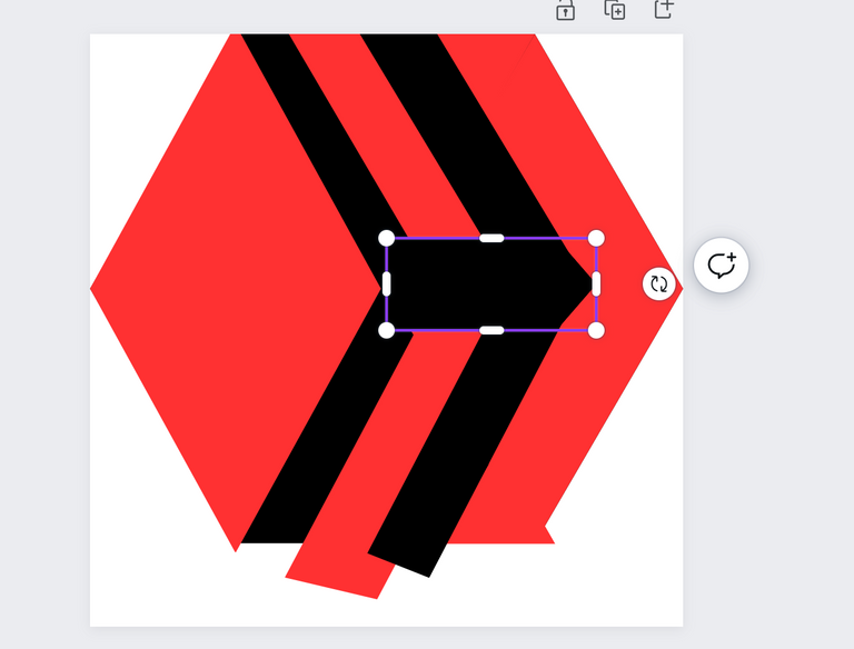
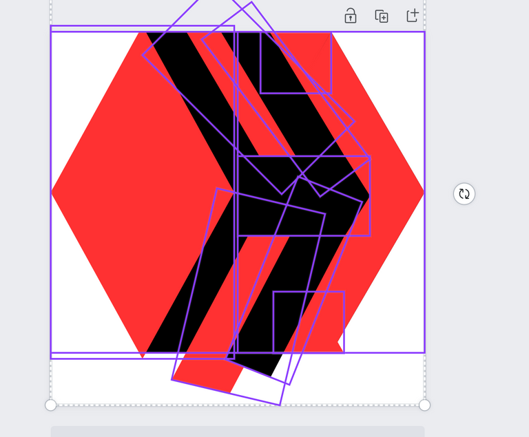
I did not take screenshots of every step or every shape I added. Instead, I highlighted everything to reveal all the layers and pieces used to create the logo. You can laugh. I did.
As I went through the process I realized I could use a large white rectangle to cut off the shapes that were too long. The rectangle started out gray so that I could line it up with the bottom. I change it to white after it's in place.
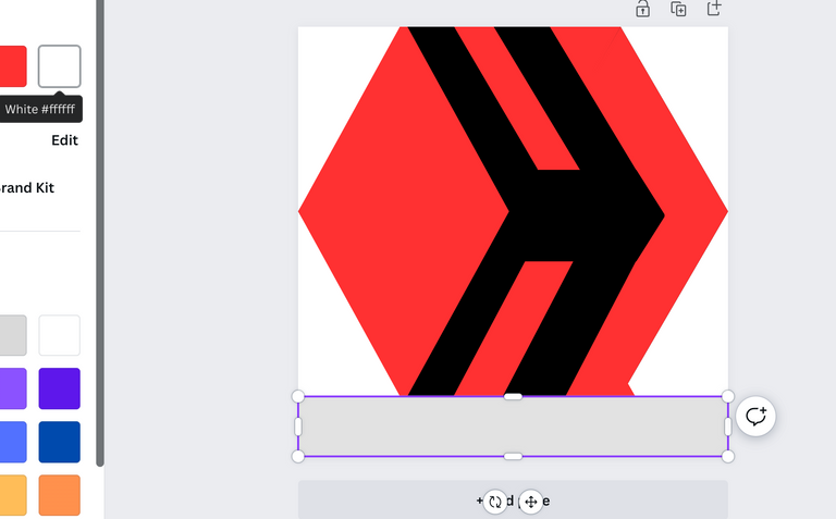
Another white rectangle to smooth out the edge on the bottom right of the hexagon. It's okay to laugh. I did.
Lmao, look at all the layers I used to mask the weird edges.
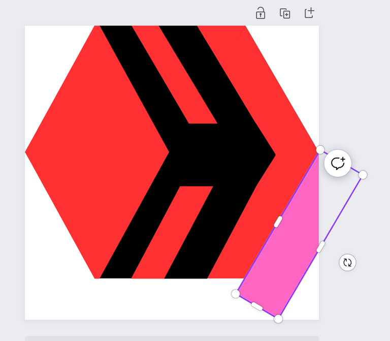
I used Apple's native software to smooth out the bottom section (white rectangle) of the hexagon. See the image below.
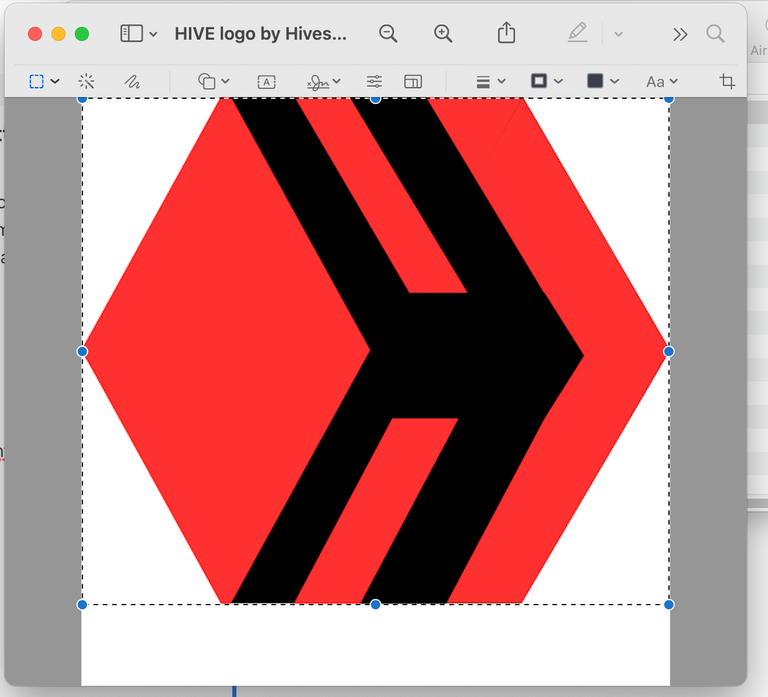
The final has a white background because transparent background is not free in Canva. Transparent backgrounds are free with PicsArt, but don't say I told you. Don't show a demand for that functionality. They might start charing for it. 😬
![]()
I could probably import it onto my phone and use PicsArt to create a transparent background. If the other parts of the logo were more symmetrical, I would take these extra steps. Maybe next time.
🤢
Fyuck, I hate my logo.
Limited time and poor training. Those are my main excuses, but also Canva seems to have limitations upon how one can warp some of the shapes. I learned a few things doing this and didn't resort to AI or copy and paste. I would rather try again and again and again. I think I could use 5 large diamond shapes of various colors and layers next time.
That's the most ghetto Hive logo I have ever seen.
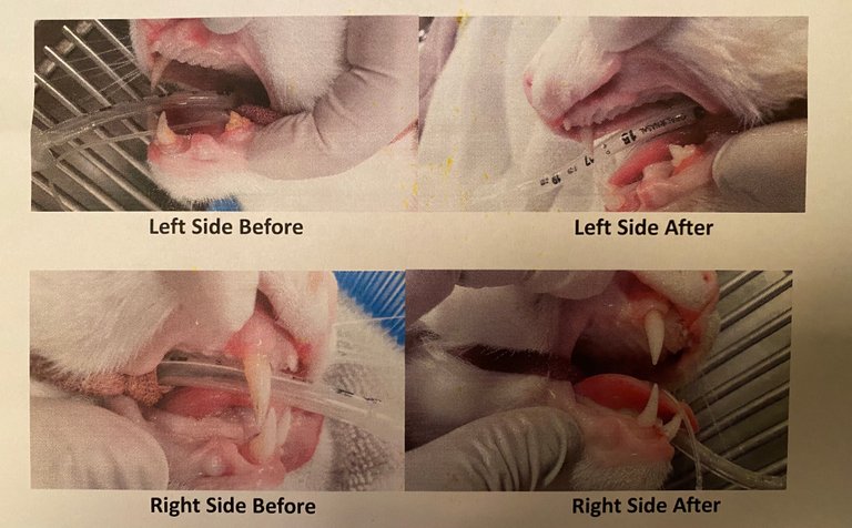
I could mess with it more and create more layers, but I shouldn't spend any more time on it. Weather has been cancelling work. I should be applying for unemployment to help pay for a cat's crazy dental surgery.
If there's a hell, I'm going to cat heaven first.
Thanks for reading and thanks for the healthy Hive contest.

Good luck to everyone and forgive my poor symmetry.
Now, I spam you. Happy April fools day!
Music: https://tetrahedroseph.bandcamp.com/music
Merch: https://tetrahedroseph.bandcamp.com/merch
Subscribe: https://tetrahedroseph.bandcamp.com/subscribe
Follow: https://tetrahedroseph.bandcamp.com/follow_me
Videos: https://3speak.online/user/steemseph
Audius! https://audius.co/tetrahedroseph
Spotify! https://open.spotify.com/artist/1awYbp9GCzfrWUy4xQEI2M
YouTubeMusic! https://music.youtube.com/channel/UCy3xm5NY9YaWHqCbic59L7Q
SoundCloud! https://soundcloud.com/tetrahedroseph
Napster! https://us.napster.com/artist/tetrahedroseph
AppleMusic! https://music.apple.com/us/artist/tetrahedroseph/1535038059
Deezer! https://www.deezer.com/en/artist/109591832
Tidal! https://tidal.com/browse/artist/21673555
AmazonMusic! https://music.amazon.com/artists/B08KWJMRS2/tetrahedroseph