 Midjourney Homepage
Before you start with Midjourney please understand the Guidelines and Terms of Service and use this tool responsibly
Quick note: If you missed part 1 of this guide please check it out before you continue with this one.
Okay, let's jump right back in.
Stylize
This parameter is an interesting one. --stylize or simply --s is a parameter that you can tweak to tell Midjourney how artistic, detailed, and color-rich you want your prompt.
The Default value is 100 and the range goes from 0 - 1000. Zero gives an output closest to the desired prompt but it looks basic and blends, while 1000 gives a lot of color and intricate detail to the image. Let me show you what I mean.
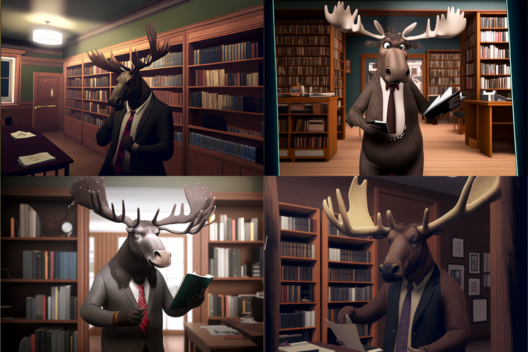
Prompt used:/imagine moose in the library, wearing a suit --seed 420 --ar 3:2 --s 0
As I said, looks pretty basic but we got what we wanted. Maybe you could have a reason to generate an image like that but would stay away from this value.
If we set --s to 100 we would get the same images we saw in the first part of this guide so let's see what happens on 500 and 1000.
500
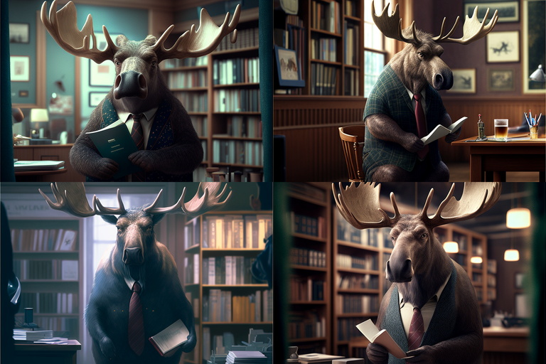
Prompt used:/imagine moose in the library, wearing a suit --seed 420 --ar 3:2 --s 500
1000
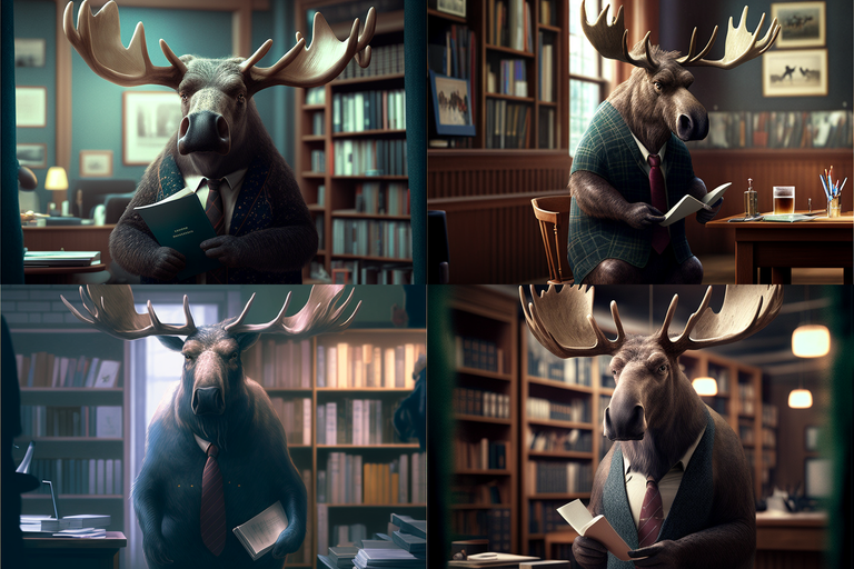
Prompt used:/imagine moose in the library, wearing a suit --seed 420 --ar 3:2 --s 1000
Already at 500, we have a lot more details on antlers, we got changes of the snout, hair got "harier", and even smaller details are added like that extra text on the book the moose is holding in image 1 and image 3. Image 2 got even more suit, haha. The background got more depth to it. All in all, this parameter can give us a more life-like/realistic look.
Much like with the --q parameter going all the way up to 1000 doesn't contribute too much. Even though there are some visible changes, in my experience using too much stylizing can lead to producing some weird artifacts and unexpected features. For example on image 1, the right side of the antler.

Stop
--stop is a simple parameter to understand. By Deafault this parameter is 100, the range goes from 10 - 100. Basically, if you use this parameter, the value represents the % of work Midjourney will do on generating the image before stopping.
20
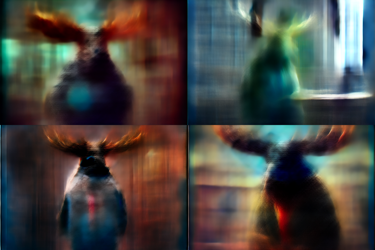
Prompt used:/imagine moose in the library, wearing a suit --seed 420 --ar 3:2 --stop 20
60
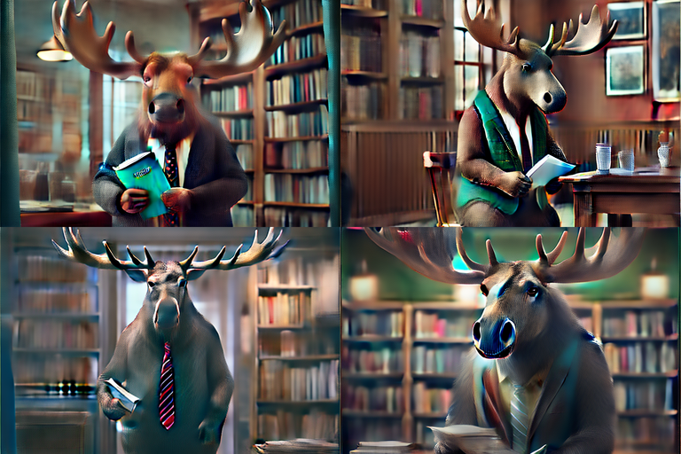
Prompt used:/imagine moose in the library, wearing a suit --seed 420 --ar 3:2 --stop 60
Not much to cover here, you get the idea. If you set --stop on 20, Midjourney stops at 20% of the work done, and on 60, you get 60% of the work done. If you just want smudged, blurry silhouettes or something with fewer details then maybe you will use this parameter. This is kind of a niche feature but we had to cover it.

Video, Tiles & Versions
Even though these two features aren't yet available in version 4 (current version) of Midjourney you can still use them with versions 1, 2, and 3, by adding parameters --v 1, 2 or 3, or even test versions by using --test, --testp.
I'm not going to cover all the older versions of Midjourney as you might guess, the newest one has the best results in most cases, but since these two features are only available in the older version you should at least know how to use them.
Video
Okay, so video... kinda. By adding --video and let's say --v 3 you can get this:
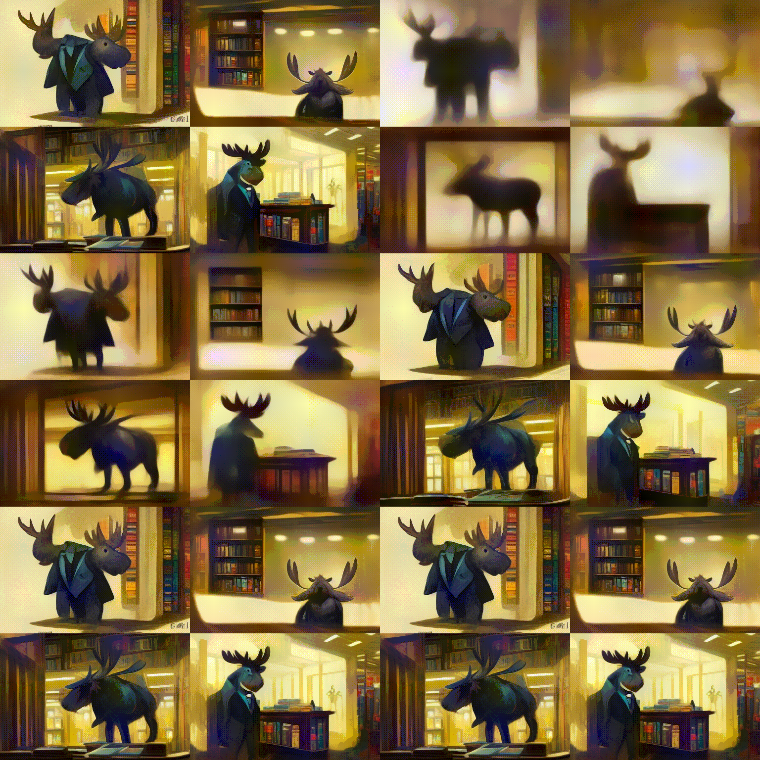
The prompt was: /imagine moose in the library, wearing a suit --seed 420 --ar 3:2 --video --v 3
First just to remind you, we used the older version of Midjourney so the seed number doesn't help us retain the images we were working on so far. But as you can see, we got the "video". It's basically a GIF of the process of image generation. Even though it's not what you might've imagined it's cool to see everything that's possible with this AI.
It's important to note that you have to add a reaction to the output of this prompt in order to receive a link to the video that you can view and download. It might take a couple of seconds before you get the message in your DM.
Tiles
Another feature available in older versions is --tile. We gonna step away from the moose just for a moment here haha.
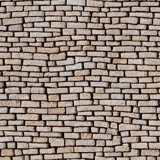
What's this? Well, the prompt is: /imagine rock brick road pattern --testp --tile
--tile is a cool little feature that you can use to get a seamless repeatable pattern that you might for texturing you video game or maybe even your bathroom haha. If you download this image and put it into a Seamless texture checker, you can see that it really is a seamless pattern. It would be interesting to see how well done this is going to be in the current version of Midjourney.

Adding Style
We mentioned in the beginning how prompts are split into three parts. But the Text Prompt can be divided into even smaller sections and they are necessarily written in any order but are in a way recognized by the AI like this:
- Subject: like in our case, moose wearing a suit.
- Medium: how the image was made, like painting, photograph, illustration, 3D-model, etc.
- Environment: where is the subject, like on a beach, in the forest, or maybe a library?
- Lighting: soft, ambient, overcast, neon, studio lights, etc
- Color: vibrant, muted, bright, monochromatic, colorful, black and white, pastel, etc.
- Mood: Sedate, calm, wistful, energetic, playful, etc.
- Composition: Landscape, portrait, wide shot, closeup, birds-eye view, etc.
This can get a mouthful pretty quickly, so let's start by adding only one thing to our prompt.
Medium
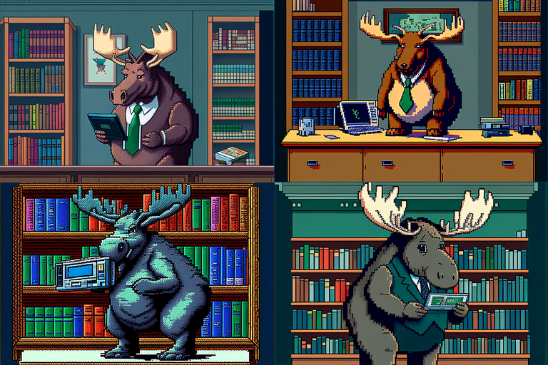
Prompt used: /imagine moose in the library, wearing a suit, Gameboy advanced graphics --seed 420 --ar 3:2 --q 2
You already saw this one teased in the last ending of the last guide. You can see that by adding "Gameboy advance graphics" the image changed completely into a Sprite, a graphic type that was prominently used in Gameboy Advance games.
Want something different? Like maybe a painting of a moose painted by Anthony Van Dyck?
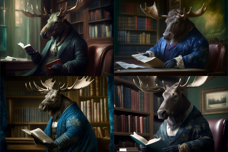
Prompt used: /imagine moose in the library, wearing a suit, painted by Anthony Van Dyck --seed 420 --ar 3:2
And here we go. A moose in the library wearing a suit in a baroque-style painting. But we can do even more.
Color
We gonna build upon these last prompts and gray out or mute the color a bit from our Gameboy Advance style images.
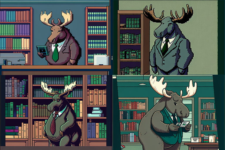
Prompt used: /imagine moose in the library, wearing a suit, Gameboy advanced graphics, muted colors --seed 420 --ar 3:2
Now we will add more color to our baroque images painted by Anthony Van Dyck by adding colorize in our prompt.
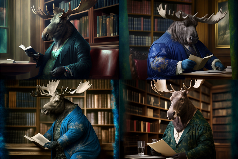
/imagine moose in the library, wearing a suit, painted by Anthony Van Dyck, colorized --seed 420 --ar 3:2
As you can see, now the colors just pop a little bit more. There are sometimes side effects, like in image 2. For some reason it got flipped, but not really a big issue, we can fix these types of things easily outside Midjourney if we want to.
Composition
As we continue building and our prompts get bigger, AI seemingly easily lost track of what it is being asked to do. Like this for example.
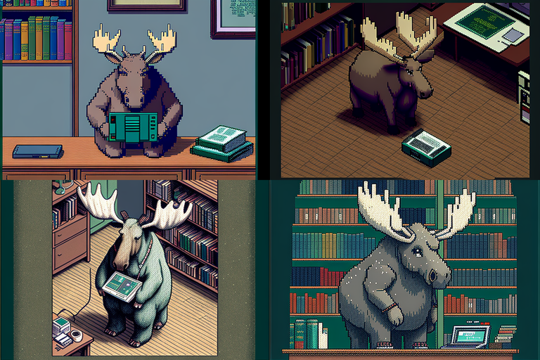
Prompt used: /imagine moose in the library, wearing a suit, gameboy advanced graphics, muted color, top-view --seed 420 --ar 3:2 --q 2
It looks like AI is forgetting something. A suit. There is no suit in any of our images. To fix this we are going to rewrite the prompt more cleanly. Our subject is moose wearing a suit, so we will group this together like this:
/imagine moose wearing a suit, in the library, gameboy advanced graphics, muted color, top-view --seed 420 --ar 3:2 --q 2
...and try again.
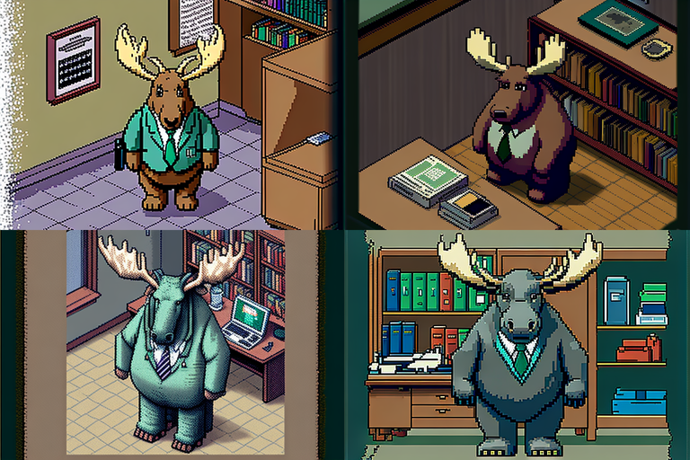
Cool! Now we got everything, sprite style graphic, blend colors, top-view, and our suit is back! By grouping the suit with our subject (moose) AI isn't getting confused anymore and is giving us more or less what we wanted. Of course not everything is perfect. Especially images 2 and 4 but we can easily work on this rather than the set of images before this fix.
We are going to implement this fix in our next baroque prompt too.
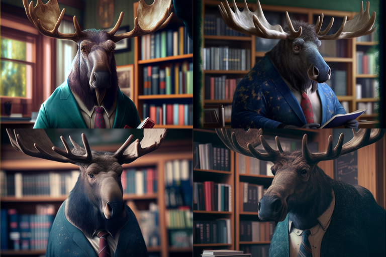
/imagine moose wearing a suit, in the library, painted by Anthony Van Dyck, colorized, extreme closeup --seed 420 --ar 3:2
And we got what we would expect, a closeup painting of our moose.

We could go through all of the little segments of the prompt but I would assume there's no need, as the process shouldn't be any different than what we covered in these examples. As you saw, when our prompts are getting longer, you will need to make your prompts as clear as they can be so you don't confuse the AI and get what you are actually aiming for.
Even if you are being clear and concrete, sometimes you won't get what you are looking for. When that happens, you should start adding parameters that we covered in the first part, and see if you can add or remove a bit of chaos or up the quality, maybe then the AI is going to please you with the result.
Experiment, iterate, and have fun!

I'm also leaving you with a huge curated list of different prompts that are categorized in detail and it's easy to find things that you might be looking for. List is full of different keywords that can affect style, color, lightning, perspective, etc. Basically everything you can think of:
Also say goodbye to the moose, next time we are going to look at what we can do with image prompts, and multi-prompts, and how we can remix our initial prompts to make build our images in a different way.
As always, thanks for reading.


