I sometimes get asked on Hive about the type of camera I use for my travel blog. Maybe people are just being friendly or maybe they are generally curious, but it's happened a half dozen times or more in the past year so I can't help but think that there is some general interest there. I always tell people the same thing though, that I'm using my inexpensive Samsung phone and then doing some light editing with the standard Google photos app that came with it pre-loaded.

What I'm trying to convey by my reply and more importantly, this post right now, is that I'm not a particularly great photographer and I don't use fancy equipment. That being said, I personally think that anyone can create beautiful images with just about any device. All its takes is some time and effort.
Ultimately, you don't need a special camera to improve your photos and your blog, you just need the aspiration and a bit practice.
When I edit I mostly just sharpen things up a bit and bump up the color in an attempt to make the image look more realistic, i.e. closer to what it would look like to the naked eye. I do this with all of my photos, regardless of how well the raw image comes out or the subject matter of my post (ex. travel, recipe or life update...etc).
Generally, I spend about 30 seconds to 1 minute per photo and I typically publish 20-40 photos per blog post, so you can imagine just how much time I spend on this process. Overall though, I think that it's worth it.
In the end it could be the difference between a good blog and a great one or better yet, between being unrecognized for curation and recognized.
I guess what I'm trying to say is that you don't need special equipment to take great photos for your blog, you just need dedication and a bit of know how. Maybe your posts have a lot of potential too, but are lacking that small boost to make them truly excellent. If either of these are the case then perhaps this post will be helpful to you.
Today I'm going to show you how to edit photos using a basic photo editing app, as well as share any tips and tricks I can think of along the way that could be helpful. Please feel free to share your ideas and suggestions in the comments to help others and myself improve further.
Let's get started.
Filters
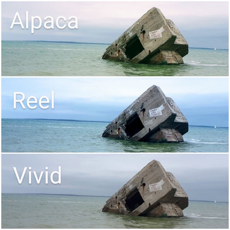
When I begin editing I always start with a filter but I generally try to keep the image as consistent as possible to the original. Each filter highlights a different aspect of a particular photo and generally emphasize its innate qualities such as its texture and color; because of this, there is usual one or two filters that will work best to enhance a particular image but they may not be the same for each photograph.
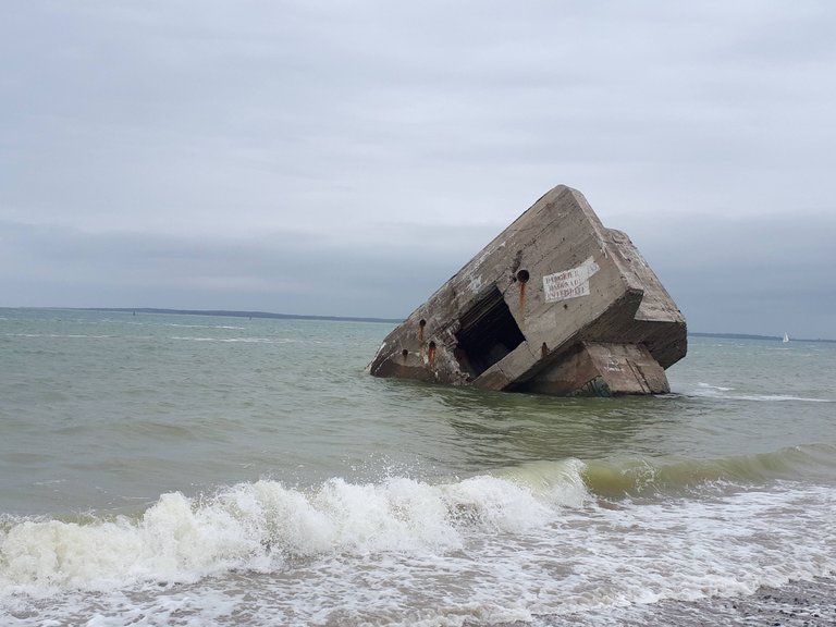
I try to avoid anything drastic and I generally like my blog to look consistent so I always use the same filter for every image. This has the added bonus of saving me time as well because I dont need to scroll through the options to decide what works. That being said, I always choose the "vivid" filter because it is the most basic and subtle and doesn't add any additional color to the raw image. All it does is brighten and crisp it up slightly. You can't even tell the difference some of the time, which is sort of the point.
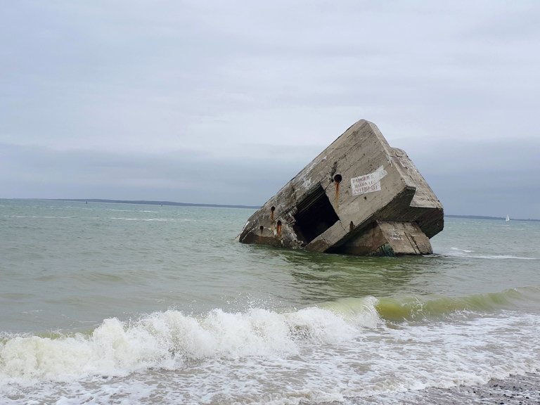
From there I edit the photo manually to make it a little brighter, slightly more colorful and always sharper and more clean.
Basic Editing
I've done these basic edits so many times that I can now do it very quickly and I've noticed that I generally do the same thing for each image, staying within about 1-5 degrees on any given tool.
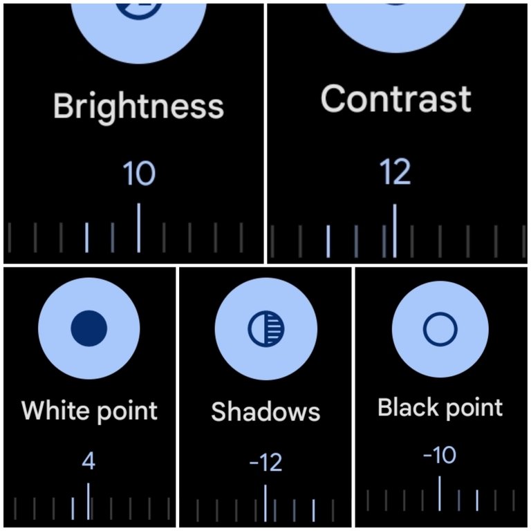
This first block of tools for me is mostly about brightening up the image and adding depth via shadows and black. I generally use these tools sparingly though and stay with 12° in the (+/-).
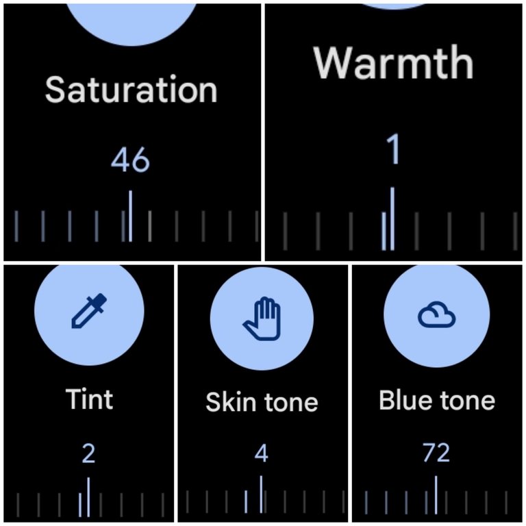
The next block of tools are obviously about adding color to the image. This block is a bit of an exception in that it can vary significantly by photo in how much you can get away with. For instance, on a grey and cloudy day a photo like this can take a lot more saturation but a sunny day photo of grass and red flowers will only need a very small amount. Greens and reds become oversaturated pretty easily in fact.
I recommend playing with an image and over exaggerating everything in the begining so that you can get an idea of what the tools actually do. For instance, go too far and then pull back, and pretty soon you will get a natural sense of where things should be.
You will also start to recognize when an image has too much of something. For instance, too much skin tone will make peoples faces glow and reds and oranges look neon. Too much green begins to look neon and fake as well, and so on.
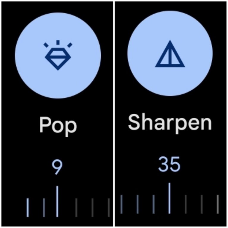
The last block of tools sharpens the image. I only use the Pop and Sharpen tool and always stay within 7-12 with the Pop tool and 20-40 with the Sharpen one. If you go too far with these it adds too much detail to the photo and begins to hurt your eyes or generally look, off.
For instance, too much of the Sharpen feature will separate every single brick in a wall or leaf in a tree and make the image appear way too busy.
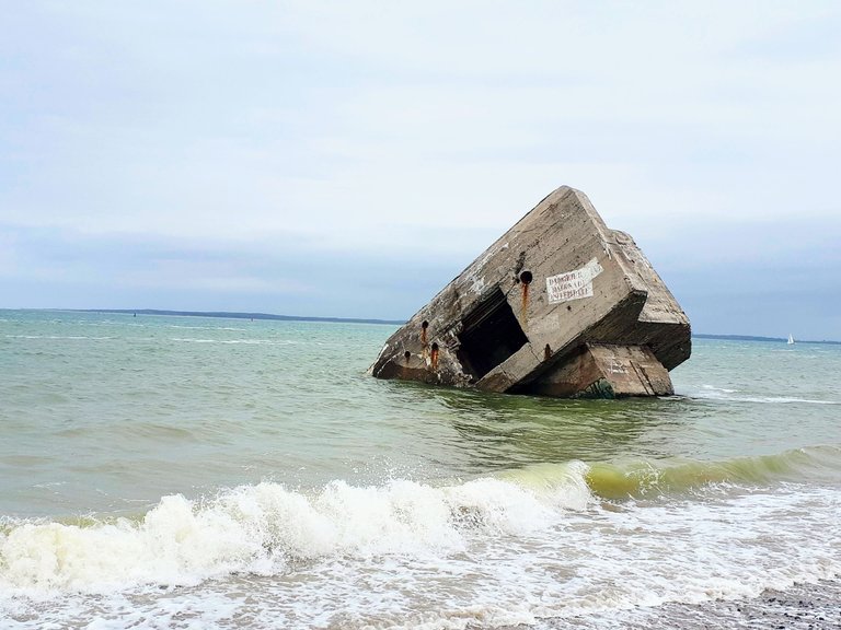
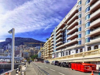
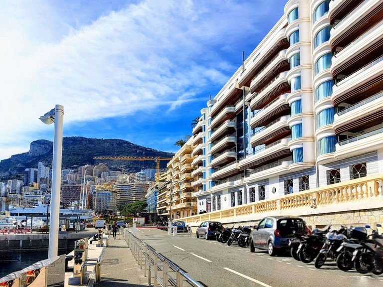
Here is an example of the final product after editing. I don’t think its too far off from where we started. It's just a little brighter and a little more lively.
Going Too Far
Here is example of going too far on some of the features. These examples are quite exaggerated but they give you an idea of what the tools do and can help you recognize what going too far actually looks like.


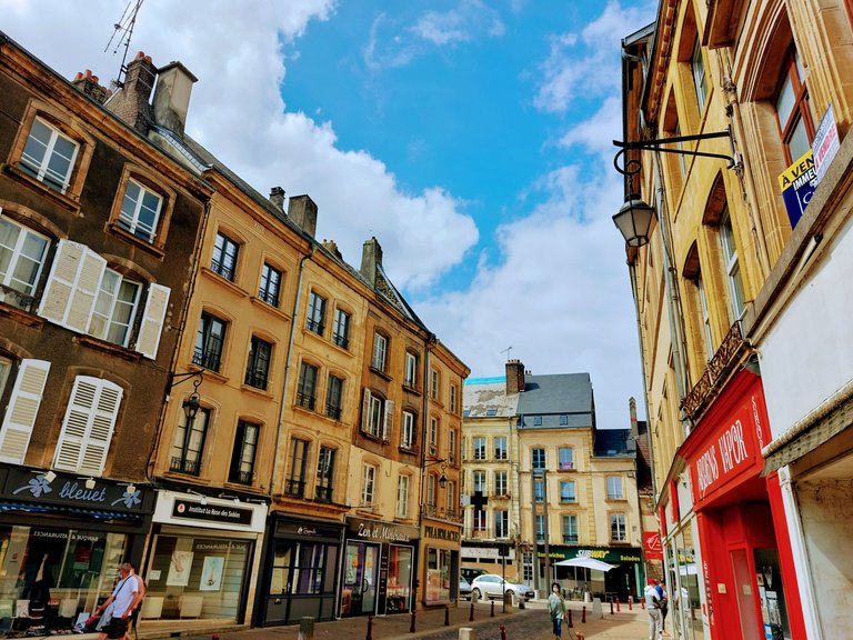
The example above is close to where I would want it to be but it's just a bit too much of the filter and is starting to look fake, or at least like a poor representation of the location. If I were to only use this filter I would probably tone it down a little, which is another option for a "quick fix," i.e. pulling back on the filter itself.
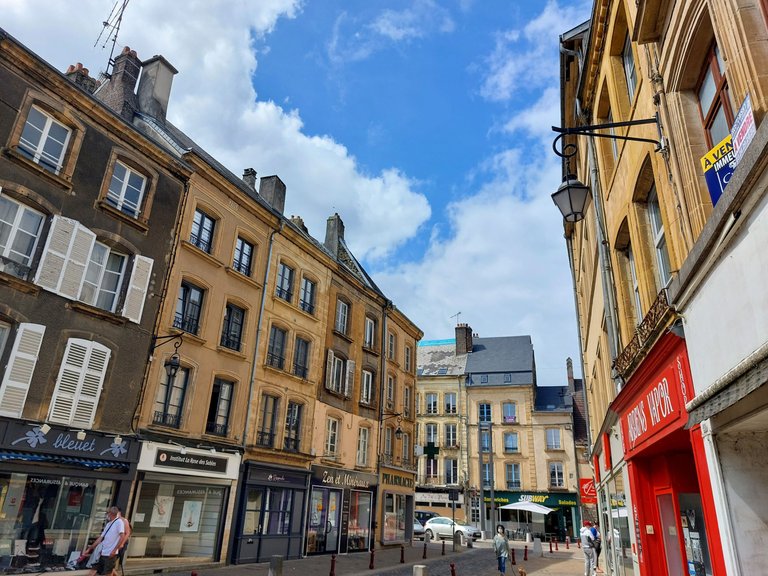
The photo above is my personal preference. The editing is quite subtle and it doesn't look fake. Overall I think it's a good representation of the location.
Sharpening
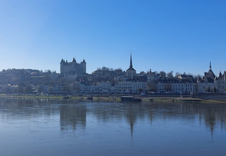
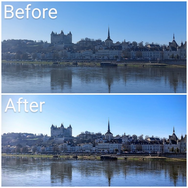
The image above was taken under poor conditions. It was early in the morning when I took the photo and I was facing the sun, but it was my only chance of getting a shot of the full city that day so it had to be done. In my opinion, the photo is almost unusable in its current state and I personally wouldn't bother to add it to a blog post as is. But after some editing just like above I know that I can make it somewhat passable. The main thing is sharpening it up a little to remove the hazy look to it.
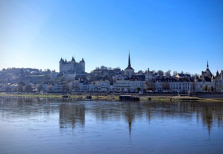
It's still not an amazing photo by any means but I think that it's better than where it started. I wouldn't treat this as a cover shot or a highlight to a post but definitely as content, i.e. as a visual aid to the written portion.
Brightening
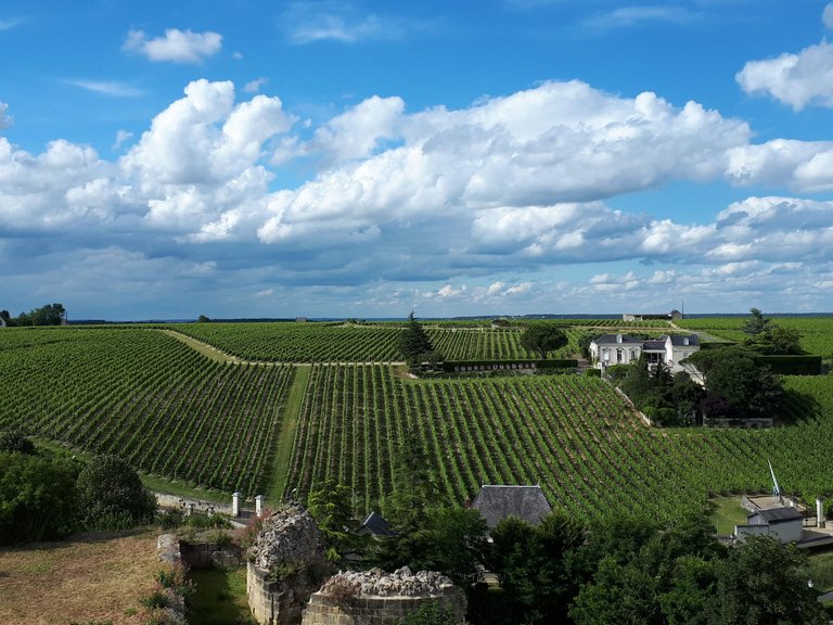
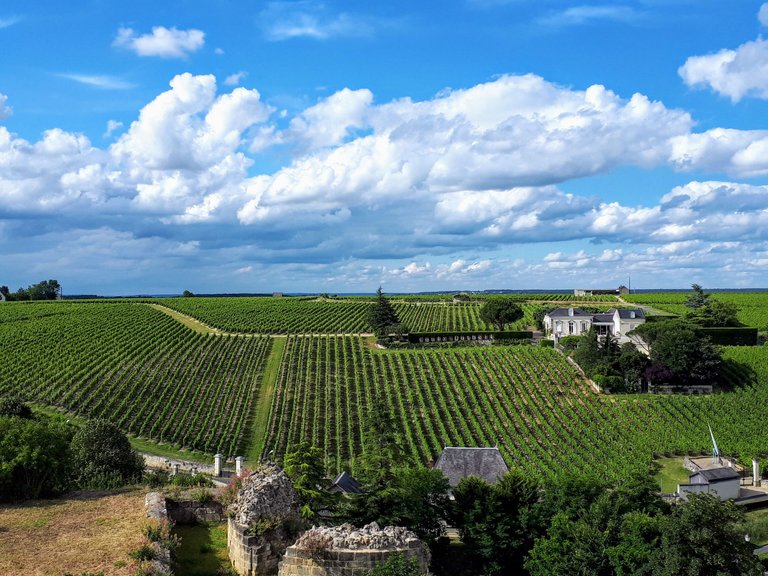
Here are a few more examples but a little less drastic. In these cases, the raw image would be usable but editing definitely livens them up a bit and makes them brighter and more colorful.
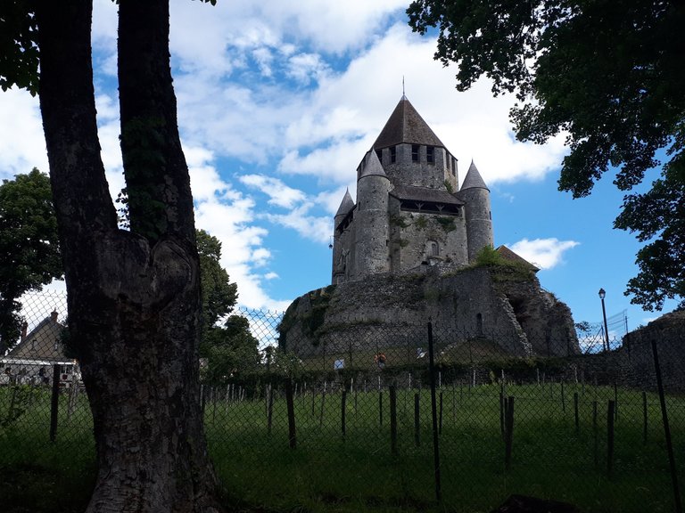
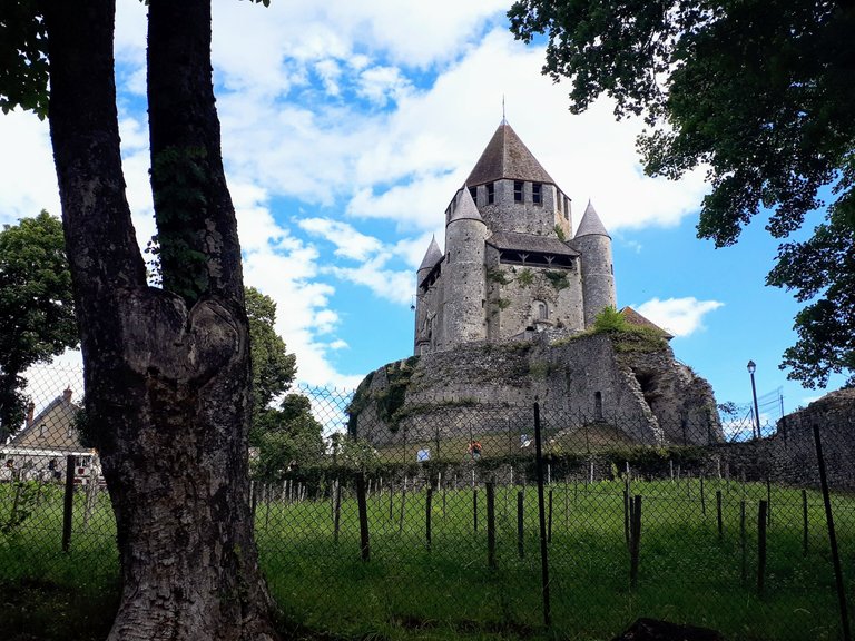
To me this is what I was referring to at the begining of the post of going from "good to great," or at a minimum from okay to decent.
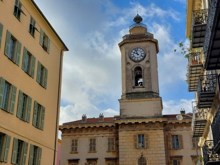
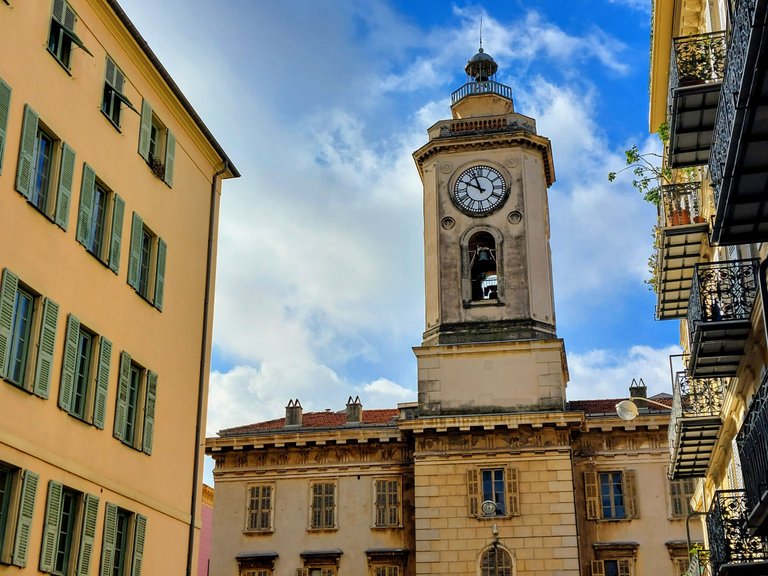
The changes aren't huge but hopefully just enough to give them that extra something something.
Cropping
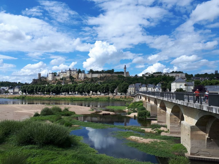
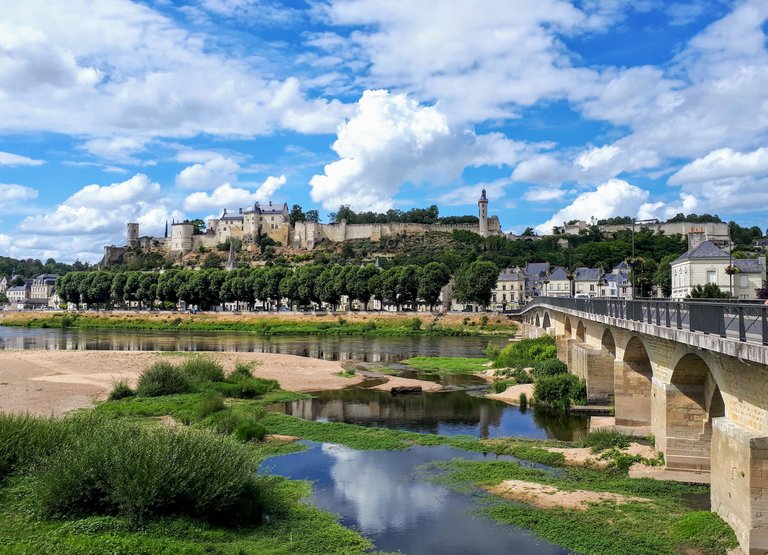
I actually don't crop my images very often and when I do it's typically to make a small change to shift the focal point, remove an object from the frame or maybe reduce the amount of sky or something in order to create balance. I generally like all of the images in a post to be formatted the same as well i.e. rectangular, horizontal landscape shots, so I generally won't crop a photo into a square. If I take some off the side then I'll also take some off of the top and/or bottom to maintain it's original shape.
As an example, in the photo below I wanted to remove the people on the bridge so I also removed some of the sky to maintain that rectangular shape.
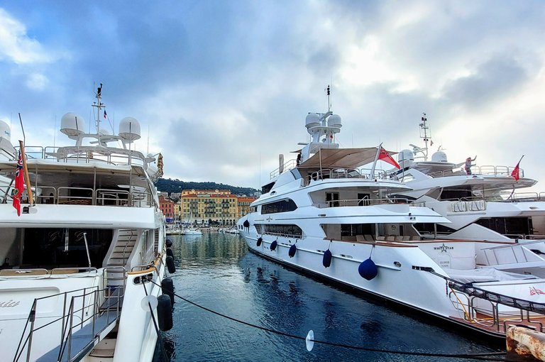
I don't like this next photo at all. It was taken with a wide angle lens and the turned out all wonky to me - maybe a little distorted. But I'm wondering if I can find a usable image somewhere within it?

After editing it and cropping, I think that its a little better. I'm still not a huge fan and probably wouldn't post it unless I needed more content but I think it's a good example of what you could do with the cropping tool.
Combining Techniques
This next technique is something that I don't do very often (almost never) but it's an example of how far you could go if you combine all the above in a basic photo app and without straight up using photo shop.
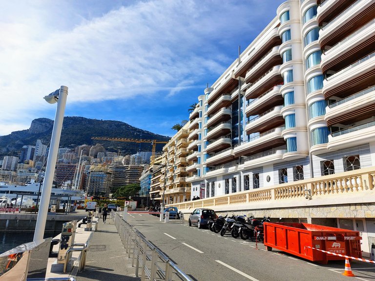
The above photo is complete garbage in my opinion. In fact, the photo itself contains a garbage in it and I retrieved it from the trash bin for the sake of this post. I don't know what I was seeing when I took it but now I'm a bit curious to see if I can make something out of it.
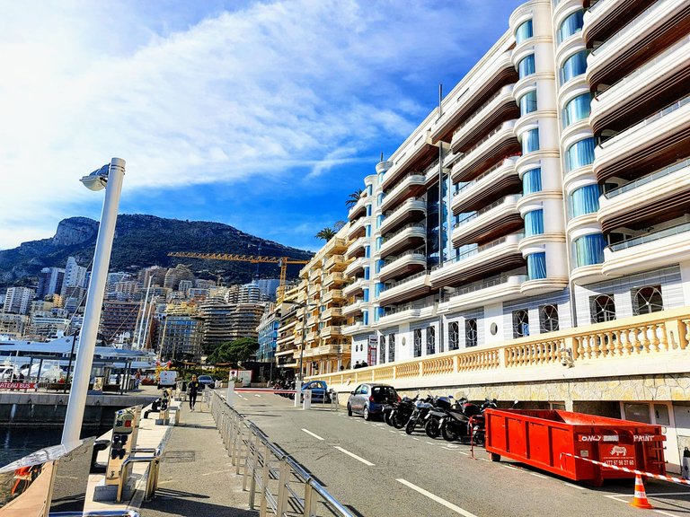
First I'll start by editing it to make it as clean and bright and sharp as I can.
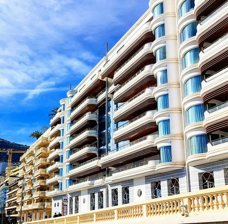
Then I zoom in on a particular spot of the photo that I like, for instance the 70's looking futuristic balcony, and I take a screen shot of just that area. I don't just crop it here because that generally makes the photo turn out very blurry but for some reason screen-shotting it seems to maintain its integrity.
Lastly, as you can see below I'll crop just the area that I like and rotate it to a position that works and voila! We turned a garbage photo in something somewhat interesting.
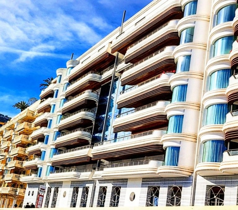
I'm still not entirely pleased with the end product because the cropping made it blurry anyway, but you get the idea of what you could do if you combine multiple techniques.
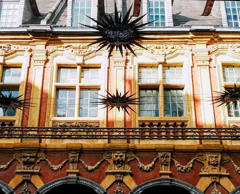
I might do this to highlight some detail of a building like the windows or doors for example or maybe a carving within a facade.


