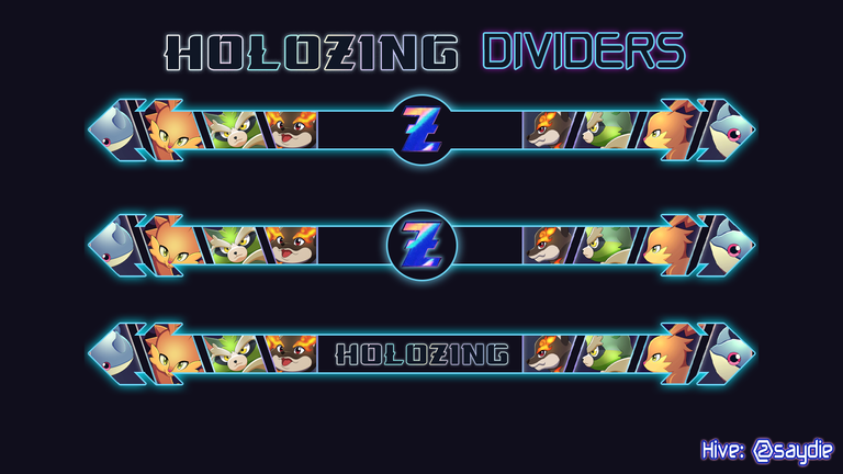
Hi there! It's me @saydie and once again, I'm here to make another post for Holozing which is an upcoming game on Hive and for this content, instead of talking about Holozing's in-game token and earnings (which what most people have been talking about), I like to provide something new by providing some simple Holozing dividers to be freely use by everyone as my contribution to the community and in order to make my upcoming post more presentable in the future. Before we go to the final result, here is how I did it using Photoshop.
Divider Layout
As I will be starting from scratch, I need to figure out first how I would shape the divider in order to place Holozing monsters and at the same time, to be also Hive inspired so what I did first was to upload the Hive logo.

From there, what I did was to remove the diamond shape then adjust the size of the logo to be more like an arrow shape. After that, I make a copy of it and placed it on the other side.

Once both sides got the arrow shape, I made a line that will connect the arrows from both sides and now we have the initial layout for our divider.

However, I do not think that its current color was appropriate to what I'm trying to make so instead of red, I change the color to black while at the same time, made some more adjustments to make the arrow thicker in order to come up with this layout.

Inserting Holozing Monsters
My initial plan when inserting the monster was to just get the cover from the Holozing website and make a reverse copy of it which I would place on both sides of the arrow. Then with the Magic Wan Tool, I could crop both image that I want to be placed in the divider.

But that was kind of boring so what I did was to make an alternate cover and use the other image of the monsters to get a different view on the monsters.

With the use of Magic Wand Tool, I crop each of the image and this is how they look now as a divider. It is beginning to look decent but it can be further improve with some final touch.

Finishing Touches
Both left and right side of the divider has the monsters on it but the middle was empty so for the final touch, I just placed the Holozing logo in the middle and add a circle shape on it with light blue border. I also add border on the divider in order to make its shape more recognizable.

Alternatively, I remove the borderlines on the side of the Holozing logo for some minor visual difference.

Finally, I made another design by replacing the Logo with the Holozing title that although was a simpler modification, covers the entirety of middle section of the divider.

Final Result (Updated)


Additional Element Based Dividers


So here are the three dividers that I made for the use of the Holozing Community. We have quite a limited resources in terms of images so I need to make some improvise which in my opinion has turned great specially when your interface was on dark mode.
That was all for this post. Thank you and see you at the next one!
Previous Post
 |  |  |
I am not a financial advisor and this is not a financial advice. Always DYOR and invest what you can afford to lose.
