Not signed up for splinterlands yet? Make sure to use this link and sign up!
Intro
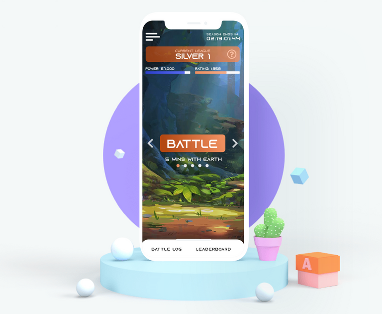
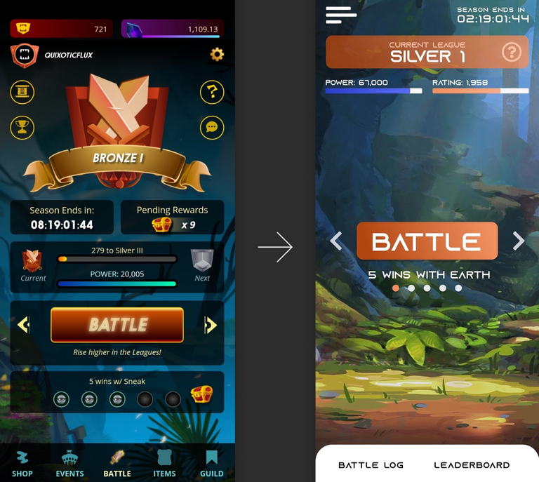
A while ago I worked on a redesign of the splinterlands mobile application's battle screen. I created a post about the proces but never really presented the design in a proper way.
I hope this is a valid entry for the art contest, if not, feel free to ignore this.

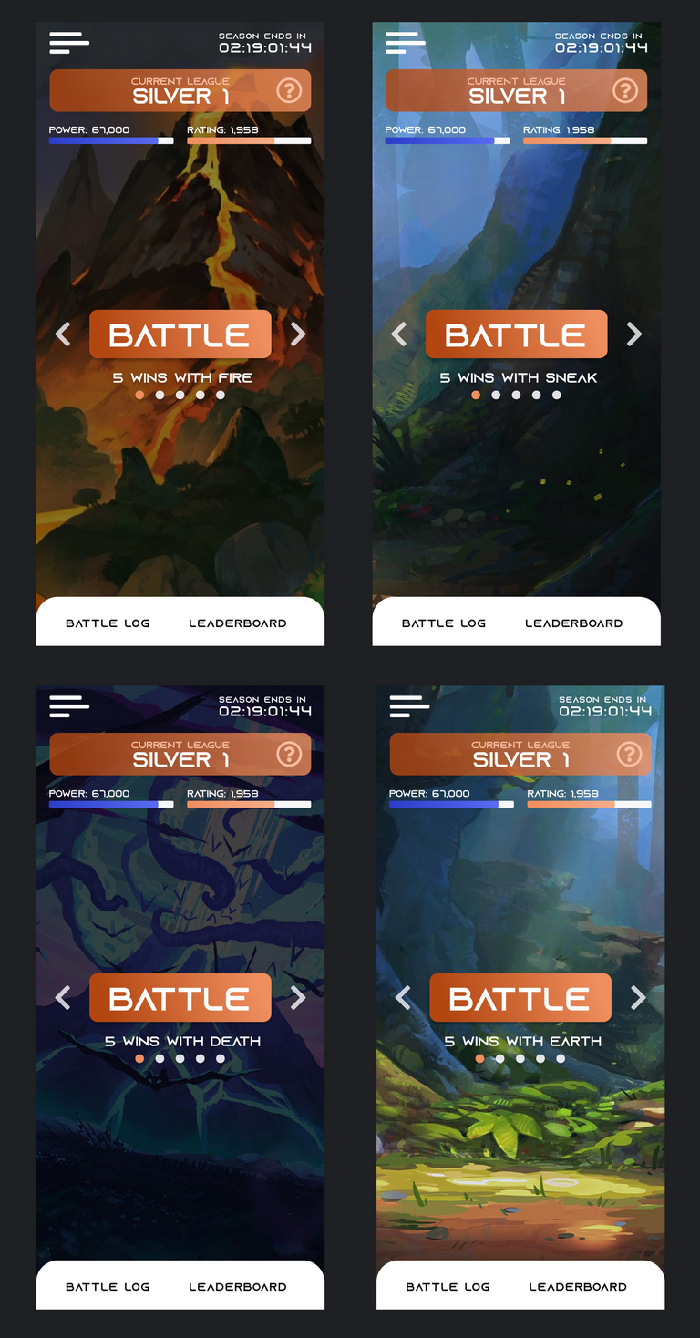
The result
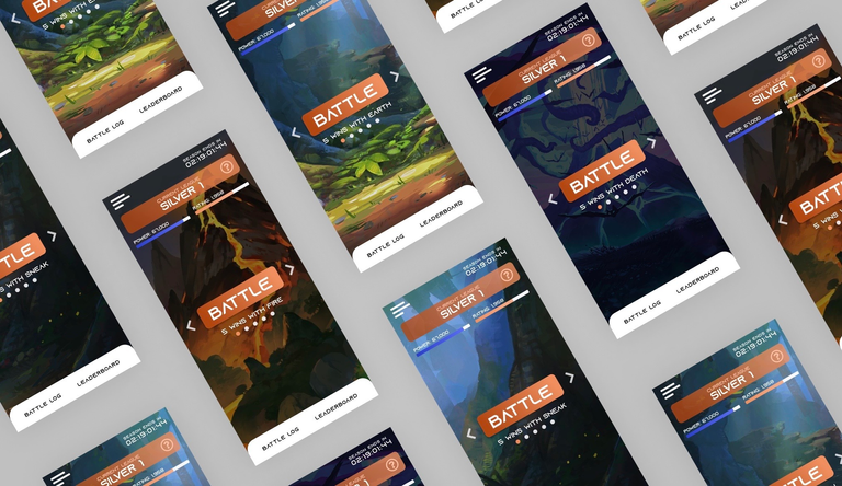
All information that seems to be gone is somewhere to be found, but the elements that are not frequently used are hidden away in a way that it should not hurt the user experience.
The idea between the different backgrounds would be that these would change depending on your daily quest. For example, you would get the vulcano background if your daily quest was "get 5 wins with fire", you would get the forest background if your daily quest was "get 5 wins with earth", etc.
This way, there can be a lot more focus on some of the amazing art that splinterlands has. Today, this art is usually hidden away behind a lot of distracting elements, which is a shame, because the art is great.

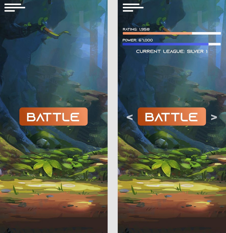
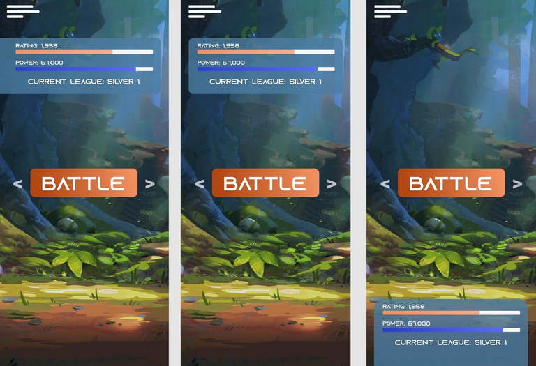
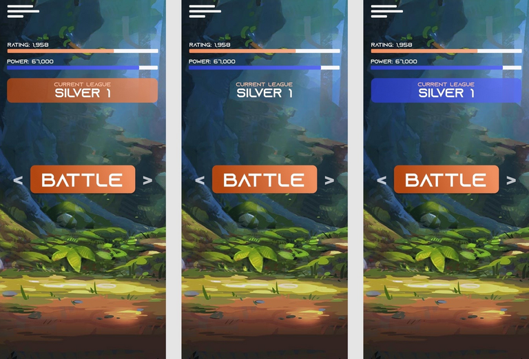
The proces
The full proces can be found here

Want to earn more money with blogging? Make sure to join HIVE and Start cross-posting to publish0x!


