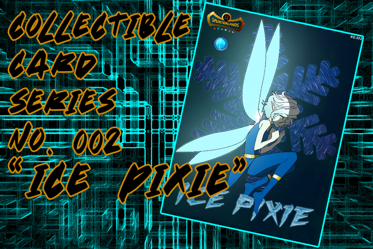
I know there's a few people waiting for my 2nd Splinterlands collectible card edition. Sorry didnt make one last week its been busy with work and birthday celebration. but here i am sharing you my Ice Pixie art as an collectible card.
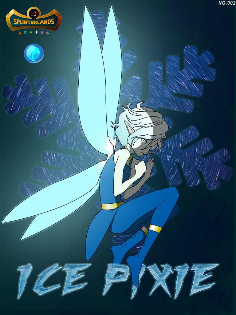
My impression of the original ice pixie card are dark and angry despite being a pixie race so i make my version dark and angry too. Not a waifu art this time but i made her super cute as a compensation for not making a waifu art.

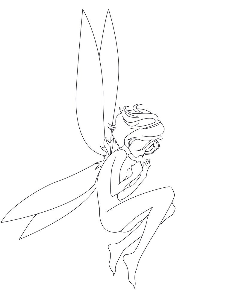
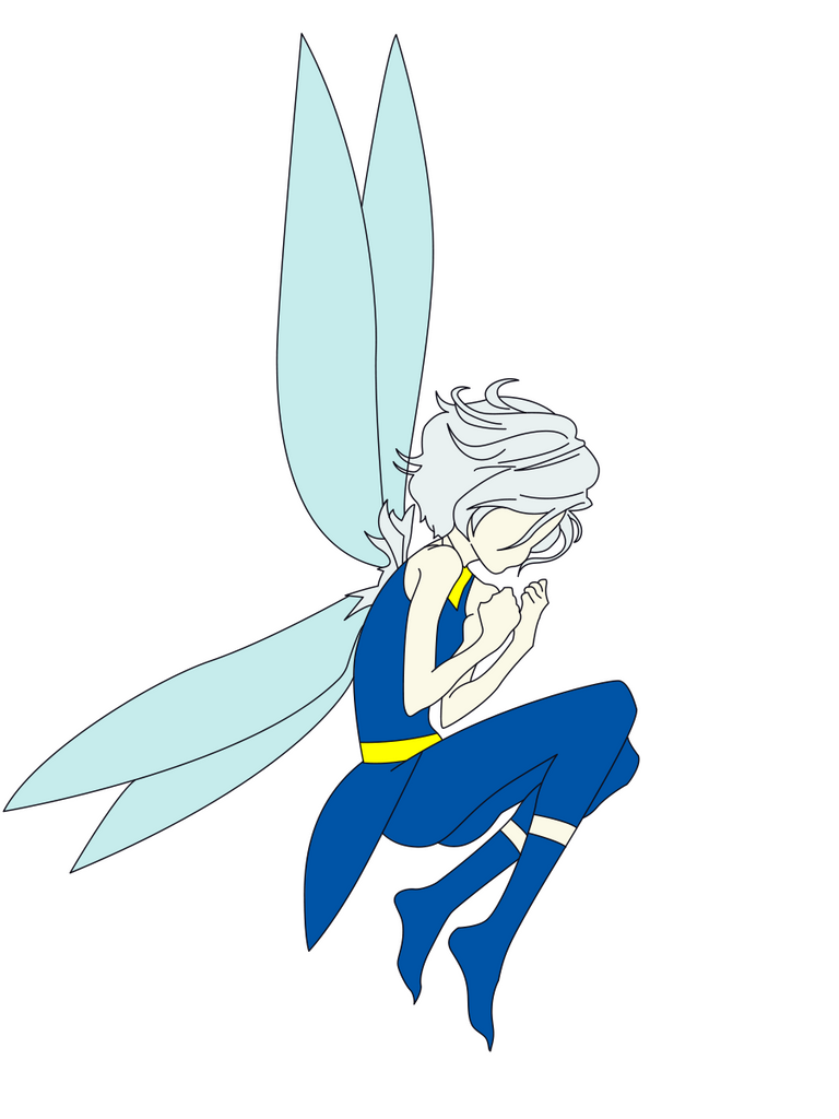
I started with sketch and outline. I didn't include the sketch in this post since its just a crappy sketch of pose i did. Ive done 4 pose and choose this one with the lonely, angry and hurt pose. I dont know why but I feel her anger and sadness in the original art, what about you? what can you feel about how the designer created her art?

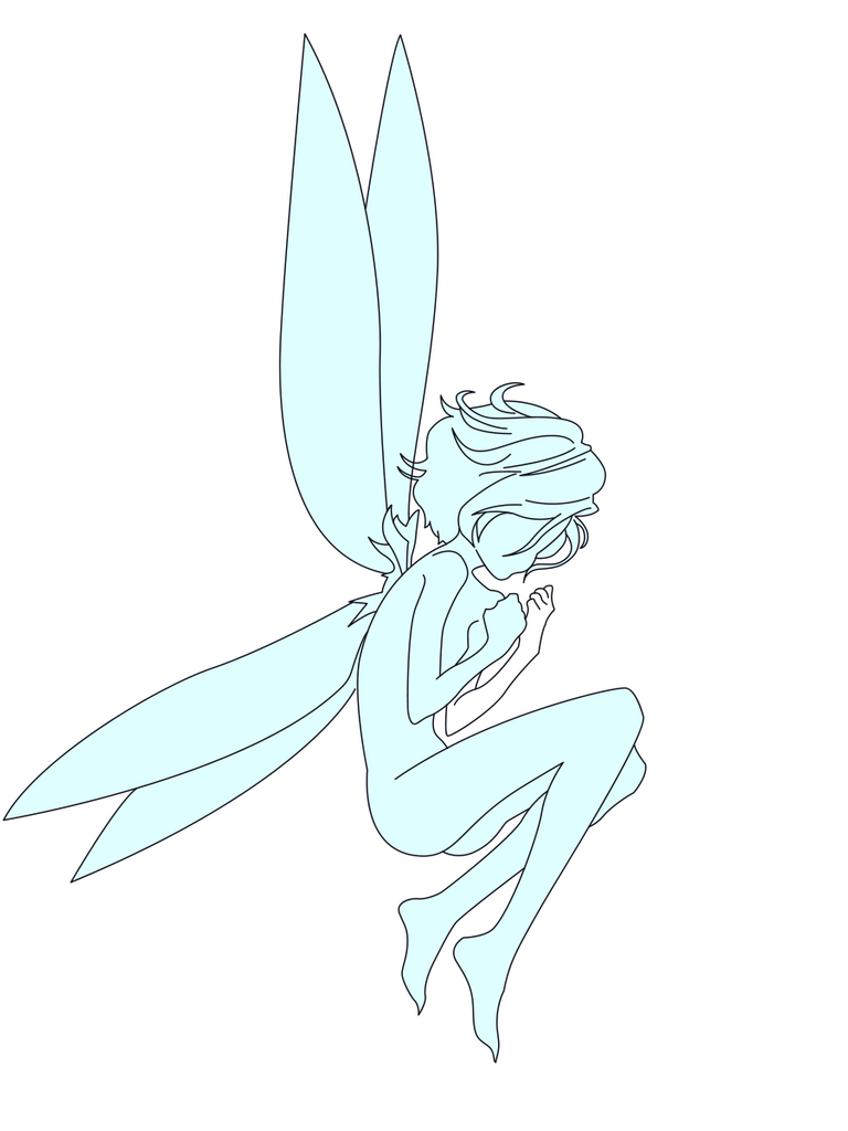
From start i thought that she is blue colored pixie thats why i planned on giving the art a blue based color. But in the process i learned that she is fair color beauty with a white bright hair, its just the glow of her magic that makes her looks like color blue. i changed the based color on the following steps i made after this.

This part i re-color the base and added more details like clothes and accesories. I also include the base color of that certain details i added. This time i can see clearly what my art will look when i finish it. Yup i can see clearly what to do next and how to do it.

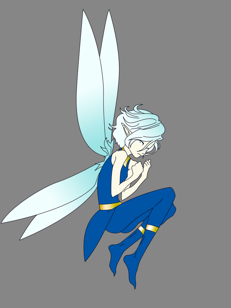
This time i created the face part details. I tried to do the same as the original eyes that glows but i didnt like it thats why i just made it as scary glaring eyes. I also tried the gradient effect on wings and hair but remove it anyway on then next step i did.

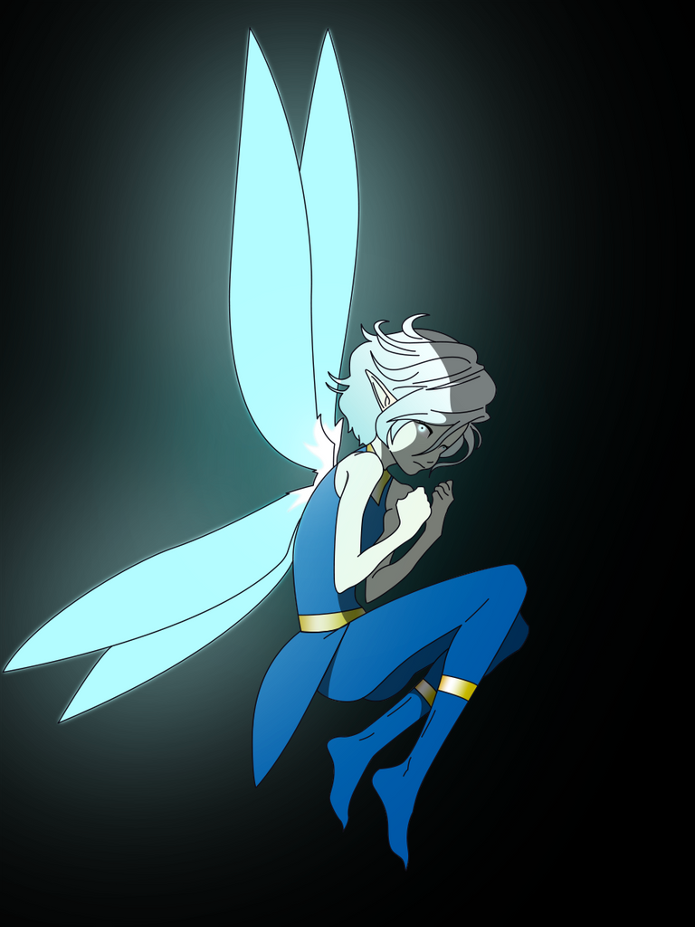
This part i added the glow so that i can decide where to put the shadows. I also include shadows in this part. I made the based color of the background black to highlight the glow and be more visible. That dark background also demonstrate the dark feelings I must include in this art.

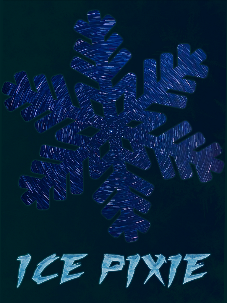
This time ill tell you how i made the background. First i made the background dark blue green cause black is too dark. Then i created this snow flakes with swirling glitch like lines. then added ice effect to the dark green background so it wont be that dull looking plain dark blue green color. Then i created the text in frozen effect.

And in the final touch I just mixed em all up. I also add the splinterlands logo, the water element icon i made and starting from now i include the number at the top right part of art as it is numbered belong to my collectible card design for Splinterlands. Thank you for reading up to this part. I hope you like my art, not as good as the competition arts but I did my best and enjoy doing this.

THUMBNAIL
