Neue Karten-Auswahl-UI "Select Units", "Seeking Opponent" und "Match Rules"-Anzeige. Großes UX-Design-Update.
Splinterlands hat vor ein paar Tagen ein weiteres UX-Update durchgeführt und jetzt auch die Karten-Auswahl modernisiert.
Das Update soll die Spielbarkeit von Splinterlands auf mobilen Geräten deutlich verbessern, sorgt aber in der gewohnten Desktop-Version zumindest anfänglich für etwas Verwirrung.
Die Filter befinden sich jetzt in der Desktop-Version auf der linken Seite und die Karten, die man auswählt, werden relativ klein am oberen Rand angezeigt. Es ist jetzt schwieriger geworden, die Karten zu verschieben, das funktioniert irgendwie nicht so richtig, und auch die Match-Rule-Anzeige ist in der Desktop-Version ziemlich klein ausgefallen, die Match-Rule-Symbole teilweise auf kleineren Geräten (Tablets) schwerer zu erkennen.
Auch der Seeking Opponent-Bildschirm wurde aktualisiert und zeigt jetzt ein cooles, bildschirm-füllendes Splinterlands-Art-Wallpaper, das sich auch bei jedem Match ändert.
Auch die Match-Rule-Anzeige wurde umgestellt und auf die neue Design-Sprache angepasst.
Was gefällt euch das Update? Habt ihr euch schon daran gewöhnt?
Splinterlands UX Update: Seeking Opponent, Battle Rules and Select Units screen updated (February 2025)
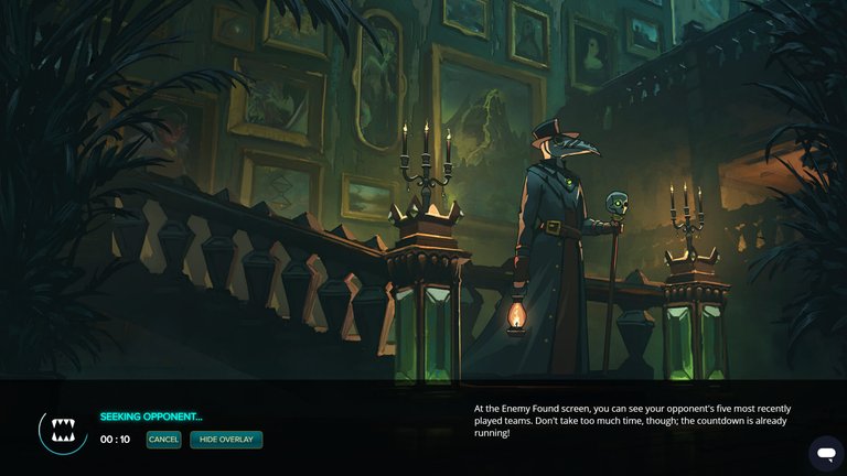
Seeking opponent

Battle rules
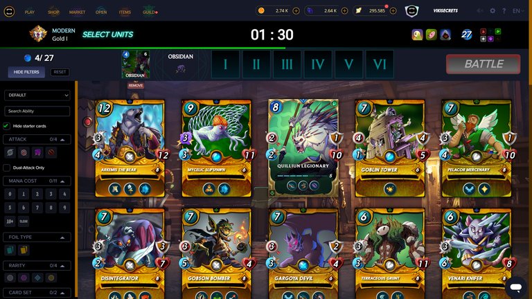
Select units
https://x.com/vikisecretscom/status/1892890780747874326
English
New card selection "Select Units" UI , “Seeking Opponent” and “Match Rules” screen. Major UX design update.
Splinterlands carried out another UX update a few days ago and has now also modernized the card selection.
The update is intended to significantly improve the playability of Splinterlands on mobile devices, but is causing some confusion in the familiar desktop version, at least initially.
The filters are now on the left-hand side in the desktop version and the cards you select are displayed relatively small at the top. It is now more difficult to move the cards around, somehow it doesn't work properly, and the match rule display is also quite small in the desktop version, the match rule symbols are somewhat more difficult to recognize on smaller devices (tablets).
The Seeking Opponent screen has also been updated and now shows a cool, full-screen Splinterlands artwork wallpaper that changes with every match.
The match rule display has also been changed and adapted to the new design language.
How do you like update? Have you already gotten used to it?
Posted Using INLEO