Here is a small love project of mine for the Hive ecosystem: hbdstats.com. A simple and intuitive dashboard designed to help you monitor the vital information related to HBD.
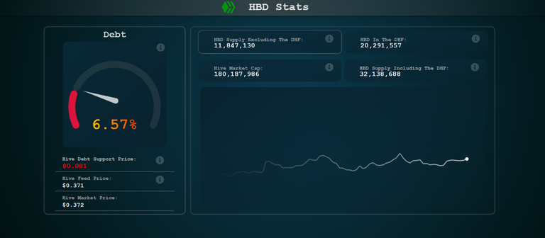
As HBD gains more and more popularity I wanted to build a small dashboard for tracking the important data for the status and the health of HBD in real-time. The main focus for now is the debt level and the Hive support price for HBD.
As we know HBD has to so called haircut rule, when if too much HBD is in circulation HBD is no more valued at one dollar. There is already one site that track this https://hive.ausbit.dev/hbd from @ausbitbank but why not have another one in the spirit of decentralization 😊.
For now, this dashboard covers the following:
- Current Debt Value
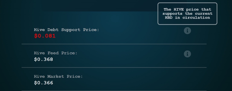
- Hive Debt Support Price: The price of HIVE that supports the current HBD supply in circulation)
- HIVE feed and market price
- HBD supply excluding the HBD in the DHF (used for debt calculation)
- Total HBD supply (including the HBD in the DHF)
- Hive market cap used for debt calculations (calculated from the HIVE virtual supply and the feed price)
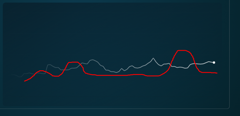
- Chart for the Hive debt trend in the last seven months
More to come.
Simplicity and Ease of Use
When creating this tool, I wanted it to be simple and elegant. It is a simple tracker but even with this low amount of data to track things can get confusing fast bearing in mind the complexity of the system.
I have striped away a lot of unnecessary things.
There is no text, and all the additional info is in the tooltip (i) icons, if anyone wants to read some more.
The chart for the debt trend has no axes value or data points, but again if you want more info, you just need to hover over the line and it will show the date and the value of the debt at that time.
Speedometer Chart
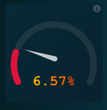
This chart was a challenge to make since I’m using the free and open source chart.js library for charting. It is an elegant but simple library offering the basic charts. The speedometer is not native to the library, so I had to custom make it from a doughnut chart.
The needle in the middle was especially challenging but I managed to pull it off with a custom plugin that draws it and adjusts its rotation to the current value for the debt.
The doughnut is also cut off, and the scales are adjusted from 0% to 30%.
The value for the debt in the middle is also customized, as there is no native value that the doughnut chart places in the middle of it. Some colorized styling was added as well.
Here is some initial iteration of it 😊.
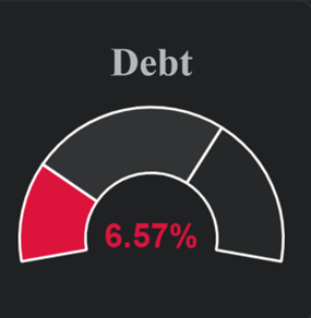
As mentioned, the free charting library that I’m using doesn’t have the speedometer as a default chart. There are some of the other charting libraries like Highcharts that have this built in, but the subscriptions there goes to a couple of hundreds of dollars per month. As a scrapy Hiver I have done my best to come close to that experience and offer it to hivers for free 😊.
Tooltips for Additional Info
All the extra info for the data points is available in the tooltips and shows up when you hover over them.
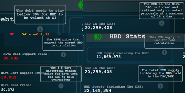
To provide relevant information without overwhelming the interface, HBDSTATS.COM utilizes tooltips. Hovering over data points reveals additional details, striking a balance between simplicity and accessibility.
Line Chart for The Debt Historical Values
This line chart is totally striped of any additional data then the line itself. It is also a bit stylized.
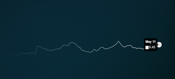
Again, the info for the historical debt is available when hovering over the line.
Mobile Responsive
Since everyone is mostly on their mobile, I have tried to make the tool mobile responsive.
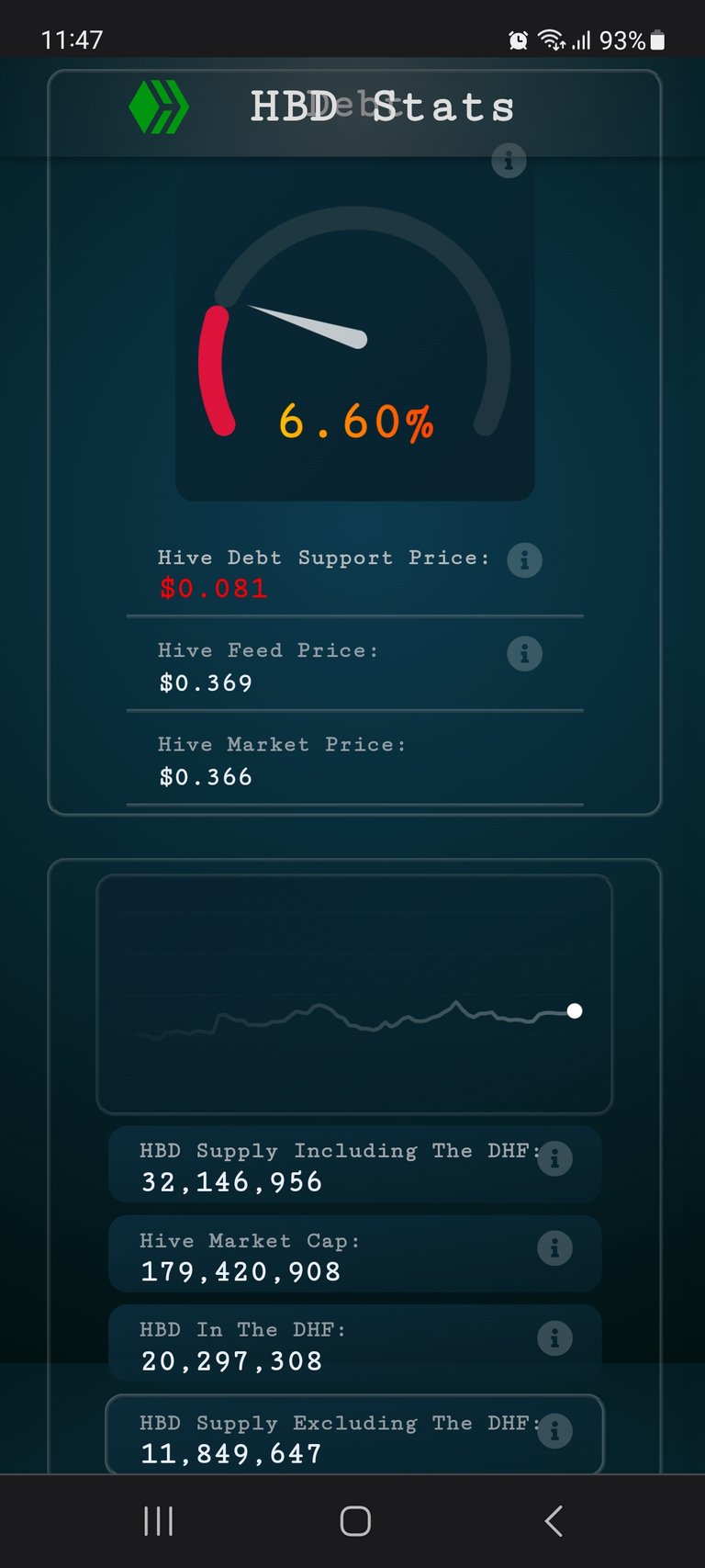
The elements are stacked vertically, and easily accessible with scrolling.
More to come
This is the first iteration for the dashboard, and I plan adding more features like:
- Chart with historical values for the HBD supply
- Chart for the HBD in the DHF and the total HBD supply
- Data and chart for the HBD in savings
- Top HBD holders
- etc
I hope you find this useful!
Any suggestions for improvements and more features are highly appreciated.
All the best
@dalz


