Hello Gaming Community. This post is for the developers of video games out there.
Someone jokingly once said: "all games are basically just copies of Half Life".
I think UI in video games needs to listen to that phrase and perhaps get out of it's bubble. These changes are not hard; in fact, they're the easiest to accomplish.
I don't know much about game programing but i understand it's complex. I have dabbled a lot in level design, and a lot of web designing, which is really close to game UI, so i think i can confidently speak to UI in games.
My point being is that i think i can safely say that designing and implementing a simple to use and understand User Interface for your game is the easiest part.

What the hell am i talking about here?
I'm talking about making your UI better. Not more beautiful, not aligned to the center or to the right, not what colors to use to evoke specific feelings from the players, but to make the basic human/machine interaction the quickest and easiest to use; how easy it is to find an option in the start menu, how quick it is to change the option, how easy it is to understand if the option you toggled is automatically saved, or not, by the game and, how quickly you can get back to the game after changing a setting.
That last aspect of the UI is what i'll be talking about.

So why am i posting this?
Well, i just started a game (and lately i've installed a few - trying to find something i feel like playing), and i've come across some terrible UI. It's not surprising; some of these games are done by teams of one developer and the last thing they want to spend their energy on is tweaking the UI!
But, i am here today to tell all you single-team developers that you can improve your UI with just a couple of thoughts in mind. Specifically for your game's options screen menu's UI.

Speed
The mouse's left-click button is not the only button on the mouse. It also has a right-click button and that button is still a button that can be used. It is not reserved to bring up an options context menu, like Microsoft Windows has ingrained into your mind for the past 3 decades. It's still a button you can take advantage of. The same goes with the wheel, but, as a developer, you need to take into consideration if a player doesn't have a wheel on the mouse - very unlikely but possible. This is not a consideration for the right-click button. All mouses have a right-click. Use it!
How?
If someone's enjoying your game, the last thing they want is to spend time interacting with your game's menus.

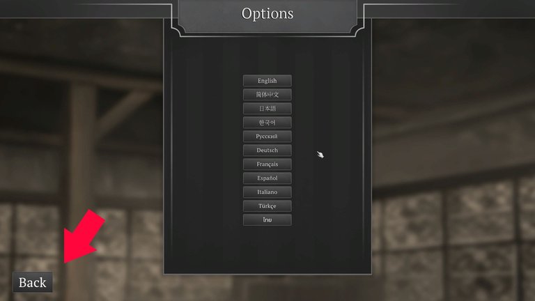
In the image above, you see the classic back button, as far away as possible from where the mouse's cursor is. In this case, the back button's pretty easy to find. In some games they're not and you might spend maybe a second of two finding it.
But also, check out where the cursor is. You need to move your mouse aaaaall the way down to where the button is. And that's to go back one screen. If your game has multiple screens that the player moves between (say the main game's menu, or even a several level inventory, or diary, or something) it becomes time-consuming to move your cursor from and to any "corner back button".
The time gained, however, from not having to move your mouse to a far-away back button is not the most that your game gains from ditching the left-click, corner back button.
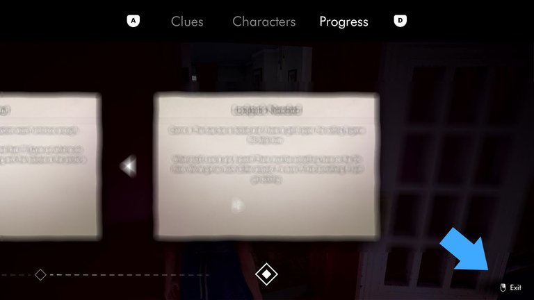
As an example, I recently played "This Bed We Made" where they used the right-click as a "go back" button.

See, all the empty space on a screen which is obviously not a button can easily be used as back button, with a mouse right-click, without the need to us to look around for the back button and move the mouse to wherever it is.

Fluidity
I spoke about the time it takes to go to the back button. And how it's an inconvenience. What's more appealing about using the right-click as a back button is fluidity.
We have two main input devices that we use to interact with your game; keyboard and mouse. On the keyboard, our left hand (for all us righties out there) is usually statically hovering the WASD keys, or resting above them, waiting to mechanically fling into action and interacting with the part of your game that is not screens, while we navigate your menus with our left hand, using the mouse.
Using the keyboard to "go back", and, if we want to keep our hand in place, resting over the WASD keys, we only have a few options. The TAB key and the SPACE key. TAB is a key that shouldn't be associated with "going back" - it's got potential for much more than that action. I've seen it be used as a way to show a screen with info, while keeping TAB pressed, hiding the screen when unpressed. It's also a good shortcut to a specific screen (like the player's inventory, or some other screen that the player commonly navigates to).
So TAB is really not a good choice.
And then there's SPACE, which should be reserved for in-game actions (jump, use, etc). I say should, but any dev can use whatever keys they want. But the point of this post is to "uncomplicate" things, not the other way around!
Moving our "resting-on-WASD-hand" away from its resting position to hit another random key on the keyboard to go back through screens is not the way to go, if you want your game to feel fluid. Even the Escape key, which is usually associated with "exit" or "go back" should not, in my opinion be used to "go back one screen" (i'll talk about the Escape key in the next paragraph). No, the most fluid option here is to not move our hands away from their positions, and, to "go back", with that in mind, the only logical option we're left with is the right-click mouse button. While inside options screens, we're generally using the left-click. So, the right-click is the quickest, most fluid (no moving of your hands) way. A simple info text telling the player "right-click goes back" is more than enough.

The Escape Key
The Escape key, while a good candidate to "go back", does 3 undesirable things; 1) it's makes you move your "keyboard hand" from the WASD resting place, 2) more importantly, it removes the option of using the Escape key as a global "go back"; in other words, closing all screens and going back to where the player first began, and 3), most annoyingly, is when the Escape key is used to go back one screen at a time and used to bring up the game's start menu! Some games do this bullshit, forcing the player to spam-press the Escape key multiple times, making us accidentally, pass by the game altogether, and enter the game's start menu. Now you have to take you mouse to the "go back to the game" button!
No. The Escape key is not a good option.
Incidentally, this game i'm giving a try uses the Escape button well; no matter how many levels deep you are in the game's start menu, one single Escape keystroke brings you to the start menu.
9/10 gamers approve of this method!

Conclusion
So yeah, between the archaic back button (which takes time to use and forces us to move the cursor around) and pressing the right-click (anywhere on the screen that isn't a button), well, if you play a game where they the right-click is used, i'm betting you'll come back to me and comment "yeah, it's actually the quickest, most fluid way of interacting with the game".
So, if you're making a game, give the right-click it a try!
In conjunction with the good use of the Escape key as a global "go back" key, you'll run into content players telling you how easy it is to navigate your game's menus.

Thanks for reading!