I used to be an avid Kickstarter fan. I'd sit on there for ages, perusing up-and-coming developers and the games that they longed to make a reality. I may have supported the development of one too many failures, however, and as a result I kind of became disillusioned with the platform.
After ignoring the platform for several years, Splinterlands, back when it was Steem Monsters, held a Kickstarter and of course I jumped on the bandwagon.
That didn't draw me back into Kickstarter like I was before, but I still kept my eye on it every now and then, just in case.
Since then, I've backed a whole two things! One of those is World of Anterra which finished its Kickstarter drive just a week or so ago and seems like a pretty good pixel Elder Scrolls-like. The other is Coral Island, a reimagining of the farm sim.
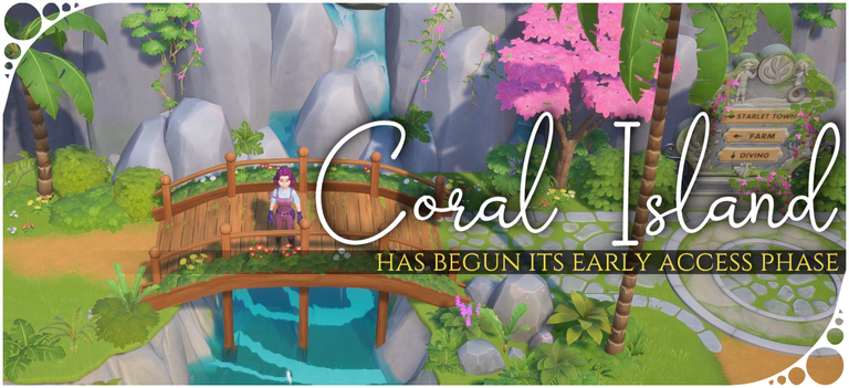
Today, Coral Island was released into Early Access. I'm not a fan of early access. I feel as though developers should just make their shit, complete it, and release it. So many games just languish in the depths of early access forever with no intent of ever becoming a fully fledged released game.
Anyway. It's in early access at the moment, I got my Steam key earlier today, and it's time to take a looksie. When it comes to games that choose to do this, I usually open them up and do a basic playtest to see if I like it and get a feel for it, then wait until the day the game actually releases.
(On that note, Kynseed will be leaving early access soon!)
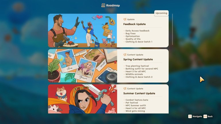
First things first, they actually have their planned development roadmap in the game. I like that! They want people to see what's planned, in the order that it's planned, and what exactly is going into the game.
I also like that they're planning their multiplayer update for after 1.0 release. A wise decision as adding multiplayer is a lengthy process and it can wait.
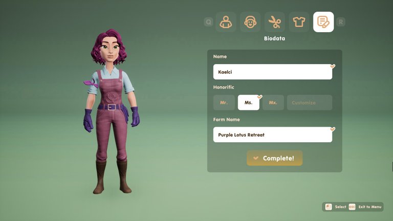
The character creator is simple but nice enough. I would like a few more options, but for what it is it's well done. I particularly like the colour customisation. You can be a bright blue person if you want; the colour option is there!
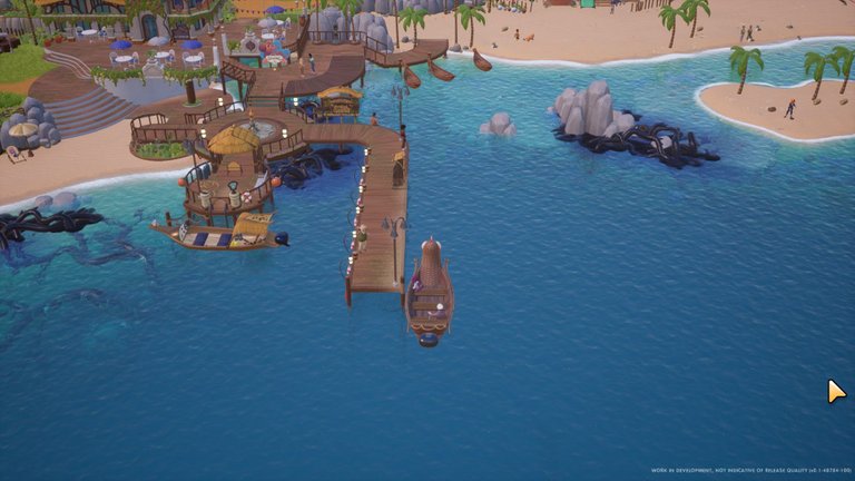
The game took a long while to load... I alt-tabbed and almost starting looking for other people's "infinite loadscreen" anecdotes in the discussions, when sounds flew out of my speakers and I tabbed back into the game to see my person on a boat sailing into dock.
The start of this is pretty much like every other farm sim ever. We meet the mayor and he takes you to your new house.
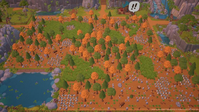
You meet the carpenters who have patched up your new home to a barely liveable state and tell you where you can find them so you can purchase repairs and upgrades from them later. And see the scope of your new property.
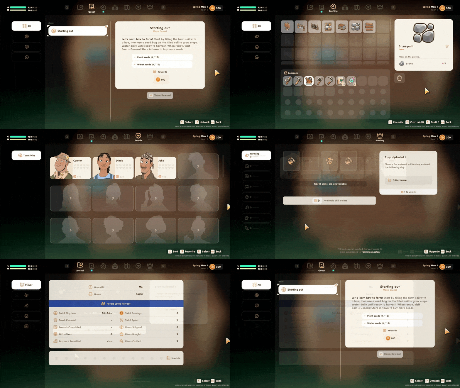
The menu UI looks nice and easy to work through. The font, although comic sans, isn't too offensive and suits the game.
It looks like you have a full perk tree based on what skills you choose to do. Crafting looks easy enough and the menu tells you what you need. I like it.
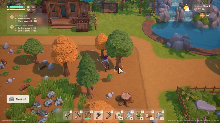
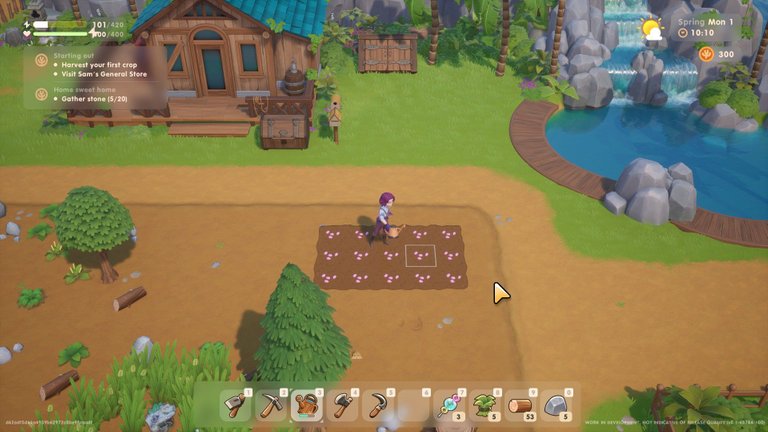
The one complaint I have about farming and resource removal so far is that it's a little bit hard to aim with the mouse. I've wasted stamina hitting the ground -next- to a rock a couple of times because it didn't go where I told it to.
Other than that, everything works really well. I particularly like that I don't have to be riiiight on top of a plot to water it or plant a seed. I can just stand on the edge and plant everything and water everything without moving. It's great. I wish Stardew Valley did that. XD
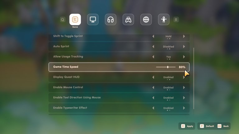
While looking through the settings to see if I could hide the HUD or zoom in closer to my character, I found this nifty feature. I really liked this in My Time At Portia, being able to lower the game time speed.
I like having longer days. This lets me do that!
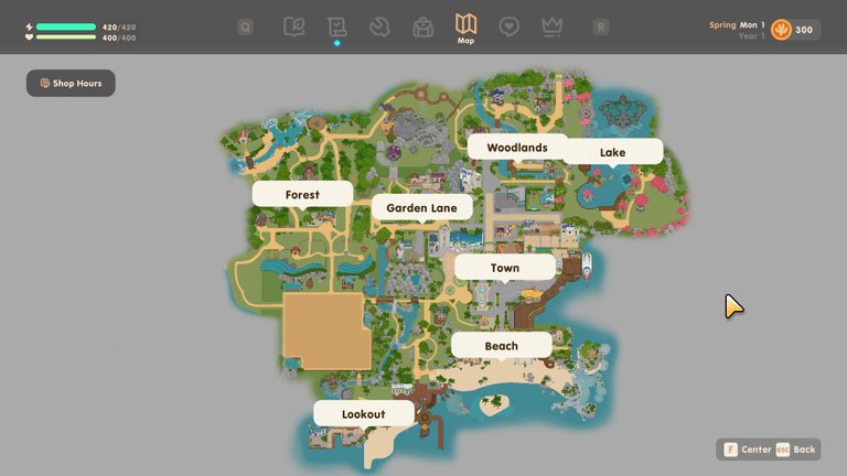
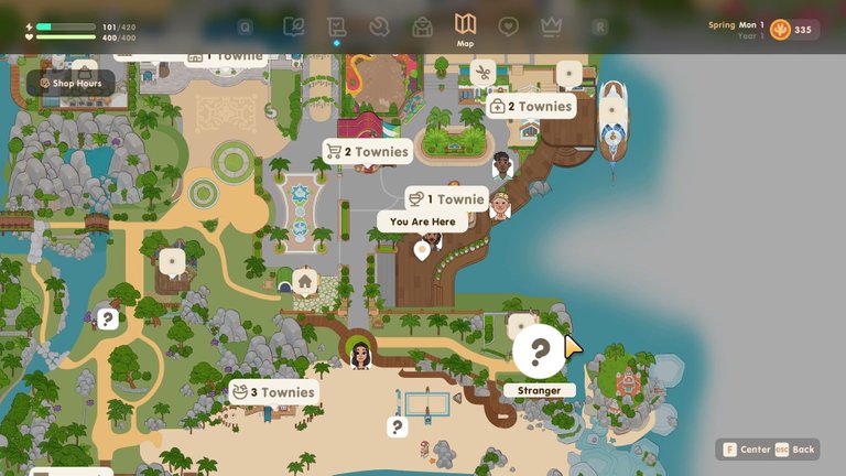
The map is fantastic!
It's very sizeable, annnnnnd, you can see where people are at, even ones you haven't met yet. That's so good. I had to get a mod to be able to see that in Stardew Valley so I'm glad that in this game it's a design choice.
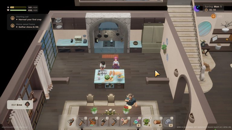
Also, you actually have a competitor. High up above the town is a fancy mansion, the other farmers in town. When you introduce yourself they smirk at you, "Oh, we were worried when we heard we were getting competition. But by the looks of you... oh, well, nevermind."
A competitor! I'm going to kick their arse! Muahaha!
I mean, in Coral Island, it differs from others of the farming genre due to the diving, pollution removal, making the island an enticing place for tourism once more... but still. Competition! Muahaha!
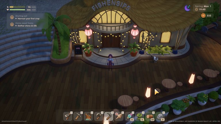
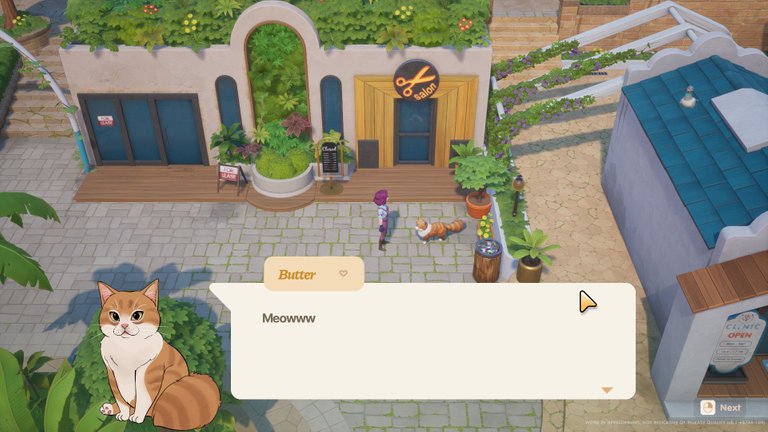
There are also sooooo many NPCs to meet and greet. Apparently there are 22 eligible bachelor/bachelorettes and there are 70+ overall according to the wiki. So many people. It's a living, thriving world.
So far I've only met about 12 of them, and so far they all seem different with their own personalities. That's a good sign!
Overall, my first impressions of this Kickstarter-funded game are quite good. I'm interested to see how it continues to develop and what the finished product will look like.
The developers have an achievable roadmap, they're active in the community, and they seem to really care about their game. They want it to be good. The game itself feels quite polished for a just-released early-access game, the graphics are nice, the controls are smooth, and it looks like it's definitely going in the direction the devs want it to.
At this point in time, I am optimistic about the future of this game. 😊 Looking forward to playing it properly once it's actually released!!
Until next time! 🌴⭐️
