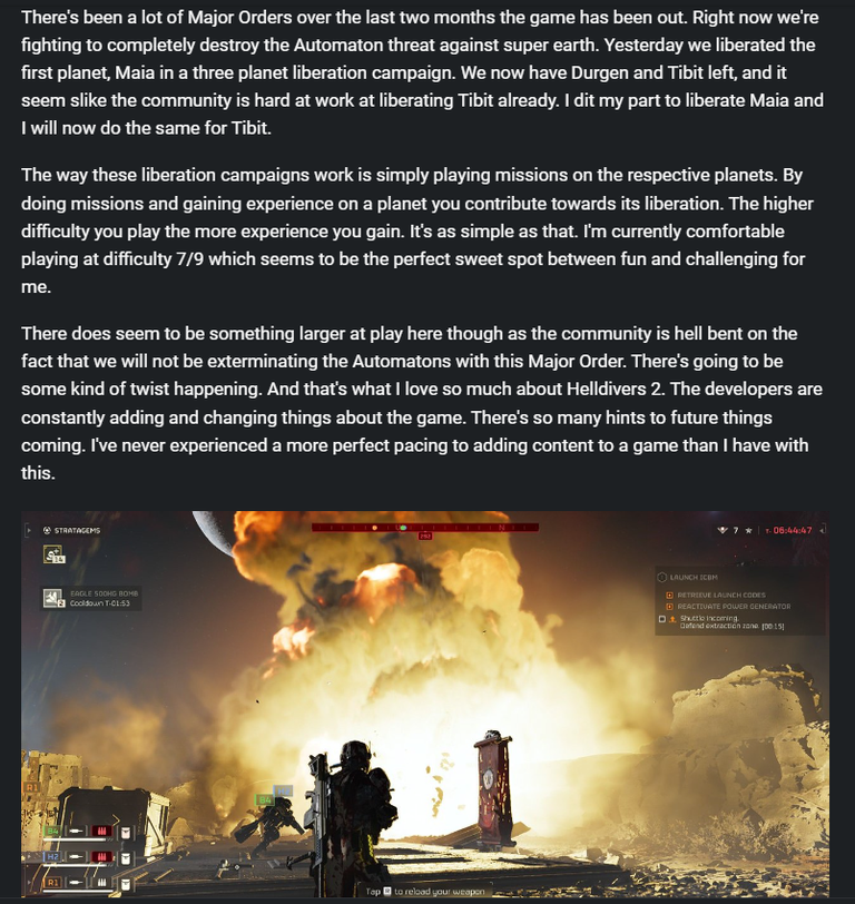
The content in the post itself is great here but your formatting is just horrible. You should look into that to make your posts easier to read. No need for long spaces between paragraphs. Making your post more compact will make it easier to read. Here's an example with an image from your post and one of mine. Your post has barely a title and a sentence on a whole screenlength. Mine has lots more content and even a full image.

