My Background story: I started my journey in mid-last year (2023) learning Augmented and Virtual reality development using Unity Game Engine. I was excited at first and challenged because it was something new to me entirely while still managing my job as a civil engineer. My main issue with learning Unity was that I didn't have a good laptop for Unity to work on my laptop. I was using a 4 GB RAM laptop. I struggled to run my setup as well as compile my C# scripts using Visual Studio Code. I felt discouraged entirely but still pushed forward watching YouTube tutorials and learning online through Udemy (Glad to have Brackeys back 🕹).
After speaking to my mentor about my decision to quit learning due to my low-specification laptop. He then suggested making game assets for me for two reasons:
Firstly, due to my artistic skills in digital art using Photoshop and Illustrator. This was before Adobe's recent Terms and conditions about accessing your creations' usage rights from their products.
Secondly, it can be easily monetized through Art commissions, selling assets on itch.io, freelancing or even working for Indie games studios, which now have huge traction due to layoffs from AAA studios.
Lastly, Aseprite; my favorite pixel art program is fairly affordable (around $20 one-off purchase) and would work very well on my low-specification laptop without hanging.
After my call with him that night, I started my learning journey as a Pixel Game Artist.
(To be continued......)
My First Pixel Art Tutorial :

To create a detailed pixel artwork, one must understand the pixel art medium and how tiny Pixel can be combined to create a net composition while maintaining readability as well as aesthetics. Due to the "delicate" nature of the medium, there are a lot of rules that govern it to avoid any deviation.
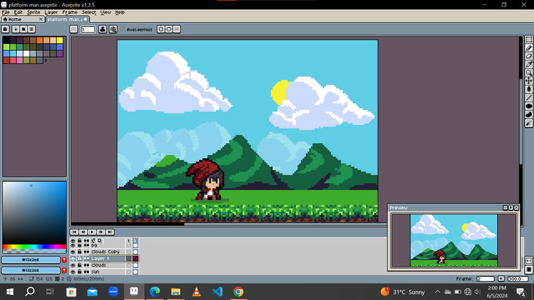
For my artwork, I started by organizing the composition, ideation, and gathering reference images; mostly on Pinterest. I want something nature-like, small in size, appealing, and relatable. This made me choose a Simple platformer tile set design fitted in a 156x149 canvas size.
Character:

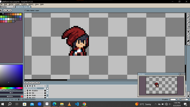
My character is a Red-riding hood-inspired chibi female in a 16x16 size. I tried different variations from the eyes before choosing the final piece. Also, I struggled while creating the hood and spent a lot of time figuring out how long the red cloak should be.
Landscape tile set:

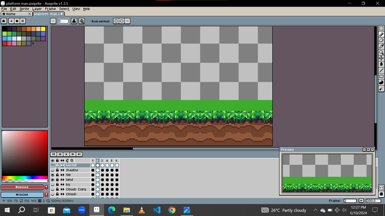
The landscape is based on a simple land tile and grass which contains a bit of noise 😞 and less readable details for a grass tile (My honest opinion). To cover for this I added the plain green surface to reduce the imperfections.


.
Clouds/Sun/Sky:

I chose a simple cloud design with only 2 colors for the clouds in the foreground while the other were duplicated with a reduced opacity of 35% to create depth and fill up the remaining part of the plain Blue Sky.
Animation:
My entire animation is made up of 6 frames looping continuously.
For the text, it was a simple up and down movement with the top most at the 3rd and 4th frames.
The character possesses an idle animation with key features at the hood, cloak, eye, and movement of the hands.
There was no sub-pixel animation on the artwork.

And that's a complete rundown of my work. Feel free to follow me on my social accounts
Artstation portfolio: https://edeodinakachukwuj6.artstation.com/
Instagram: https://www.instagram.com/odispixel?igsh=YjdoMzV0eG9kZGhp
PS: I don't and would never support AI-generated images. Hence don't in any way use my work as a training model for your AI. Art has a tradition and expression no matter how it is.
AI can never replace the skills of an Artist.
Stay tuned for part 2.....
A big shout-out to @thisnewgirl who after seeing her work made me post mine. I didn’t know there were pixel artists here. Open to new connections. Thanks