Hello! Well, this is a rushed post as I did some work in our backyard few hours ago. I saw this week's challenge is about creating a logo for the ASEAN Hive Community, ASEAN Hive Logo Redesign and I feel like I wanna create my version of the community's logo.

I have made 6 designs on my drafts but then due to time constraint, which is obviously my fault (lol), I came down to 2 designs. Just like the original logo, I based the colors from the colors used in the ASEAN emblem. Blue, red, yellow and white. Blue means peace and stability, red means courage and dynamism, white for purity, and yellow for prosperity. So here are my designs and a short explanation for the logo I designed.


Of course, I retained the Hive logo in both of my designs because we are a community on Hive and I think it has to be present on the logo to easily see where we are from. Hive!
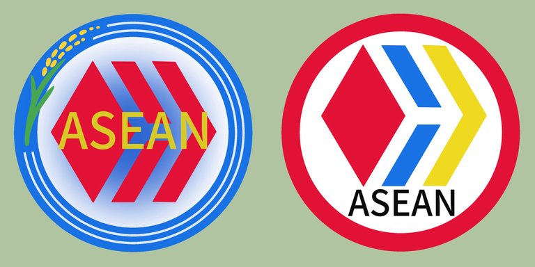
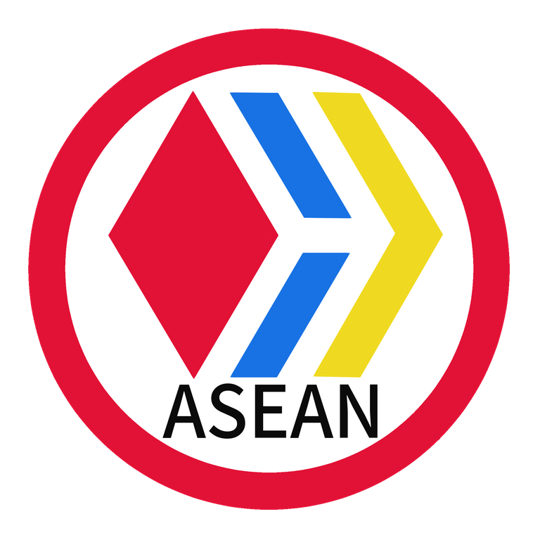
Let's look on the logo on the left. This one is really simple, I just changed the color of the Hive logo into the ASEAN colors and made the ASEAN text into black. I think it looks neat and simple.
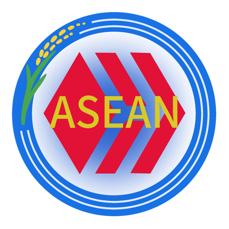
Now moving on to the logo on the right, I added a rice bran on the top left because rice is a common produce in the ASEAN nations. And Asians love rice! So let's represent rice. Hehe! Meanwhile, the circle lines represent waters because most ASEAN nations are islands and waters apart. That's all. :)
Edit: What a rushed post. This is the first time I've used my pen display in months. I felt like a newbie again but it felt good. Wish I could draw soon.. for now I'll take a snack and return to our backyard.
Have a nice day!
🐾
Straykat


