Well, here I am and there you are. This was going to be a post about making a simple room in Bryce but, as is usually the case, I never get to the end I set out for at the beginning. When I'm creating I'm thinking about what I could be creating with my creations and it all becomes quite muddled in my mind. It is true for all of my creative endeavors. I don't know if it's a gift or a curse, I just know it is a fact. Enough about that, on with the post.
I started in Bryce to do a step-by-step on how to create the inside of a room. I put two cubes together and made the smaller negative so it would hollow out the larger positive cube. In the illustration below the window has also been cut from the larger cube.
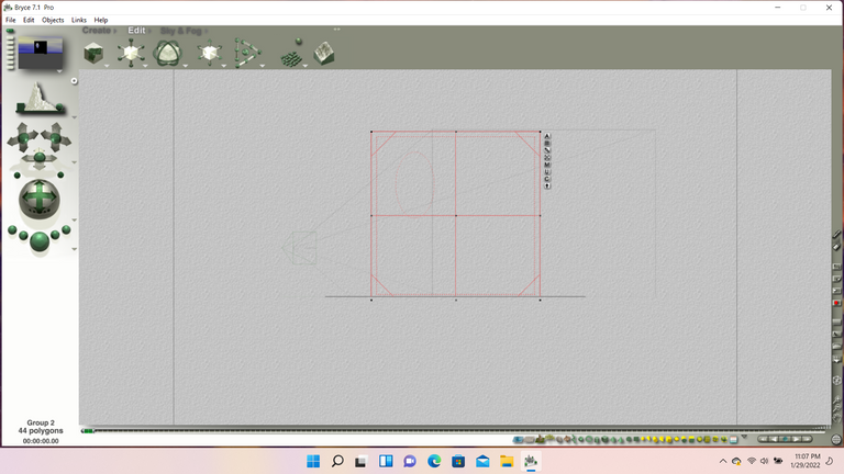
In the next illustration you can see that I created a window frame to set on the inside of the room. I also put the cubes in for the floor and the ceiling. A spotlight was set in place (the large yellow square in the center of the picture) but that was taken out. While I was doing these things, I was wondering what I could use this room for when it was done. That is the point where I started to stray from my original idea.
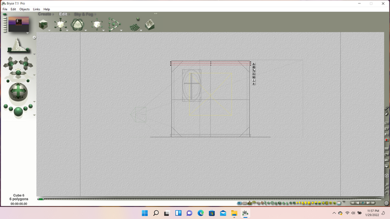
All that was left to do was put the materials on the objects and enlarge the room so that the only exterior of the room would be seen through the window. As I mentioned I took out the spotlight and opted for a dimly lit radial light toward the corner because my mind was already fully involved into what was coming after the models completion. Below you'll see the wire framed and rendered model.
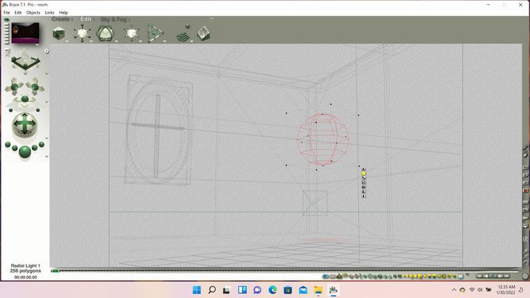
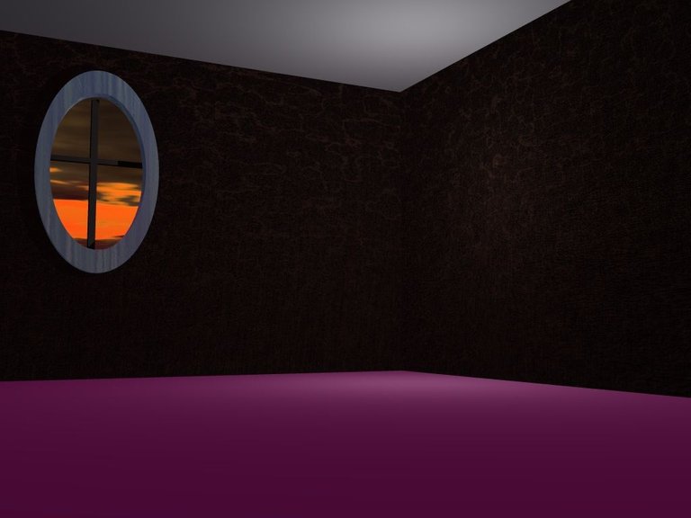
That is where this post would have ended except I probably would have added a table and chair and probably a flower in a vase on it. Also,the room would have been rendered with a more friendly lighting scheme but I was already fully involved with the idea of pimping it creepy at that point.
I took the finished image and I put it into Paint Shop where I could work some darkness into it. I found a picture of a doll to add to the picture. I manipulated it into just a shape and then added some creepy facial features. Then I used a filter to change the whole thing into a sort of cubist horror painting. The eyes on the doll barely showed through but the mouth looked so frightening open with the jagged edges (I could almost hear it wailing!) that I decided to leave well enough alone.
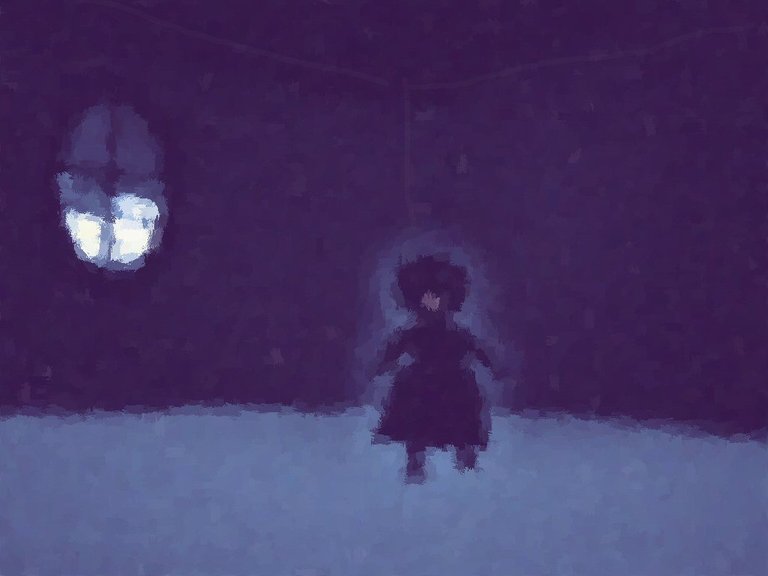
So which did you prefer? The room as a model or the 'Wailing Ghost' digital painting? Let me know in the comments, I'm truly curious. Until the next time, my friends .......
