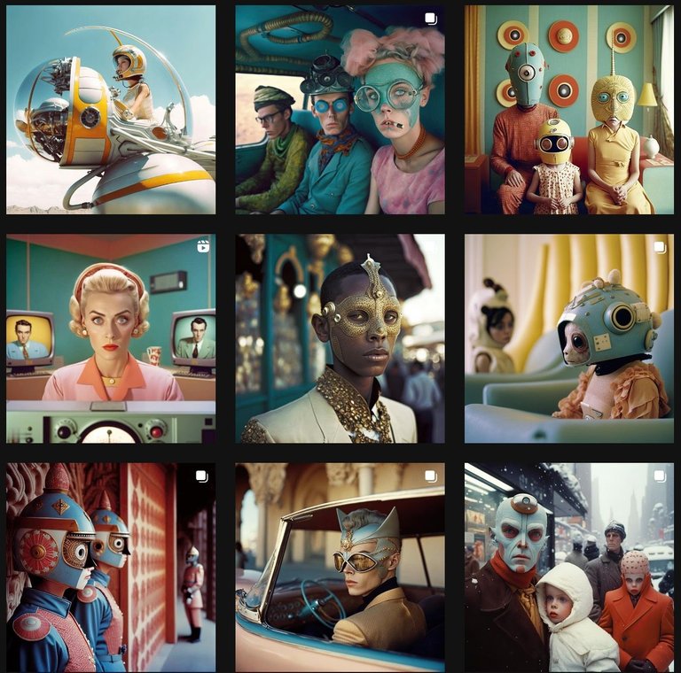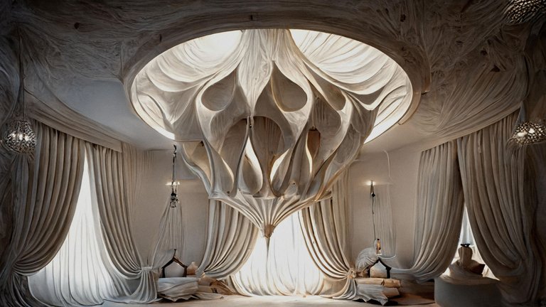
Having had a few days to learn Midjourney, an AI assisted art tool, I am able now to produce much more specific images than the ones I showed you in my first post. It took a fair bit of time yesterday to master certain aspects such as prompt weights and negative prompts, also learning how to use seeds and the remix mode which permits me to create variations with very specific changes. My prompts are no longer simple, containing specific information relating to camera type, lens, post production techniques and overall style because it would seem that more is less with this kind of art.
Here you can see the prompts I used to make an 'octopus bed', interacting with the midjourney bot on discord.
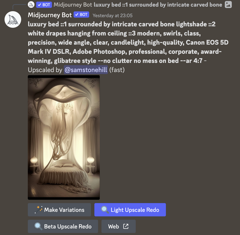
The numbers after the :: show the weights of my main themes. So, a little bit of "luxury bed" (1) with a bit more "intricate carved bone lightshade" (2) and more still of the "white drapes hanging from ceiling" (3). The values go up to 5 so obviously I played around with these numbers a fair bit before settling on this enjoyable balance. Negative values are used when you start to see things appearing which you don't want.
Further to this I am also using an AI based upscale tool which can be found here:
The Midjourney upscaling tool can only go so far before it stops looking great so I do recommend having another way to create the final high resolution images if you are looking to take this to the pro level.
The friend who got me into all of this also sent me a link to the instagram page of @designmidjourney where I saw some examples of what can be done:
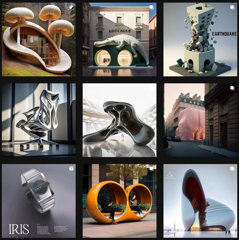
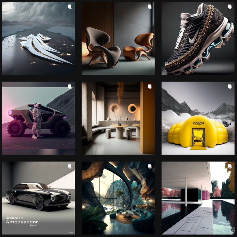
Really enjoyed looking through these images and felt inspired to produce a few variations of the themes I saw there.
Luxury Beds
After working for around three hours before bed last night I was able to create my first luxury bed range!
Coming soon to a bed shop near you ;)
The Octopus.
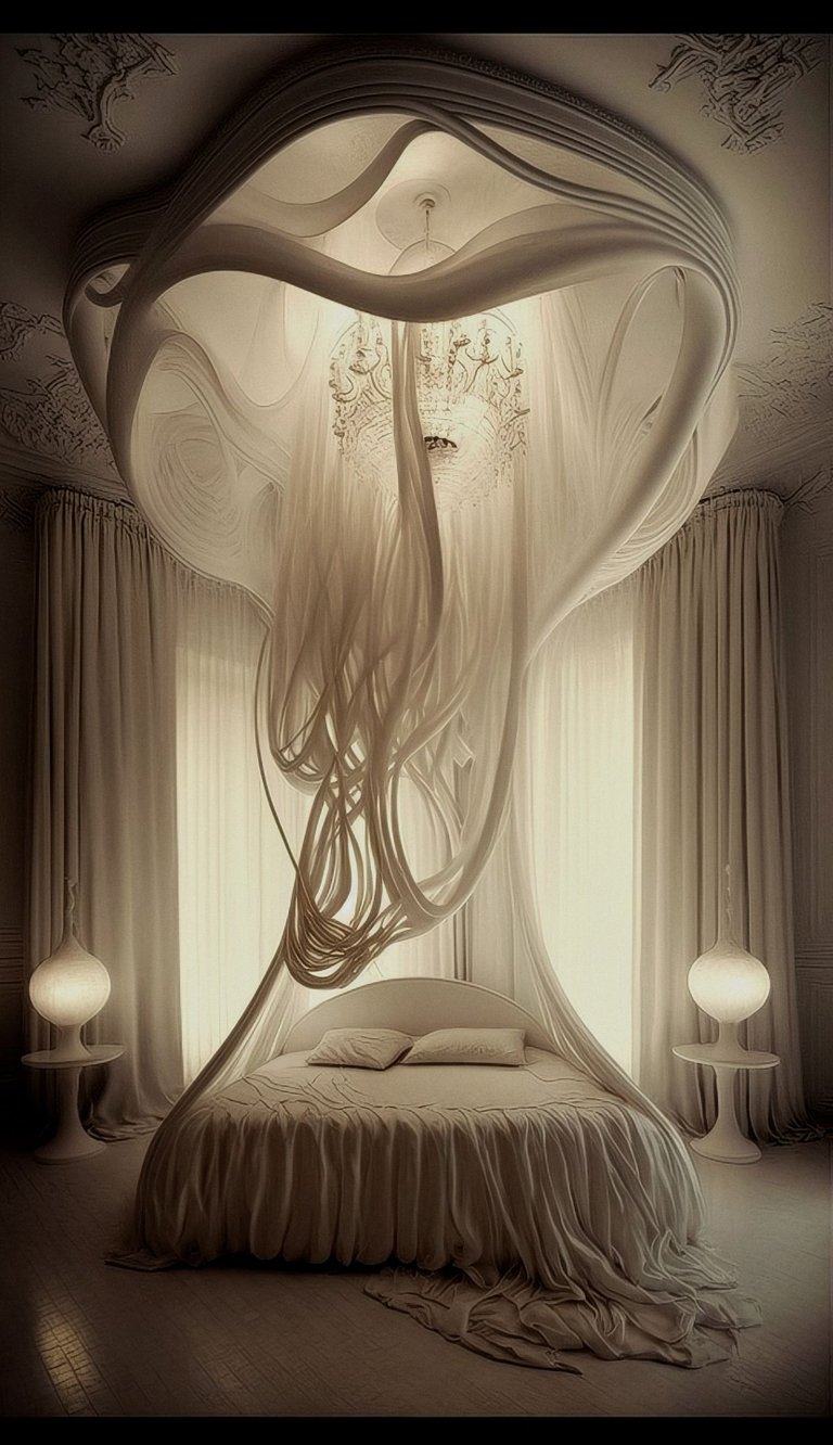
The Moroccan.
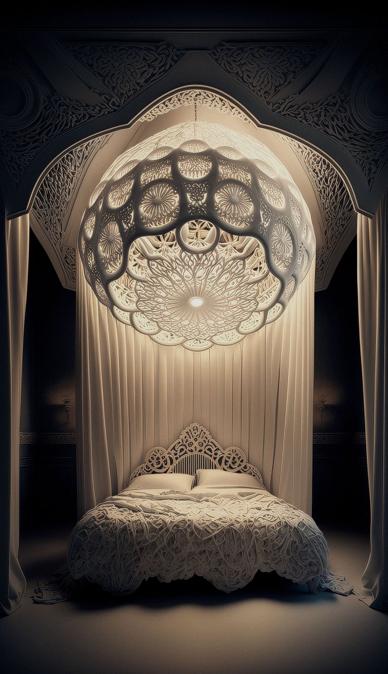
The Ocean.
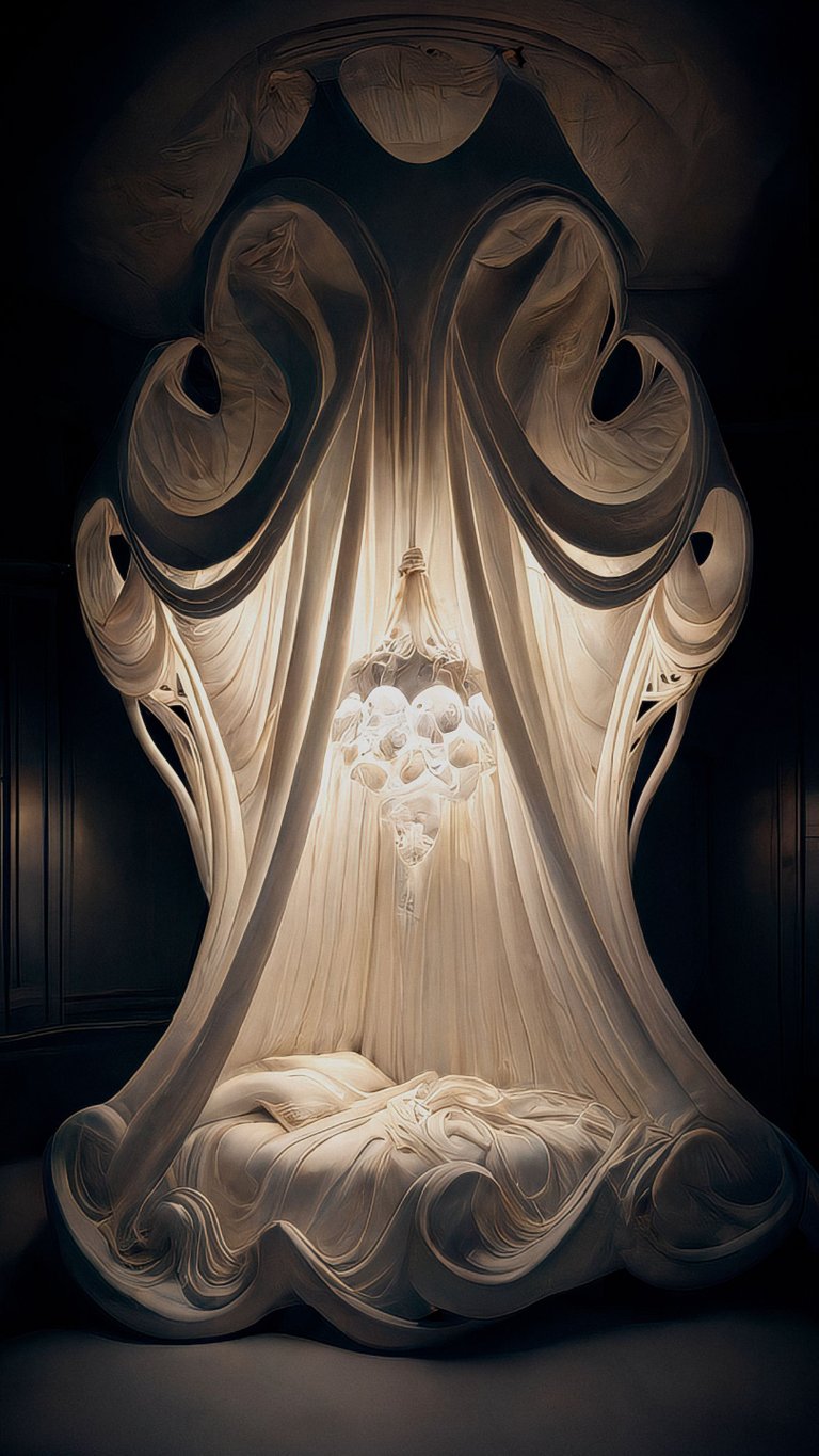
The Enchanter.
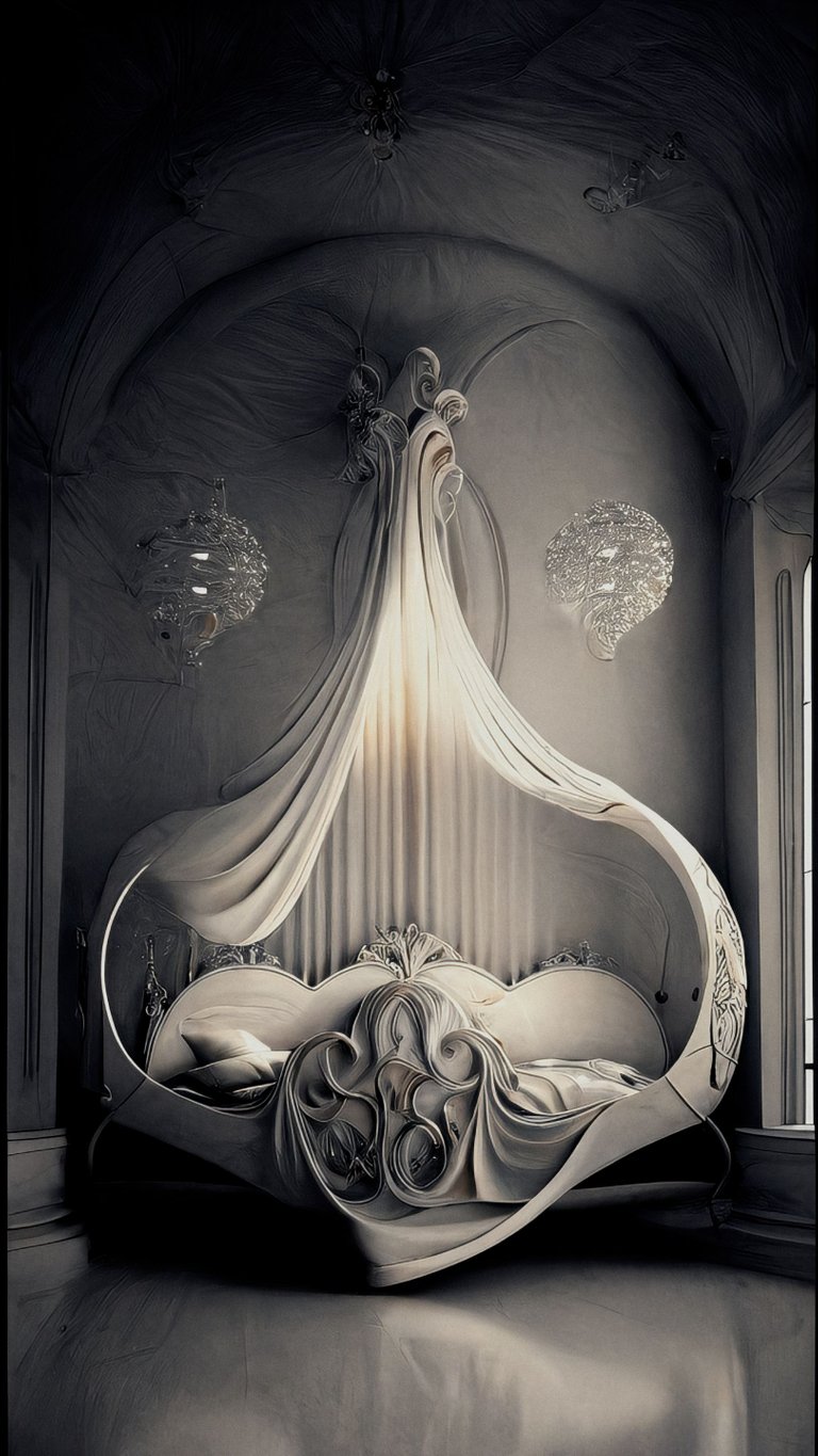
The Cradle.
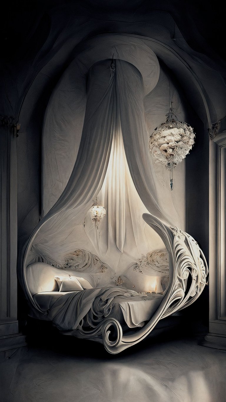
I also make luxury beds for children!
The Swan.
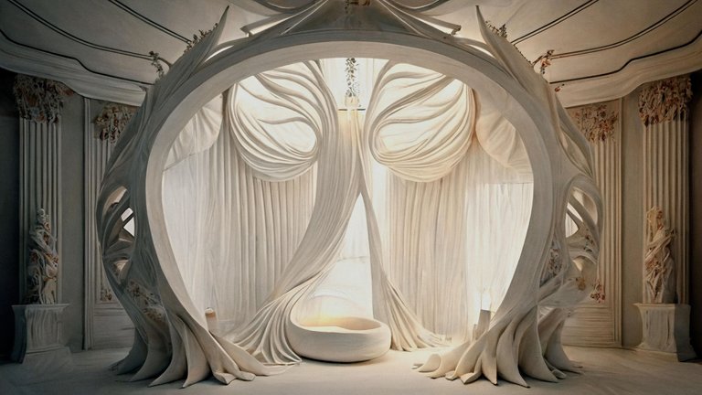
The Nautilus.
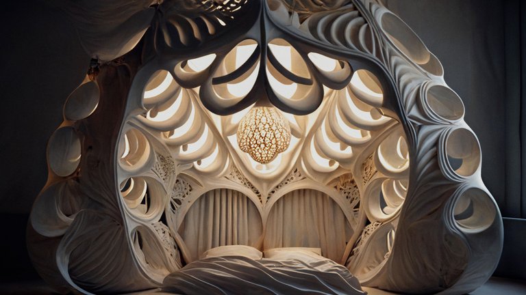
The Conch.
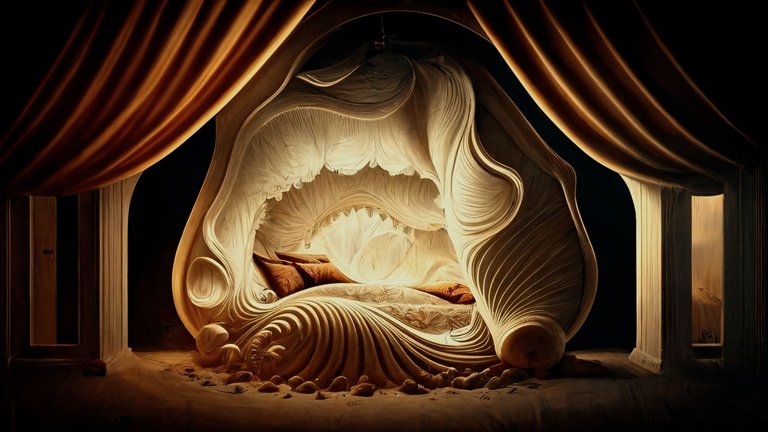
The Clam.
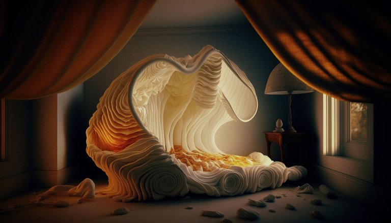
The Drifter.
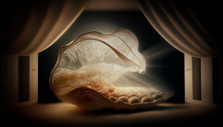
Felt like I was moving too far from reality at this point so switched themes to think about a design for a restaurant.
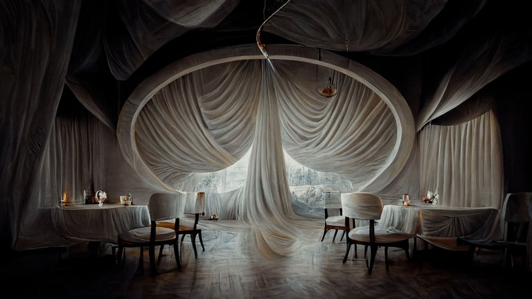
Using the original seed I was able to see how my restaurant looked at different times of day with different decor.
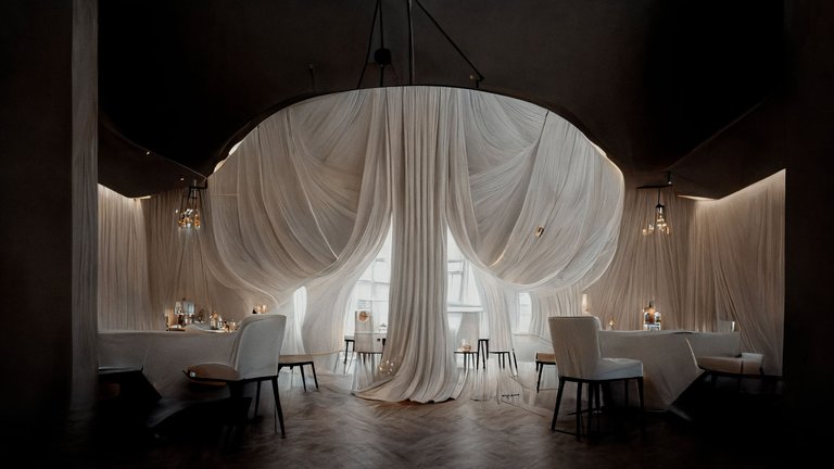
Evening mode here.
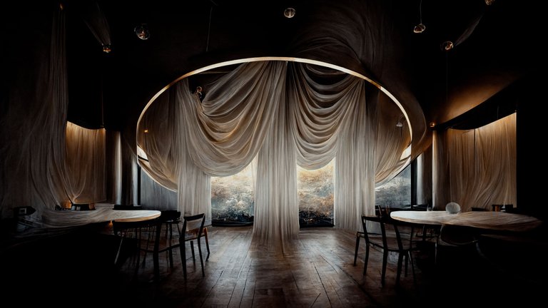
Before hitting the sack at around 1am I made this lamp shade, but again felt as if I was drifting too far from reality.
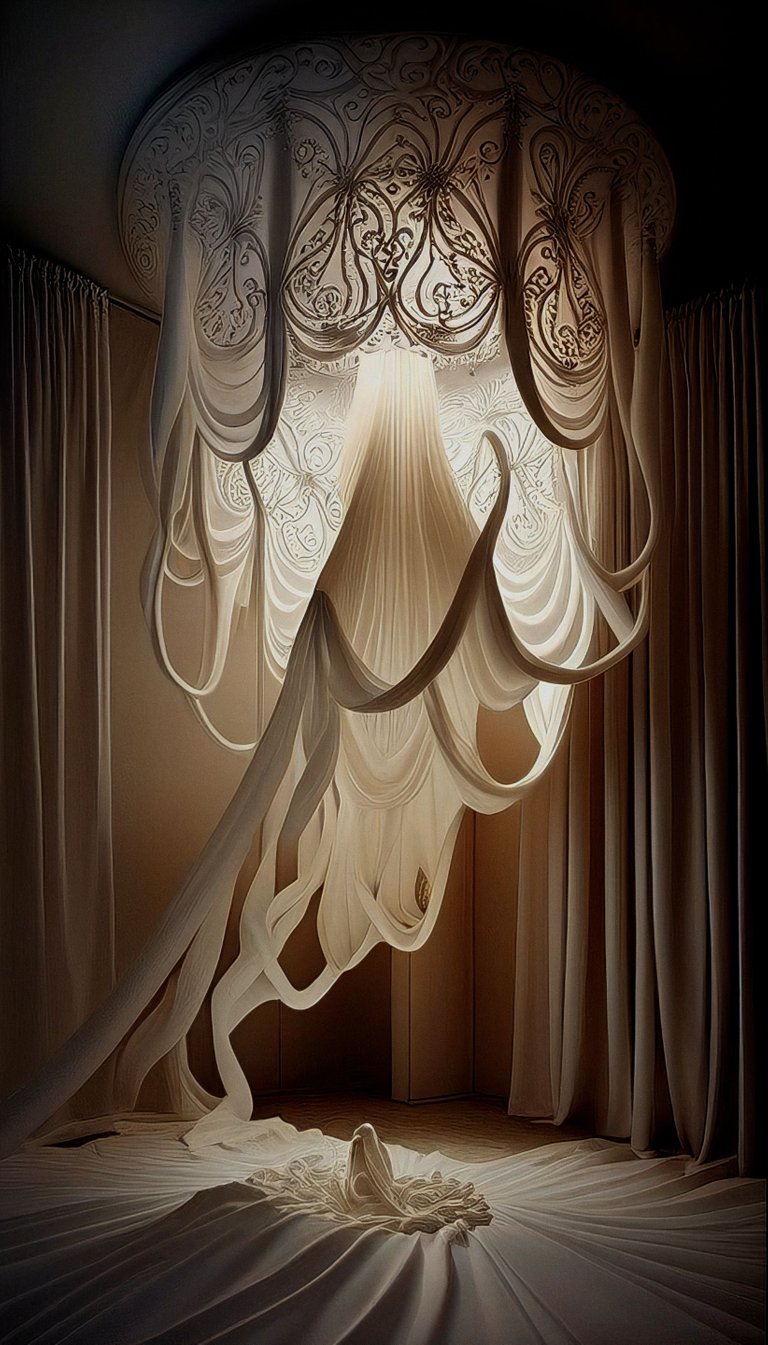
So called it a day and started to write this post.
Final thoughts
I am not planning to sell beds in the future (except perhaps the electroculture inspired devices which can be used to energise them!) so I made these images more as an exercise than anything else, to ease myself into the Midjourney workflow and hone my skills.
I told you in my first post this was easy but I was wrong about that. There is certainly a skill to it and without prior knowledge of cameras, lenses, shooting styles, post production styles, artists and filmmakers, you will not be able to produce these kind of images. Unless you just use the cheat sheets ;)
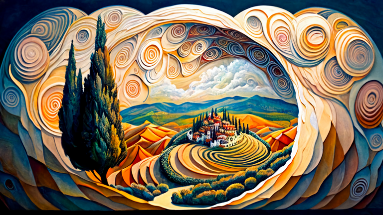
In the last week I made a new banner for my main page.

In the process I created a great many other potential options, like this one.

this one.
this one.
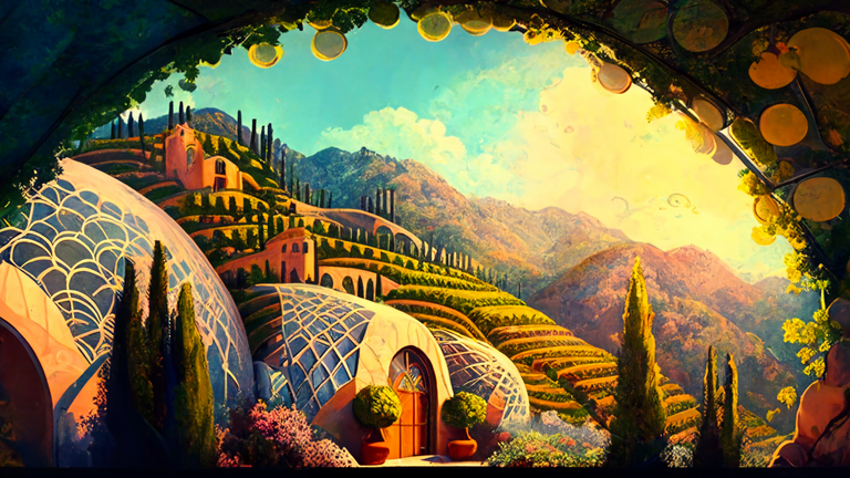
or this one!
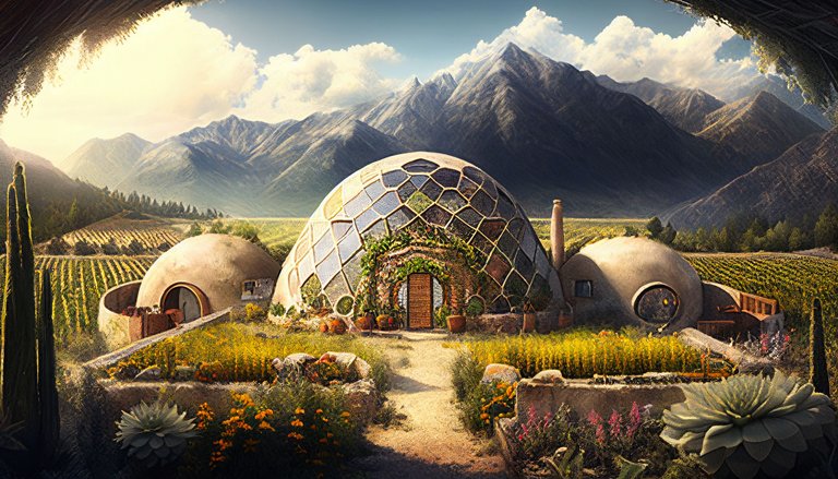
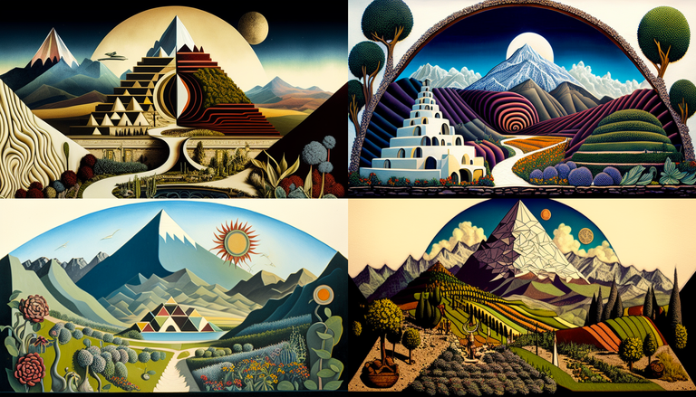
I also now have access to various reference sheets which help build my knowledge of artist styles and how they will influence my work.
These ones are in the style of Kay Nielsen.
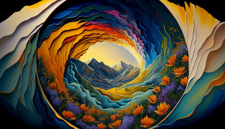
Really love this one which is not in a particular artist's style but created from a very specific set of prompts which I will show you beneath.
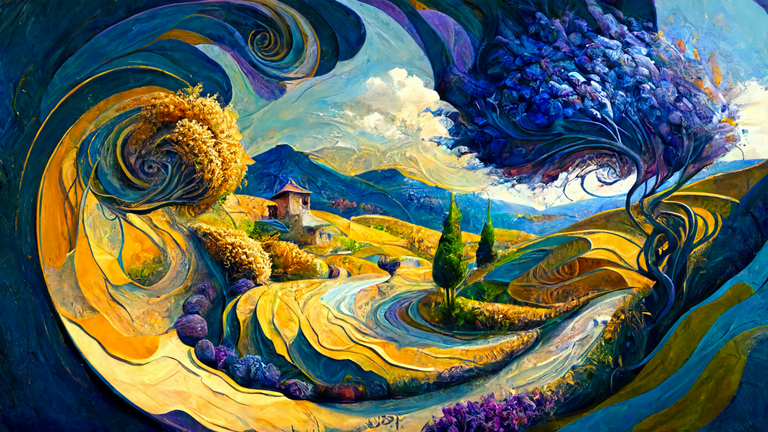
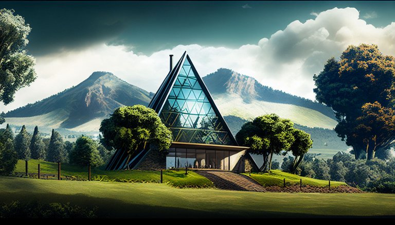
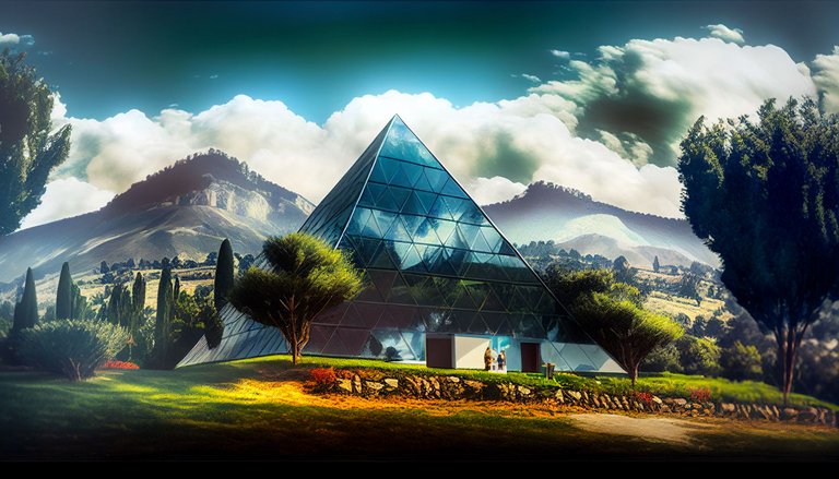
pyrenees mountains, eco village, pyramids, vines, sunshine, healthy plants, mushrooms, agriculture, fruit, vegetables, fibonacci spirals, earthships, vibrant, photorealistic, high quality,::5 Professional Impressionistic Painting, swirling brushstrokes, impasto techniques::4 expressive brushstrokes, thick, visible brushstrokes, textured, vibrant colours, traditional medium, hand-painted, high-quality canvas, limited edition, oil paint, palette knife, windsor & newton oil paints, award-winning, glibatree style, attention to detail, dynamic compositions, unique subject matter::3 gold swirling masses, navy, colours, bright contrast::2 flat, dull colours, low-quality, generic, poorly composed, uninteresting subject matter, lack of detail, smooth brushstrokes, minimal texture::-2,
I made a pyramid and stuck it in the Pyrenees, but the AI had not understood at this point that I was looking for a four sided pyramid.
So I made another with the same dimensions as the Great Pyramid.
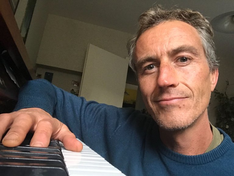
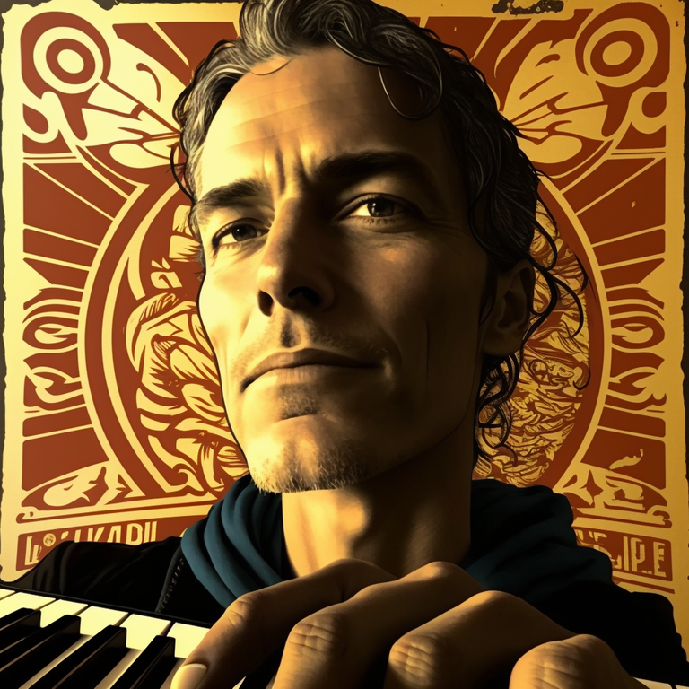
I found a way to use my own face to create the main character in a book I am planning to write.
From this:
To this (in the style of Shepard Fairey):
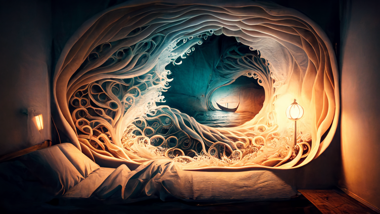
I made a wall design for Esteban's future bedroom.
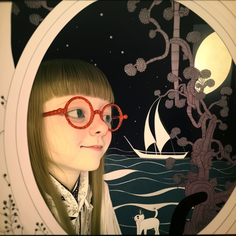
And I created this cute image of Luna in the style of Kay Nielsen.
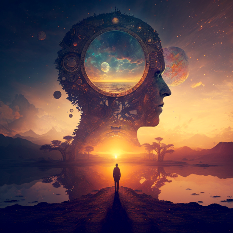
The key I think is creating a visual style which is yours and sticking to it. Like these guys.
In fear of become completely addicted to this incredible new tool I have limited my Midjourney account to 15h a month. 5 of which I have already used in 5 days!
Better slow down and focus on other things now...
It is clear that humanity is standing upon a great precipice at this time which has the power to both uplift and destroy us but the point which has become most evident to me is that our future has in fact been planted firmly into the hands of the children now because only through their forgetting of the real way one creates will we meet our demise.
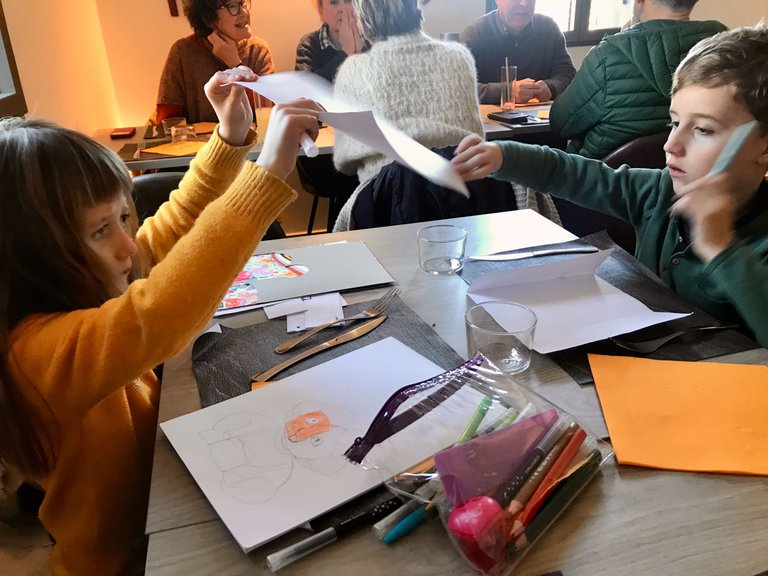
My children are very familiar with pens and paper and you can be sure that will never change! Here they are at our local restaurant on Sunday, settling down to wait for their food.
It is a dinosaur Esteban says, a present for his grandmother.
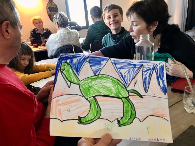
A simple but effective image, created in what will eventually be known as the old fashioned way.
Love & Light everyone 🌱
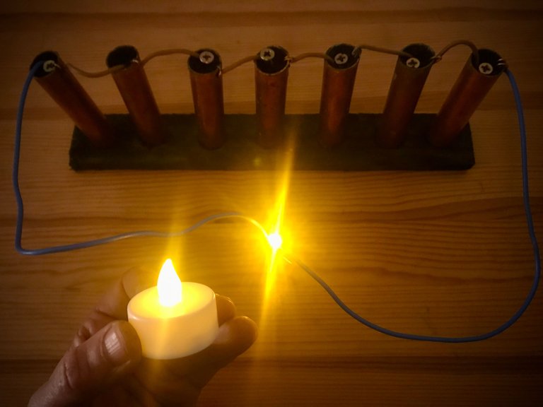
Number of days experiment has been running: 11
Number of lithium batteries consumed: 0 (but it is getting dimmer!)
This image was taken today to show comparative brightness.
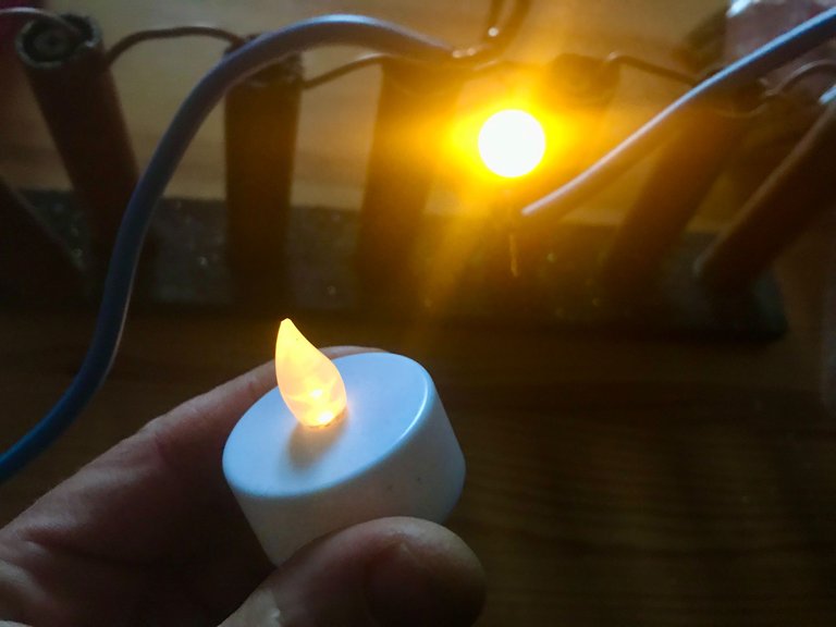
To learn more about this experiment please check this post.

