Lightroom by Adobe has been my go-to photo editing app for a long time. Even with its free version, you can achieve remarkable edits on your photos. Here's how I use its features to improve my images without needing a premium subscription.
Before we begin, let's use this photo as our example.
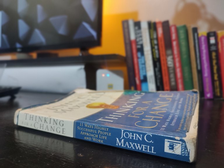
My goal to improve its appeal is to:
- Adjust the color balance.
- Reduce haziness.
- Deepen the blacks to allow the book stand out.
- Sharpen the image slightly.
- Crop out unnecessary parts.
Step 1: Adjust the Light Settings
The Edit section is the first stop. The Light controls allow you to fine-tune lighting in the photo.
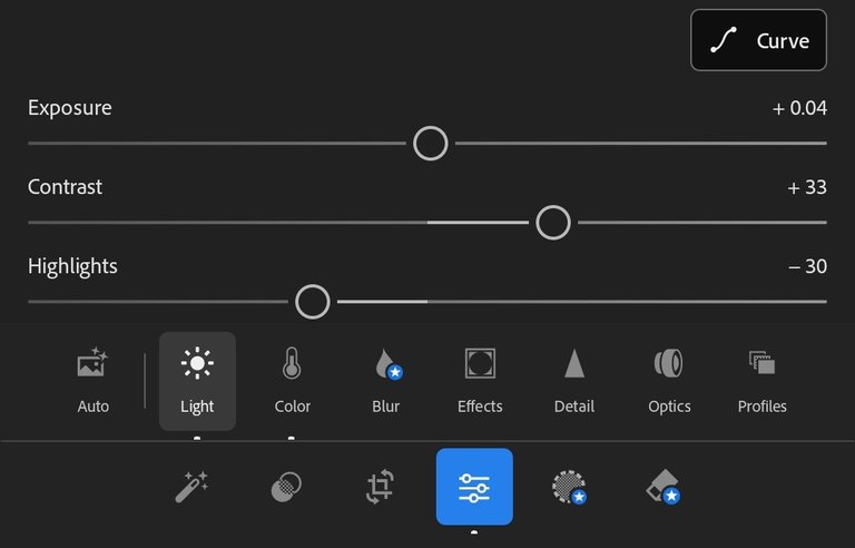
- Exposure: Adjusts overall brightness.
- Contrast: Controls the difference between light and dark.
- Highlights & Shadows: Fine-tune bright and dark areas
- Whites targets wherever you have the colour white, and Blacks does the same for black.
Step 2: Play with the Colors
The Color section is where you can adjust warmth, vibrancy, and saturation. Yet, being subtle is the key. I try not to overdo things to avoid ruining the photo.
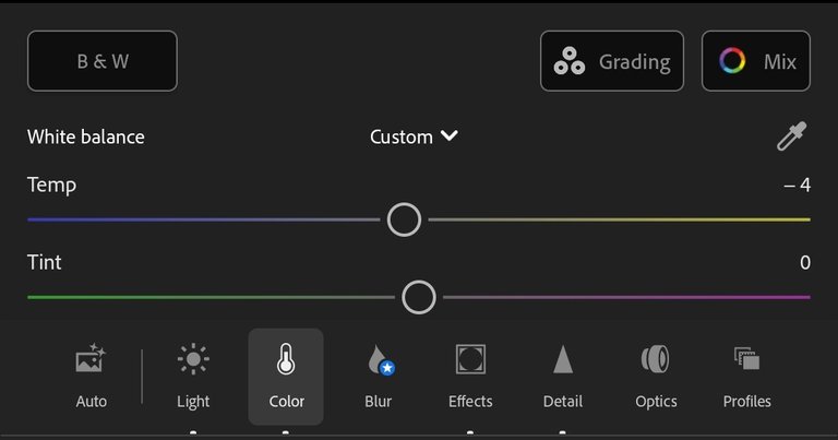
If necessary, I use the Mix feature to tweak specific colors. For instance, if that yellow light is too strong, I can tone it down using Mix.
Step 3: Refine the Effects
Under the Effects section is where you'll find tools ike Texture, Clarity, and Dehaze, which I use regularly.
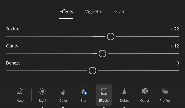
- Texture & Clarity: Affect details of the image
- Dehaze: Targets areas that have low-contrast
- Vignette: Lightens or darkens the edges of the photo
- Grain: Adds noise to the image, which can give paper-like look.
In the Detail section, you should be careful how you use sharpness, especially when you have used texture & clarity. A photo may begin to look unnatural if sharpness is overdone
Step 5: Explore Presets:
If you're short on time, Presets can be a lifesaver. The one-clicks available sometimes provide a great starting point, which you can work on to refine further. There are several free presets to try.

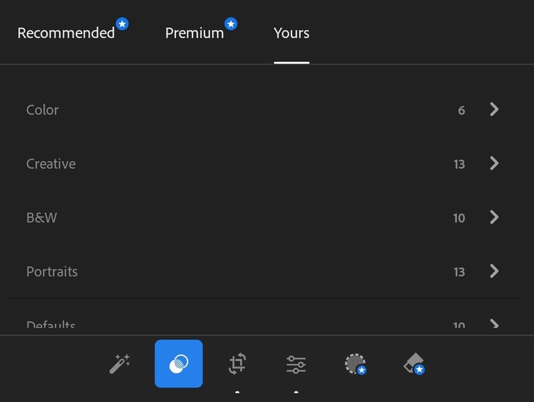
Step 6: Crop for perfection:
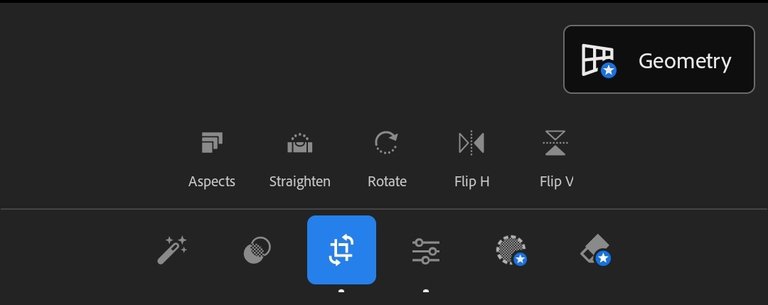
The Crop section is where you crop, rotate, straighten, or flip the image. The straighten feature is mostly useful and effective when there are buildings or people standing where it has a reference to work with. For this photo, I only cropped out the part I didn't want.

Before
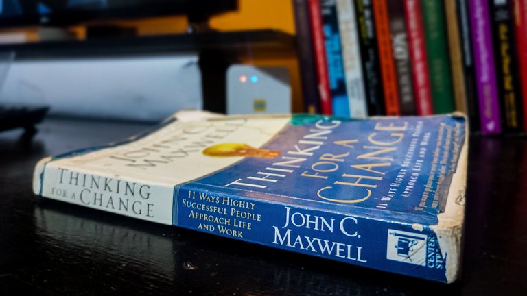
After
And we're done. The next thing to do is to export.
A little tinkering around and you will be able to turn your photo into what you desire. I have my eyes on the premium, though, so I will share what more is on soon enough. It is surprisingly not as expensive as I thought.
Image(s) belong to the author
Posted Using InLeo Alpha
