I recently just joined this Community and lo and behold, there's an amazing contest going on. I can't quench my craving for competing in web3 contests (as I like to call them), and I've been doing so ever since I joined the space in Late 2021.
The thing I love so much about these bit-sized design Contests is that, they automatically help me grow my skills in general Design while also in the run for some incentives. (There's never been a better way to Learn) 🙃
So even if I wasn't here towards the Growth of HL's 5k Community Members Milestone(🎉), I decided to create a Cover Art for this Contest.
Personally, I'd rate it 8/10 in terms of Attractiveness n Suitability for the HL's Community (What Wud u Rate it ⬇).
So now, I'm gonna reveal the Cover Art n Work you through it's Creation Process!
YAY ...

.
.
.
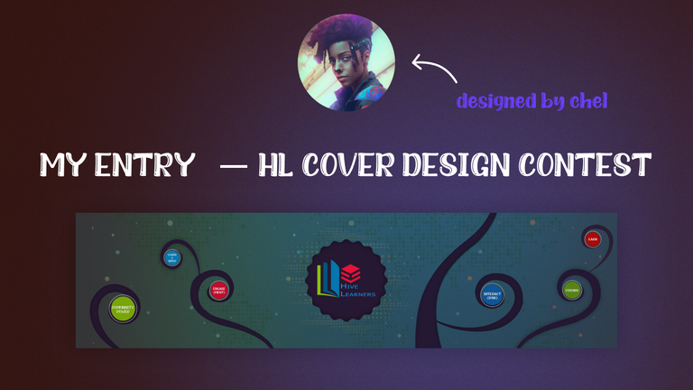
How I Created in Figma : (From Scratch)
STEP 1:
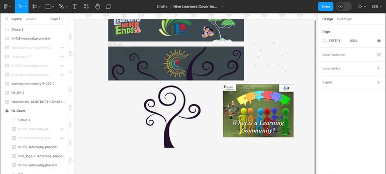
Opened a Blank new Canvas and Created a Frame in the Proper Dimensions as Stated in the Announcement Post.
Truth be told, I made it a little bigger(vertically) than what was asked for, but this is something that can be tweaked 😅.
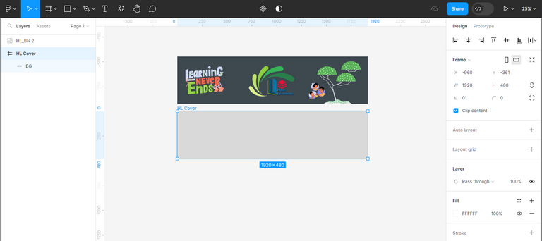
As you can see above, I grabbed a Popular HL Cover Image to note the Style, and in fact, I used it's Height dimensions.
STEP 2:
I Grabbed some Reference Images from online sources that would guide my Asset Creation. I'd settled on the style n inspiration I wanted, which were:
- Community Growth
- Global Learning
- Predefined Rules but United
Basically, got references in this style 🤔
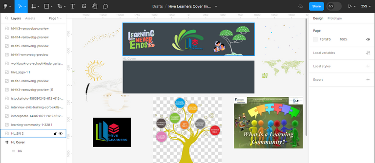
I ended up Including some design styles and not using others!. It's an on-the-flow thing decision.
STEP 3:
Here, I Started from the Background and testing out some assets for HL's Logo BG.
I also started Drawing the main shape for the Cover Art, which was a Curvy Tree with Similarly Curvy Branches. At first, I didn't know how to use this in a creative way, all I knew was that I wanted some tree in the mix 😂.
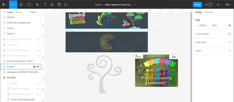
STEP 4:
I transferred the Tree into the Cover Art Frame but First Detached the Various Branches and even Duplicated some to spread them across the width. It looked fine, but at this point, that Middle HL BG was killing me. It wasn't coming together no matter how much I tweaked it - so I just threw it away(in the nxt step though).
STEP 5:
Wow, this step was Chunky. Most of my Styling had come together but let me split it in details for you:
That Middle HL BG was replaced with a rounded-star shape with a Dimmed out BG of Dotted Light
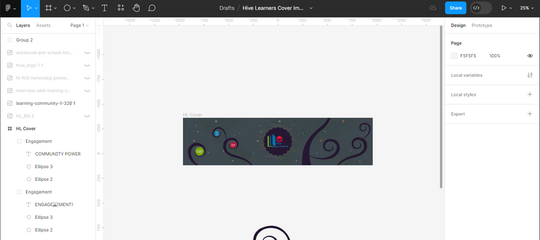
Another Group of Colourful Dots spread across the width and I used Figma In-built Editing tool to Tweak them so they have varying Color, Contrast, Tint, Saturation etc. These also had their Opacity low, so I can drive attention to the main parts (
Can you guess what it is?xD)So now, with the tree and branches in-place, I started designing a simple circle(with outer stroke), where I could pass some Hive Learner Features in, with Short Words. for these, I'm basically using the Color-code of HL Logo (Red, Green, Blue).
Another note, is that, the circles come in varying sizes according to thesize of the branchthey're sitting on.It looks good, and with some Final touches, I could have a suitable cover art, but something was still off. my
super artist instinctwas telling me this 😅.
Also note that by final touches I mean; Adding Inner Shadow n Drop Shadow to various elements on the frame as I see fit.
STEP 6:
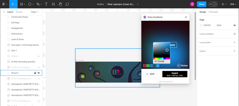
And Voila, I added Noise to the mix. What do I mean? - There's something called Noisy Gradients in Figma (it comes as a plugin), and this wasn't part of my initial concept, but it made the cover art so attractive and I felt satisfied at last.
So again, I designed this noisy gradient in the same HL Logo Color Code, which the circles have also be designed in, this is just for uniformity (to make it sync), and of course - the opacity was tweaked to prevent blindness from viewers of the cover art xD.
NB: What can we learn from this STEP 6? - Whenever you're undecided about something,
MAKE SOME NOISE😂

HL Cover GIF: Created in Active Presenter

Quick Steps to Create:
Importall Individual Assetsfrom Figmaas PNGs.
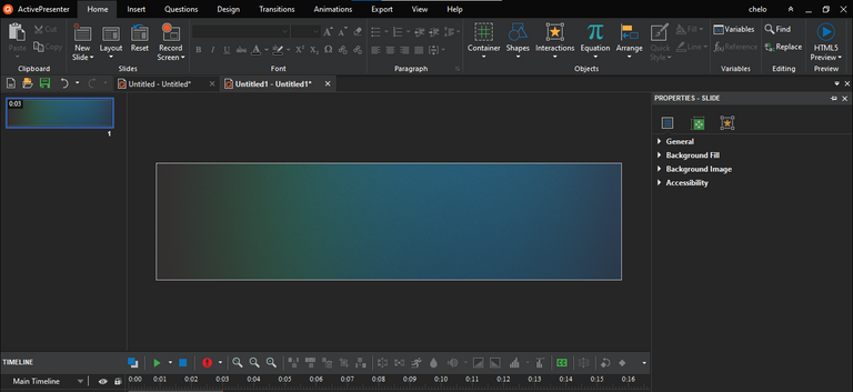
Animate the Transform (Y)of each branch aftergroupingthem with their corresponding circles (so they can move together)Animate at different
framesso each branch appears after the last branch
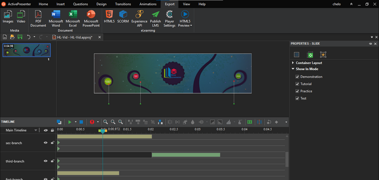
Exportto Videos (MP4) FormatI Used this
online toolEZGIF to convert to GIF
So Basically, the Key Highlights of this Cover Art are:
Did you notice the low-opacity BG of the Map of the World?. That was in-place to depict Hive Learners Inclusiveness to members from any country. It's amazing!!
I decided to
leave out any 5k Member Reference, as I hope the Cover Art can be Used for Larger Member Milestones (if it is selected as a winner).The Overall Concept of this Cover Art is built from how I've come to see HL - a comm where anyone can learn anything from the experience of their peers. It has been depicted in the form of a growing tree,
with curvy not spiky branches😄.
Thanks for Reading
Hope u enjoyed reading and have learned more than one thing from it xD.
Gamer & Builder,
Chel_