#Sunday-creativity has become my most favorite initiative by this community. I'm an admirer of paintings and sketching and keen to learn these skills myself as well. I am excited to show my practice work here every week. This motivates me to keep practicing and improving.
This is going to be my second week of participation. In case, you missed my first post, here's the link to that.
For this week, I wanted to go for a dreamy theme but my 5-year- old son wanted me to paint something of his choice. He chose a mountain-scape for me. Landscapes or seascapes are not my strong points but how I am going to learn if I won't practice. (:
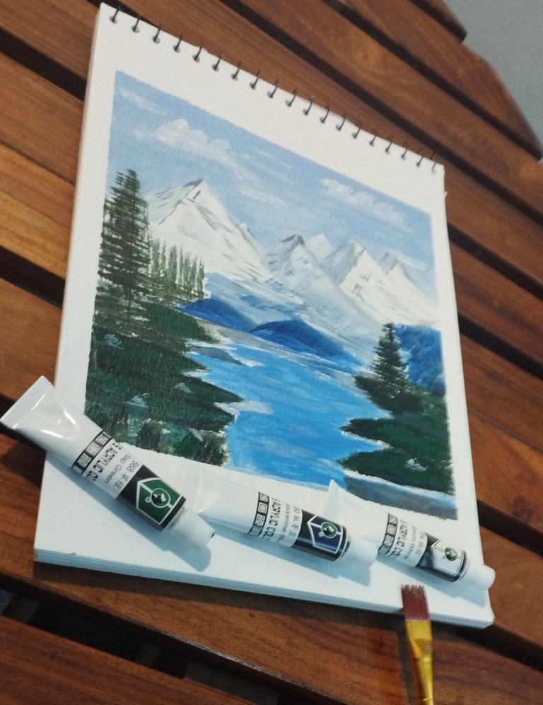
The painting turned out okay; I wasn't sure in the beginning though. Let's see how I made it.
Materials Used
- Acrylic Paints
- Sketchbook
- Medium-sized Flat Paint Brush
- Water
- Paper tape
- Palette
- HB pencil


Process
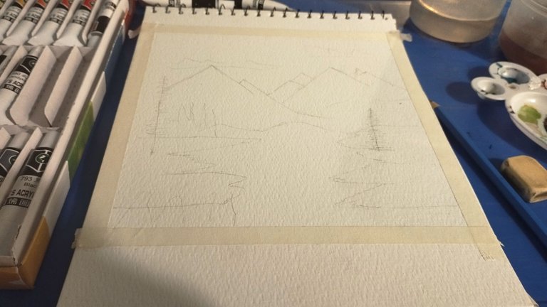
With an HB-pencil I made a rough sketch of the scenery. Although, this painting didn't need much detailing but as a beginner, I am more comfortable with territories defined. XD
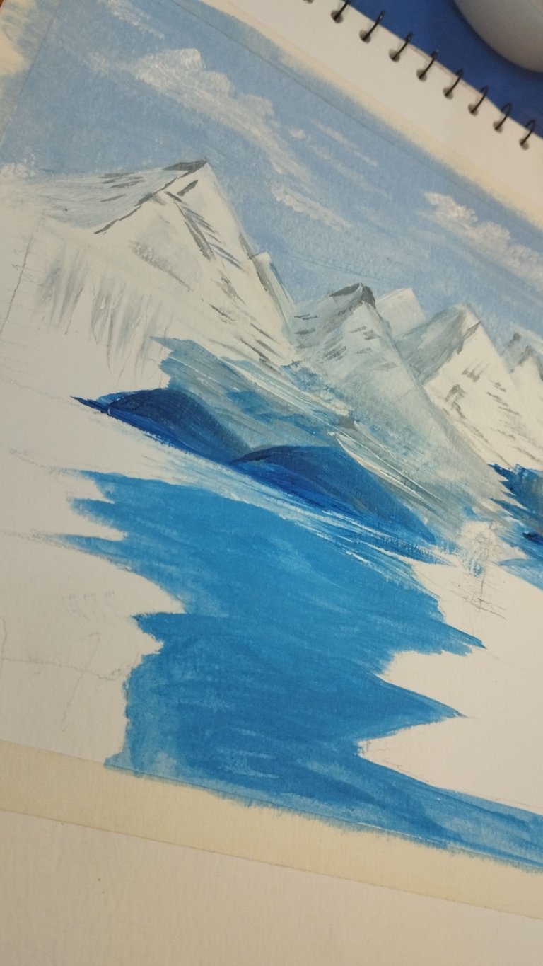
I mixed up Cobalt Blue and Titanium White to prepare a Sky Blue color.
For lake water, I mixed Phthalocyanine Blue and Titanium White.
There are no exact measurements, I just added dashes of blues in the whites and checked until I achieved the desired hues.

|
|
|---|
I must mention that I didn't prepare both blues at the same time. Acrylic paints dry up quickly when exposed to air. So only after painting the sky with a flat brush, I prepared the next batch of blue for water.
For clouds, I again used Titanium White and stroked dashes of it with a dry flat brush to give more texture.
Titanium White again for the snow-covered mountains with dashes of Cold Gray to add some texture and shading.
Now come the Greens....
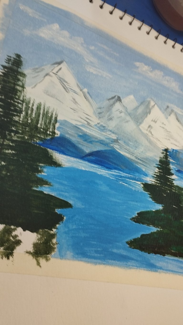
I prepared the desired shade by mixing Sap Green with a dash of Black and painted all the grass and trees.
|

|
|---|
Applied white and black strokes to highlight the lit areas and shadow the dim areas.
Added finishing touch-ups in the water and Tada painting is done.
Removing the tape at the end is so satisfying. I like the neat and crisp edges for they add more definition to the entire artwork.
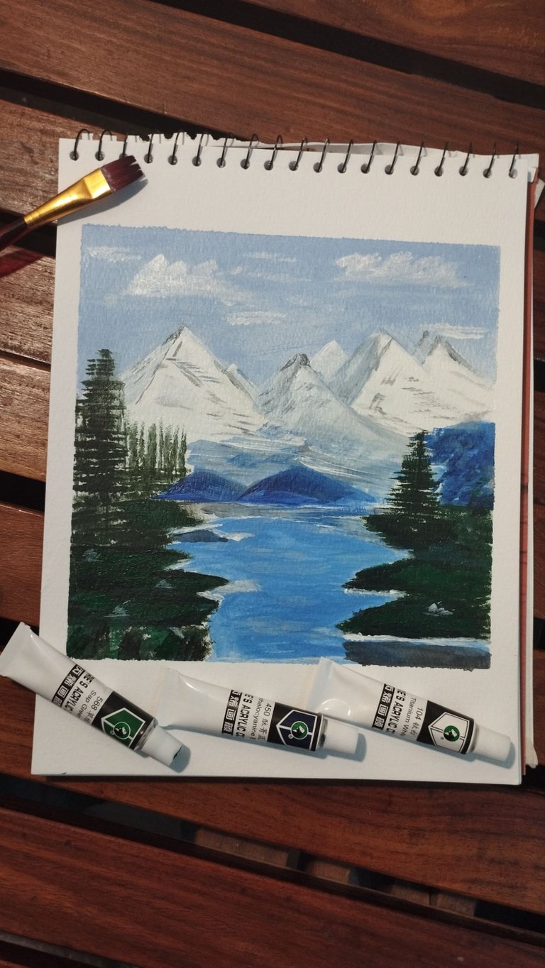

Constructive feedback is welcomed.
Read My Introduction.


