I am particularly excited about this second task because of the canva tutorial I have to share. I hope other newbies learn from me. I will try to make it as simple as possible.
Also, this post will discuss the primary DOS and DONTS on hive. Ones that you should know or be aware of as the most basic hive user.
It goes like…
As a Hivean, What are things that are expected of you? What are the things which are not expected of you to not do?
What are things that are expected of you?
Off the top of my head, the use of original thought and opinion is all the platform asks of its proof of brain nodes. Does this sound a little bit technical? My bad. Lol.
All I am saying is that it is expected of you and me, as hivers, to share only content from our own thoughts or our opinion and not to copy someone else’s thoughts or opinions from anywhere and post here as ours. This goes against the core principles of proof of brain. It is more like you are shitting on everything this platform stands for.
We all hivers creating content on this platform are nodes on the hive blockchain. We are contributors to the success of the chain. We represent the proof of brain consensus. With that all content we put on here must be original of us; our own thoughts and opinions.
What are the things which are not expected of you to not do?
You should not use other people’s thoughts and opinion like it is yours. Try to avoid this as much as possible. If you need to use it at all, then make sure to state it plainly that you are using someone else’s ‘property’ by citing them and giving them credit.
[Put their name here](Link to the original work here)
I cannot even begin to tell which one is worse, using other people’s opinion or using AI generated content. Doing any of this means you lack basic understanding of this platform or you are just lazy and stubborn. There is no room for you here I am sorry.
If you want to participate in this platform then take some time to learn about the platform and be a good participant. Otherwise you risk being blacklisted. Heck, you will be blacklisted; muted.
Markdowns
Following are some basic markdowns for you everyday content on hive.
Text Justification
This makes your content look very well structured in alignment. Notice how the right and left sides of this post is squared? It’s not right or left aligned. You achieve this by putting your whole content in between this markdown code;
<div class=text-justify> Your content </div>
Highlight
Use the greater than(>) symbol to highlight texts or a block of statements. Thus, if you want indicate that a line or block of statements are copied from somewhere you can use this markdown on it.
> This line will be highlighted
This line will be highlighted
Headings
Headings make your content look organized. You create headings with the following markdown code;
# Heading 1
## Heading 2
### Heading 3
#### Heading 4
##### Heading 5
###### Heading 6
Heading 1
Heading 2
Heading 3
Heading 4
Heading 5
Heading 6
If you ever need to use headings and you don’t know how to use them, this is how to use them.
Line Breaks
We use line break to mark the end of a section in our posts. And a line break is made by typing 3 underscores, like so…
___
Table
To construct a table, the following markdown is used;
| SN | Team 1 | Team 2 | Team 3 | |-|-|-|-| | 1 | Member | Member | Member | | 2 | Member | Member | Member | | 3 | Member | Member | Member | | 4 | Member | Member | Member | | 5 | Member | Member | Member | | 6 | Member | Member | Member | | 7 | Member | Member | Member |
| SN | Team 1 | Team 2 | Team 3 |
|---|---|---|---|
| 1 | Member | Member | Member |
| 2 | Member | Member | Member |
| 3 | Member | Member | Member |
| 4 | Member | Member | Member |
| 5 | Member | Member | Member |
| 6 | Member | Member | Member |
| 7 | Member | Member | Member |
Content Alignment
To make contents/images appear side by side of each other this is the markdown to use. I have realized the ecency app does not support this feature. To appreciate it, do view with hive.blog. Perhaps Peakd also supports the feature.
<div class=pull-left> **CONTENT** </div>
<div class=pull-right> **CONTENT** </div>
Left
All the content here are going to appear to the left of the window.
Right
All the content here are going to appear to the right of the window.
My post thumbnail, made with canva.
Designing in canva can be really really simple. Like this cover design of mine. I achieved this in just a few design steps. Canva is made up of unlimited design templates to choose from. You can also decide to start your design from scratch. With this thumbnail, I avoided the trouble of starting everything from zero.
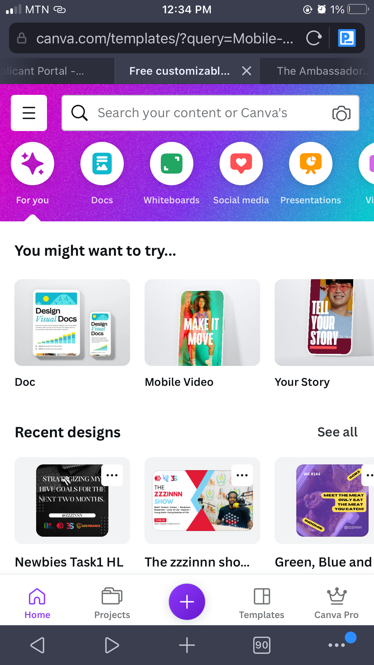
I opened my canva web app.
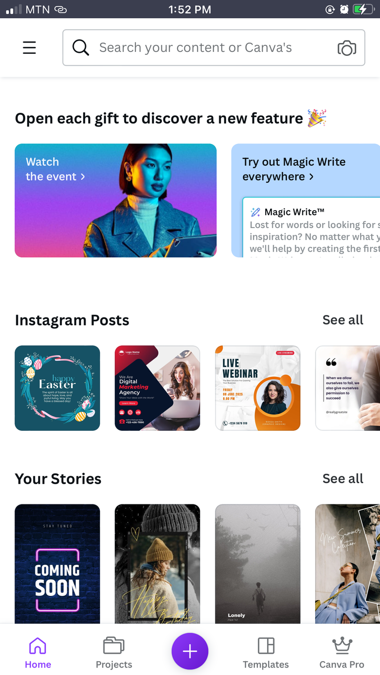
Scrolled till I found a design that caught my eye.

Opened the template. From here you can already see there is not much left to do. The design is basically ready.
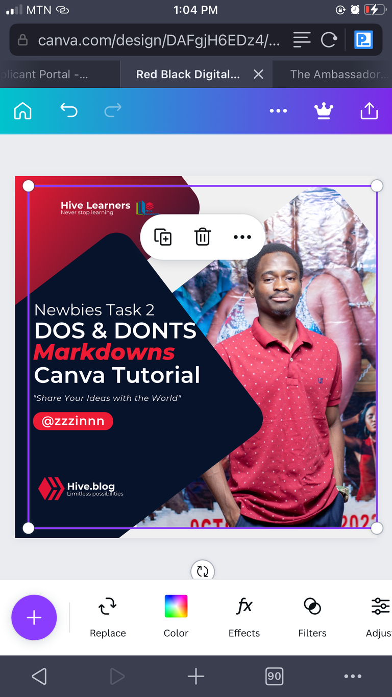
I edited it to suit myself and become my own by changing the picture and the text content to mine. I deleted everything else I didn’t need and replaced with mine.
The design is a simple design with only 3 rounded angle rectangular frames. One of these frames housing the image. What makes the design stand out is the choice and gradient of colors used.
That’s all for my task 2 entry post. I hope it was worth your time.
I would like to express my appreciation to the leadership of the Hive Learners community which is led by @starstrings01.
Shout out to my team(team 2) leader, @depressedfuckup.
Thanks for passing by.
You can support my blog with your upvotes, reblogs, comments, and or a follow.
See you in the next one!
Cover Made With Canva

