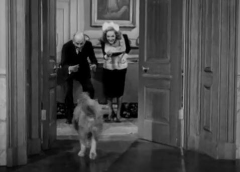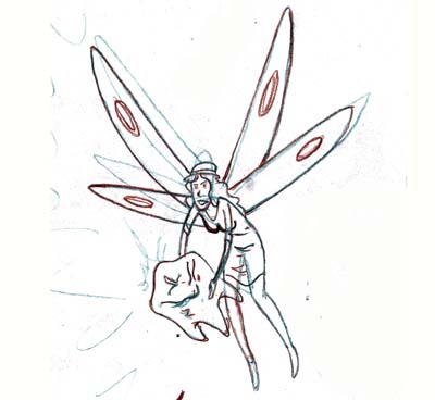
FIRST AND FOREMOST, and great big thank you to @nftshowroom and @juliakponsford
for featuring my work at #hivefest !! I am quite honored!!!
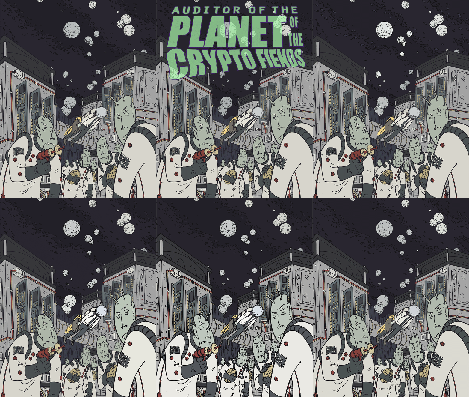
If you are interested in seeing the behind the scenes/progress pics of this piece, here's a link to that blog!
part 1 here- https://hive.blog/hive-156509/@arseniclullaby/nft-illustration-progress-space-madness
part 2 here- https://hive.blog/hive-156509/@arseniclullaby/nft-illustration-progess-crypo-feinds
part 3 here- https://hive.blog/hive-156509/@arseniclullaby/nft-illustration-progress-space-madness
NOW THEN, let's take a look at a piece that isn' going so well
It's gonna seem like I'm making this up, but...oh...five f'ing years ago ( or more) I was just sketching out ideas, and came up with a simple but pretty worthwhile idea for an illustration.
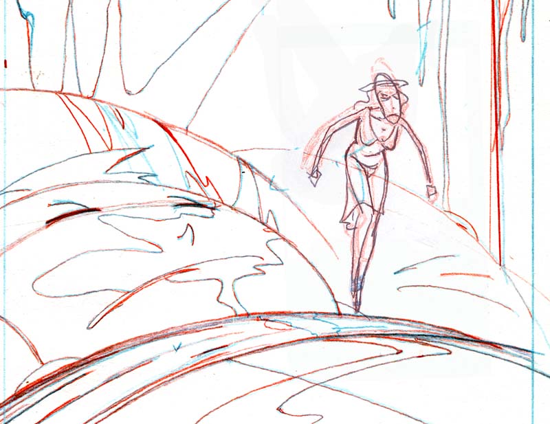
NOW...keep in mind this is rough and the merit comes in...in that the composition is interesting and the overall idea is cool. So take a look and I'll explain what it is...
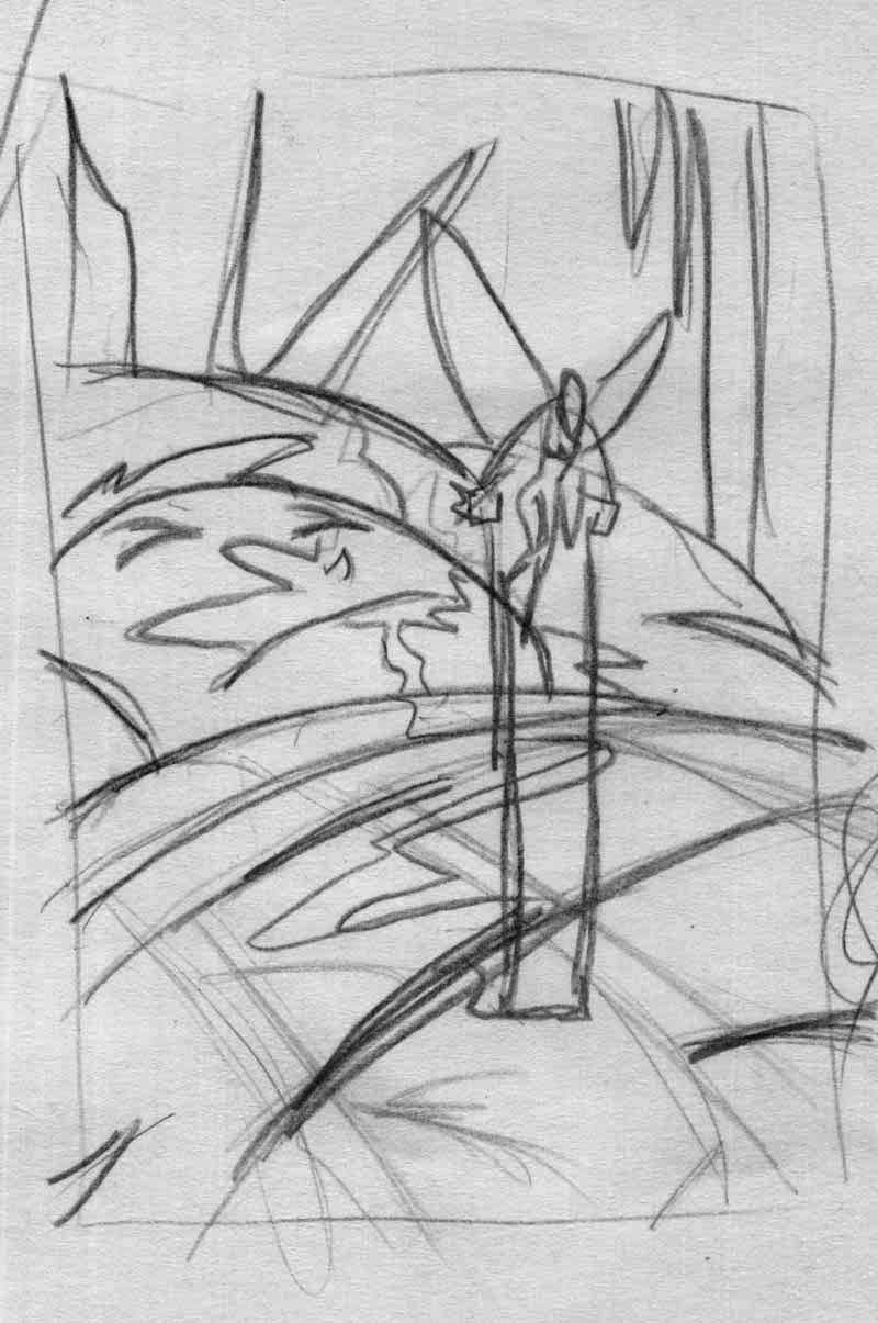
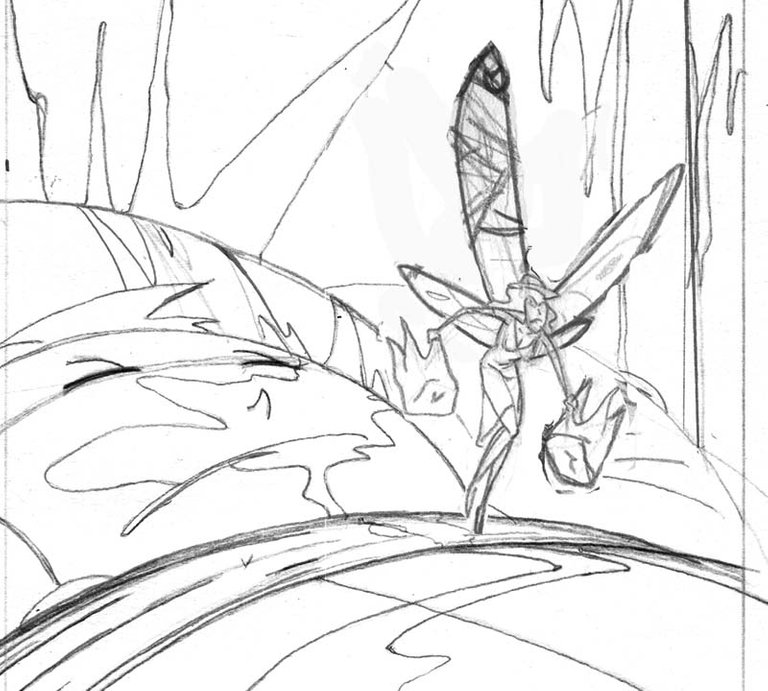
YOu have a kid either asleep or knocked out, bleeding from the mouth to an absurd/horrific degree and a tooth fairy flying off with two teeth. Like I said it's rogh and roughs are often just enough lines for you to remember what it looked like in your imagination...lemme...uhm...here
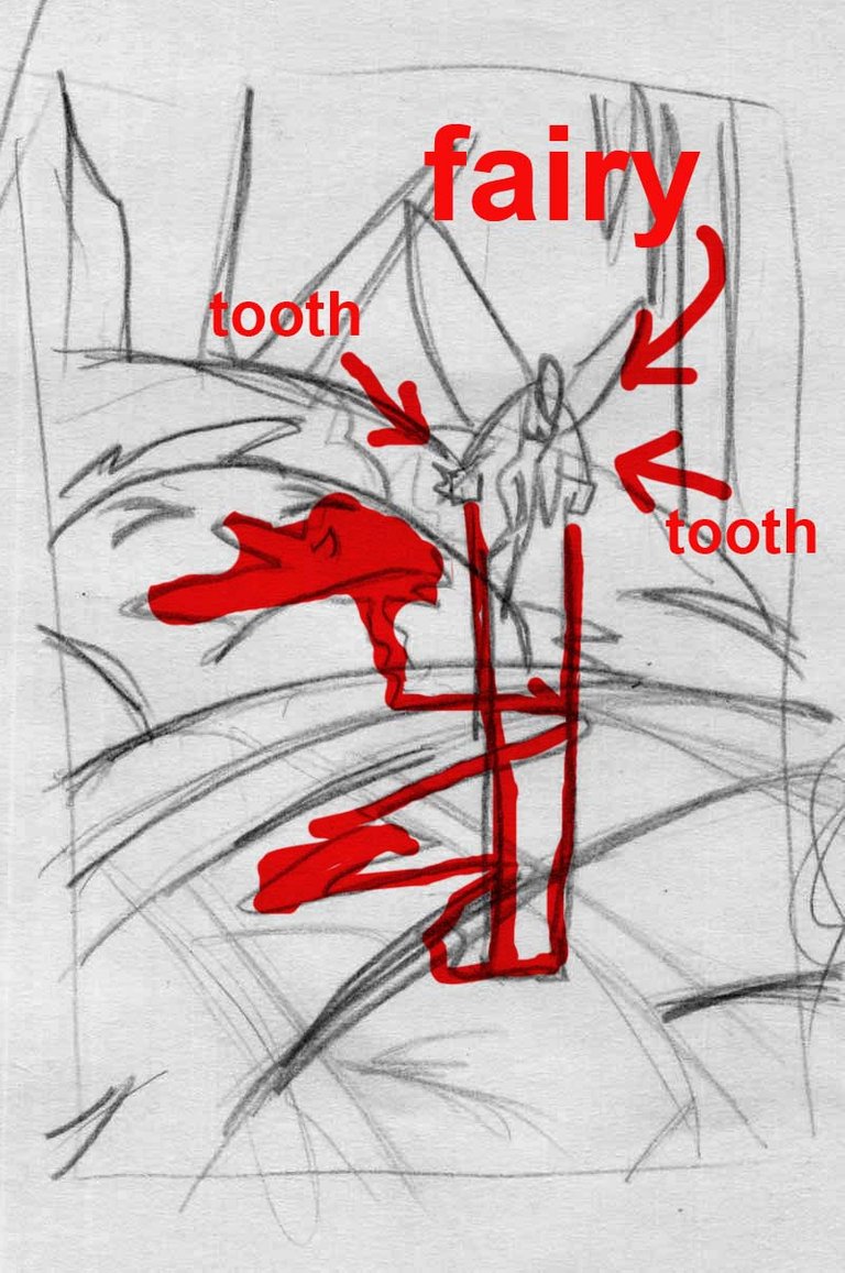
Okay, so...the knocked out kid is pretty well done there already. Basically, just needs a little refining. The tooth fairy...not even close. First, I want her to look menacing and not sleazy exactly but not anything close to innocent. Sort of, waitress who works at the night shift at a cheap diner kind of feel. attractive but with a lot of miles on her and defiantly not someone the mess with unless you want a punch in the face.
...isn't that a interesting description? Wow...quite a lot to convey...considering I have YET...in five years even been able to get the f-ing pose right. The look/feel I described is actually not the difficult part. That is one of the things I do very well, convey a lot in just cartoonish a facial expression. It's a visual "shorthand" that I have down to a science.
But the pose...ffs I can't get it.
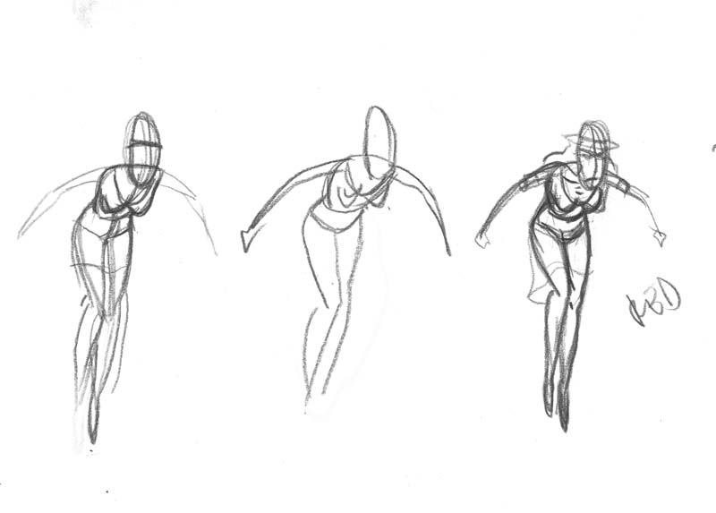
Those are all close...but every one of them is not quite right. Trust me I've tried refining them all and they are off. Either the legs are off, or the arms or the neck/head. Or maybe not...maybe any of them are fine. If I had a deadline on this I probably would have just finished one, looked back on it 6 months later and said "that's fine...what did I think the problem was?"
But when there is no deadline, you end up chasing the "white whale" wanting the image on the paper to be exactly what is in your head.
I haven't been non-stop working on this for five years. I struggle with it for a few days, until my frustration meter peaks and then I say "to hell with it" and shove it back in a drawer and deal with some actual deadline. and....come back to it in a few months and try again, get frustrated, put it in the drawer. Seems like it has been like that for as long as I can remember.
Here's the issue when I can't a specific pose right, and I think I mentioned this before, there are guys like Frank Frazetta and Bernie Wrightson who do hyper realistic stuff. And they are clearly using models or knowledge of actual real human anatomy...
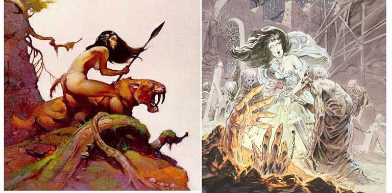
and guys like Jack Cole and Bruce Timm, where is is a cartooney abstract representation, done in a few lines that captures all the form that needs to be shown for it to get the point across...
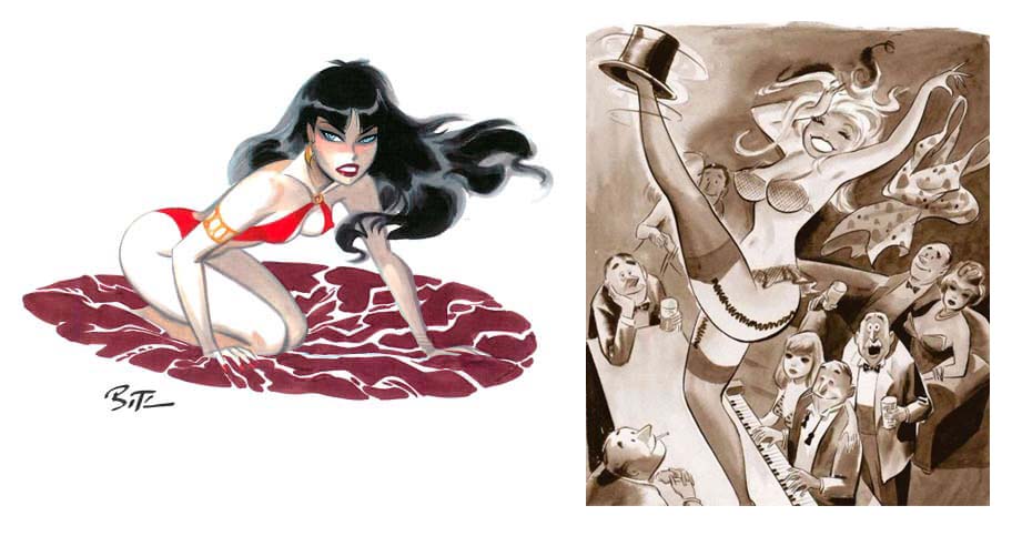
I fall closer to that last category, which does require a sound understanding of human anatomy, but is boiled down to a few lines...it is instinct. and once you start overthinking something that should juuts be quick and natural, you ...are...screwed. AND... it's an abscract style specific to you, the figures are too abstract to actually exist (in Timm's case, on the right, the woman's head would be so heavy her neck couldn't support it. ) so you can get a picture for reference or use a model but that's only a guide...you can't just draw what you see, because you are making an abstract version.
AND...the pose is not possible. Not really, in real life. because the fairy would be essentially hanging in mid air by her wings. Her weight wold be hanging from that point so...how the fck do you get a model to pull that off?
I started once again looking for some sort of reference pictures...and what I learned was...my brain is done with this f-ing thing. Lemme explain. I found this image...kinda close to what I wanted, leaning over enough (though still the balance of the body is wrong because she is obviously not floating in air by wings attached to her back)
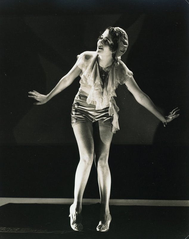
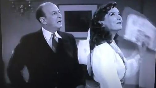
and my brain said "oh, I wonder who his is?" Turns out that this is Lupe Valeze, who was a star of silent pictures and then had a career in "Talkies" (movies that had sound...that was a big change back in the day). She was know mostly for comedic roles and was very very good! Very funny, you could tell she had worked in vauldville and on silent pictures because she did a lot of physical comedy.
She did a series of movies/sequels of "the Mexican Spitfire". Where she and another ex-vaudeville Leon Erol star were a comedic pair getting into absurd situations.
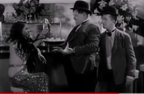
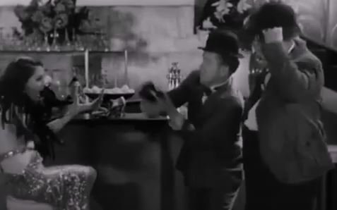
Sort of a precursor to Lucille Ball ( if you even know who that is). Here she is with Laurel and Hardy
and...she had a very tumultuous life in Hollywood, with a lot of drama, and eventually she killed herself. Overdoes on drugs, the legend says.
So, that is a rabbit hole I somehow ended up going down went down for several days instead of working on the pose. There were 8 sequels to Mexican Spitfire, you can't watch just one, can ya?
Then, since the toothfairies that I draw have 1920's type outfits, I tried finding pics from that era, thinking if I found a pose close enough I could hide any mistakes of form with the wardrobe. Just for laughs I tried "1920 model with wings"...and low and behold...
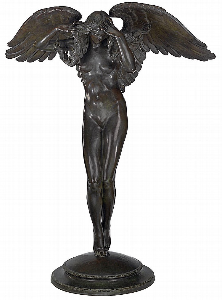
Now, that is not going to work at all because it is a completely different pose, but it was pretty sweet actually getting what I asked for in a search, for once. Then my brains said * "okay...so is this person?"* . Didn't think there was any chance of getting an answer, BUT it turns out the internet actually knew who posed for this.
Audery Munsen...ending up finding out that Audrey Munsen was the queen of modeling in that era. She posed for paintings, pictures, and many many statues that are all over the U.S.
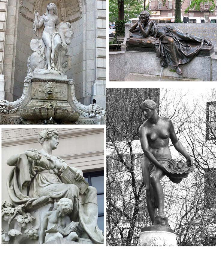
and she ended up in a mental hospital and eventually died there.
I am seeing a unnerving connection to this drawing I am trying to do, in a theory of Time/Space sort of way, and mental surrender/illness. Everyone I try to use as a reference met some tragic end. Perhaps I should put this illustration back in the drawer.
OR...may just try a different pose? ...
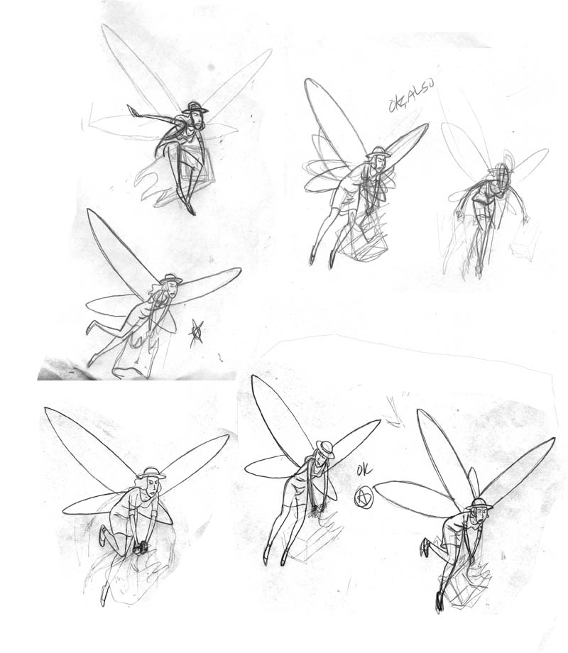
Nah, I don't like any of those either.
anyways...I'll be at Cincinnati Comic Expo next weekend! Come by and say hello! https://cincinnaticomicexpo.com/

As always, homebase is here
https://www.arseniclullabies.com

NFT work here-
https://nftshowroom.com/arseniclullaby/gallery
https://makersplace.com/arseniclullaby/
Here are the other places to find me...my use of them is fluid, inconstant, susceptible to the whims and shifts of the paradigm
Torum-https://www.torum.com/u/arseniclullaby
Instagram- https://www.instagram.com/arsenic_lullaby_official/
twitter- https://twitter.com/arsenic_lullaby
bitchute- https://www.bitchute.com/channel/arsenic_lullaby/
youtube- https://www.youtube.com/user/arseniclullabycomics
