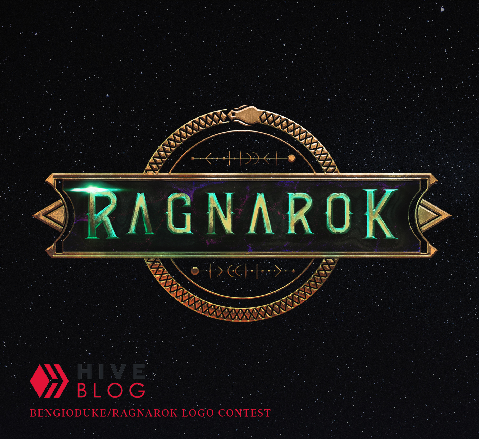
Hello beautiful people how you all doing ? Hope you're all doing well! First of all thanks @Ragnarok.game for this opportunity! It's been long time since last time I got a logo brief and this was the right call to get back to it.I was a bit rusty but I could finally be able to pull it out! Had so much fun while doing that so I wanna share the process with you all!
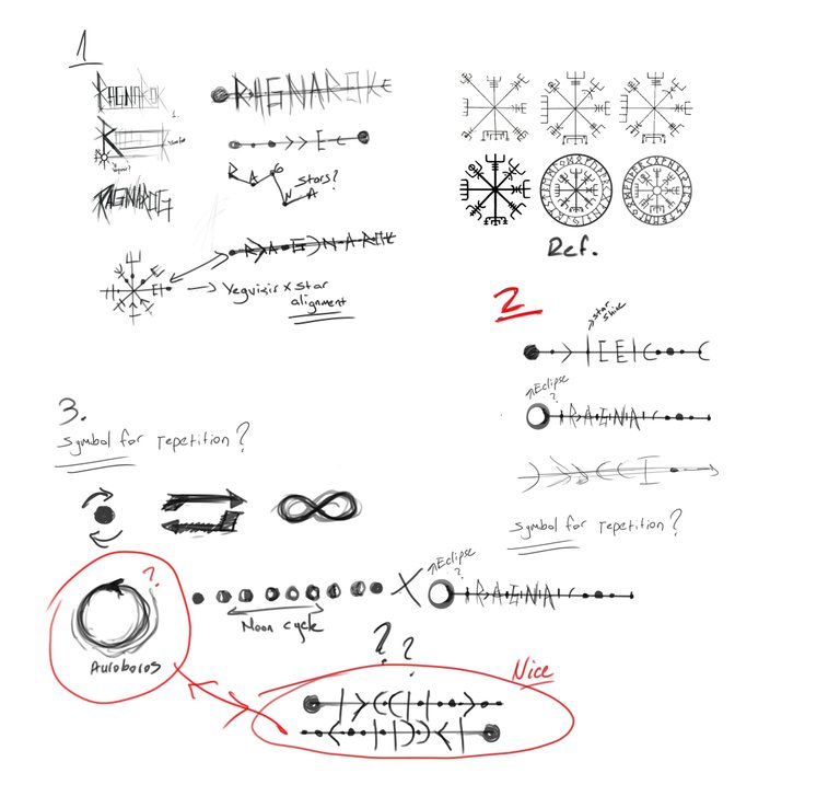
First I started with raw sketches to turn the brief to primitive shapes.I took "Repetition - Myths - Conflict -Realms" I didn't want to dive fully into Norse mythology because of the title because that would narrow the design and I don't like to be stuck in single dimension.I did a shape research for Vegvisir(Nordic Compass) ,some shapes from easterm myths/culture and modern interpretation of the headlines.Sketched them out roughly in Photoshop without worrying.I thought horizontal vegvisir might be a good start and meanwhile auroboros and moon phases took my attention too.
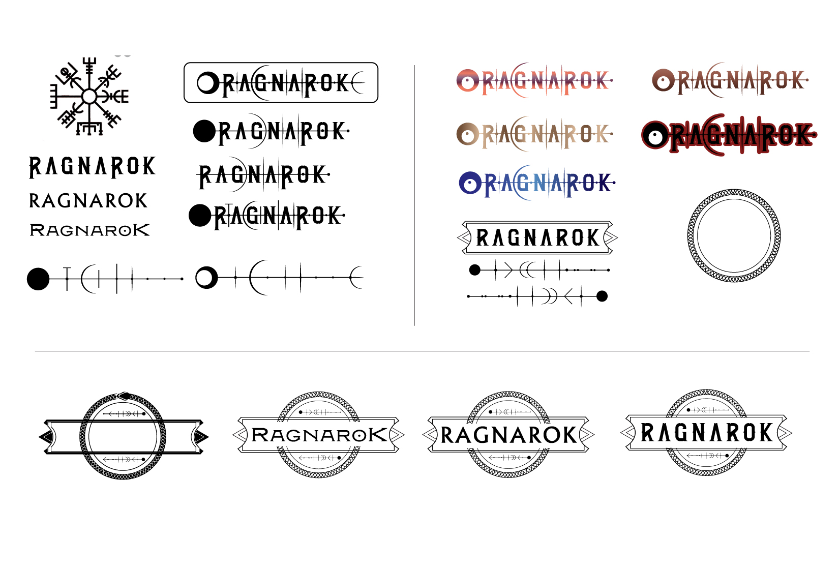
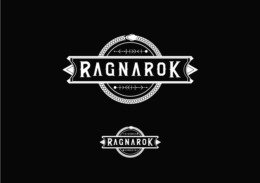
After that I took my base to illustrator to see how flat vectors would work.My first choice as a font was "Rebel" .Horizontal Vegvisir was working but keeping it with Letters was an overkill it bothered me alot.So I decided to go with a framed and more grounded design.Meanwhile with a lighting struck I thought alignment of the stars might be a good idea too.So I started to mix moon phases,vegvisir and start alignment with some extra oriantalist spicee.I finally found the one that I like.I was like ok this one can represent the repetition but I wanted to put something about "conflict" I didn't need to go much further because auroboros was there and my name's meaning is the same too so i decided to put a personal touch to it.After 2 days of trials with colors and clean shapes I finally reached the flat result!! yayy!
Now it was time to Compositing, the fun part ! I took it to photoshop and start playing with layer effects.I wanted to reach some rusty bronze/gold and space influence on design.In this phases it's way more confusing to explain because I was going back and forth with layer effects (Bevel&Emboss,outer glow,inner glow)
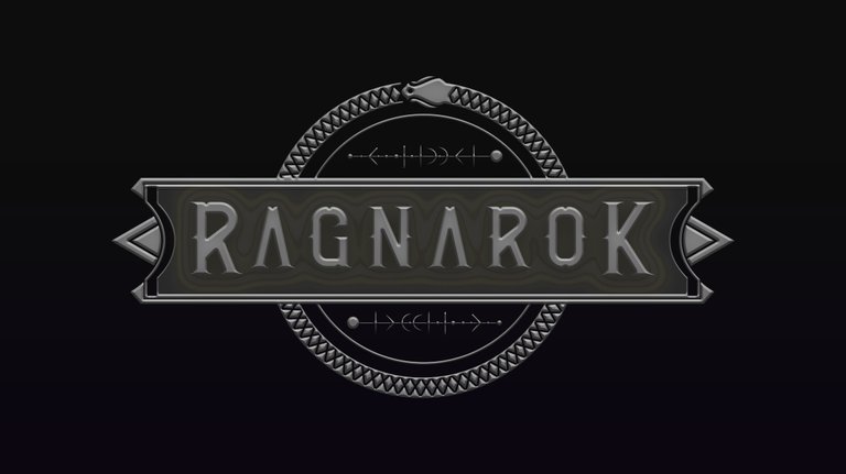
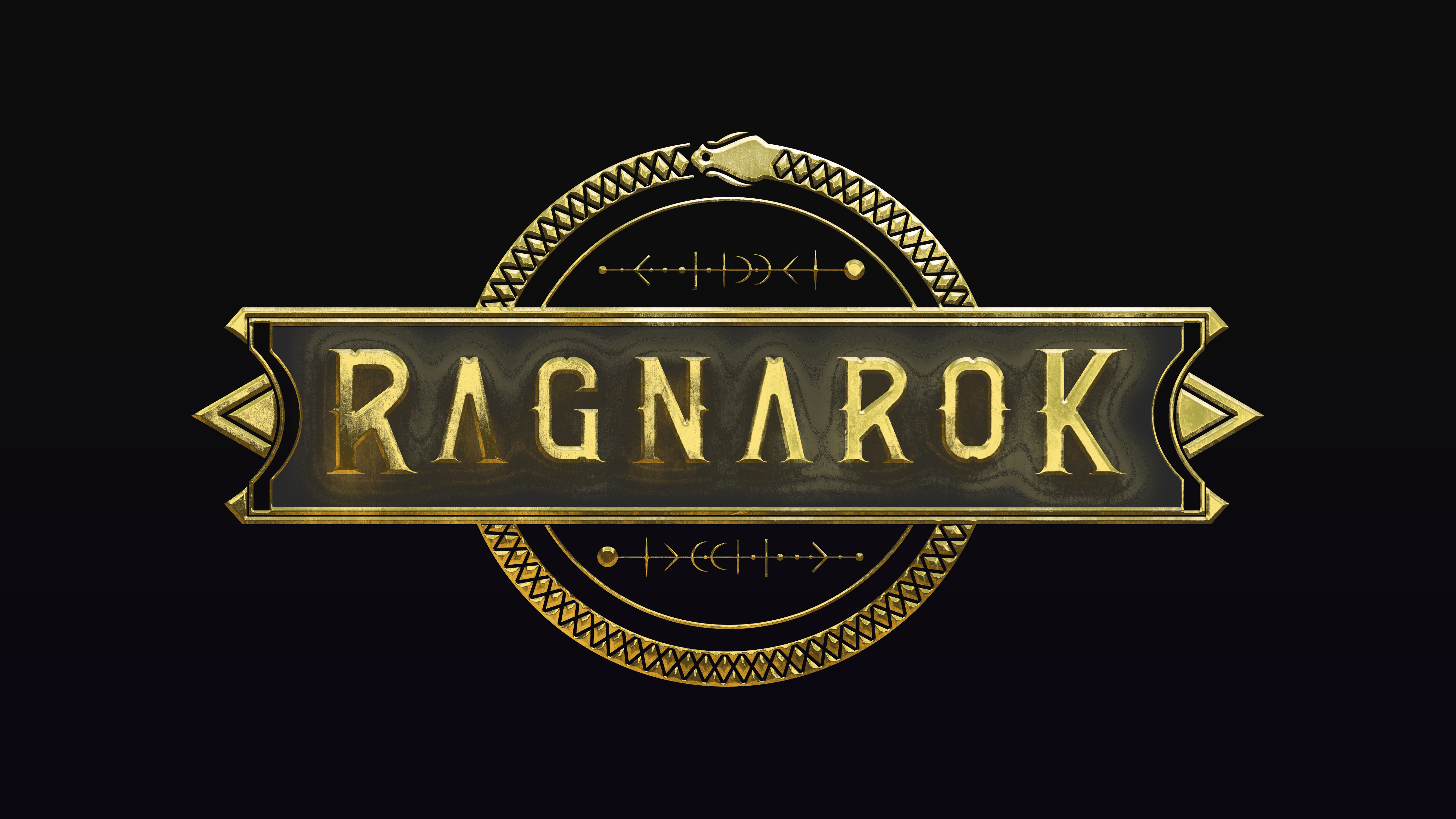
After Finding the rusty gold it was time to make it rusty.In this process I used layer modes(color balance,hue&saturation,curves) and some texture I made in photoshop to make the reflections less static.
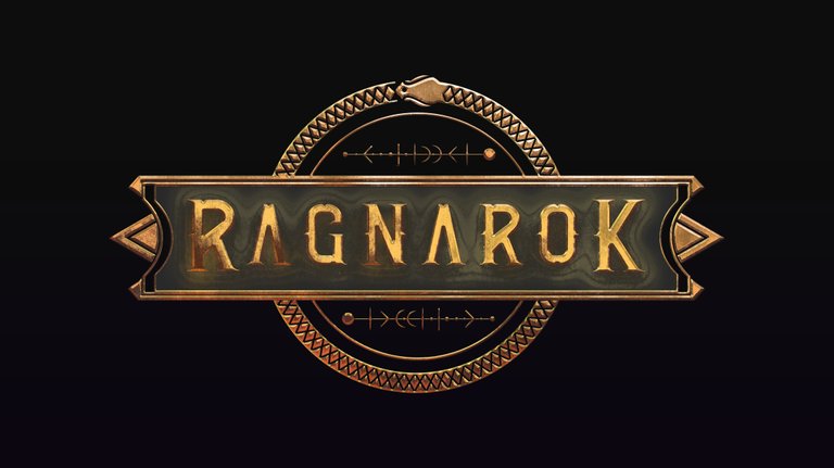
Background of the frame started to remind me some liquid/portal thing.So I wanted to mix it with some space depth.

I was a bit bothered with warmth colors.I wanted to add some contrast colors.After 1 day break and commissions I pushed myself to limits and reached the colors I wanted.Added some extra lens flare and purples in it I was like ok there are nothing left to push but I gave it one extra day to decide.Because even if Im super happy with the result I was second guessing. And guess what I got way more hyped on the other day!
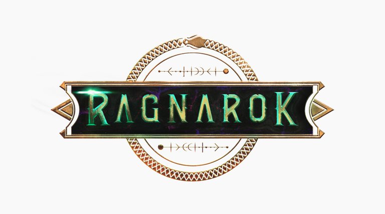
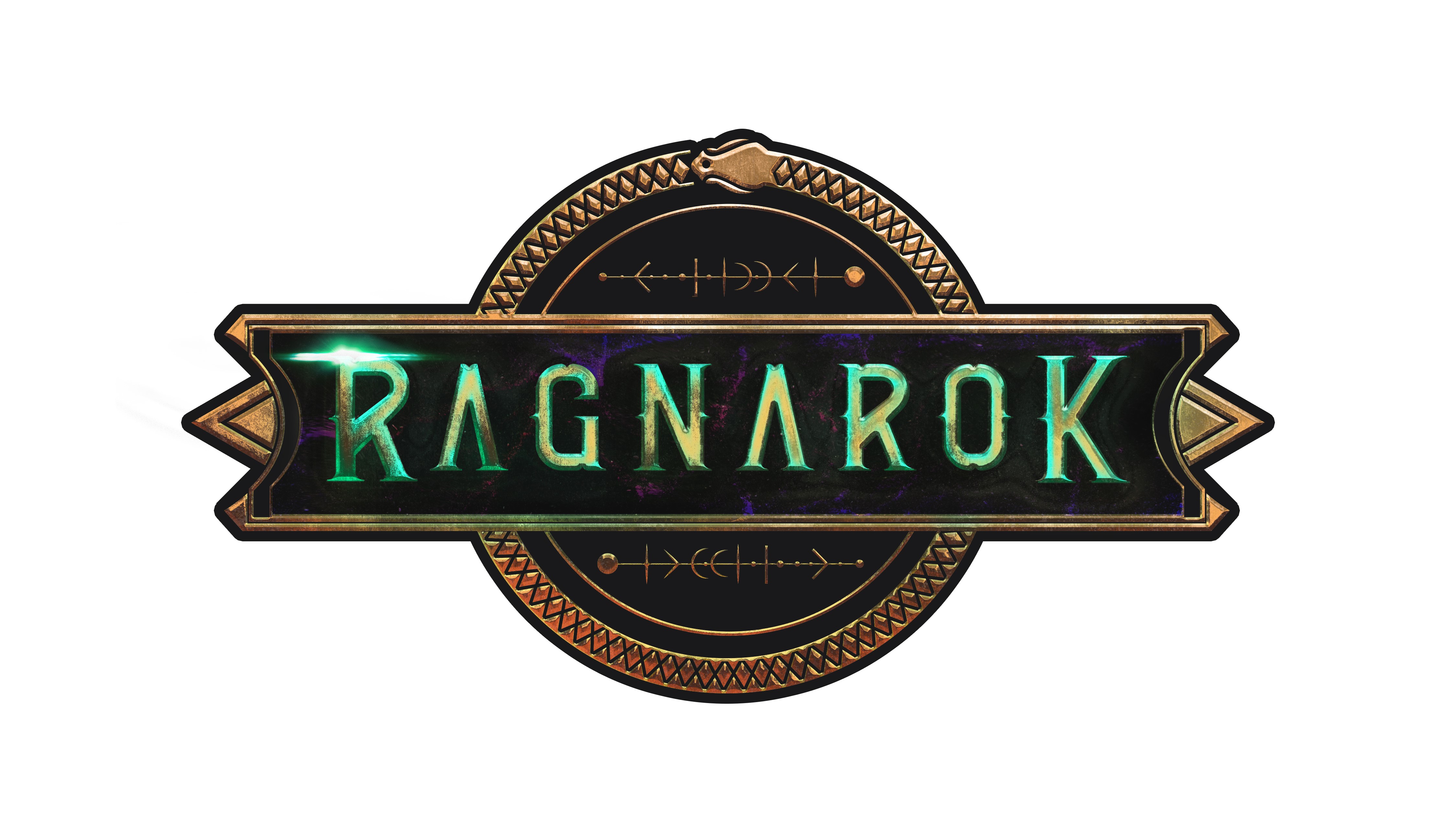
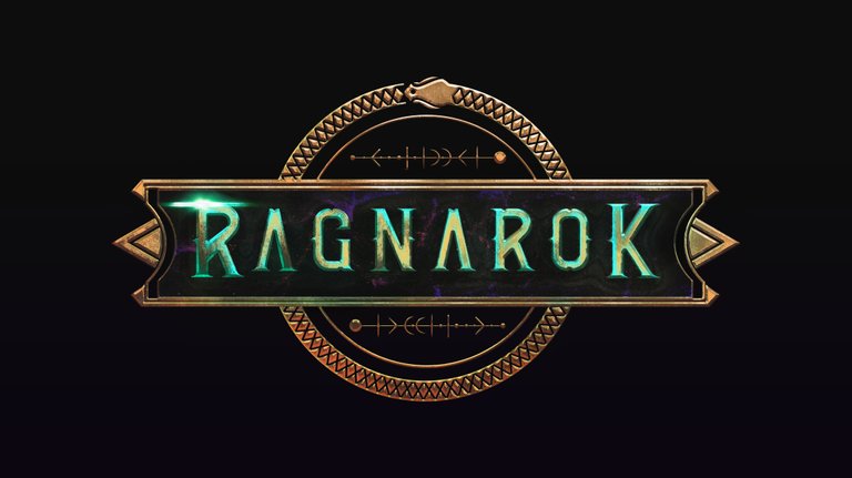
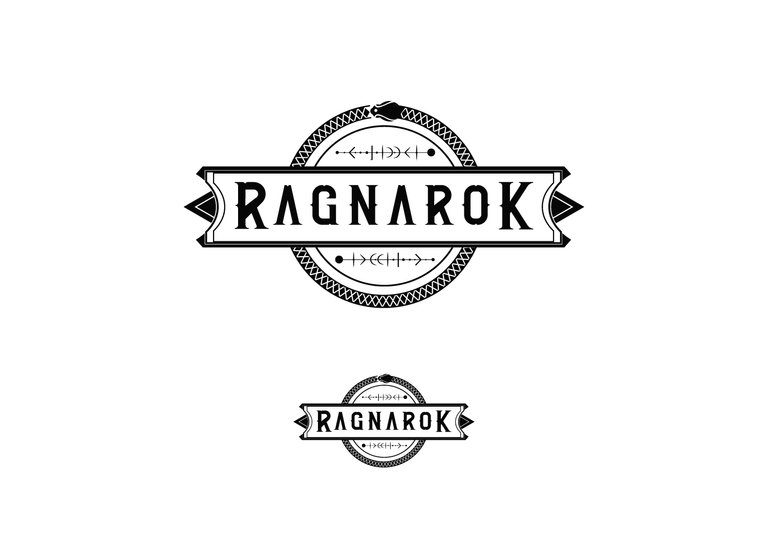
And here is the final vector and final file is ready to ship! It felt great to go out comfort zone and compete in this community event! Kudos to all participants and hope you guys liked it.Hopefully I could give some inspiration about my process to you all If you got questions feel free to ask.Thanks once again @Ragnarok.game!
My;
Instagram