Hello, everyone. Here is my first post on the Onchainart community, and I am thrilled to be here. I will drop a series of art posts, and I hope you love my art content. I am more of an author than an artist, but I tried my best to come up with this here.
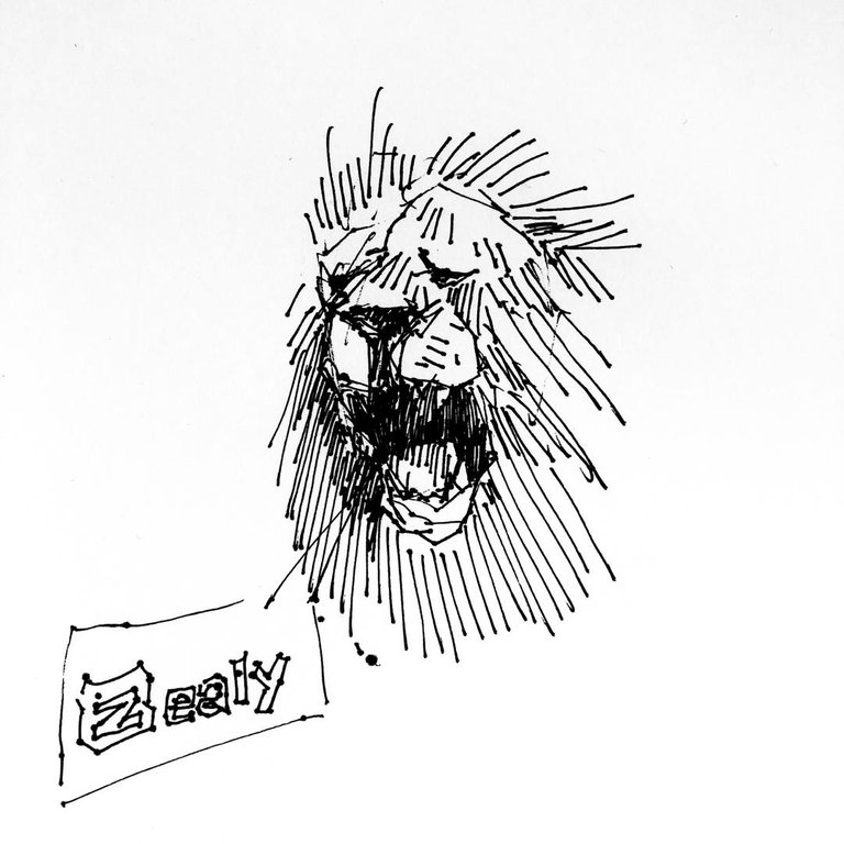
In a world where art meets finance, I embarked on an exciting artistic endeavour brought by the LeoFinance adoption campaign, which was channelled through the Zealy platform. Trying out this drawing was made possible through my friend's ink and digital editing applications I had to download to help create this captivating visual representation infusing both zealy and leofinance brands. Join me as I share the process and the story behind this unique creation.
The Artistic Process:
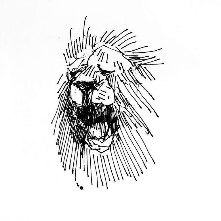
Using ink on paper, I carefully sketched the distinct lion of LeoFinance and Zealy. The bold lines and intricate details began to bring the artwork to life. As the ink flowed, I felt excited, knowing that these two entities would soon merge into a harmonious composition.

Symbolism and Interaction:
The interaction between LeoFinance and Zealy in the artwork holds symbolic meaning. It represents the dynamic synergy between the realms of finance and digital innovation. LeoFinance's lion exuding strength and leadership, engages with the sleek and modern Zealy logo, signifying collaboration and mutual growth.

Adding a Touch of Magic:
To enhance the visual impact, I turned to Snapseed, a powerful photo editing tool. With its versatile features, I unleashed my creativity, playing with colours, contrasts, and textures. Snapseed allowed me to amplify the vibrant essence of LeoFinance and Zealy, creating a captivating visual narrative.
The Result:
The final artwork showcases the fusion of art, finance, and technology. The vibrant colours and intricate details reflect the essence of both LeoFinance and Zealy, capturing their unique identities. It is a testament to the power of creativity and the limitless possibilities that emerge when innovative brands come together.

In conclusion, the contest has brought out a side of me that I never thought there was a way finance could meet art, but it met and here is the proof on paper. The fusion of ink on paper and the digital enhancements in Snapseed brought this vision to life. This artwork serves as a reminder of the exciting collaborations that can shape the future.