Hi hive! Triz here.
Good night, day or afternoon community! As soon as I finish publishing I will go to rest for a while, I have not slept well these days, only a few hours, there is someone who calls me Vampire 😉. Today I ended up with a headache, I didn't eat anything either because I wanted to finish the drawing, although in the end it didn't just stress me out more since the two internets left while I was editing the publication and I couldn't participate.
So I stay for the next week, that is: Today I already rested enough on Sunday so today I am here with you.
Today I want to show you my participation in the Splinterlands contest ---- Let's clarify this -- That is, today I present to you my participation that I made for last week that I could not publish because of the stupid internet services that I have to they are useless... That is why there are things written in the past and others in the present. But it's still my fault! I forgot that I should not trust that I can leave things for the last day, because countless possible things can happen only here😣😆.
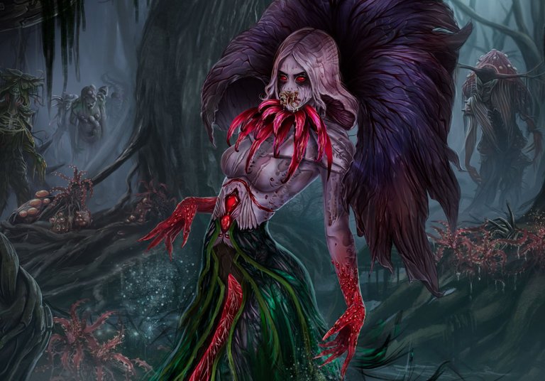
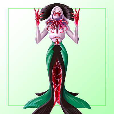
Yes now! Let's go back to what matters, when I was selecting the character I wanted to do, I went around a lot and saw several very good ones but the character of Queen Mycelia, I liked it a lot and the story had a lot of potential and I said why not?
I've been working on this for almost two weeks, it wasn't exactly two weeks of drawing, because I also do other things besides drawing hahh, but it was many, many, many hours. Making the background in this drawing was what took the most time, I didn't want to draw trees anymore haahha. - If I make a comparison of the entire drawing in relation to time, putting together the character, the monsters, the final details and other things, it took me 30% compared to the time it took to make the background.

Come with me! I will show you a bit of how the process was from scratch to the end and I also want to show you some details that I did in the drawing that seem decent to me.
~ 1️⃣ The sketch ~
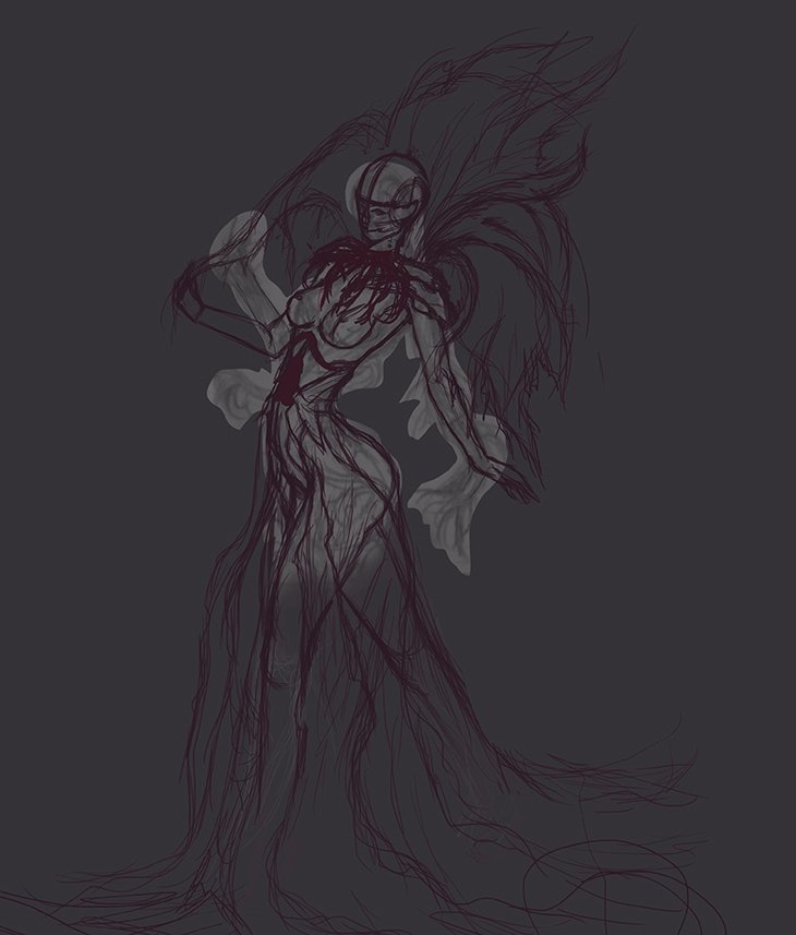
I made a simple sketch in my notebook and transferred it to PS (Photoshop) to finish making the sketch, it was still a simple sketch. My lines are not very pretty but that didn't bother me since I was just looking for an idea that I was going to change later!
~ 2️⃣ The thumbnail ~
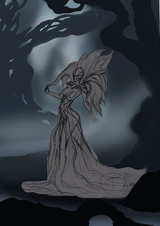
I wanted to make an evil forest (more than the final result), so a few thumbnails were very helpful and this was the one I selected! I just imagined that they were some trees and with the values I could see the depth that I wanted to add.
~ 3️⃣ The background - First stage ~
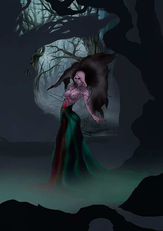
The background is what most complicates me of all the drawings I make, it takes me a long, long time, so with this one I decided to do that first, that's why you'll see that she's still the same in all the steps... I went from back to front. So I shared the background in 4 stages, this would be the "first stage" where I made the most distant trees, I was also guided a bit by the Thumbnail so as not to lose what I had decided to do.
~ 4️⃣ The background - Second stage ~
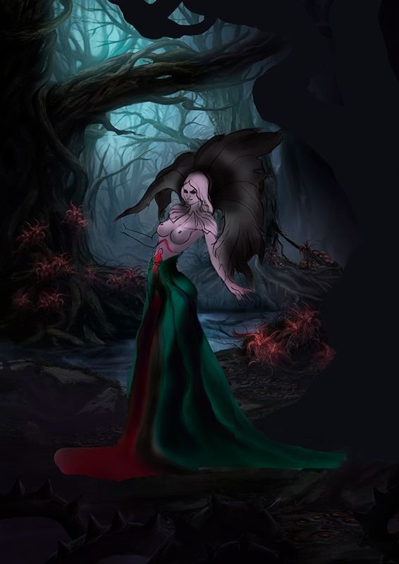
The forest was taking more shape in the "second stage" the tree in the middle had already finished, the water (which in the end you can hardly see, I wasted time on that lol) and some rare flowers to give it a touch of fantasy, I didn't post a picture of that here, but in this step you can see a person who is stuck in the right tree of the image.
~ 5️⃣ The background - Third stage ~
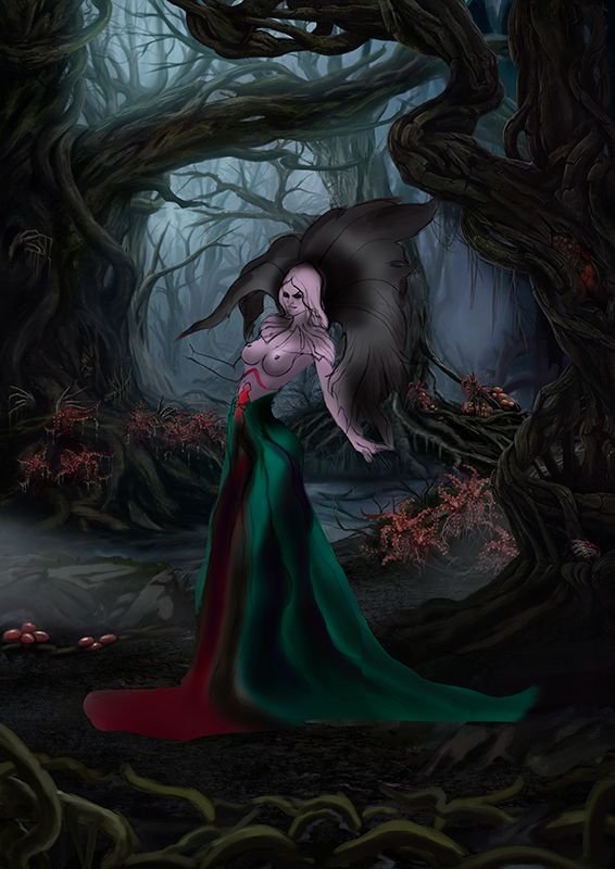
The "third part" was missing, which is that of the tree that is closest, almost to the front, in that one I anfocused much more than in the other trees in the background that should not be so detailed because of the depth. I added some mystery details, you can see it there and in the middle tree I added others.... and for the "fourth part" there was only one idea, it looked like spaghetti.
~ 6️⃣ The time has come ~
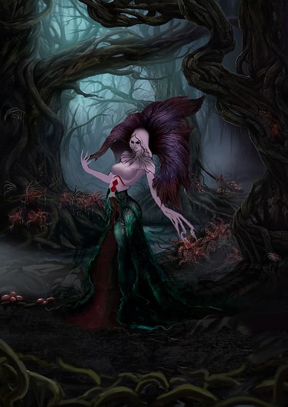
The time has finally come to work on what should be the protagonist of all this. I made some changes but without leaving aside the essence of the character, for the skin I only made a base, because I wanted to add texture to it. In this step you can see the details that I did in what is behind the head and one of the first attempts in the lower part of the girl. I was going to put legs on her but then I didn't want to change the character so much.
The leaf dress (I assumed) was already taking more shape, I wanted something worn (and yes, it was, I ended up worn out after finishing the drawing lol), after several attempts with that, up to this point I couldn't achieve that effect.
~ 7️⃣ A little horde ~
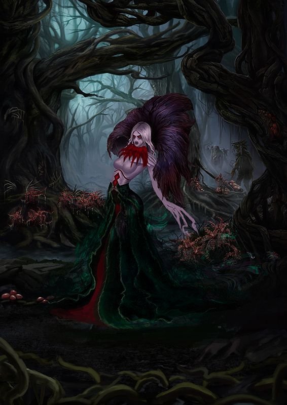
According to the description of this character, she turns into monsters all those who get too close. So I did not want to leave her so alone in that place and I made a small horde for her. I designed from scratch these little monsters in the background, I only focused on the two that are closest, the ones that are further back I did not do so many details and some of them duplicated them, so there would not be only three.
It was still not clear to me how the hands were going to be, but one of the ideas I had (that I would have liked to do it) is that she would be transforming someone, that's why the hand was in that position, but later I changed my mind due to time.
~ 8️⃣ Sudden changes ~
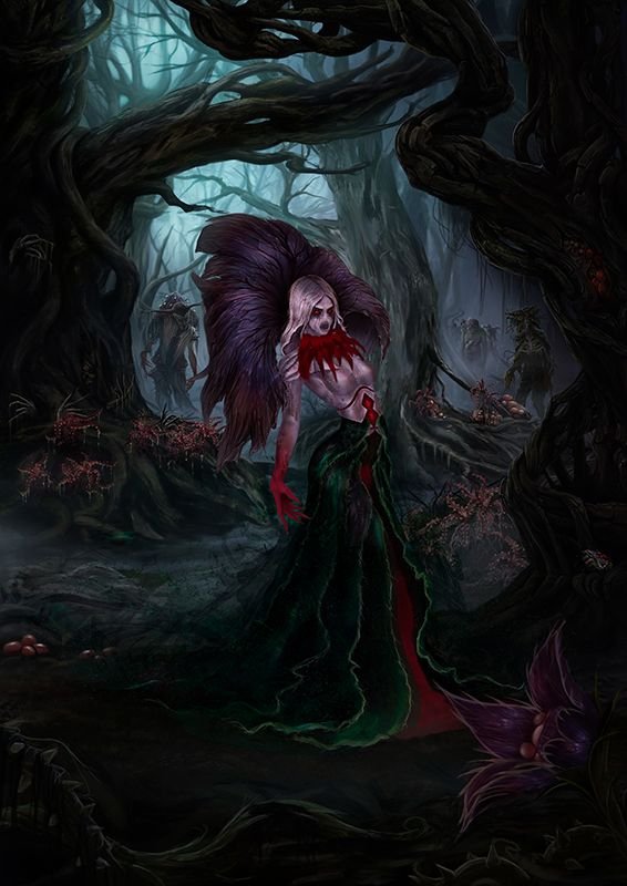
In this step the main thing I did was flip the character horizontally, it didn't seem to me that it was fine where it was and that I could take advantage of a little more space, in addition to that I removed the right arm - I didn't have the left one lol- and I did a new one in another position. The "fourth stage" changed the background, there was no more spaghetti, instead some thorns and a large flower that by the way added the same texture as the thing behind the head. Already in this step I added the texture to the skin that I told you about!
From the beginning when I made "the sketch" she was very human, but it was all about having an idea where to start. Following the story of this queen, I wanted a more monstrous character (more than the final result, try to hold back a bit) and not so human.

Some details
~ Texture ~
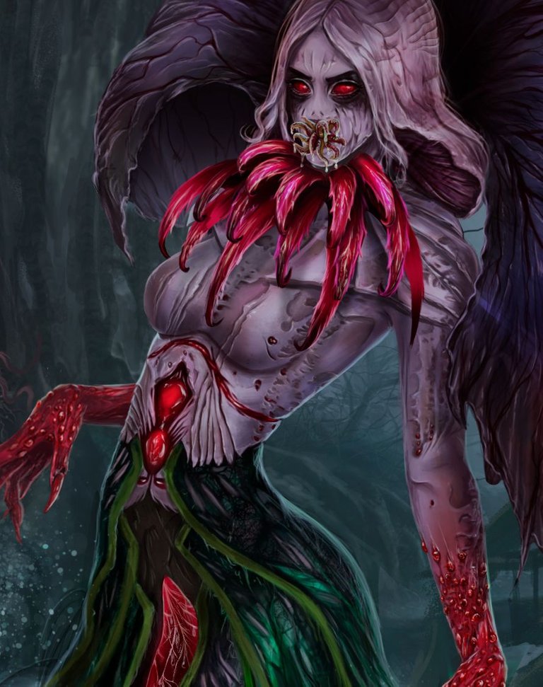
Here more closely you can see the texture that I made, in the upper part of the body. I wasn't quite sure why her hands were that color., what was in the neck, what was in the middle of the legs and what came out of her mouth. A friend told me it was because of the mushrooms and thanks to that I was able to complete the drawing. But I still made some changes in that, since I placed some worms in the mouth, the things on the neck I turned into leaves, I placed the kind of spider web or membrane that I had in the middle of the legs and for the hands I added the drops that they come out of one of the species of fungi or something like that, even so I didn't want to be wrong😞.
The texture that I took from some of my own texture albums that I have created over the years for that purpose. After I had placed it how I wanted on a layer on top of that, I fixed the imperfections a bit and added other details. I saw that the character had no hair but he had some hair back. I assumed this could be a mushroom, so the girl's head turned into a mushroom.
Monsters at the order of the day!
In the finished drawing they look very small, but I liked it when I made them and they made me want to do them well, well in the future, fix them and give them their own prominence.
~ First monster, Mushroom Boy! ~
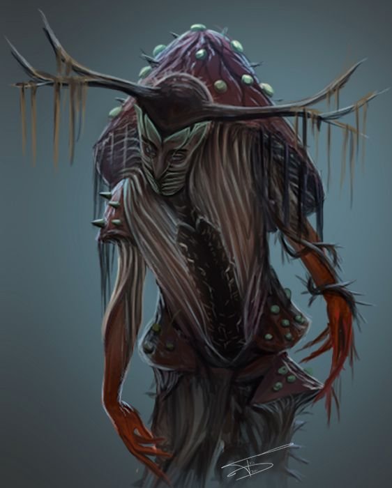
Ok, doing this was fun!, and the truth is that it was a little more decent (It was the last one I did lol) than the others, he is a man who has the body of a Mushroom and to give him an extra I added a big mouth on the stomach with many teeth. If you see something blurry, I had to enlarge it since in the image it was tiny.
~ Second monster, the lettuce man? ~
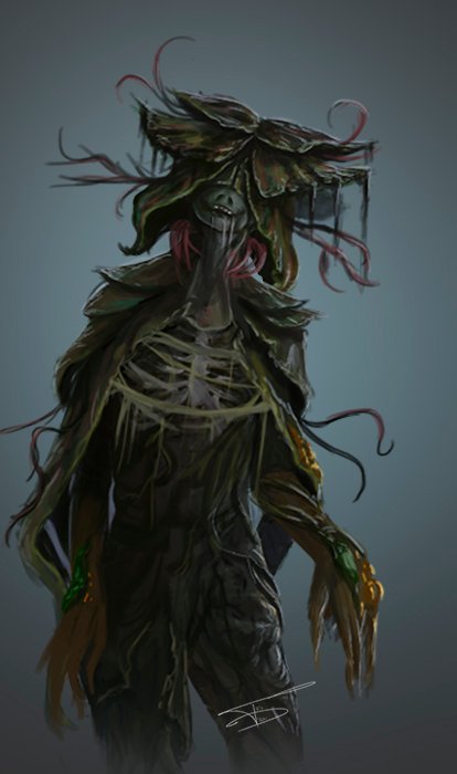
She transformed him and he was wrapped in all those leaves lol. I made some branches and I didn't make the nose either, these are less human than the character. You can see the bones a bit, since they are small I can't go into much detail but you can see the idea, I think! I wanted to make it a little more rotten like the zombies, but it wasn't going to be as noticeable, so no lol.

Mini-tutorial
I did those two things with the same brush! I just wanted to show a little how I did it.
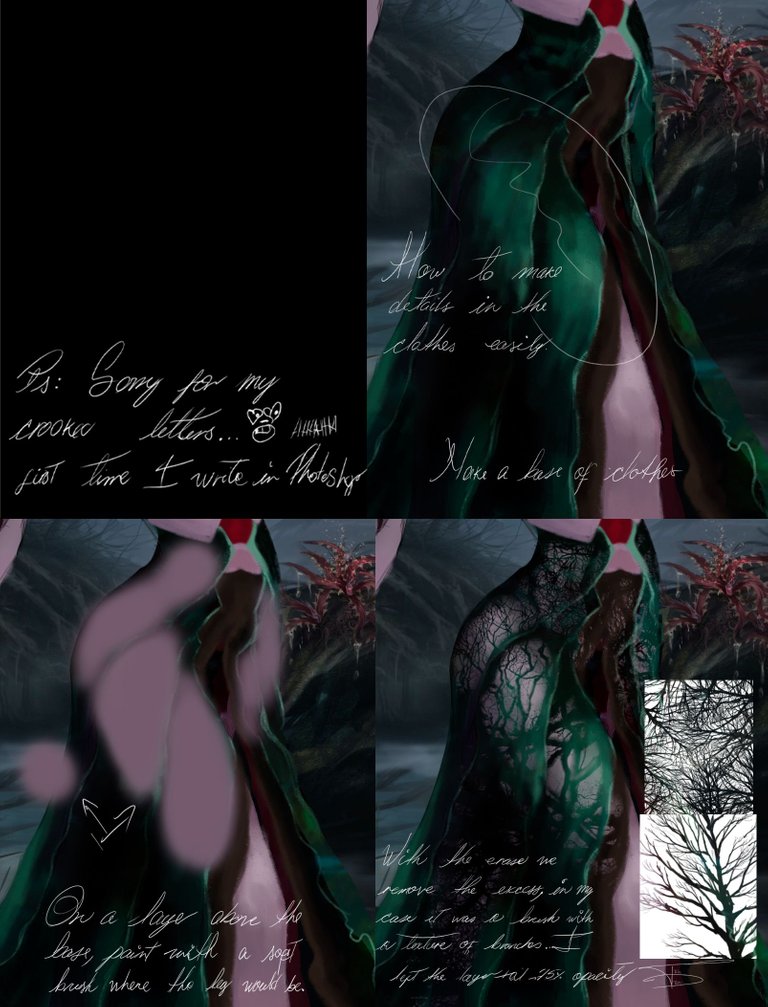
I think I said above, I don't remember, but in one of the attempts with the lower part of the girl I made a leg, you can see it here although later I removed it, but even so I didn't want the leg to disappear completely and to do it I did this steps.
I had left it at 75% opacity but then I changed it a bit and well then I added more details and it no longer looked like that, but the idea is there.
In case it is not understood in the image lol, I used the brush as an eraser.
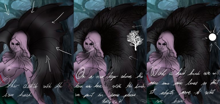
It's not a secret that I have a dramatic history with straight or perfect lines in Ps hahhaha, I wanted to make my work a little easier with the same brush I added the color I wanted and with a very small normal hard brush I added more details.

Final Result
For the ending I made some adjustments, added some haze and changed the character's dress again. Today I saw something I didn't like and I changed it! I wanted it to be dark but for things to be seen and not all black.
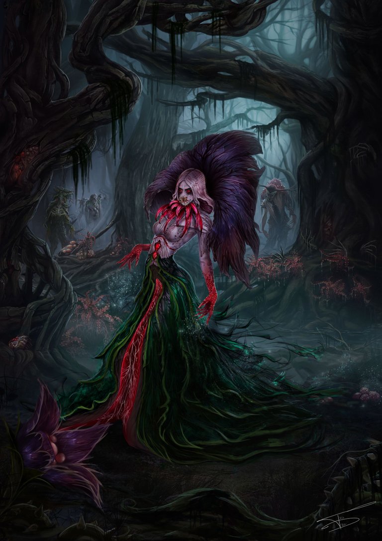

I had never written so much it's a publication hahha! Tell me what did you think of all this? I would love to know your opinion. And if you have reached this point, I thank you very much for taking the time to read me 🤗🥰😉.

Some of the most recent pieces here😌

This has been all for tonight 😍😘😍😘 !!
See you soon Hive 😏!

See you soon Hive 😏!

