FIRST- a comic con appearance announcement! I don't do a lot of these anymore, so if you wanna come see me and my work in person, you'd best be there when opportunity knocks. I'll be in Michigan USA for Grand Rapids Comicon Nov 3-5th!
https://www.grcomiccon.com/
Now then...
Some time ago Andy Brown of Berserker Comics emailed me to see if I'd be interested in being a part of his new horror anthology. FROM UNDER THE FLOORBOARDS
https://www.berserkerart.com/?page_id=15106
He's worked with some of the all time greats, the man knows talent. And among some of the greats he's published is the one and only Simon Bisely.
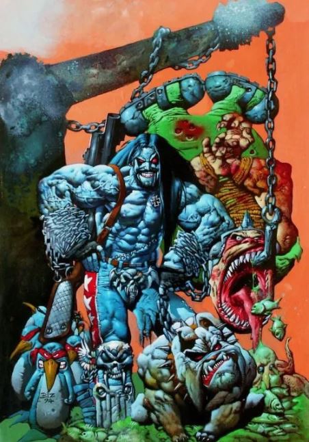
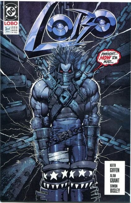
Bisley's done more work for more companies than I can list, but chief among them is his legendary run on Lobo. While no one in thier right mind would call our styles similar and I wouldn't say I took direct art type inspiration from him, this is one of my all time favorite comics and it opened my eyes to the notion of just how many people were looking for something more weird and violent than standard Marvel and DC super hero dreck.
So I was, all bravado aside, happy to be on board. and honored to be in a book with along side his work (including his cover art).
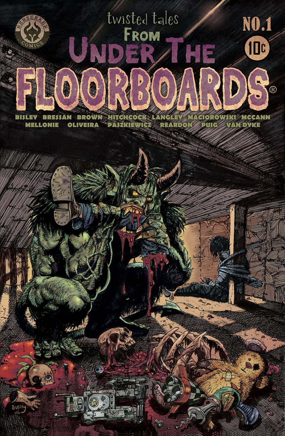
Berserker Comics Presents, Under The Floorboards. An anthology graphic novel of 11 Horror and Science Fiction short stories, in the style of old pre-code EC books. 128-page Graphic novel. Twisted tales of Horror, Aliens, Witches, Gangsters, Space Ships, Bigfoot, Futuristic cars, The Devil, Parallel Dimensions, Fever Dreams, and MURDER!
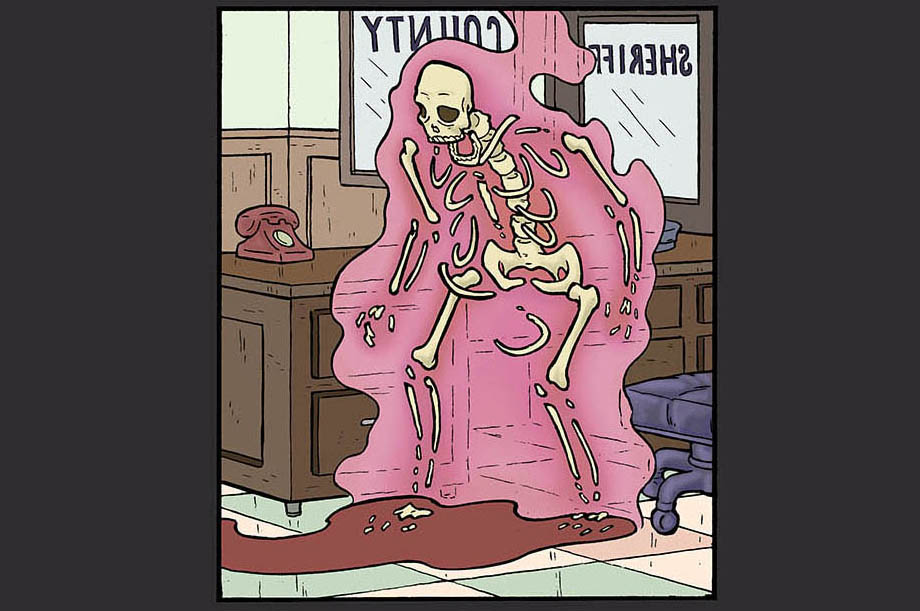
I've shown samples of my work for this book here and there...let's show you some more, and some of what the rest of the team contributed.
For the sake of not spoiling anything...I'll show you just glimpses of my stuff and in random order, so as to not reveal just wtf is going on in the story.
as usual I work traditionally, meaning pencil, brush and ink. Starting with a rough sketch and eventually refining an image/concept into the finished page.
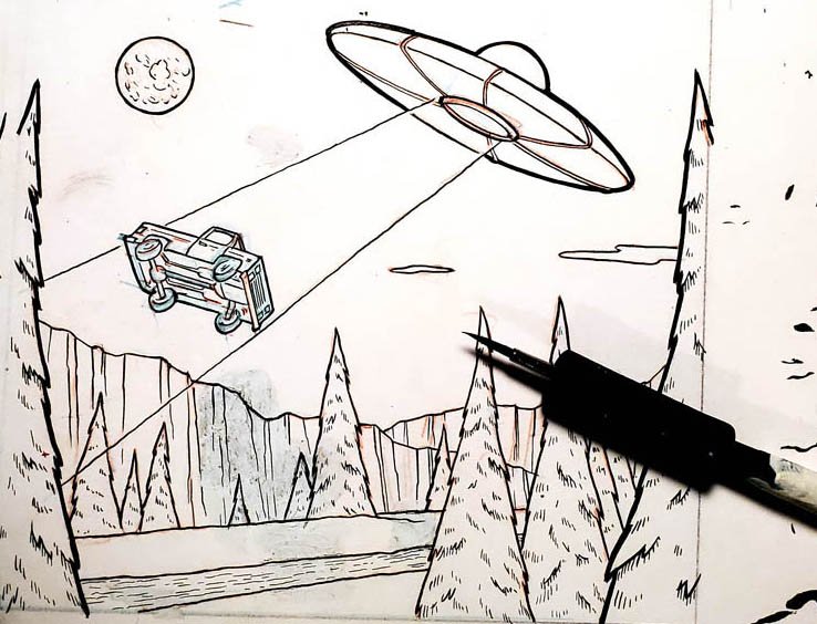
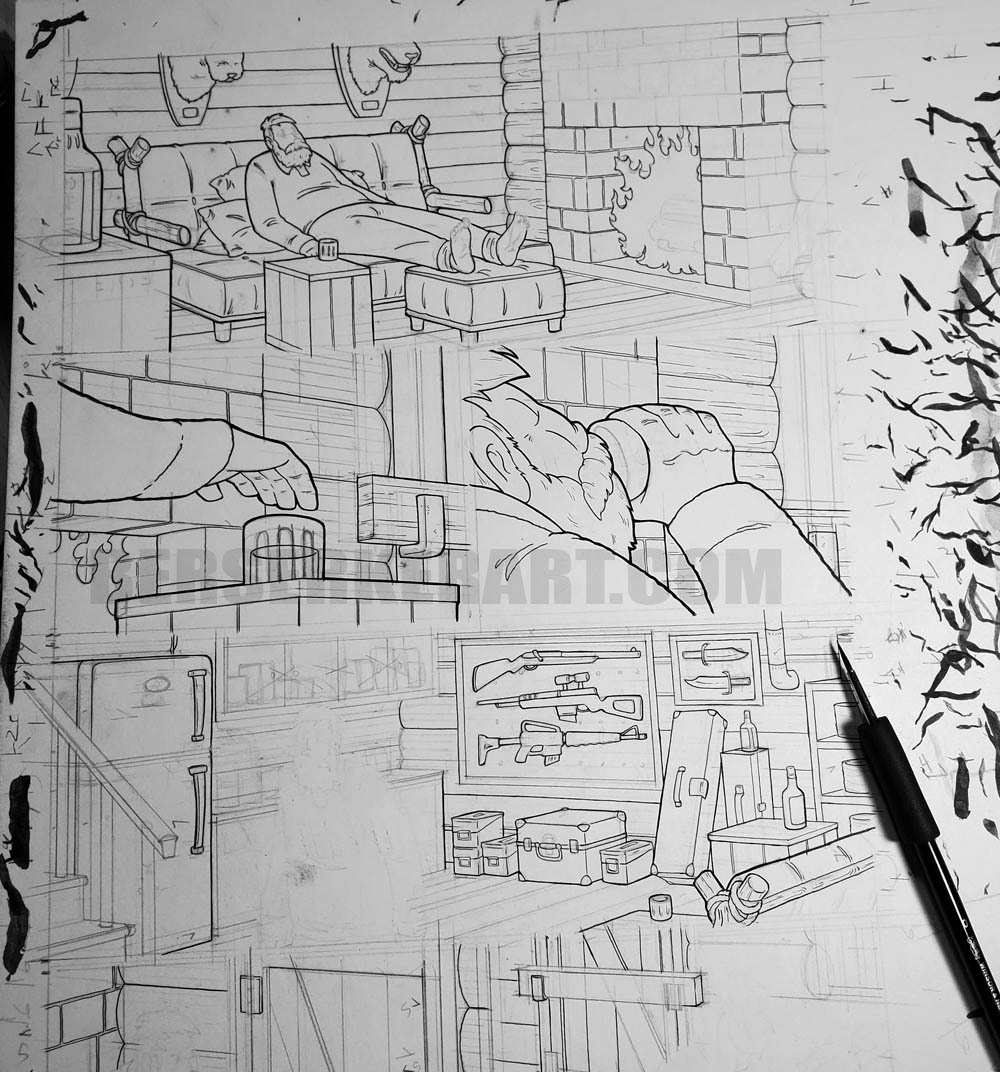
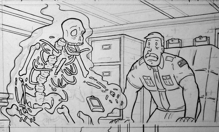
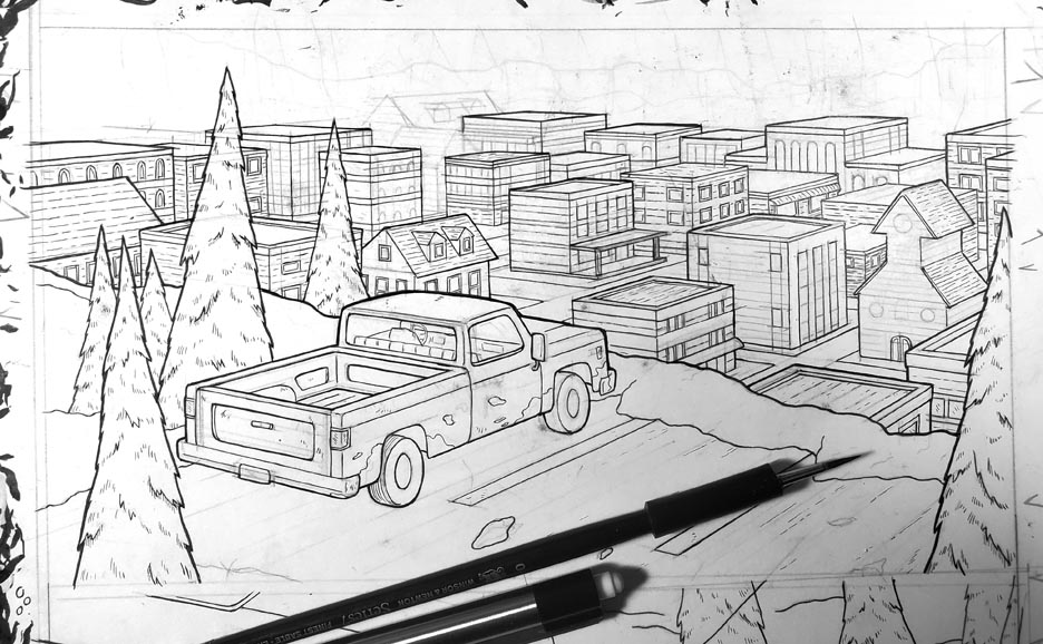
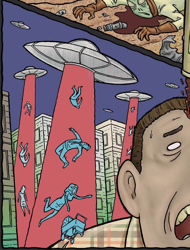
This next particular page called for a surreal type of delivery of the story/visual information. The basic info is that a guy is strapped down being opperated on by aliens and there are images swirling around him (sort of speak). The focus is on the guy about to get his head drilled by some kinda alien tool, and he is to be the only known commodity. By that I mean there needed to be ambiguity involved in everything else, the reader isn't to know when the other scenes are happening if they are happening.
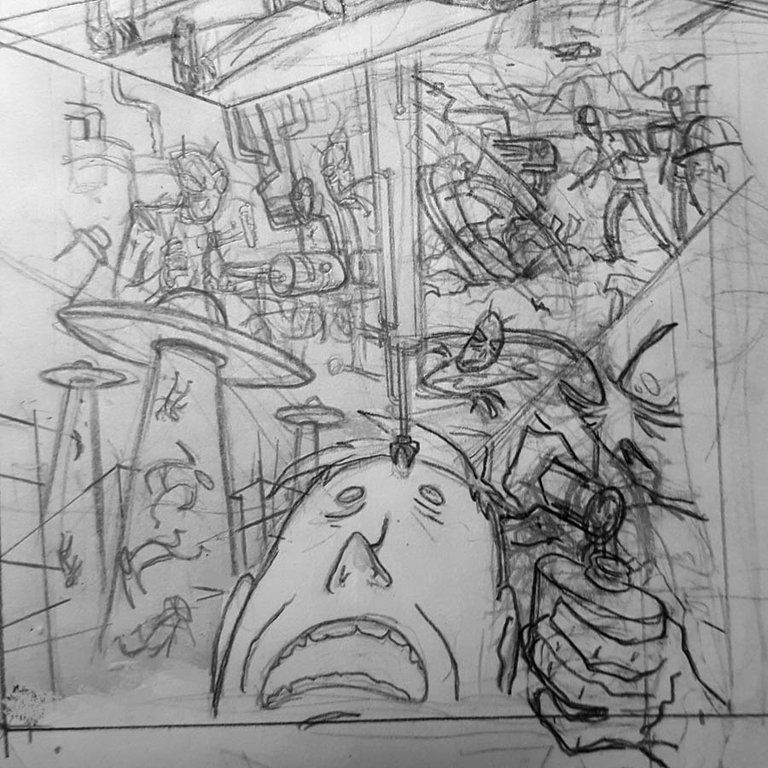
I don't do a lot of abstract looking pages, so this was a fun challenge. I put the guy in the foreground and had the different events sort of behind him and made the panel lines sort of weird creepy and uneven.
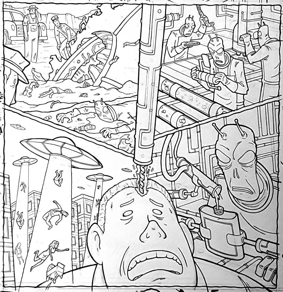
That bottom left panel has the woman and baby stroller coming from in front of him not behind...which goes against the reality of rest of the scenes, but it was just too visually cool to not do. And it does sort of draw the readers eye back into the page and towards the terrified look on the guys face.
Anyhooo, Andy was the colorist on this here story. So let's show off his efforts on my linework!
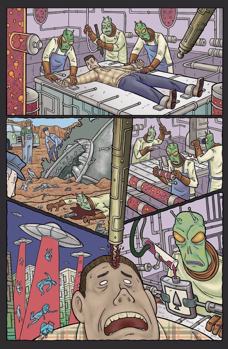
Coloring my stuff, is actually very difficult because my style is such a weird combination of overly simplified and overly complicated. We did a lot of back and forth and trial and error getting the colors and lines to work together...and truth be told, I THINK this was the final version, but it could be the second from last...at some point on a project like this my laptop becomes a chaotic mess and you can abandon all hope of finding what you need. I'm pretty sure that's the final version. Looks good in either case!
It's the little things that make up life, and for me, personally, that lower left hand panel is the crown jewel of my work on project. It's just very weird and fun and surreal with the tiny people being pulled in from in front of his shoulder AND that light blue monchromaticness ( I think I just made that word up) is a technique I always wanted to try out. They used that ALL the time in the golden age of comics ( 1950s-ish) and I always though it was cool af. What they'd do is...for the sake of putting the focus on the primary characters or giving depth or keeping the image from being to complicated visually...pick a layer of depth in the scene and make that layer all blue. Like these panels here.
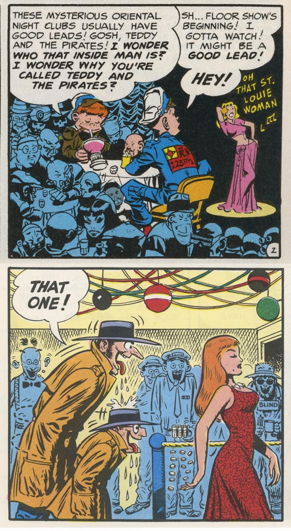
How Andy used it here is for almost the opposite effect ( put the focuses on the blue figures instead of taking it away from them). Either way...I like it and I'm gonna start using that technique more on my stuff.
OKAY...that's enough, for this round of sneak previews, of my work.
Lest you think the only worthwhile pages in the collection are mine...here's a few other of the skilled efforts on the book!
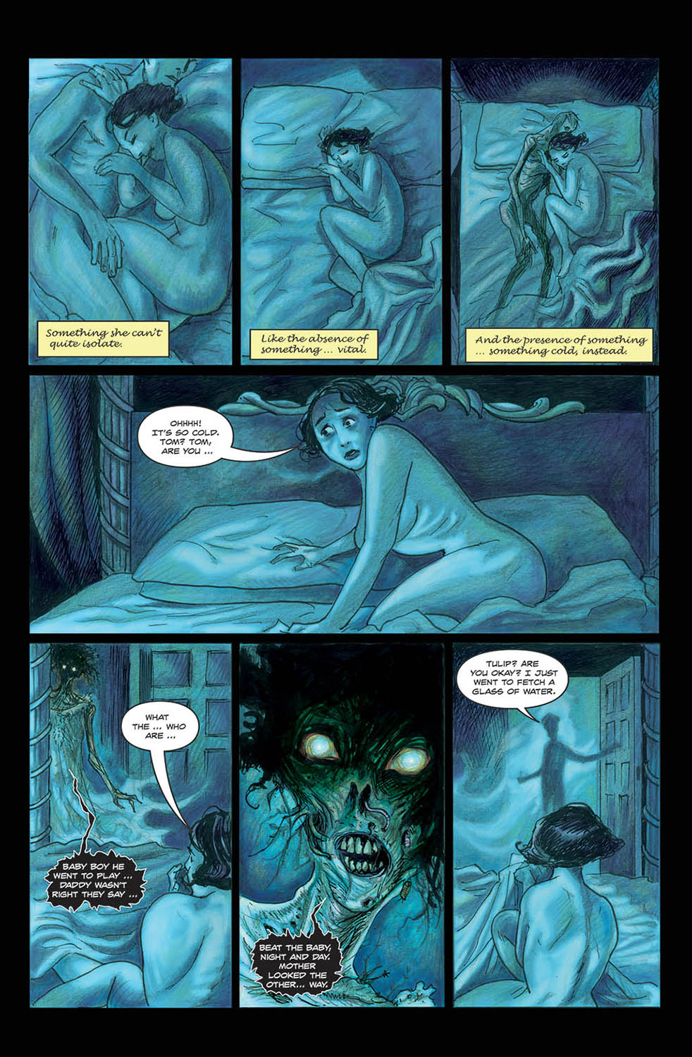
Art by David Hitchcock https://www.instagram.com/davidhitchcock100/
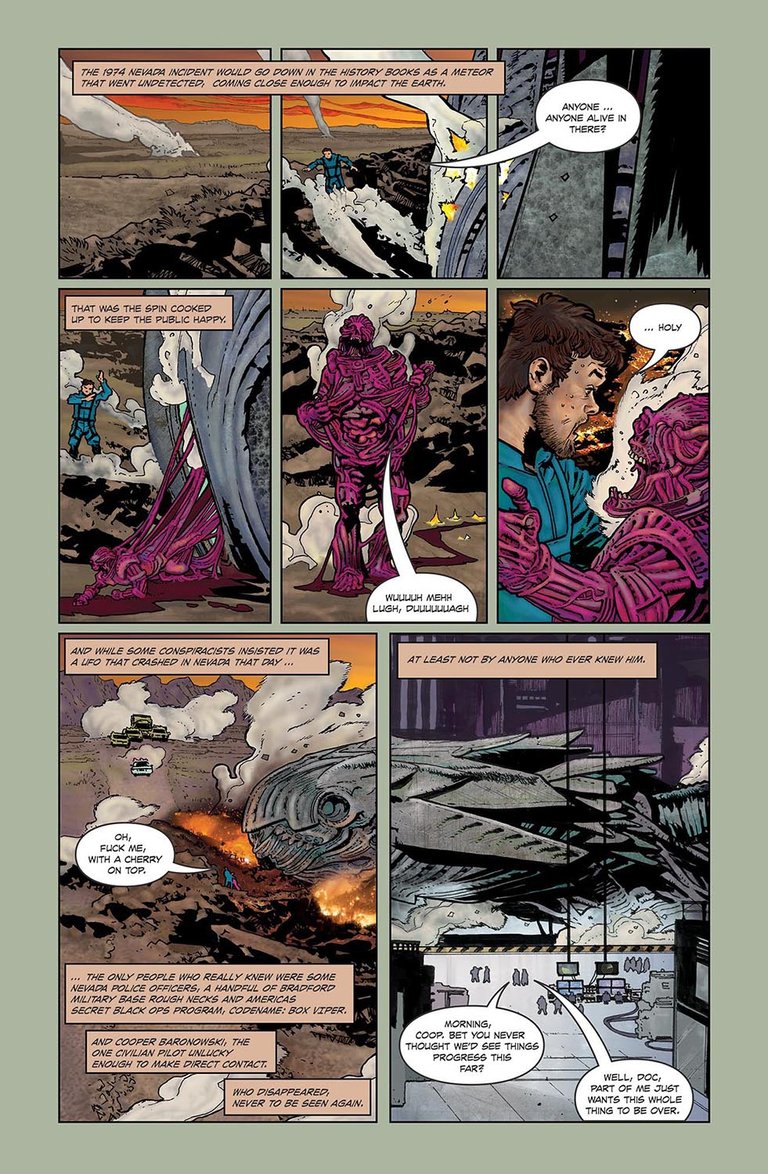
Art by Andrei Bressan https://www.instagram.com/andrei.bressan/
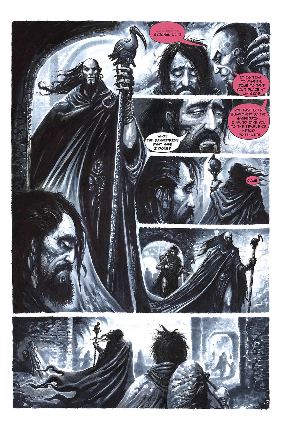
art by Clint Langley
NOW THEN, you're local comic shop can get this, and if you'd tell them too, that'd be very nice of ya. This link'll help if they have questions
Or you can get it straight through Berserker. Fear not, my incompetent ass is not in charge of shipping. They had me draw a story and am not in the position to screw anything up after that.
https://www.kickstarter.com/projects/berserkercomics/under-the-floorboards-anthology-graphic-novel?fbclid=IwAR0K-nmUOZ8vCVOvVoNUY7ZocTTITQucZz0G776xErF4nBabn2SbcfwC8S0
anyways...
As always, homebase is here
https://www.arseniclullabies.com

