Saturday! Weekend!
Day to finish my participation for this week's @Splinterlands weekly contest, yes again I'm just close to the deadline, but I couldn't resist the urge to participate this week.
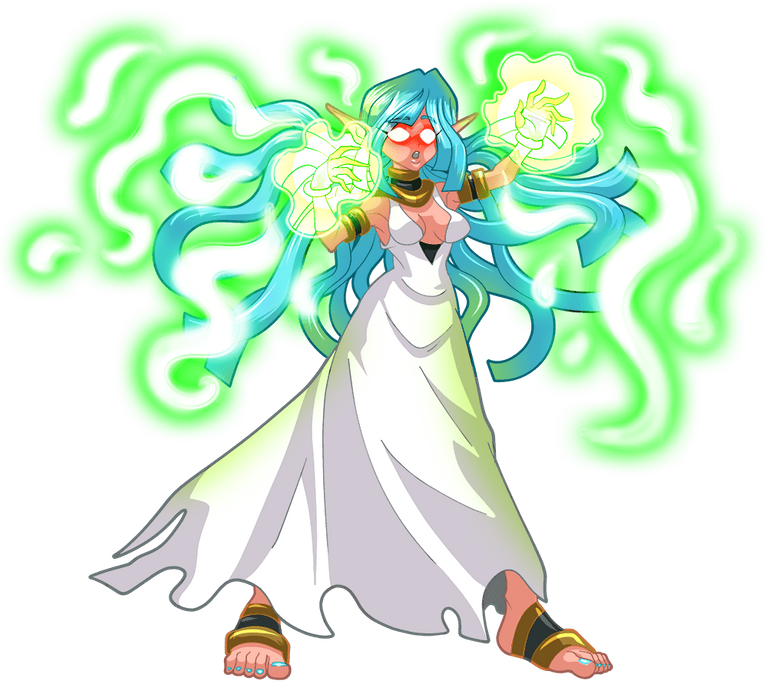
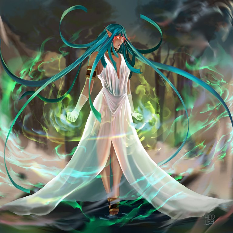
Checking the cards, I got one that made my heart go crazy, Lunakari Mistress, her design is perfect and she is an extremely powerful lady, not to mention that she does magic, and I want to keep practicing the drawing of sparkles and enchantments, I had to draw her.
Play Splinterlands Now❕


-Step 1:
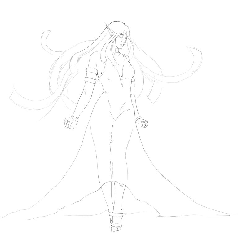
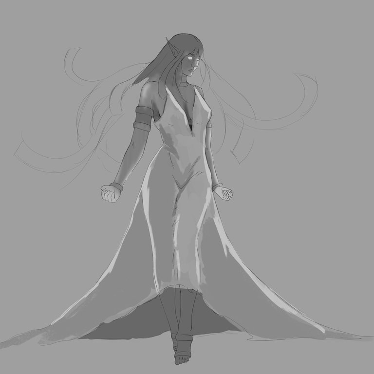
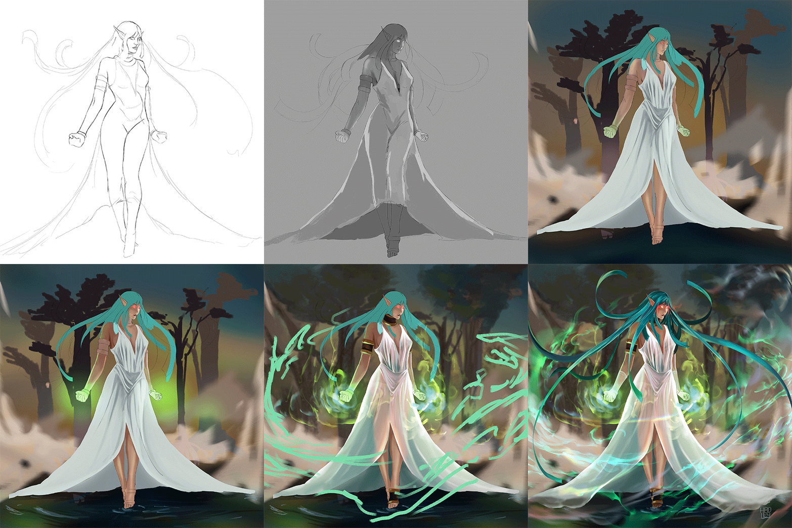
According to the Splinterlands lore, Lunakari Mistresses are at least 50% taller than humans, which is why they sketch a slender girl with long legs and arms, just like a high fashion model.

-Step 2:
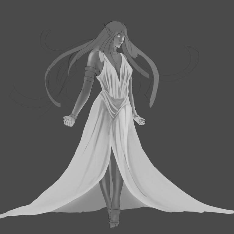
As I sometimes do, this time detail in gray, I did this not so much to fill the character and give it volume and depth as usual, but to be able to plan the shape of the dress and its folds before coloring, since I wanted the fabric of the dress to be thin and clear, to stick to the body and keep the shape of the legs.
 |  |
|---|

-Step 3:
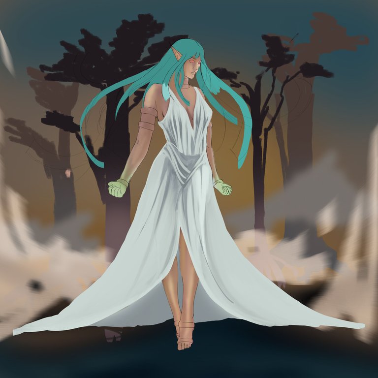
I have noticed that many of my artworks for Splinterlands usually have a bluish or violet color palette, and this time due to the green color of the magic of the Lunakaria Mistress I wanted to use other colors, specifically those of a forest, but not so much green in the grass, but a little more brown.

-Step 4:
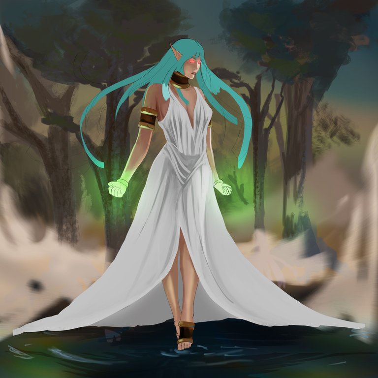
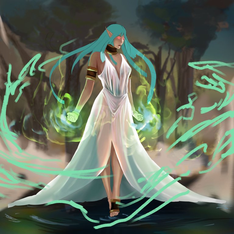
I wanted to give a lot of details to the metal elements of his arms, neck and feet, but they clashed with the overall look of the scene, so I said "I'll spend more time on them later" and I didn't, but I did manage to integrate them without stealing attention from the eye, so I decided to focus on what I was eager to do, the magic. When you see the final result you may think that it is something very difficult to do, but it is not, although you need a little patience, the trick is to give brush strokes in the direction you want it to flow and then use the Smudge tool to soften the edges and manipulate in new directions and shapes the magic glow.
 |  |
|---|

-Step 5:
To highlight even more the magic effects, you have to explore the layer blending modes until you find the one that best fits what you want to achieve, in my case I used "hard light" and "vivid light" to make the magic strokes look more resplendent, but at the same time translucent.
I left the hair until the end, because it was the element that would fill the space on the canvas, as you saw before, the background I worked quickly and even blurred it a little, because I wanted my protagonist to be the magic, and for lack of time I didn't reach to detail even more the hair, but I love the result.


I will leave you a GIF with the whole process on it, so you can better appreciate the illustration process.
Tell me in the comments that you imagine when you see this illustration.

See you in a future post!
Thank You for Supporting My Artwork
TWITTER | GHOSTMARKET |TERRA VIRTUA |NFT SHOWROOM | INSTAGRAM | FACEBOOK
⬆️ Follow ⬆️

