! [ Warning] The following publication is out of participation, I do not use Distriator and I do not like the app, so I can not advertise this application; This publication is for educational and referential purposes.

There is currently a design contest on Hive open to the whole community, it is the Distriator Infographic Contest with 300 HIVE among other things as a reward, I take advantage of the beginning of this post to invite those who read me to participate and try their luck, the rewards include recognition from @Hivebuzz, votes or the reward I am taking which is the practice of design and skills, something for me invaluable.
I have noticed that there is a disconnect between designers and users, users don't understand how design speaks to them and designers don't speak a language that users can understand, and in the case of an infographic this can be a problem; Considering that an infographic is designed to briefly explain a topic, what would be the best option to communicate that message?
In this post I'm going to give you a few tips to improve your infographics and thus have more chances to participate for the grand prize of 300 Hive.

First, know the topic you are going to talk about and the place where you are going to talk about it, the first part of this you can do easily using the Distriator app and also in the official post of the contest coldbeetrootsoup does a good job explaining what they want in the infographic and the content you should understand.
The second part is I would say that 80% of the work of any designer, a complete study of who we are going to direct the message?, in which social network we are going to publish our infographic?, what language we want to use for our infographic?
Many users skip this step and unfortunately a quality design can not skip this, it is not the same to explain the use of Distriator to young university students with technological knowledge and looking to make money, than to older people with distrust in cryptocurrencies and whose goal is to invest their savings.

You also have to think in the size of your infographic, an infographic in videos for stories is usually 1080 x 1920 for Tiktok or Instagram, but it does not work the same for Youtube Shorts or other platforms because of the positioning of the buttons; In case of images you must decide if you want them square, or vertical or horizontal rectangles, because they have different sizes images for Facebook, Reddit, Instagram, Tiktok, and you must find the best option if you want your infographic on multiple platforms.
In my house I designed a rectangular image of 1080 x 1350 px, a popular size nowadays due to the changes that Instagram made in their photos and that also works in X, Threads and BluSky, leaving almost obsolete the for years popular square image of 1080x1080.

We must thank coldbeetrootsoup who gives us the tools to do the job, as Distriator logos and brand colors, the use of this information allows you to start designing once you know all the information we already talked about, at this point you should have on your table the information (Content), the tools (Colors, language, illustrations, logos, etc) and your canvas (The program you use to design) so you just need to start using everything to create your art.
In my case I had quite clear what I wanted to represent in the infographic, it is aimed at men and women of adult age, thinking about the need to get extra money, new forms of investment and savings, and receive rewards for activities; The colors and logos as I said were provided in the official post of the contest and the canvas I used was Adobe Illustrator, because I wanted to use basic and simple illustrations and I was more suited to that space than Photoshop.
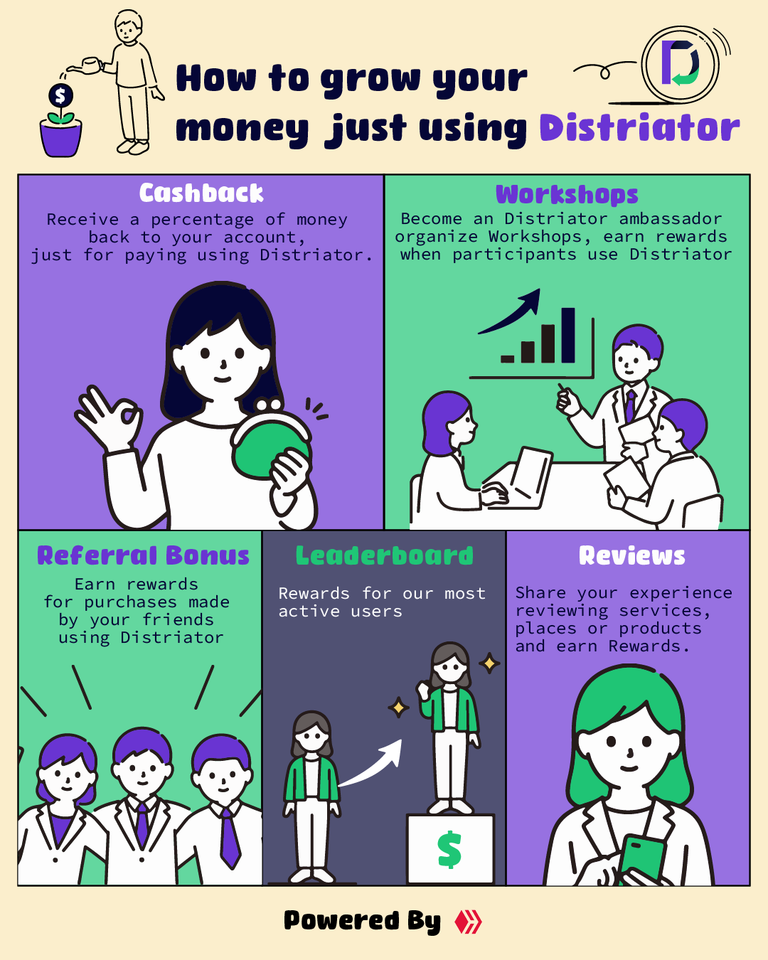
Here I present my infographic, since I saw the colors of Distriator I was inspired by a very popular Ecuadorian payment application called “De Una” and here comes my next tip associated with this; I understand that we all want to be unique and different, but design does not work with originality and inventions, for an infographic you must study other infographics, see how they communicate, see how they use colors, see the reason why they work and copy, yes copy, many people have rejection to this word but the reality is that copying is to adopt what others work and use it to make your project work.
Even Distriator uses code that was already used in other apps, and it is not a bad thing, on the contrary when something works it is good to use it, improve it and adapt it to our needs, do not be afraid to copy, take things that you think can work and adapt all that knowledge to your projects, there is a wide difference between copying and plagiarizing, so do not think that plagiarizing is right and if you think that no one will discover your plagiarism believe me that on the internet is quite easy to realize your bad practices.

As you can see in my infographic I wanted to use an easy to read typography for the titles, another san-serif to facilitate the reading of the contents, and I wanted to give a lot of importance to the images, they not only work to make the infographic attractive, they also illustrate and make it easier to filter the information in the user's memory.
On the other hand you will see that I used black and white very often, as well as a cream color in the background, this to highlight the colors of the brand, create contrast and not have a visual saturation; Technically speaking both the purple color and the blue of the distriator are quite heavy, while the green that is complementary to the purple does not achieve so much contrast with the strong blue, so specifically in this case, not using light colors (White, Cream) to remove weight to the image will end in a visual fatigue and that users are less likely to consume the entire content.

As a last tip to finish, do not saturate the user with the brand, in this case we use the colors of the brand, the logo and its name in only four occasions, although it is understood that we talk about Distriator and we disguisedly imply that it is a payment app, not constantly repeating to the user that we want to use distriator and simply mention benefits of using the app along with small references, will make our infographic does not seem an invasive advertising and that the user is more willing to consume it.
“Powered by Hive” this little trick take it as an extra suggestion, understand that Distriator is a new payment app and being new it will not automatically have the trust of apps that have years in the market like Paypal, Binance or others, so adding a brief reference to our Blockchain helps to inform new users that there is a platform that supports this new application, remember as a designer it is not about making 3 little drawings and make it look good, it is about playing with the user's mind, give him information in a language he understands, create curiosity and catch him in your networks, you are not a digital cartoonist you are a storyteller.

If you have questions from the design of how to improve your infographic you can leave it in the comments and I will gladly help you from my point of view.
Although I don't use Distriator, again I invite the whole community to join and participate in this activity; Distriator Infographic Contest with a great prize and an opportunity to practice, even if you don't win you may be the next infographic designer for another brand.
Finally and to say goodbye I want to make it clear that my infographic is not part of the contest, it does not count as an entry and therefore its distribution or the distribution of any part of it is forbidden. My native language is not English, but I wanted to make this post in this language to practice my writing, so I apologize for any grammatical errors you may find.

! [Disclaimer] All images in this post were edited by me, distribution is forbidden.
Special mention to loosedrawing for providing for free and without attribution the illustrations used in the images that accompany this post.
