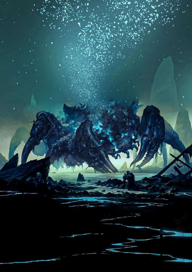
Two days ago, I created this picture and shared it on my Behance and Twitter accounts. However, there is a slight colour difference between the version I am describing now and the one posted on those platforms . This one has a light bluish tint.
I am writing this post to detail the process of making this image. I made this image using only two images and links are given below. My initial intention was experiment the blending layers, but the outcome turned out to be unexpectedly . I was totally surprised to see it at first time .
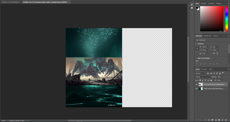
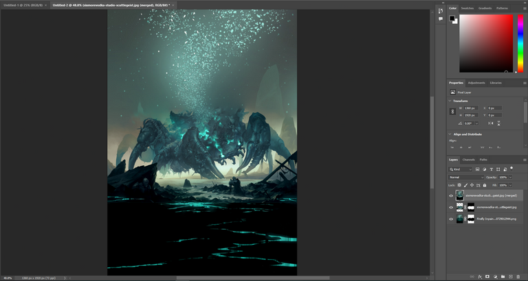
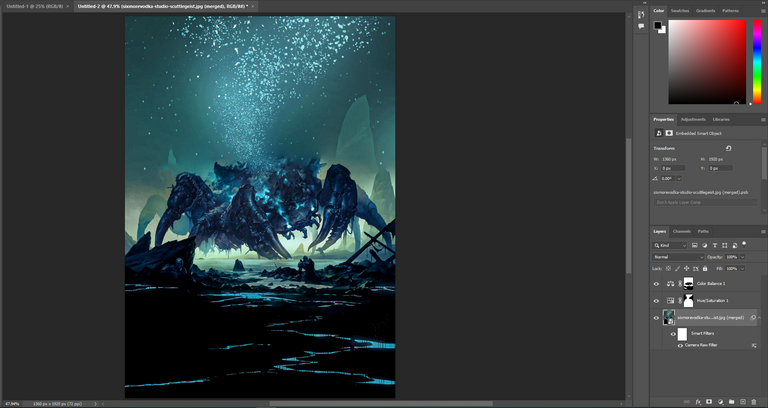
The steps I followed were quite simple. I used the resize option to reduce the size of the crab image and positioned it perfectly in the centre of the background image and used the blending layer .To enhance the image further, I decided to apply some more adjustments. I used hue/saturation, colour balance, and camera raw filters to achieve a perfect effect.
I have given the complete process here and have given links to the two images along with some pictures of my process of making it. You can also try if you want. It will only take 2 minutes to make. I hope you enjoy the end result as much as I did. Your feedback and support mean a lot to me . Thanks ❤️


