Splinterlands Art Contest
Hello guys and welcome back!
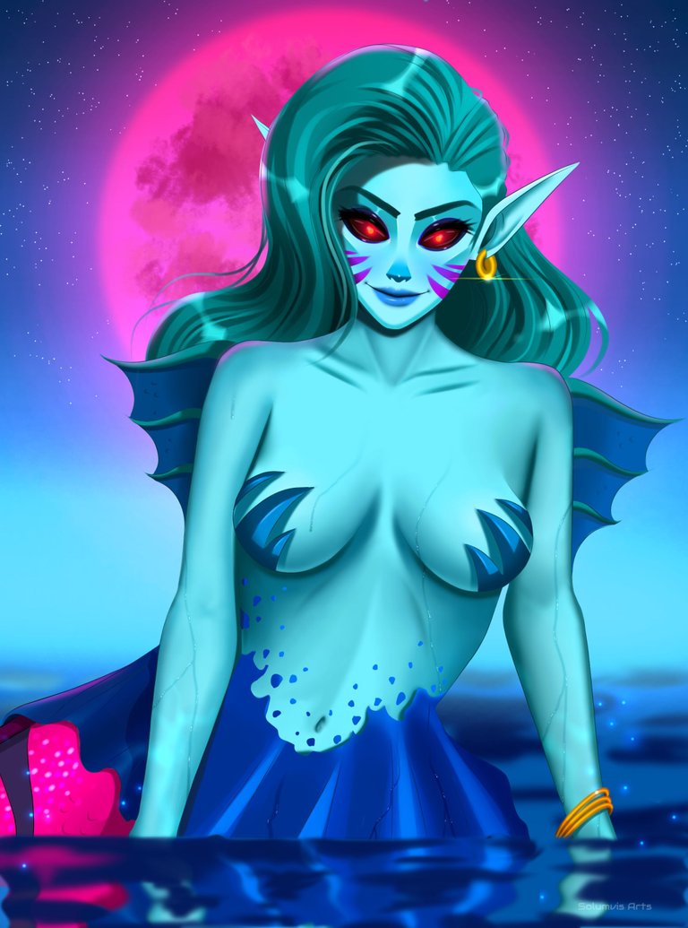
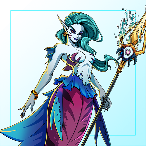
I thought I was gonna skip this week but luckily I was able to join eventhough I'm 2 days later than usual . Recently I saw someone posting about Coastal Sentry in the splinterlands social media challenge. I saw her, loved the design and loved the colour palette they used for this character. It was very suitable for a water splinter card and That was one of the reasons why I chose this card. The second reason is that I wanted to paint a character where I can add more details on the body so this character is...well, semi-naked? Yes, so it was perfect hehe. I usually just concentrate on the head and do minimalist shading on the skin. On this one, I actually did some work with rendering. I think it looks 3d enough in some parts if you know what I mean hahaha...
Coastal Sentry in my style!
Official Design
The process
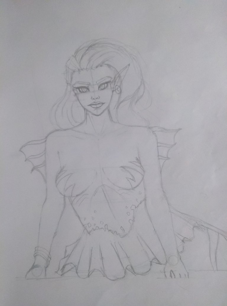
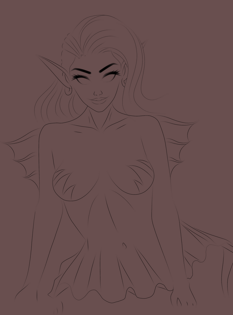
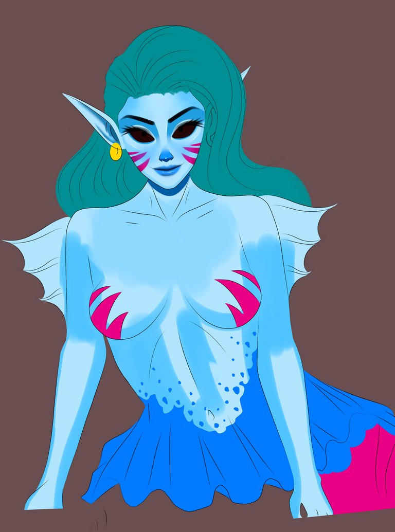
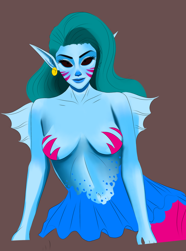
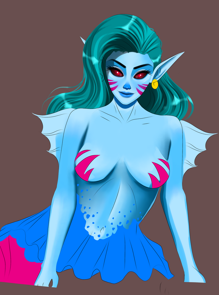

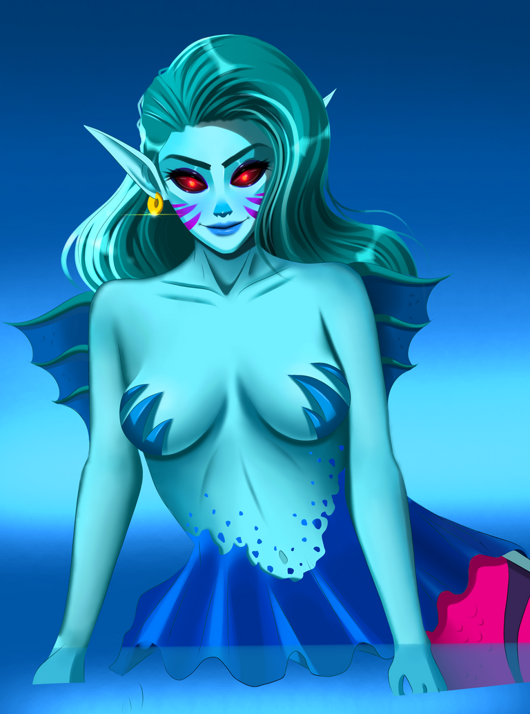
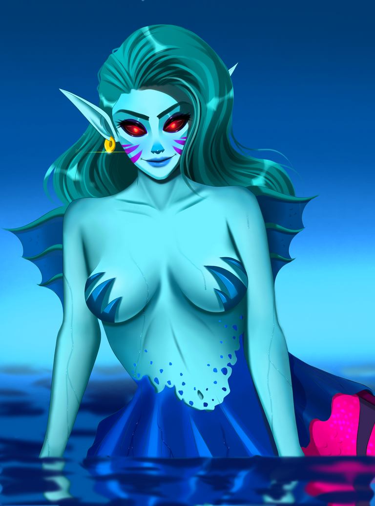

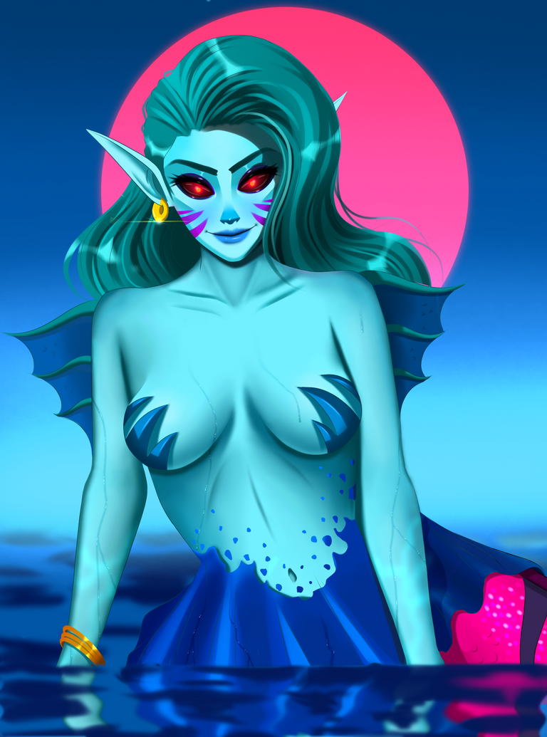
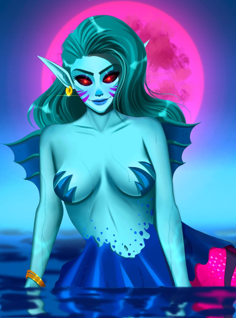


Short explanation :)
So I started with the painting the face as usual. This time I put in more time to get that refined look because I'll be doing the same with the rest of the body later on so it should at least match a bit right? This was the first time I drew eyes with a black background and dark purple eye shadows but this time painting the eyes was much easier since it's like a dot. I improved it a bit by adding glow in there because it was a nice opportunity to apply it because of the dark background. I also added some juicy highlights on both of the eyes, outside and inside as well.
The next part was the hair. I had serious doubts about drawing her hair in teal because the body also had a similar light tone but to my surprise after adding the highlights and shadows on it, the hair looks pretty good in that colour. It kinda resembles the sea in a way.
Next up was the body and this took a lot of time to finish. The first two tries didn't work out too well. It was just blurred shadows forming and I wasn't satisfied with it. As I mentioned in the intro I wanted to make it look a bit real this time. Good thing is that I already had some experience since the River Nymph I drew a while back was well-detailed like this one here. I had some trouble rendering the lower abdomen though so I improvised blending and shading in that area a lot. It was flat earlier and I believe now it has a better shape. The tail areas were much easier to paint because most of the areas were submerged under the water hehe. Still, I added much detail as I can in there. The Magenta colour, damn that definitely compliments her blue skirt-shaped fins. I need to do an another one like this soon and I think I saw a card in there will similar colour pallette. But I want to work on a OC next time because I couldn't do it this time.
The fun part on top of my head while painting this was adding those running water drops on her body. I never tried doing this before so I had to test it on this and surprisingly it was mighty easy to do. I just drew some lengthy drops on a multiply layer above the skin layer and added highlights sparsely on top of it. It's a nice touch for someone who is constantly swimming in the water hehe.
The final step was to create a good background. I choose a dark blue background and painted the horizon area with light blue on a glow layer and the part infront of her is painted with her reflection plus shadows created by the waves in a blurred form. After finishing the water rendering I felt like the sky is missing something so I painted a Magenta moon behind her and added detail on the surface with a watercolour brush to show the depressions on the moon and airbrushed the background to make it look like it's glowing!
That's pretty much it guys. I think I covered all the important parts here.
A problem!
I noticed that the first 9 WIP shots has better quality than the rest and main image. What I found so far is that the ones with better quality has more than 2MB in size (same resolution) and the rest have 0.2MB (same resolution) in size after upload so slightly zooming the main image is showing pixelated quality which is more noticeable around the hair.
If anyone knows how to fix this issue please let me know in the comments section. It's important that people see artworks in the intended quality because of the small details we added in there.
Tools used: Ibis paint x, notebook and pencil
Duration: 15hrs
