Splinterlands Art Contest!
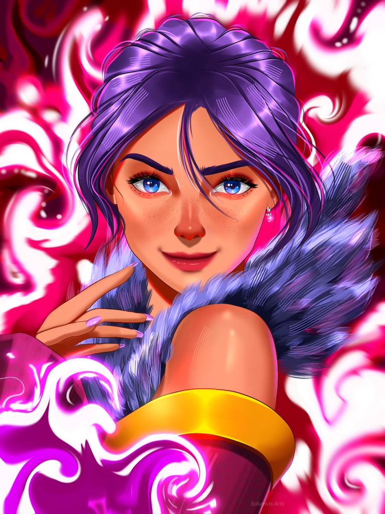
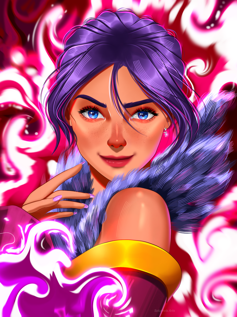
Hello guys, how's everyone doing today? It's Friday so I hope you guys have a wonderful weekend. As for me, I was just busy preparing this artwork since yesterday to post here now. I picked Water Caller from the Splintercards this time to draw. It's been a while since I drew a portrait in semi realism so I thought this card would be perfect to paint especially the hair. This painting and it's background was heavily experimented with different sorts of brushes to reach this point. I let myself free while painting this so I had so much fun this time. Well anyway, enjoy the painting and the process below
:)
Water Caller
The Process...
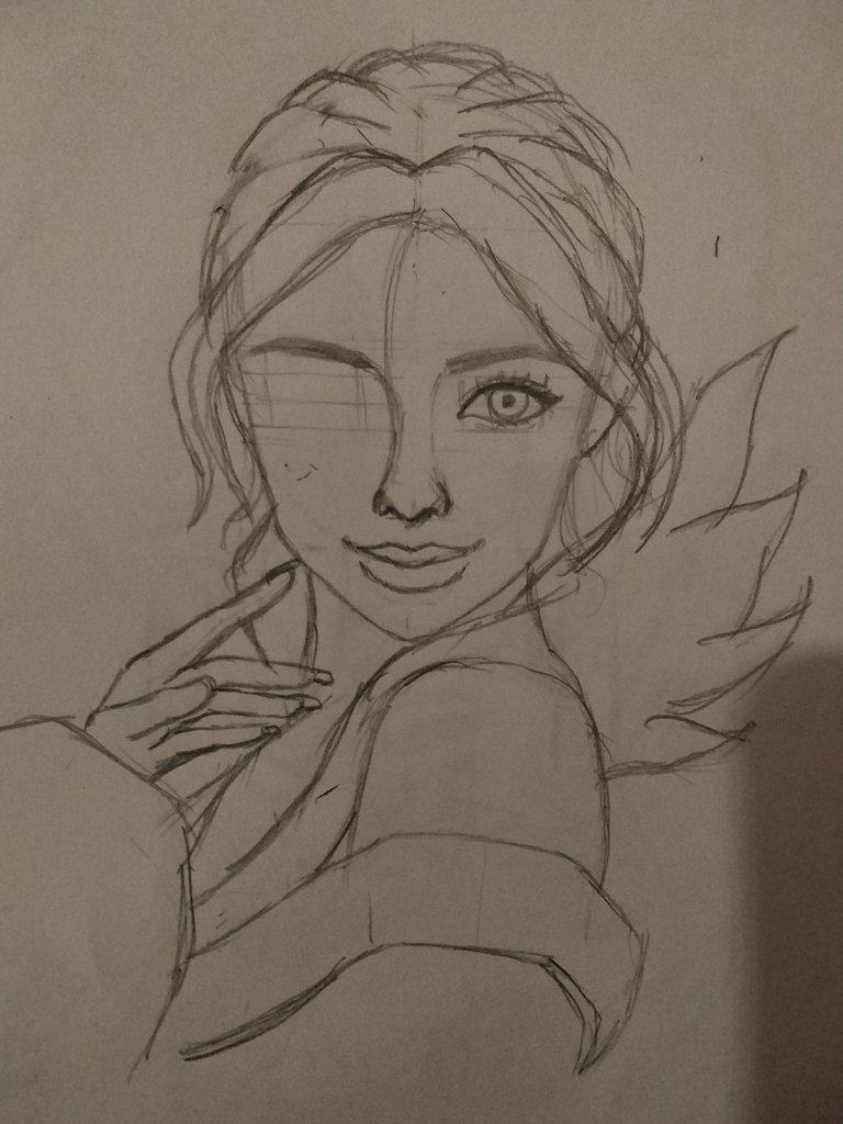
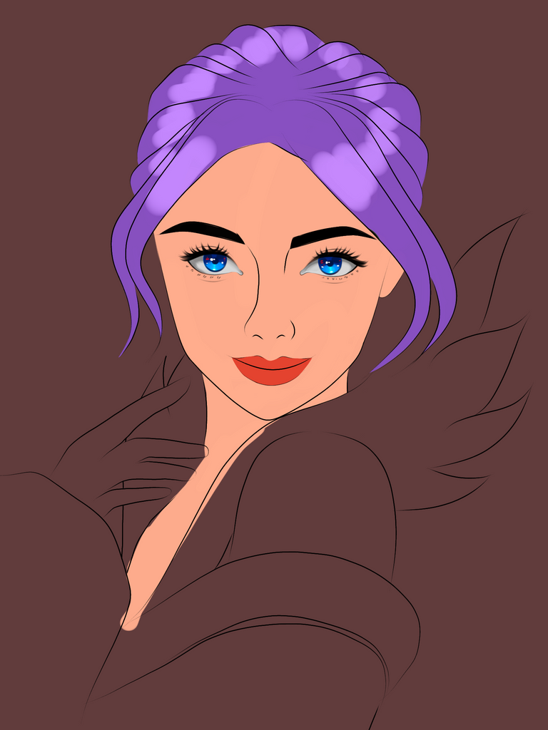
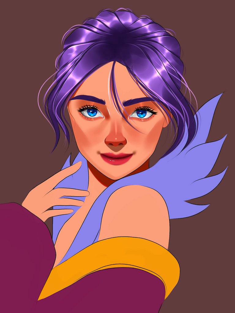
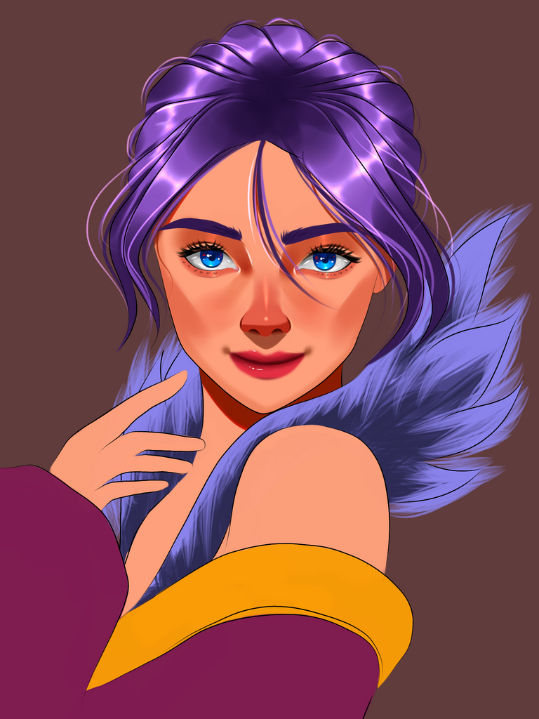
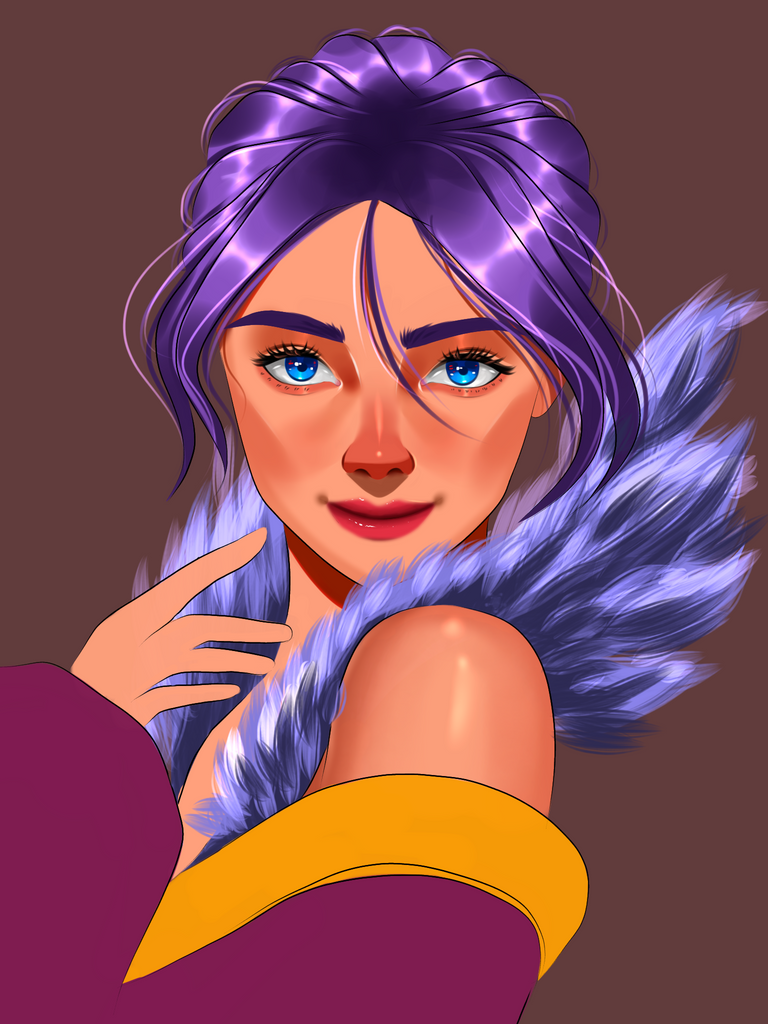
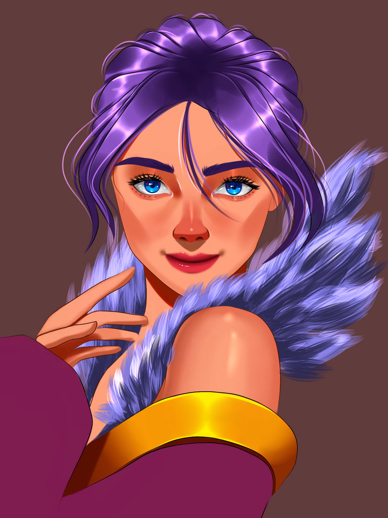
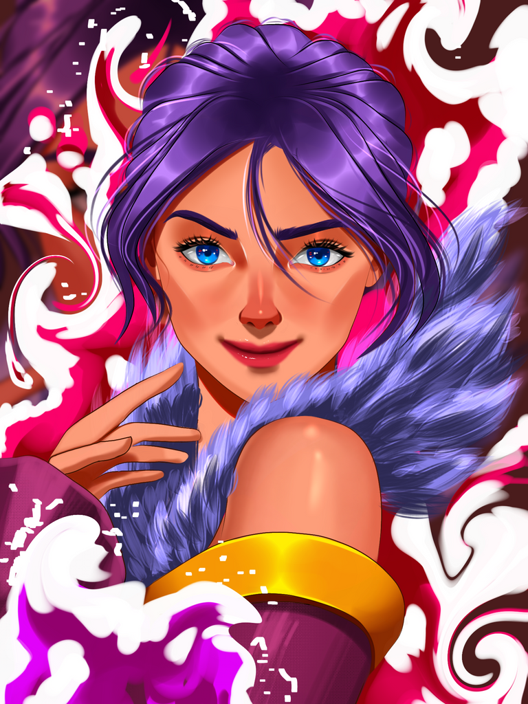
As I mentioned in the introduction I really wanted to play with the hair this time so choosing to paint a portrait is the way to go. I found a good reference from Pinterest and started making the sketch and to my luck the sketch came out pretty good and didn't have noticable mistakes. That really gave me confidence to move forward xd. I made clean lineart on my Ibis app and if you notice I made the eyes a bit more detailed this time, especially the shape you know. I always felt like something was off with the eyes on some of my old works so this time I studied drawing realistic eyes before drawing this so this came out pretty good.
After finishing the lineart I painted the base colours in it. I wanted to paint the eyes first so I did that by selecting blue colour. In the official design the eyes are closed so we can pretty much choose any colour that we want but since she is a water splinter I decided it's best to go with blue since water is represented by the colour blue most of the time. I did something different with the eyes here. I added hints of red in there near the pupil for the contrasting effect. I usually don't bother with this while doing full body painting since it's not very visible in them. Then I finished it with adding some highlights on different parts of the eye.
I moved on to painting the skin after this and decided to keep the skin tone a bit orangish since blue eyes can be complimentary to orange tone. Added shadows and on parts which was hidden from the lightsource, also added a red stroke as a border between the transition to base tone to create a nice effect there. I used this on multiple parts of her body. It kinda improves the quality of the painting. I have been studying to pair realistic paintings since a while now so I applied some techniques I learnt there on her face here. After adding blush and other defining details on her face I used airbrush triangle to add highlights on her cheeks instead of penfade brush. To my surprise it worked so well here and notice that I moved the highlight position of the nose form left side to centre. This kinda creates a nice 3d effect without much effort. Painted the under side of the nose darker and added the ambience bounce light under there as well and removed the nose lineart completely from there. Finally I finished rendering the face by adding some freckles. It gives of the feeling of a realistic skin.
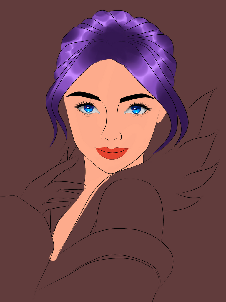
Ah yes, we reached the part that I was more eager to paint, the hair hehe. I painted the highlights first and added shadows on the opposite sides of each strands. Then I amplified the highlights by adding one more layer in an add layer and blured it. This will make the hair look very soft and silky. Added a bunch of hair strands in there and that was it. Pretty easy right? Except it wasn't haha. I also added pink strands in there as well because later on I made similar colored background.
Next up was to paint her clothes, it was done pretty quick and I did do something crazy with some new brushes there. I kinda like it, instead of using boring textures the new brush which is actually the hairbrush helped me to create intresting highlights on the clothes.
I wad very satisfied with the painting and now it was time to paint the background. I did some experiments but the one you see made it to the final output. I made some waves, painted white highlights on its edges and added shadows randomly on different parts of it. Then I blured the background a bit. I thought maybe a glowing wave would be much better so I airbrushed on an add layer above it to create the glowing background. This looked much better then plain waves and that was it and the painting was done :)
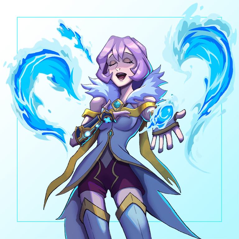
Official Design
Result

Tools used: Ibis paint, notebook and pencil
Duration: 8hrs
Pose reference
Thank you so much for your time 😊


