This is an interesting contest so far, I have learned from many ideas from this contest where people are designing a beautiful leofinance application with various tools that I don't know myself are too good to be use for this designing.
So I came up with another test method using Corel Draw X7. Although it is very difficult to do in Corel because it is not a drag and drop design like Canvas, Figma.
Hereby, present to you Leofinance application design with Corel X7
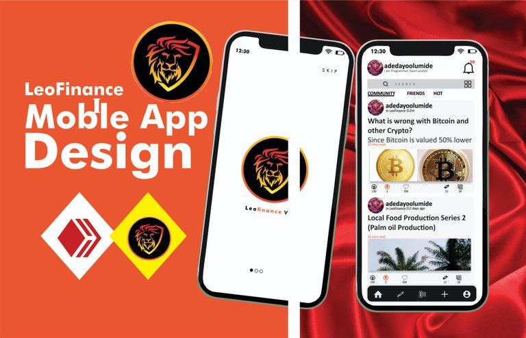
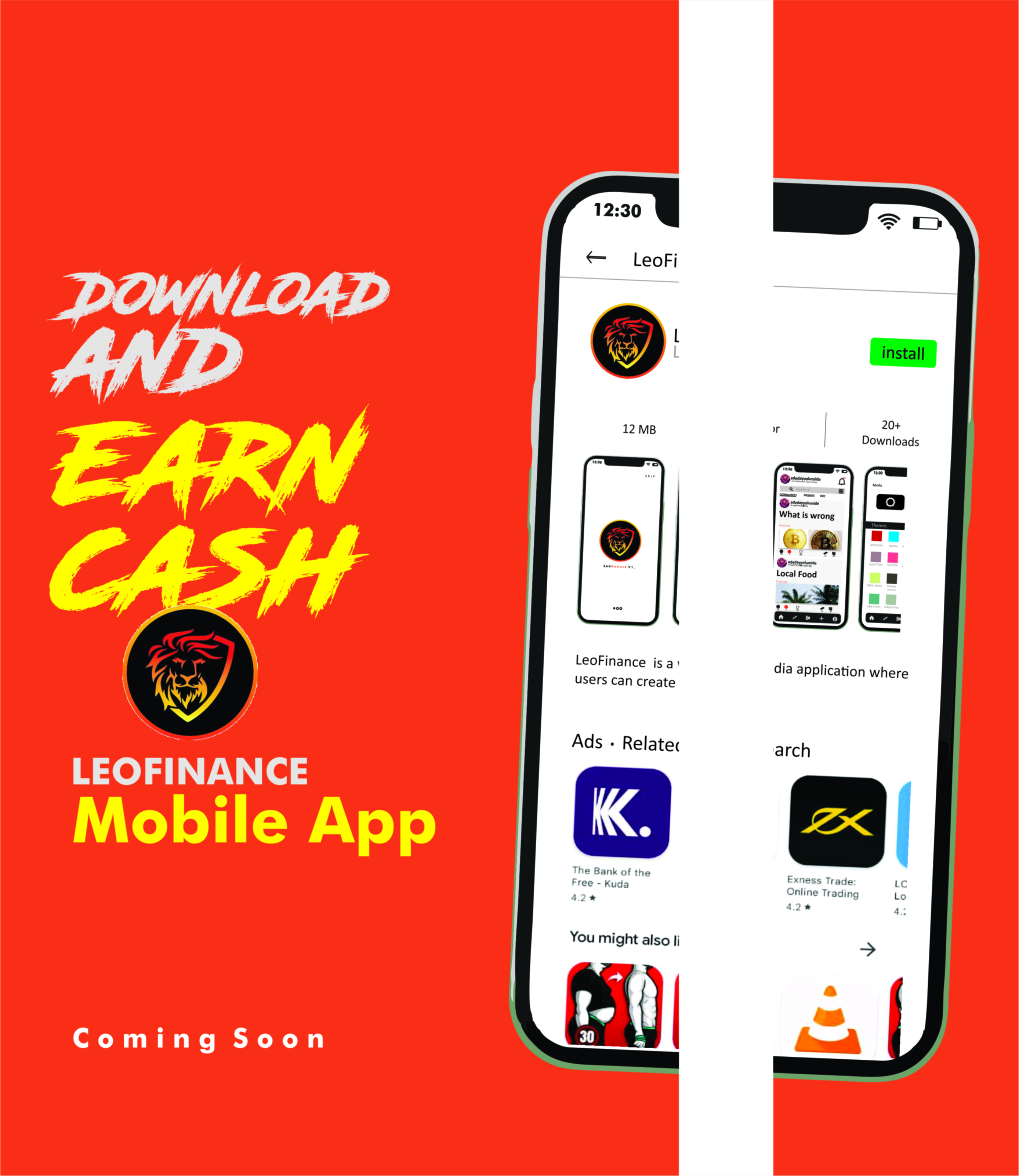
Hereby I present to you Leofinance application design with Corel X7
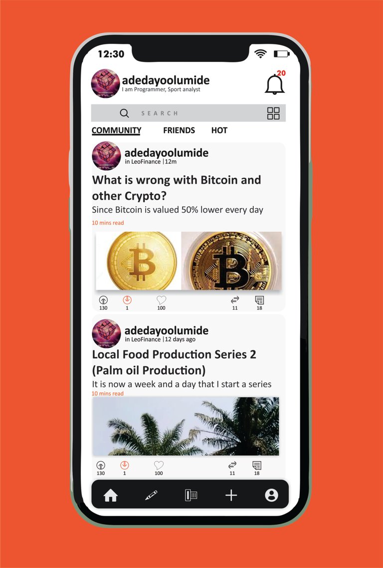
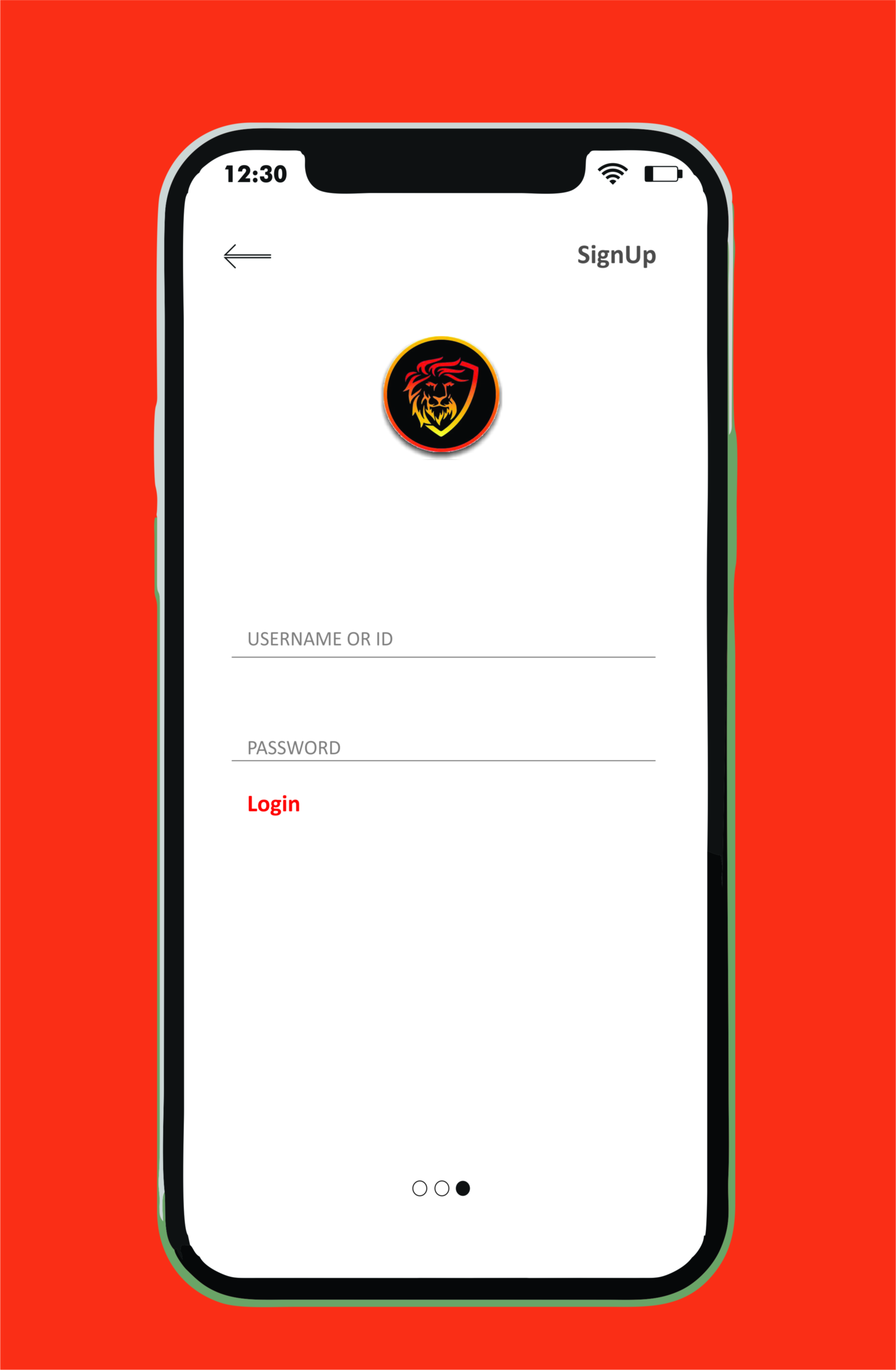
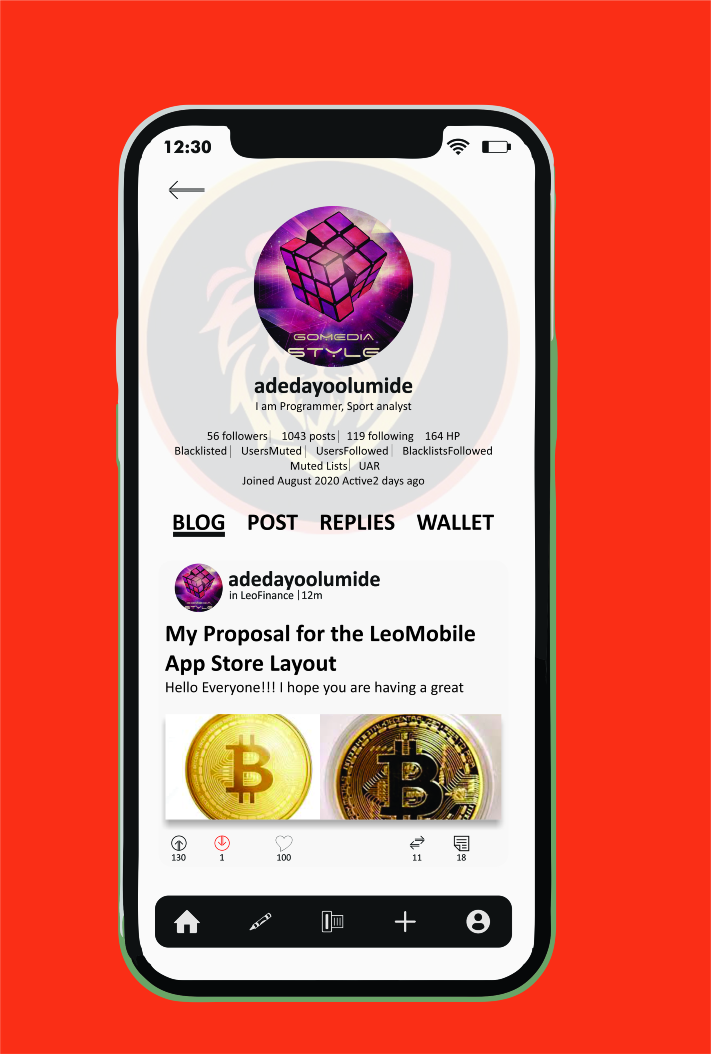
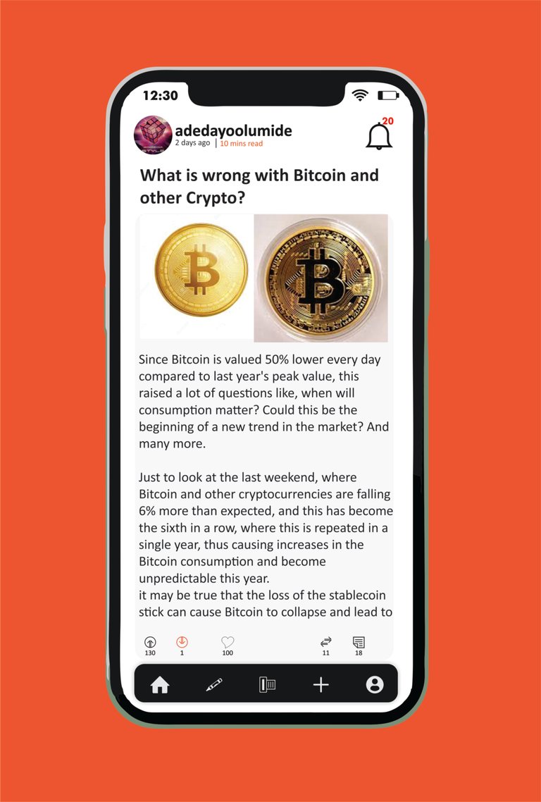
I made some changes to our current Leofinance Mobile App. The App home page gives us easy access to only curated articles and news feed articles, so I created another home page that will give access to find an article from our friends and link leofinance to other Community.
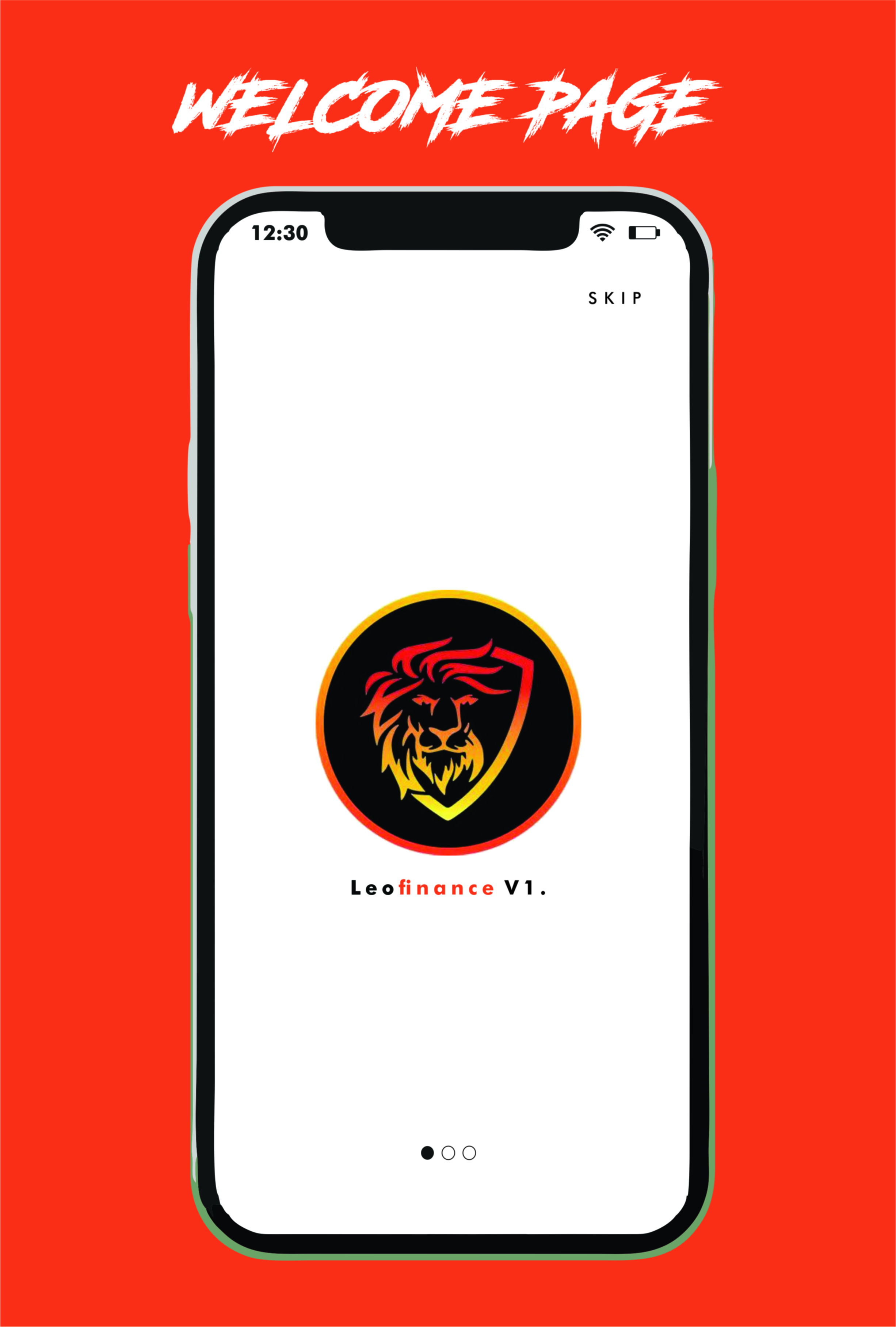
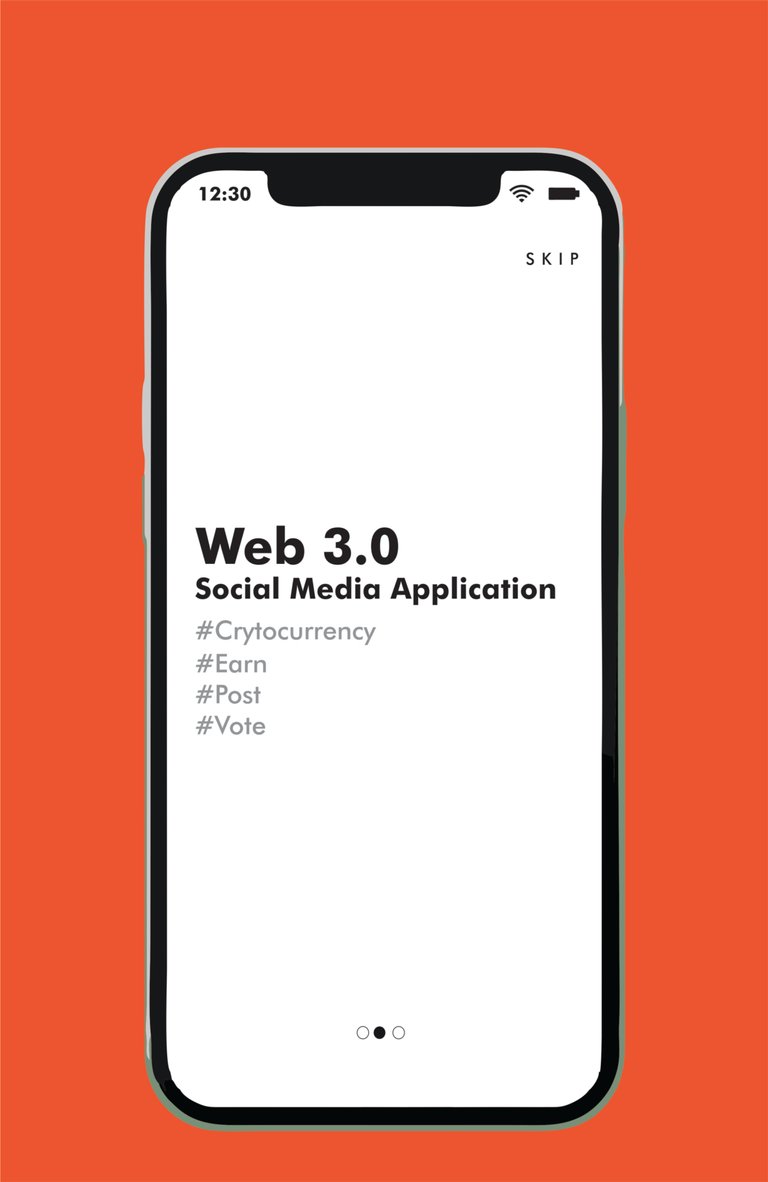
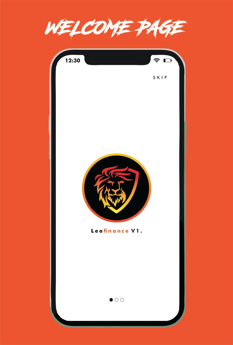
The first page of the leo mobile looks attractive with little information about the Application.
| P 1 | P 2 | P 3 |
|---|---|---|
 |  |  |
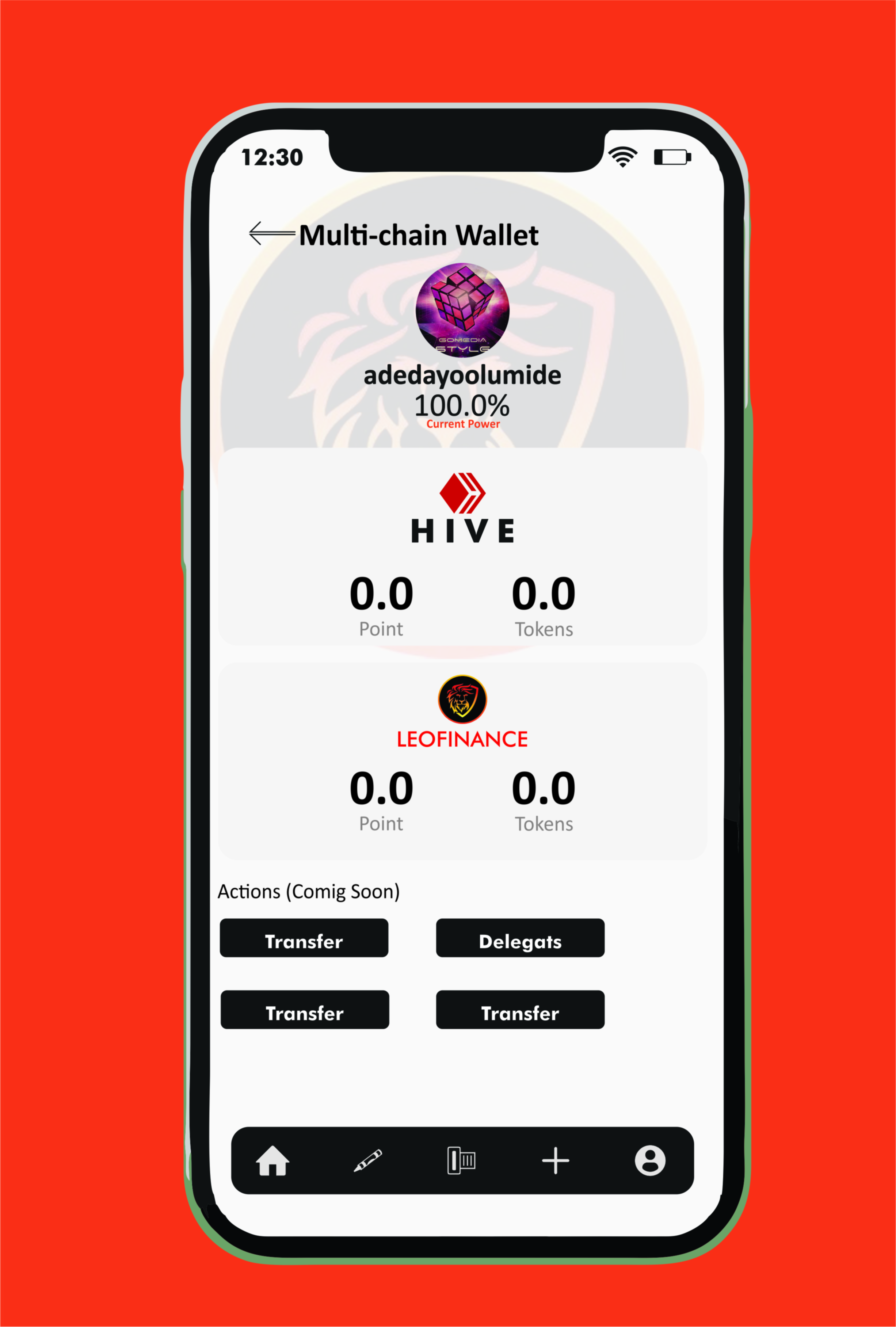
Getting access to Multi-chain wallet, easy access to other token by swap,buy, and sell your tokens.
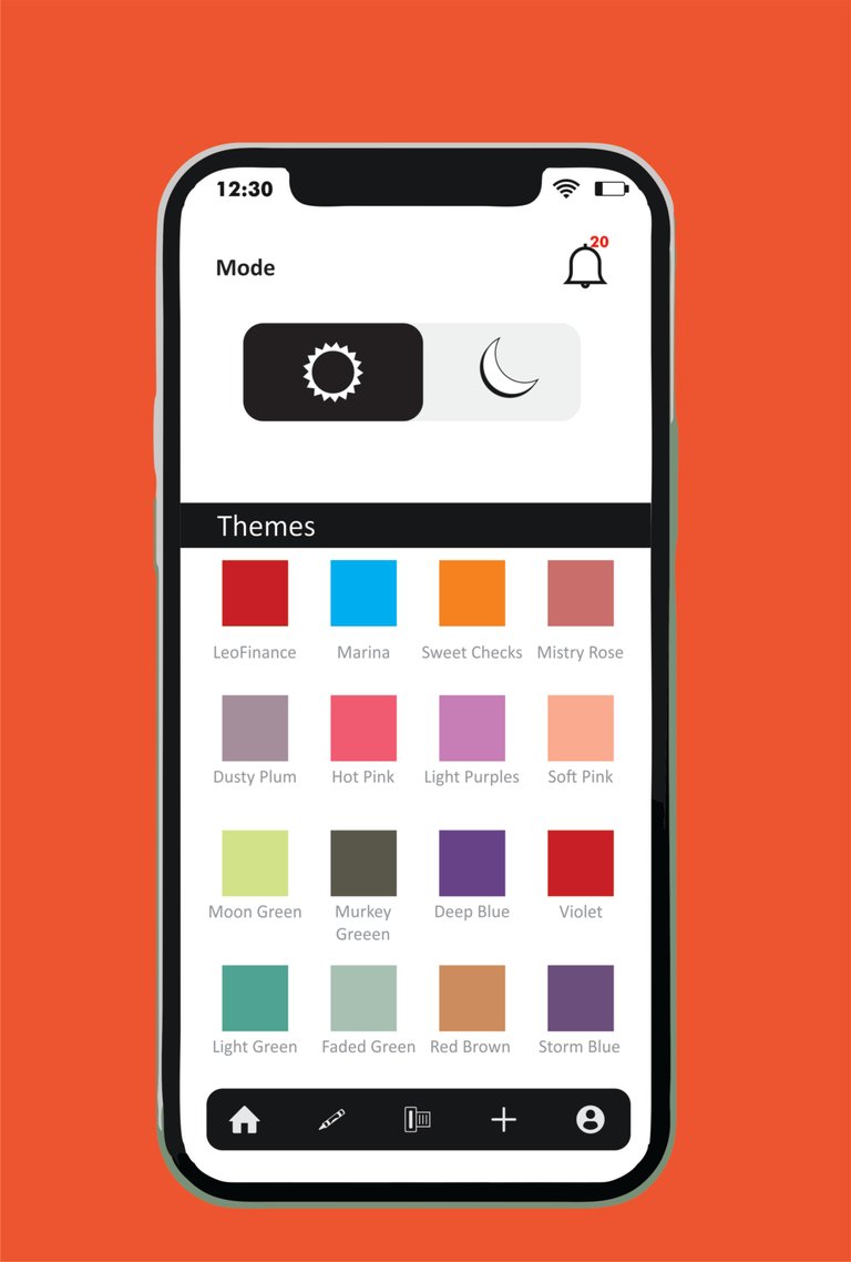
Play with the color of your choice, this will look unique than the current Leo app, because when you change the color, it will change the color of the entire app including the first page that appears when you open your app. As shown below
When the color is changed to black, it affect the entire App color and transferred them into black.
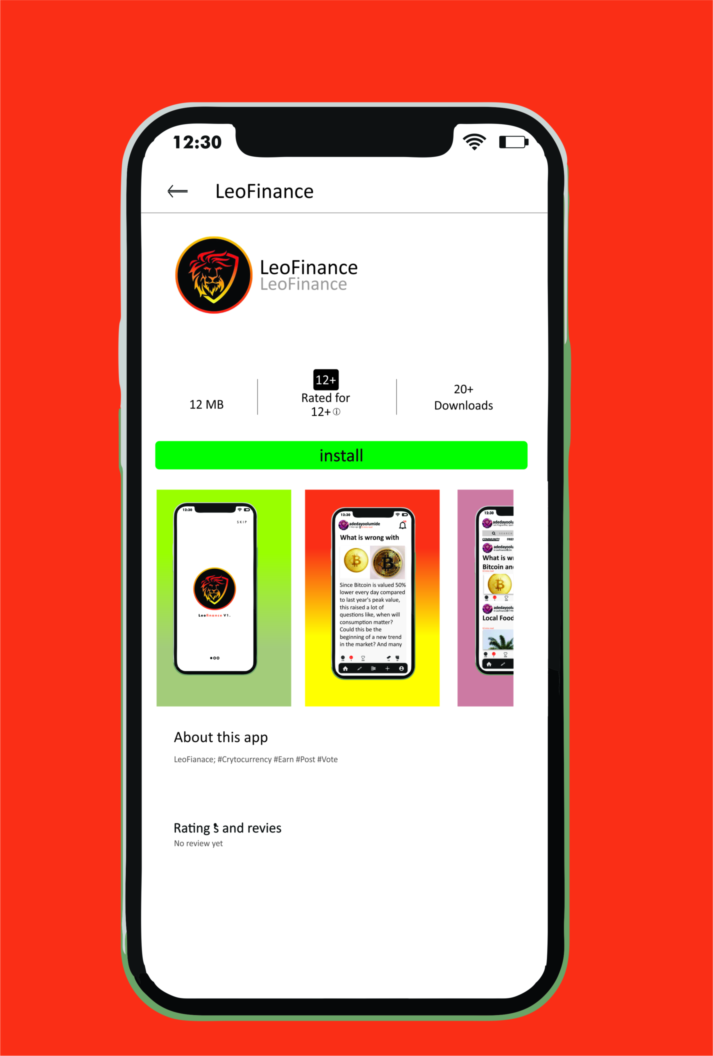
This introduces you to the Google Play Store download layout that will easily promote the web3 app and let people visit it with a short description that gives more information about the app.
I chose from all my listings Designed to create a simple advertising Goggle play store design.
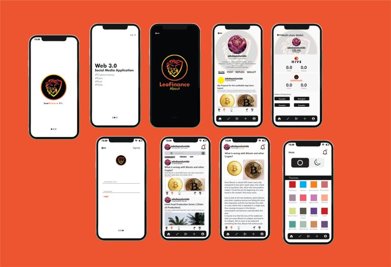
Thereby I introduce you to Leofinance V1 Applications Design layout using Corel X7
Posted Using LeoFinance Beta
