Hello Reader,
A few days ago, One thing led to another and I decided to get the Leofinance app. Sometime last month, I tried to install the app, I searched but it wasn’t available on my App Store. I was confused and just ignored it and continued using Leofinance.io, it’s highly effective anyways. After some time I decided to try again, this time I asked some questions and did a tad bit of research and voila! I got the app.
The Leofinance.io is great and effective but the app is just an entirely different experience. I recently just started User experience tutorials and I must say the Leo mobile is offers a better user experience for the users of Leofinance platform. The design, branding and functionality of the Mobile app is amazing. I can’t tell that it had been designed to offer an improved and better user experience from Leo finance.

The Leo Finance community is easily the most progressive community on the blockchain so it’s a great move with the mobile platform to give the members and users of the community a better user experience.
When I first joined Hive, I had a hard time adapting to the many uses of the website in general and wished it had a mobile outlet because I was used to mobile platforms. The designers of the Leo-mobile really snapped with it because the features and user interface are amazing.
Here are some of the features you’ll love about the Leo Mobile App.
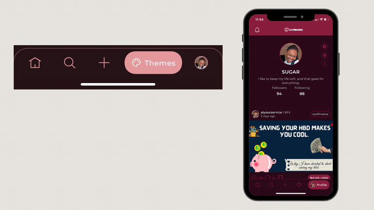
THE SEARCH BUTTON.
I’ll tell you this, using the Leofinance.io can be okay frustrating because there’s literally no search button. I remember wanting to leave a comment on a post, I read the post using peakd but I wanted to engage from the leofinance.io, I couldn’t search for the user’s handle and I quickly went to the mobile app and did so.
I find the search button super helpful and I’m sure every other user feels the same way. So, if you feel frustrated because you can’t search for posts or users using Leofinance.io then quickly port to the app as it eliminates that problem.
NOTIFICATIONS.
This is freaking amazing, enabling push notifications means you get notified once there’s an engagement on your account on leofinance, that way you stay in control in full awareness of what’s going on on your hive account via Leo finance; I find this really helpful.
DIFFERENT THEMES.
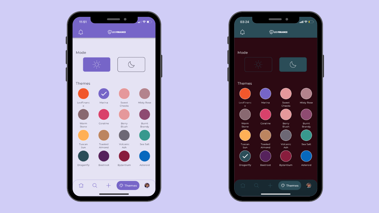
This aspect is so cool and aesthetically appealing. They’re sixteen different themes to choose from and they all look amazing. There’s the standard Leo finance theme, Marina, Sweet cheeks, Misty Rose, Warm Stone, Berry Blush etc. I’m currently applying the Sweet Cheeks because I like nude colors but they all look great.
It allows you to have a different feel to the whole blogging saga. Love it. There’s also the night and day mode and I quickly switched to night mode because I like having my mobile on steady dark mode.
VOTING SLIDE.
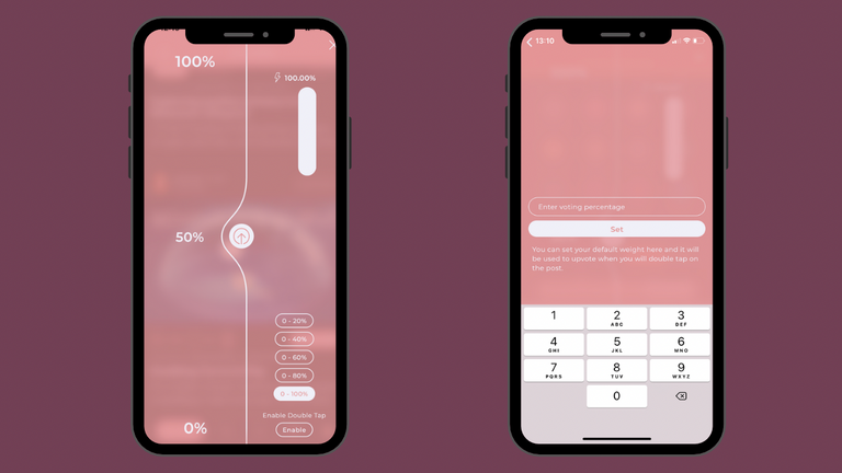
I’m not exactly sure what to call it but the voting button and slide is to die for. I struggle a lot on the other front ends with selecting the percentage of my upvote especially when I have my nails fixed, but the model on the Leo Mobile is insane. It actually covers the entire screen and you have to slide it up or down in a swirl. So cool. Also, there’s an option to set a default voting percentage when you double tap in a post but that didn’t seem to work though.
BOOKMARKS.
Next to the comment button is the option for bookmark. This is a great addition, one which I utilize very much on Twitter. Allowing you the liberty to save posts you’d like to easily access again later.
DISPLAY MODES.
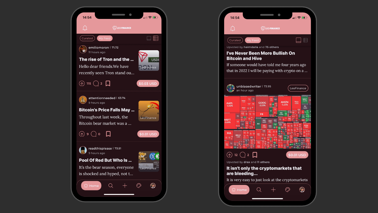
There are two display modes- the posts appear larger in one, while they are a bit compressed in the other, allowing for more content to be displayed, which is really cool. The Home Screen is dope and I haven’t encountered any glitches so far. The curated feed and following feed buttons are just next to each other allowing for a smooth transition.
ROOM FOR IMPROVEMENT.
Generally the app is amazing and the transitions are really smooth, however it is still being tested and there’s always room for growth. One particular thing I’ve noticed so far that posed a difficulty for me was in the upvoting part. When I tried to set the default voting weight, I discovered that I couldn’t go back to the Home Screen, I was just stuck on the screen displayed in the image above. I had to minimize and close the app I order to open it again.
When I tried again, this time I imputed a voting percentage, it worked fine but when I tried to disable, I discovered the disable button wasn’t functional at all.
The app is an amazing project and I know this problem will be fixed once the designers are made aware of it.
 |  |  |
|---|
HOW TO GET THE LEO MOBILE APP.
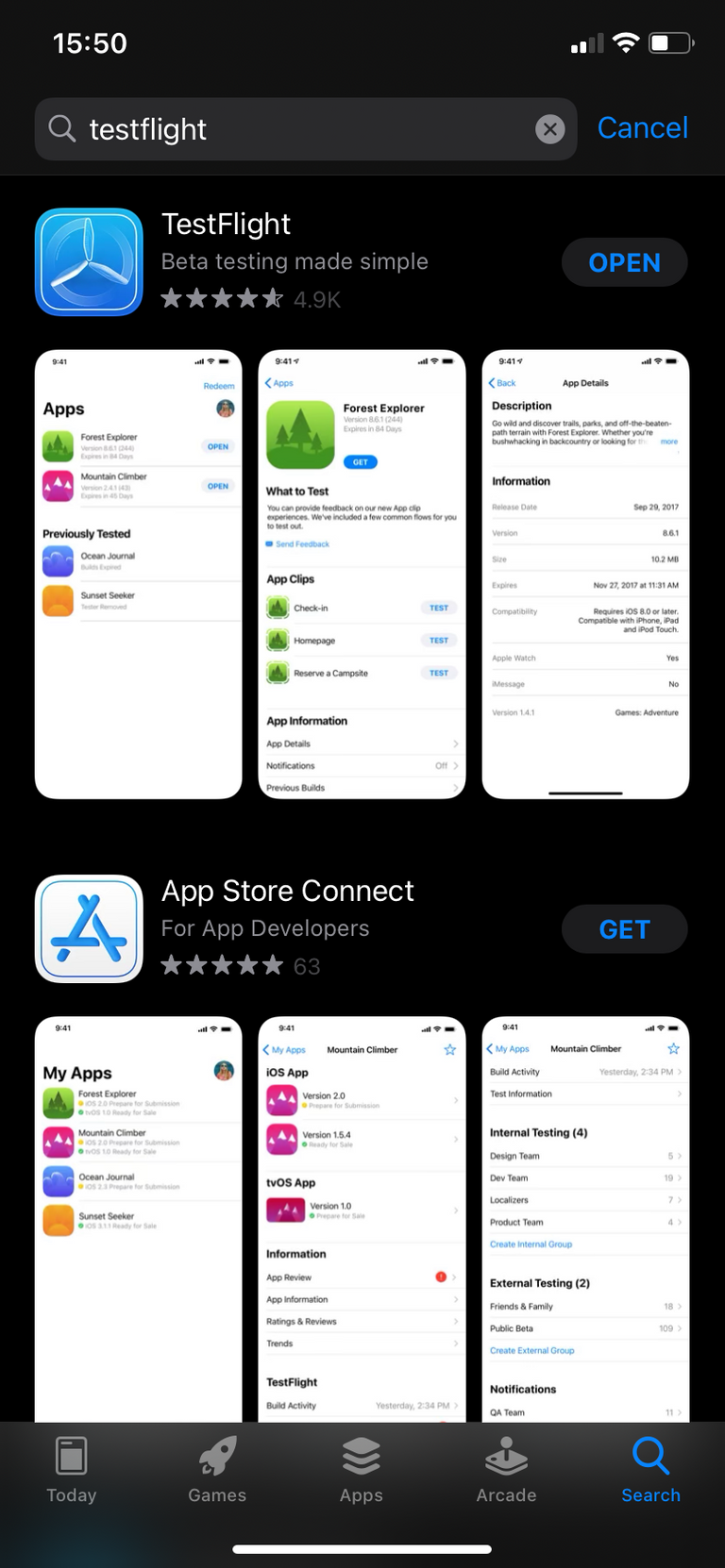
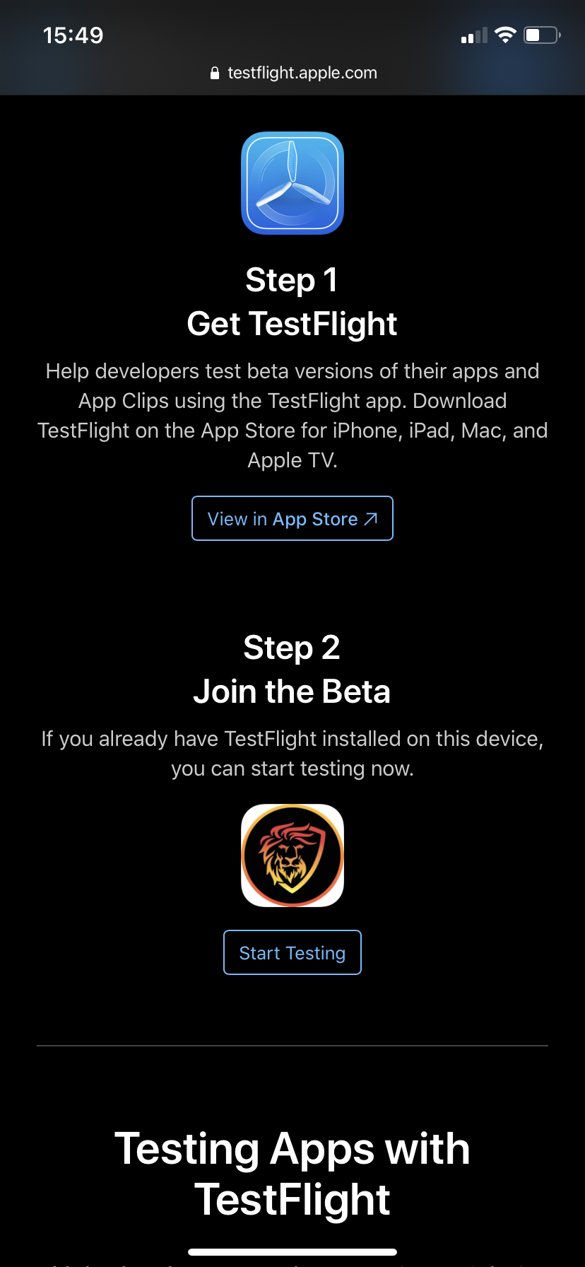
I mentioned earlier that the app isn’t on the the App Store yet, so here’s how you can lay your hands on it if you don’t already know.
First.
You have to download the TestFlight App from your App Store.
Second.
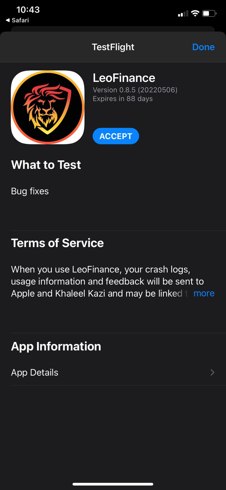
Click on the link below: and accept the invite to install and use Leo mobile app. It’s pretty simple.
IOS:
https://testflight.apple.com/join/cskYPK1a
Android:
https://play.google.com/store/apps/details?id=io.leofi.mobile
Thank you for reading. I hope you found this helpful if you aren’t already using the Leo finance beta app.
Posted Using LeoFinance Beta

