First of all Congratulations to all of us because we are experiencing such great development from the LeoFinance team. I am writing this post from the new Interface itself.
It's Fast
Yes, the first impression of the new UI is that it's pretty fast. Previously the old Leo Finance interface was fast too but if we compare it with the new interface, it is surely the quicker alternative. Along with that navigation between two tabs does not take much time and which makes the user experience much better.
Since I am a developer myself, this is what we always try to fix in our application too.
Threads are the Priority
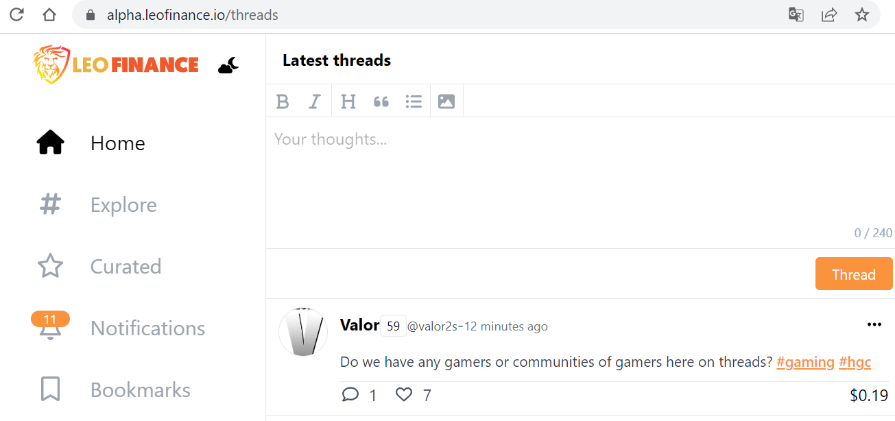
Yes in the new UI, threads seem like a priority where it will surely become the better version of Twitter on Web3.

Writing Post UI Needs Improvement
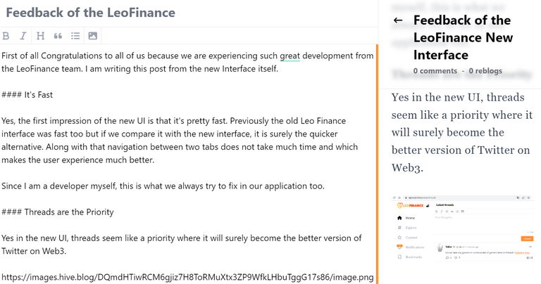
As you can see below diagram I am writing posts from the new UI where we have both writing and well as post preview. But the maximum size is being taken by the writing itself and thus there is no way to shrink it which makes it harder for doing the post preview as of now.

Console Error
I know it does not affect the User Experience or Perferformnace, but it should be looked at. When we open the new UI we get a bunch of console errors which should be looked at.

Color Improvement
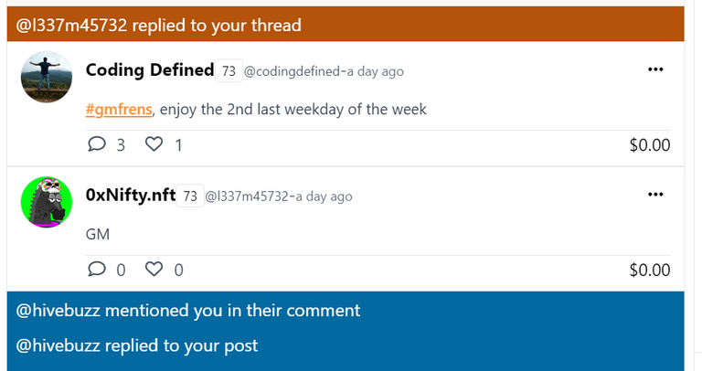
I am not sure if is it me but I am not liking the colour combination in the notification tab. Either it should be the same as the official colour or it should be a little lighter on the eyes.

SEO Improvement
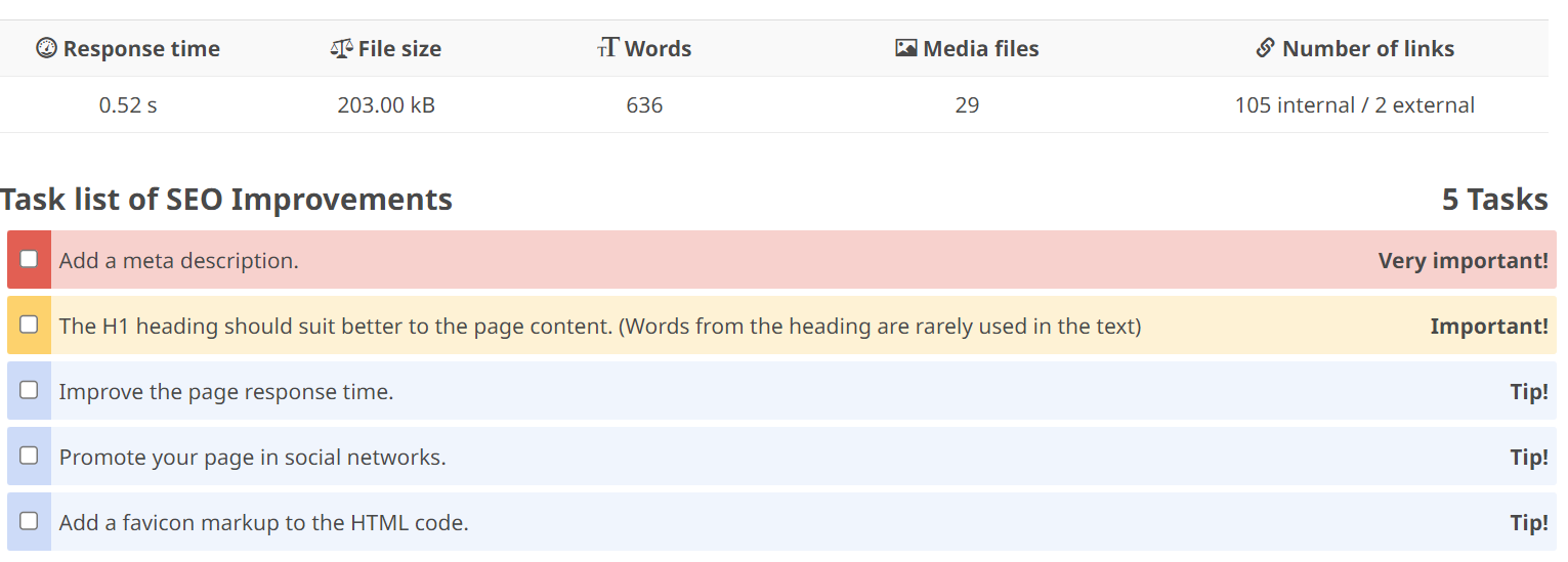
I checked the SEO of the website and thus we are missing some of the Important SEO tags, which need to be looked at. Along with that, the Favicon of the new website should also be looked at. As of now, it is showing blank.

I know this is just the start and we will see more and more improvement in the new UI. And a lot of missing pieces will get added here.
Posted Using [LeoFinance Alpha]https://alpha.leofinance.io/@codingdefined/feedback-of-the-leofinance-new-interface
