
Yesterday, I stumbled on this Tweet:
"Hmm. What is this showing me?" I wondered.
tldr;
Year over year percent change in money supply is not the same as the money supply.
Reasons for that Tweet
I know nothing of mikemcglone11, but I'm now wondering...
- Is he just another never-Bitcoiner?
- Is he just trying to throw out a hot take as clickbait?
- Is he being deceptive?
- Is he just being a bit careless?
- Is he struggling with math?
- Am I wrong?
Not sure of the reason for this graph and interpretation, but here's my thinking...
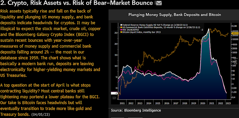
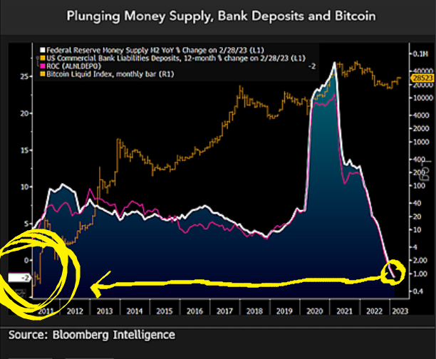
The "money shot", the "Oh snap!" moment on the graph is the white line shaded with blue. Particularly, the sudden moonshot and drastic decline is the eye candy. That's the Wow! factor alluded to in the title "a thousand words in a chart." Frankly, I can't even tell what the gold colored line is since two data sources use gold/yellow in the legend and I only see one on the chart. Regardless, the white/blue is the money shot anyway.
The chart is titled "Plunging Money Supply...", and this is where my eyebrow rises. The legend clearly labels the white line as "money supply M2 % YoY Change." Wait, this is not the money supply, this is the percent change in the money supply. To present it as "plunging money supply" is either careless, or wrong, or worse, intentionally deceptive for some reason.
My guess...if I had to guess, I suppose someone was playing around and clicking some toggle buttons on some fancy charting tool. Clicking toggles is fun. Push "Go." The software ran some data and spit out a pretty graph. We like pretty graphs. Ticking "money supply" didn't look too dramatic, so it wasn't included here. We like dramatic graphs. Untick that. Ticking "percent change M2 YoY" wound up looking dramatic, so it was included. Then, the author misinterpreted things as plunging M2 in a hurry to get it out into the wild. And, here we are.
The actual M2 money supply can be seen at https://fred.stlouisfed.org/series/M2SL. On that chart, it's evident that the M2 money supply is, in fact, not plunging.
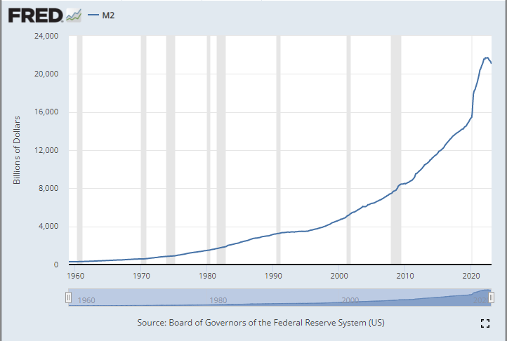
The M2 money supply chart above from "FRED" looks very different as compared to the percent change M2 money supply YoY in the Tweet, doesn't it?
To be fair, the Tweet author is speaking of liquidity in banks as declining. However, I simply don't see that reflected in the chart. The clear message implicated in the graphic is via the nose-diving white/blue chart. Combined with the discussion of M2, the message is couched as drastically declining liquidity in M2, supposedly visualized in the white/blue graph. It barks...
"OMG! Look at how little money is out there! Look at it dropping fast! That's a thousand words in a chart! It's a liquidity rug-pull!"
Again, the white/blue stat in the Tweet is not showing money supply. It is showing percent change in M2 money supply year over year.
Math time
Let's go back to 7th grade math class with that weird teacher we all had. The formula for percent change is usually shown in one of two ways: (1) (d/o)100 or (2) [(n-o)/o]100

My 7th grade math teacher taught me the (n-o)/o formula is better. Using d/o works, but 7th graders sometimes mess up when the % change is actually negative. When the old is 100 and the new is 95, they tend to think, "Oh, the difference is 5...it's a 5% change." Nope, it's a -5% change. Using the (n-o)/o formula prevents this oopsie.
YoY chart fun
Let's talk about year-over-year (YoY) percent change. There's a good explanation of YoY % change here: https://blog.golayer.io/finance/calculate-year-over-year-growth. She's smart so she uses (n-o)/o.
In the case of % change M2 as shown in the Tweet's graph, we need a data set for M2. The FRED chart above shows the numbers. My guess is the tweet author is drawing from the same data...he references "our database" going back to 1959, peculiarly the exact year the FRED database goes back to. I imagine the data set could be downloaded and graphs constructed, but (1) I don't just not feeling that geeky right now, and (2) I'm almost sure we'd just get the white/blue chart anyway, so what's the point! :)
Anyway, YoY % change M2...the trick is to take a measure right now (that's the n number in our formula) and take a measure 12 months ago (that's our o number). Then, just work the formula. So, we currently have:
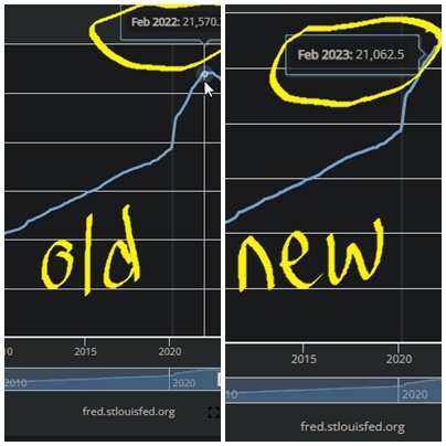
new number (n) = 21,062
old number (o) = 21,570
So, working the formula...
21062 - 21570 = -508
And then...
-508 / 21062 = -0.0241
...when multiplied by 100 gives...
-0.0241 x 100 = -2.4%
-2.4% as the percent change
Yep. That's what's on the white/blue chart in the Tweet.
But, that's only one point on a chart. YoY % change usually is shown in a line graph, like in the Tweet. We need to go back. We need to range back 10 or 20 years, do the same thing, plot our dots. When we do, we get the white/blue chart in the Tweet's graph...YoY % change M2.
And here's the rub
When there's a significant increase (or decrease) in the data set, the percent change is altered dramatically. Whereas the data changes, the percent change dramatically changes. With the momentous increase in spending and M2 in recent years, the percent change dramatically and naturally shot upward. Then, with recent holding back on M2 expansion, the percent change resultantly dropped dramatically. Although percent change dropped, M2 is still very high.
Case study: Sally's Rainbow Unicorn cards
Sally is a great entrepreneur. She constructed homemade Rainbow Unicorn playing cards and began selling them to kids in the neighborhood.

Kids sometimes lose their cards, so each year she has a meeting with everyone, takes inventory, and sells more cards to replenish the lost ones. When COVID hit, she ramped up the distribution of cards, just to give the kids something fun to play with while stuck at home. She keeps meticulous annual records in her Rainbow Unicorn notebook and charts them as below. Her charts aren't as glitzy as the Bloomberg charts, but just imagine them bedazzled up with sparkles, sprinkles, and rainbow-glam and it works:
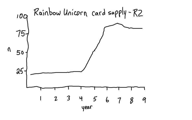
She goes even beyond just the Rainbow Unicorn card supply (R2) and also calculates the year-over-year (YoY) R2 percent change:
| Year | R2 Supply | YoY R2 % Change |
|---|---|---|
| 1 | 22 | - |
| 2 | 23.5 | 2.27 |
| 3 | 24 | 2.12 |
| 4 | 24.5 | 2.08 |
| 5 | 50 | 104.08 |
| 6 | 85 | 70 |
| 7 | 90 | 5.88 |
| 8 | 83 | 7.77 |
| 9 | 83 | 0 |
She charts that out as well:
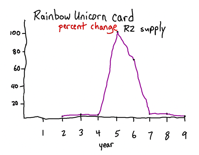
Billy, the kid next door, saw the chart above and said, "Oh no! The supply of Rainbow Unicorns is plunging!" Sally knows better. She knows that she's still selling far more cards than pre-COVID days. She's not fooled by the percent change graph. The R2 supply is still very high.
Summary
Year over year percent change in money supply is not the same as the money supply.
Bitcoin, and other finite commodities like oil and copper are fine. They're not going anywhere and we're not getting any more. What's not fine and what's not finite is the fiat money supply and the value of fiat currency. Percent change M2 aside, the M2 is still ridiculously high. If anything, I see these M2 statistics as being bullish for Bitcoin.

Not on Hive yet? Watch the animation I made: The Hive Story Animation and you'll learn all about it. The top benefits of the Hive blockchain: (1) no ONE person/group runs it, (2) YOU own and control your content, and (3) YOU earn the rewards that your content generates. Learn more or consider using my referral link to get your free account here and I'll support you as you begin. Alternately, you can see other sign-up options here.
Posted Using LeoFinance Beta