Hello again from a weekend. It was an extremely busy week. Fortunately I have two days to rest. Anyway. Previously, I wrote an article about how to follow Moving Average on Hive price in Python. If you want to take a look at the blog post, you can check it out here. Today, I will touch what RSI is, how it works, and how we can use it to understand the trend and momentum of Hive's price with Python in this blog post.
As a simple explanation, RSI is used to identify overbought and oversold conditions in an asset's price. When the RSI is above 70, the asset is considered overbought, and when it is below 30, it is considered oversold. Traders use these levels as potential buy and sell signals, as an overbought condition may indicate a pullback or a reversal, while an oversold condition may indicate a potential rebound.

Actually, the RSI is a momentum oscillator, so it is used to identify potential trend reversals and to confirm price trends. It is one of the indicator that I use grequently to identify potential entry and exit points for trades, as well as to confirm or conttradict price trends seen in other technical indicators.
Applying RSI to Hive's Price
To apply the RSI algorithm to Hive's price, we first need to obtain the historical data of Hive's price. We can use the Python programming language and the pandas and yfinance libraries to fetch Hive's price data from Yahoo Finance. I mentioned these libraries on previous post about MA.
import pandas as pd
import yfinance as yf

# Start from '2021-08-25'for the Hive price data
start_date = '2021-08-25'
end_date = '2022-02-25'

# Fetch the Hive price data
hive = yf.download('HIVE-USD', start=start_date, end=end_date)

# Calculate the RSI using a 14-day period
delta = hive['Close'].diff()
gain = delta.where(delta > 0, 0)
loss = -delta.where(delta < 0, 0)
avg_gain = gain.rolling(window=14).mean()
avg_loss = loss.rolling(window=14).mean()
rs = avg_gain / avg_loss
hive['RSI'] = 100 - (100 / (1 + rs))
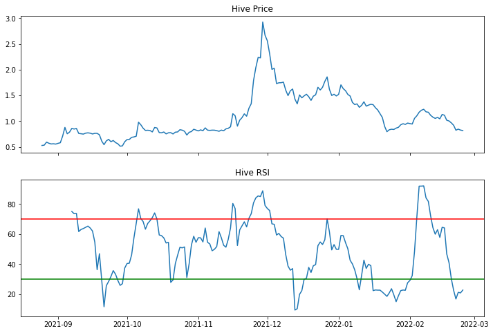
I set the start and end dates for the price data to the past 6 months, from August 25th, 2021 to February 25th, 2022 in the code above. Then I fetch the Hive price data using the yfinance library, and calculate the RSI using a 14-day period. RSI values stored in a new column of the Hive price DataFrame.
If we look at the code above, I calculated the RSI for Hive's price over the past 6 months in the code. Now I will try plot the data for analyzing the trend and momentum of the Hive price.
import matplotlib.pyplot as plt

# Hive price and RSI
fig, axs = plt.subplots(2, 1, figsize=(12, 8), sharex=True)
axs[0].plot(hive['Close'])
axs[0].set_title('Hive Price')
axs[1].plot(hive['RSI'])
axs[1].axhline(y=70, color='r', linestyle='-')
axs[1].axhline(y=30, color='g', linestyle='-')
axs[1].set_title('Hive RSI')
plt.show()

I used the matplotlib library to plot the Hive price and RSI on two separate subplots and also add horizontal lines at the overbought (70) and oversold (30) levels but here I will also use one of the my favorite visualization library, Plotly.
import plotly.graph_objs as go
from plotly.subplots import make_subplots

# Subplots
fig = make_subplots(rows=2, cols=1, shared_xaxes=True, vertical_spacing=0.05)

# Hive price and RSI traces
fig.add_trace(go.Scatter(x=hive.index, y=hive['Close'], name='Hive Price'), row=1, col=1)
fig.add_trace(go.Scatter(x=hive.index, y=hive['RSI'], name='RSI'), row=2, col=1)

# Overbought and oversold lines
fig.add_shape(type='line', x0=hive.index[0], x1=hive.index[-1], y0=70, y1=70, line=dict(color='red', width=2), row=2, col=1)
fig.add_shape(type='line', x0=hive.index[0], x1=hive.index[-1], y0=30, y1=30, line=dict(color='green', width=2), row=2, col=1)

# Update layout
fig.update_layout(title='Hive Price and RSI', xaxis_rangeslider_visible=False)

# Show the figure
fig.show()
The Plotly code above creates a two-panel plot with the Hive price and RSI over the past 6 months. The top panel shows the Hive price using a line plot, while the bottom panel shows the RSI using another line plot. The overbought and oversold levels are shown using horizontal lines at 70 and 30, respectively.
Now, let's look at the Hive price for potential sell or buy signals. As I mentioned earlier, when the RSI is above 70, it is considered overbought and when it is below 30, it is consiidered oversold. That is the metric we should consider here.
When the RSI is overbought, it may indicate that the price is due for a correction, and traders may consider selling the security to take profits or avoid potential losses. Similarly, when the RSI is oversold, it may indicate that the price is undervalued, and traders may consider buying the security in anticipation of a rebound. If the RSI crosses above 70, it may signal a potential sell signal, while if it crosses below 30, it may signal a potential buy signal. But it s important to note that the RSI is just one indicator and should be used in conjunction with other technical and fundamental analysis to make informed trading decisions.

Important Note: The code I provided does not include any predictions or forecasting for the Hive price. The code simply generates buy and sell signals based on the Relative Strength Index algorithm and visualizes the resulting signals on a chart. It is not an investment advice.
I have decided to buy some Hive next week based on my latest analysis. Predicting future prices of cryptocurrencies is an intricate undertaking that necessitates more than basic technical analysis. Sure, it entails considering various elements, including market sentiment, news events, global economic conditions, and more. I will delve into numerous techniques and models for predicting cryptocurrency prices, such as machine learning algorithms, time series analysis, and sentiment analysis in my future works. It's worth noting that forecasting prices with high precision is still an ongoing research area every day and entails a considerable degree of ambiguity.
Thank you for stopping by,
Yaser
Posted Using LeoFinance Beta