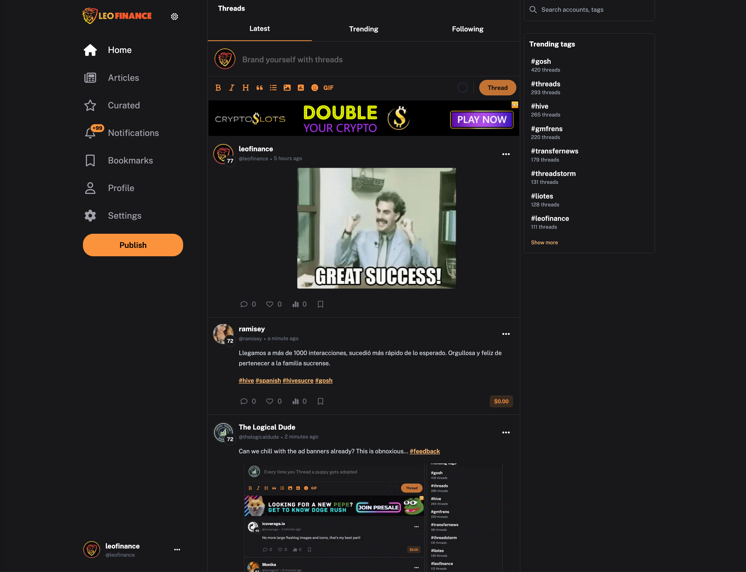
We've spent a lot of time building the Everything App. Things are changing rapidly and we are constantly improving the experience. Along with some major backend updates, we've spent a lot of time on the frontend this past week.
In today's update, we'll go through some of the major changes that were made. I'll keep this post brief and to the point. The best way to see the updates is to experience the updates.
Go experience the best of Web3 -> https://leofinance.io.
Thread, Comment & Article Module Update

The first major change you'll notice is that we redesigned the Thread module at the top of the site. You'll also see changes across the UI when you make a Thread, Comment or Long-Form Article.
This design is more compact, includes more features and is overall way more clean.
GIFs
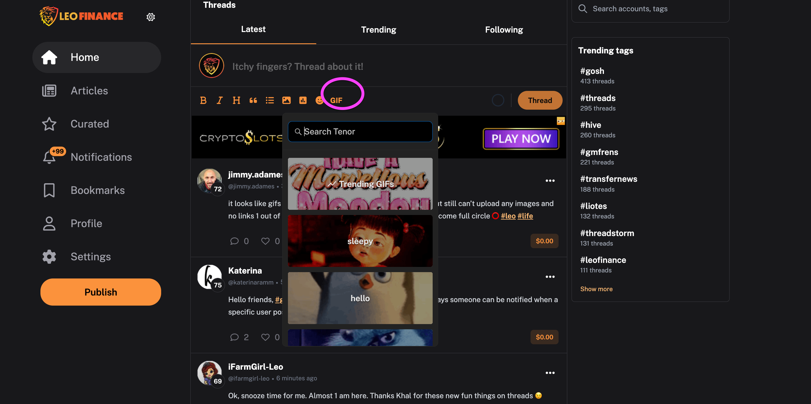
GIFs were on the UI a long time ago but they were removed because we had some incompatibility issues.
We finally sorted those out and GIFs are now back on the UI. We've noticed a small bug in the display that can be fixed temporarily by hard refreshing the page you're on.
We'll fix this soon and then you won't need to refresh. The GIF module works but it will look weird if the bug occurs.
Emojis
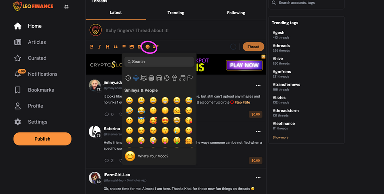
Emojis - similar to GIFs - have also made a return. We fixed the issues we had before and they are once again compatible with the UI.
The UI bug can occur on Emojis as well. We're working on getting a fix for these deployed by end of day.
Backend Stuff
A bunch of backend updates like SSR issues and broken routes were also fixed. The boring stuff but ultimately what makes your UI/UX smooth and enjoyable.
Performance Improvements
Along with a lot of backend updates, we made signifcant strides on performance.
If you haven't yet, go to the https://leofinance.io/threads UI and start jumping between Threads and Pages using the menus... Check out how fast that loads.
Lightning speed. We've made a huge breakthrough on the performance front. We'll save the details on that for another post... because they're quite lengthy.
Copy Link, Reblog and Downvote Added to Articles
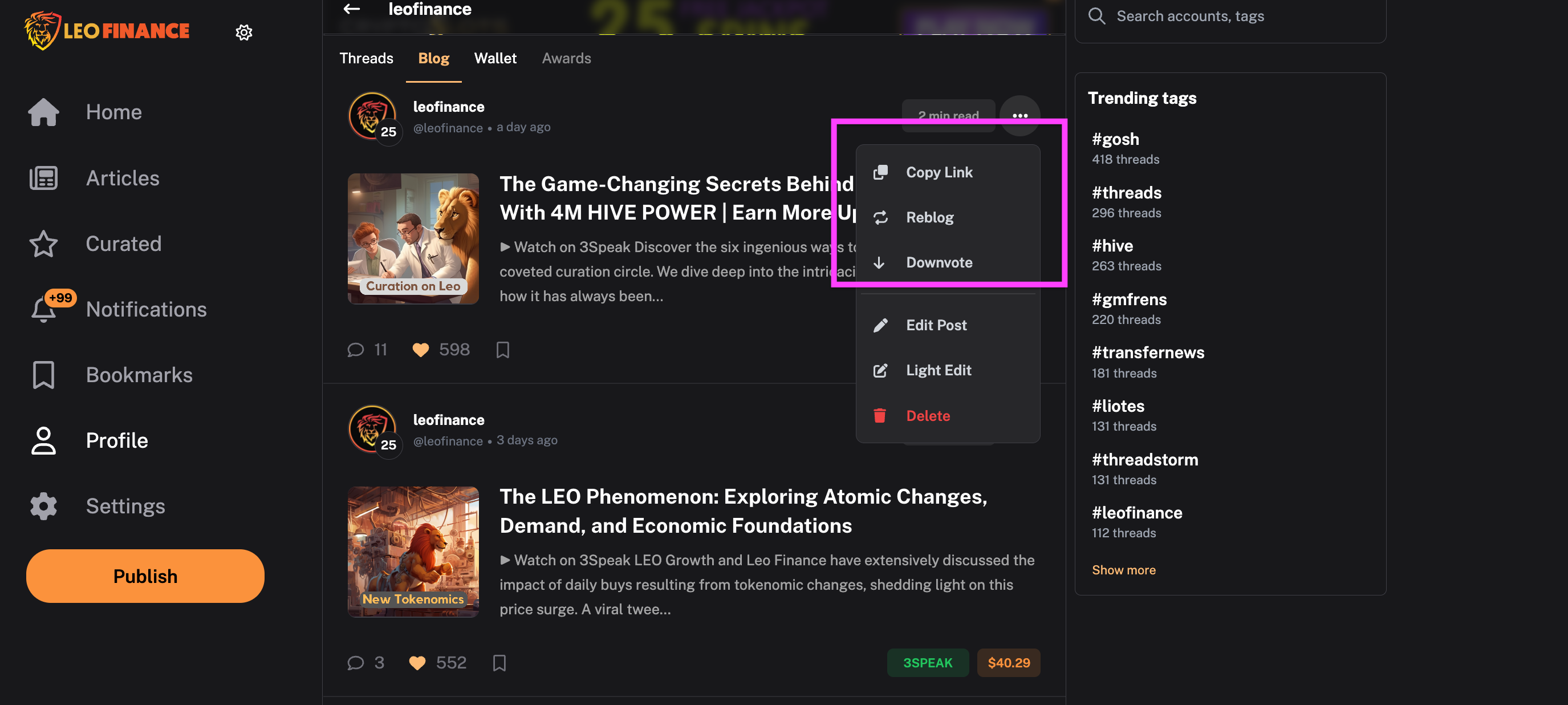
We added these features to Articles on the UI. They're available in the "3 Dots" menu at the top right of any Article Card.
Edit Post, Light Edit and Delete

Edit is something Taskmaster4450 has bugged us for. We added it to the Articles UI.
We also added a Light Edit option. This is basically a quick edit where you can just use a short pop-up window to edit something quickly and publish the changes.
Beneficiaries Issue
We fixed an issue with beneficiaries showing 0% instead of the correct setting.
100% Power Up Issue
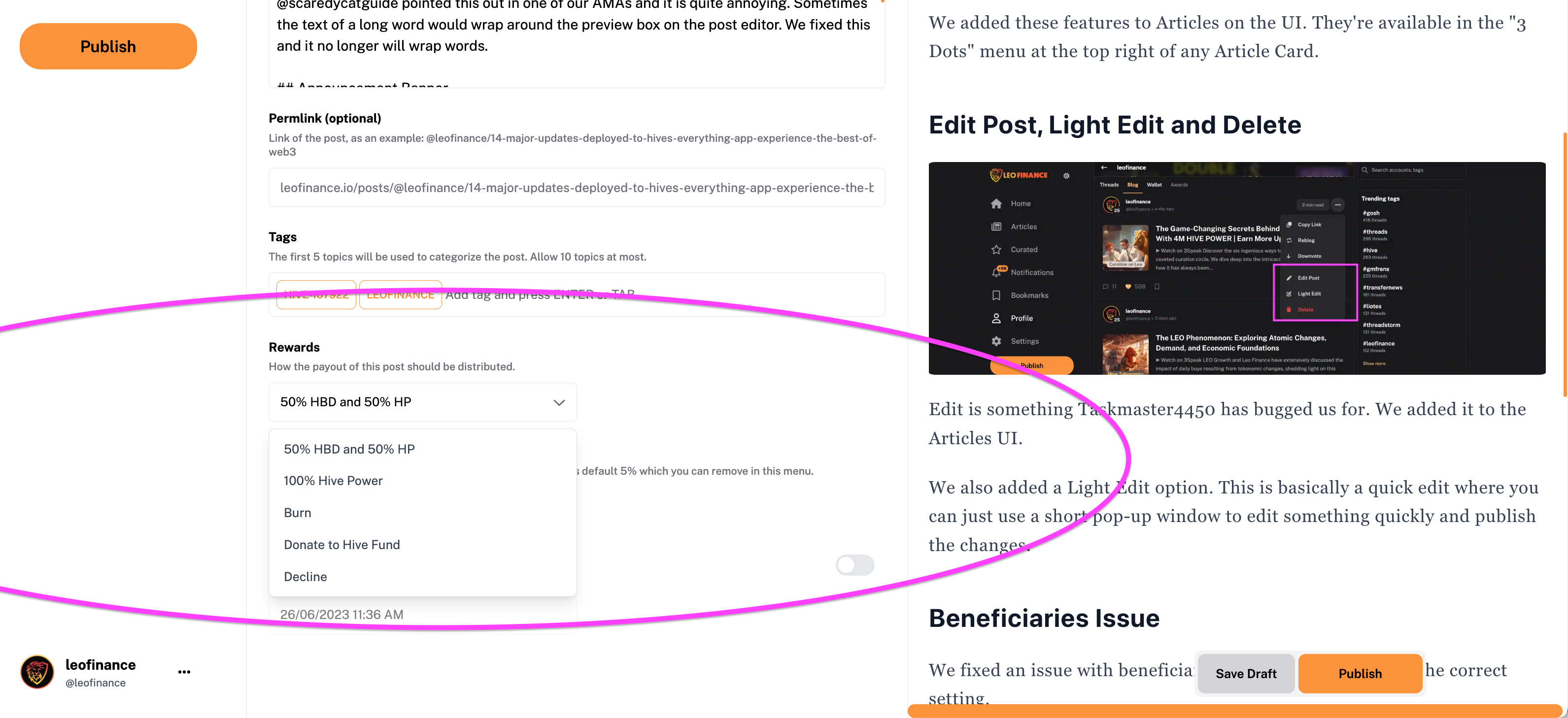
We fixed an issue that wasn't allowing 100% power up & other Rewards Options to work.
Text Wrapping on the Publishing UI
@scaredycatguide pointed this out in one of our AMAs and it is quite annoying. Sometimes the text of a long word would wrap around the preview box on the post editor. We fixed this and it no longer will wrap words.
Announcement Banner
We added an announcement banner to the bottom right of the screen. Whenever a new announcement comes out from @leofinance, you'll see this banner appear and you can either dismiss it and see the headline only or click "Read More" to go directly to the Article discussing whatever the newest update is in the LeoVerse.
What's Next?
We've got a few more massive updates coming in the next 1-2 days. Namely, we are adding HTML support on articles. This has been requested as some other UIs do it and articles on LEO that use this format look bad.
We are also adding the ability to publish to other Hive communities from the Leo UI. This has been highly requested for over a year now on our old UI.
The new UI represents a broadening focus for the LeoVerse as we shift from being solely crypto & finance to building The Everything App on Hive.
Community Pages are now live and you can view other Hive communities directly from LEO's UI.
The next update we roll out will allow you to publish your articles into whatever community you want.
This means you can finally write non-crypto/finance articles on LeoFinance.io and publish them anywhere. Does this mean that the name leofinance needs to change?
Some bigger scope updates are on the horizon, frens ;)

About LeoFinance
LeoFinance is a blockchain-based Web3 community that builds innovative applications on the Hive, BSC, ETH and Polygon blockchains. Our flagship application: LeoFinance.io allows users and creators to engage & share micro and long-form content on the blockchain while earning cryptocurrency rewards.
Our mission is to democratize financial knowledge and access with Web3.
Twitter: https://twitter.com/FinanceLeo
Discord: https://discord.gg/E4jePHe
Whitepaper: https://whitepaper.leofinance.io
Our Hive Applications
Join Web3: https://leofinance.io/
Microblog on Hive: https://leofinance.io/threads
Delegate HIVE POWER: Earn 16% APR, Paid Daily. Currently @ 2.8M HP
Hivestats: https://hivestats.io
LeoDex: https://leodex.io
LeoFi: https://leofi.io
BSC HBD (bHBD): https://wleo.io/hbd-bsc/
BSC HIVE (bHIVE): https://wleo.io/hive-bsc/
Earn 50%+ APR on HIVE/HBD: https://cubdefi.com/farms
Web3 & DeFi
Web3 is about more than social media. It encompasses a personal revolution in financial awareness and data ownership. We've merged the two with our Social Apps and our DeFi Apps:
CubFinance (BSC): https://cubdefi.com
PolyCUB (Polygon): https://polycub.com
Multi-Token Bridge (Bridge HIVE, HBD, LEO): https://wleo.io
Posted Using LeoFinance Alpha
