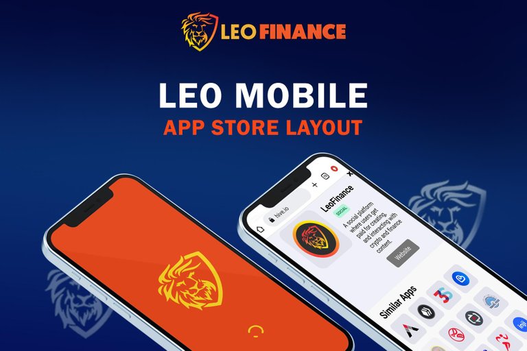
LeoMobile is set to be released in the app store (Google Play store & Apple Store)in no time. Here is my entry for the Leo Mobile app store layout challenge.
Before participating in this challenge I made sure to understand Leo's Goal or Objective.
Leo's Goal
After going through Leo's post, I noted Leo's Goal which are to;
- Make Web3 accessible to the masses.
- Reach people who are interested in learning Stocks, NFT, Crypto, Finance and more.
So, here is how I came about with the ideas for my design.
CONCEPTUALIZATION
The idea is to make something Beautiful and Attractive, yet simple. Something that makes you feel the Veracity and Trust worthiness of Leo Mobile Blockchain Web3 community.
Now, here's how I did it.
Colors:
Since the Leo's interface is in orange color, I choose blue which is the opposite of orange for my background to make everything standout.
Orange - Blue
Color Psychology
I also choose blue because it is a color that stands for Sincerity or Trust
Blue - Trust, Sincerity.
Fonts:
I use only one font in this design, varying just the scale to simplify things.
Font: Franklin Gothic Demi
Colors of Font: #ff4815, ffffff. Deep Orange and White.
I used only two colors for the font, for emphasis and simplicity, making it easy to read.
PURPOSE:
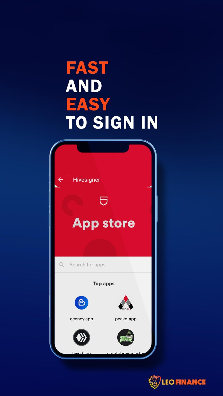
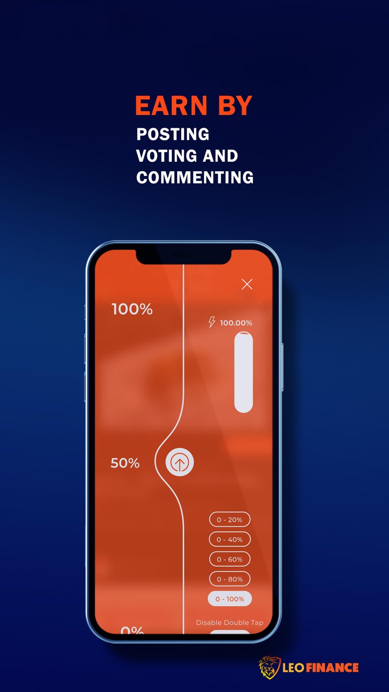
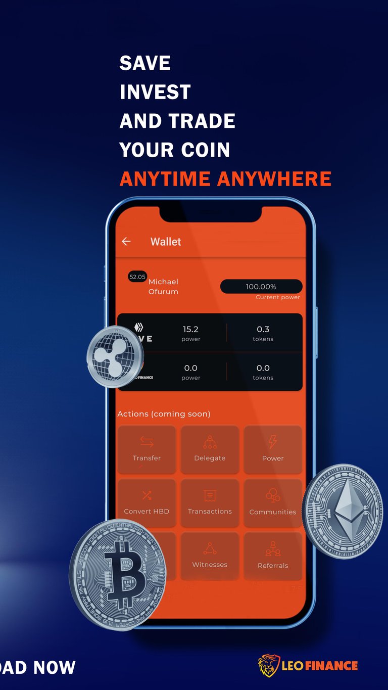
The purpose of every screenshot in the app store is to show users what the app is about and what the user experience/interface feels and looks like. That is exactly what I did, taking in-app screenshots to show users or viewers the in-app experience of Leo Mobile.
Here goes my designs.
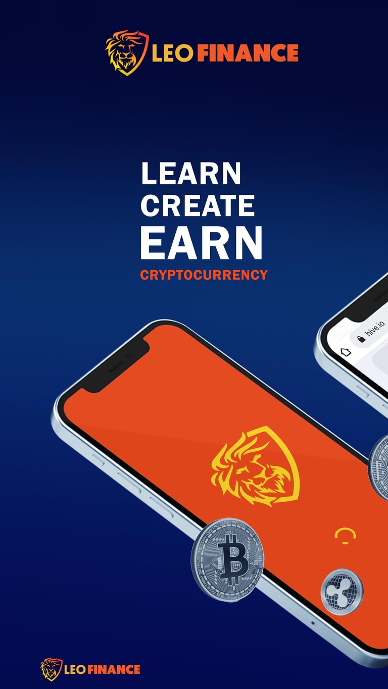
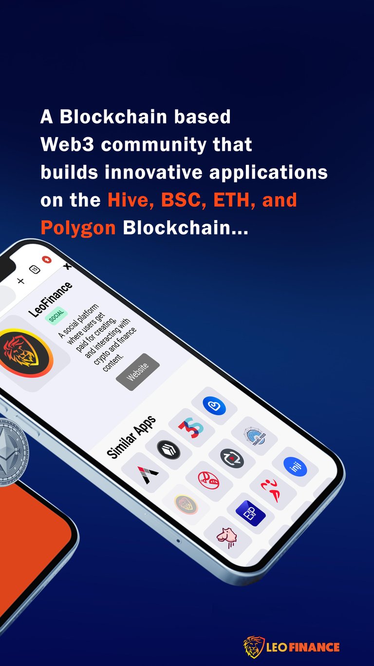
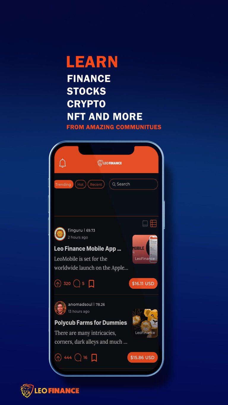


Thanks for viewing my entry.
Feel free to make constructive criticism.
Photo Credits: The Mobile device (Phone) was downloaded from freepik.com
#loemobile #leofinance #askleo #challenge.
Posted Using LeoFinance Beta
