Logo Design Contest for Larynx, Broca, SPK
Presenting you with an entry for the logo design challenge: Design a logo for Larynx, Broca and SPK.
(more information: https://peakd.com/hive-112019/@spknetwork/spk-network-tokens-logo-contest)
Token Information
There are many ways to design logos and as complete freedom was given to participants, I first had to collect some information about what these logos will represent and mean, including their literal meaning.
- Larynx: miner tokens, literal meaning is: a biological term used to describe 'voice box', an organ in throat.
- Broca: network gas token, literal meaning is: an area in brain that deals with speech function.
- SPK: governance token. Shorthand for 'speak' token.
Designing Logos
Now that I had basic info I could go on and proceed to come up with some ideas.
Larynx Logo
Since, Larynx is a miner token I decided it would be a good idea to display this in a simple way. Furthermore, I thought about giving the mining token a more scientific look. And the result of it is shown in image below.
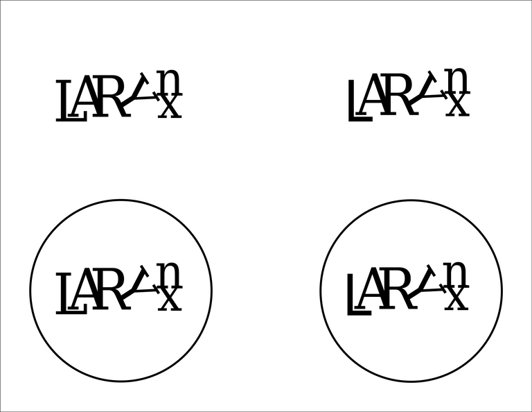
This logo is simple and it portraits the mining action by treating the 'Y' letter as a pickaxe, held in arm of 'R', aimed at 'nx', which represent hashes.
The scientific look is achieved by the way the 'A' letter rests in 'L' and the general look of this logo, which bring into mind 'LaTeX', a software where whitepapers for mining tokens are written.
Broca Logo
For Broca logo I thought about the themes: network gas token, computation, brain.
Below are three logos with slight variations in fonts used. The third uses custom made font which is meant to represent 'semiconductor traces' to emphasize the computation aspect of Broca gas token. The letters 'OCA' are placed into each other, if it is difficult to see how this logo spells out BROCA, take a look at the picture below. One other hidden meaning in this logo is that if it read normally it spells 'Brai', missing just 'n' to complete the word 'Brain'.
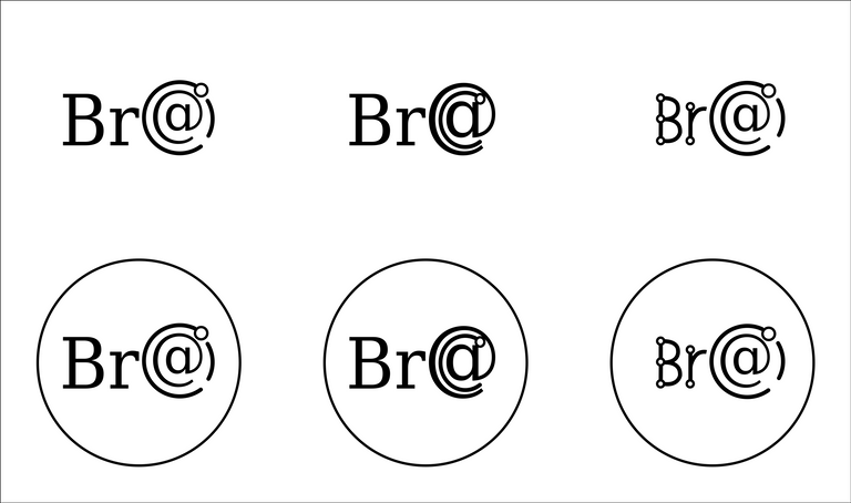
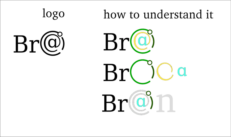
Thus to summarize the meaning of this logo, and other meanings that I can think of:
- spells Broca, with 'c' located inside 'o', and 'a' located inside 'c'.
- spells Brai, when read from left to right, by adding 'n', we get 'Brain'
- spells BrO, this can mean either 'Bro' as 'brother' or 'BrO' as 'hypobromite ion' (chemistry/biology reference: hypobromite is apparently found in immune cells)
- dots and lines symbolize semiconductor traces, reference to computation
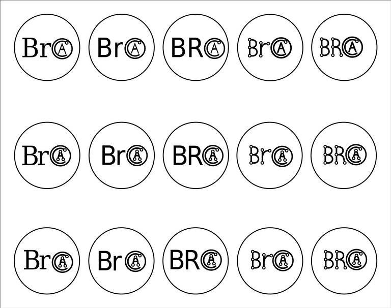
In order to get to this logo a lot more variations were created. It would be waste not to share them with you.
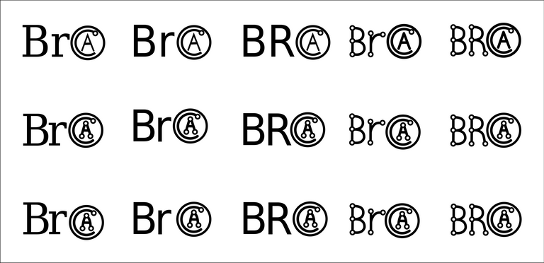
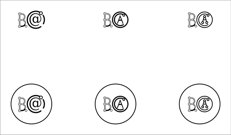
Lastly, a thought came to me whether it would be further possible to reduce the size of the logo. The result of which were the three logos below. Letters 'BR' presented in each other. These logos are indeed compact, but I personally prefer the ones above.
SPK Logo
The Speak is the governance token. I assume most people will be familiar with this token, making the SPK logo the most important from the three.
The question then arises: what should this logo achieve? I decided to go for the simplicity of understanding and remembrance.
The result is the logo below, which clearly says SPK and is very simple to understand. In order for the logo to be remembered, a unique shape is formed by the SPK letters.The 'S' letter can be seen to seamlessly flow into letter 'P'.
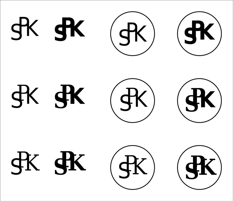
There is also a layer of meaning hidden into the logo. The letters SPK are all located at different height: namely S is below, P is above and K is in the middle. As SPK is a token connected to speech: this could for example mean: that there is speech that is low, symbolized by the low 'S', speech that is lofty or proud, symbolized by the high 'P', and factual speech presented by the neither low nor high K.
🌻 Have a Good Day.


