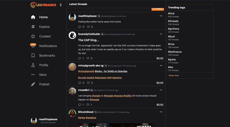
This is a result of an effort that we have been waiting for for almost two years now. Project blank that seemed like an idea is now a reality here on the Hive blockchain. Project blank is bringing twitter to the Hive Blockchain, remember, one of the most used utilities of the Hive blockchain is its social media feature. Its a Web 3.0 social media platform. But we all know Hive as a place we come and post a lot of lengthy content which can be really exhausting most times. Some of us just want to post 25 words worth of content without looking like a spammer. Its hard sometimes to socialise when you can’t speak your mind if its not above 200 words. How do you say “its a sunny day today but I wish the rain falls today” in over 200 words when that is all you wan to say?

This is why I feel and I know that project blank is one of the greatest features on the Hive blockchain, giving micro bloggers the opportunity to express theirselves on the micro scale level without the need to use a lot of words. Lets not forget how this encourages massive engagements on the blockchain. People will get the chance to engage more as the UI seems more like twitter. It will be like bringing twitter to Hive. Honestly speaking I am I love with this new UI, the old thread seemed too complex for me, not exactly complex but looked to clustered and a person who is cluster-phobic, I wasn’t comfortable on the old thread. But on this new UI thread, I see myself threading more there. Although its still on its testing stage so dont expect things to move smoothly, have an open mind for some errors and code displaying moments. Then don’t expect all the features to work as this is still on its testing mode, there are los of bugs fixes expected to be done on the platform, if you are used to twitter, you will enjoy this new UI, when the bug fix is done. So its twitter but with incentives, but then have fun with it and engage as you like.
FeedBack
I was looking for the reblog button but didn’t see, I hope we get the opportunity to have a reblog button, because when I see a thread I can relate to, I have to reblog. I am sure that the team must have thought of this and are probably going to add the feature soon. I also hope that on the official Leofinance site we have a tab on the platform that directly takes us to New UI Thread when we click it. Just to make our journey to the new UI smoother and faster. Aside that I am cool with the new UI, and I am sure that those other features that are not operating yet will be operating when the main site launches. Thank you so much @leofinance team for all you have been doing.
Posted Using LeoFinance Beta