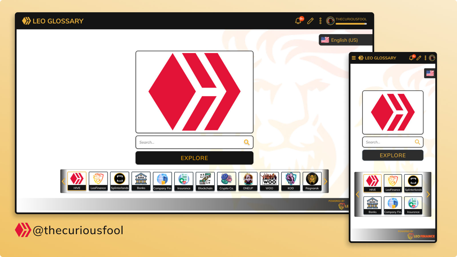
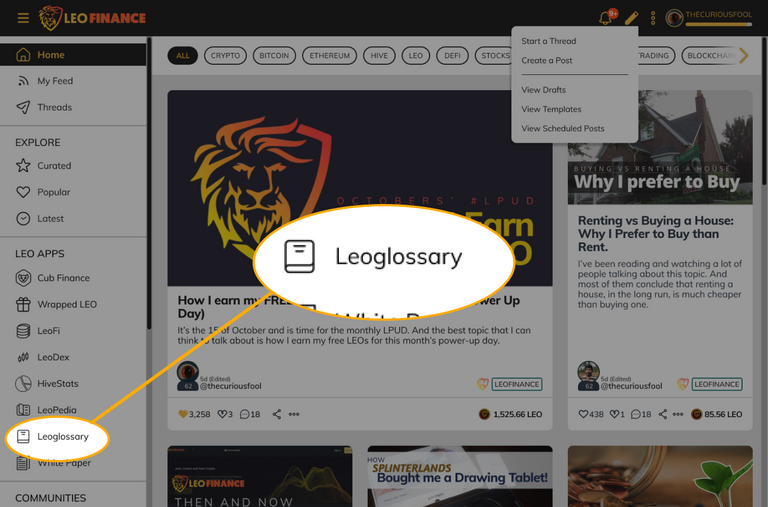
If you read my previous home page design proposal, you might have noticed that somewhere on the drawer menu, I purposely included LEOGLOSSARY in it. The purpose is that I am thinking of making a page dedicated to the Leoglossary. Which is what I would be presenting on this post. 🙂
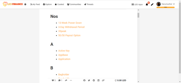
As of now, the easiest way to view the contents or find a specific term on the leoglossary is to go to the main menu post and find the term that you are looking for.
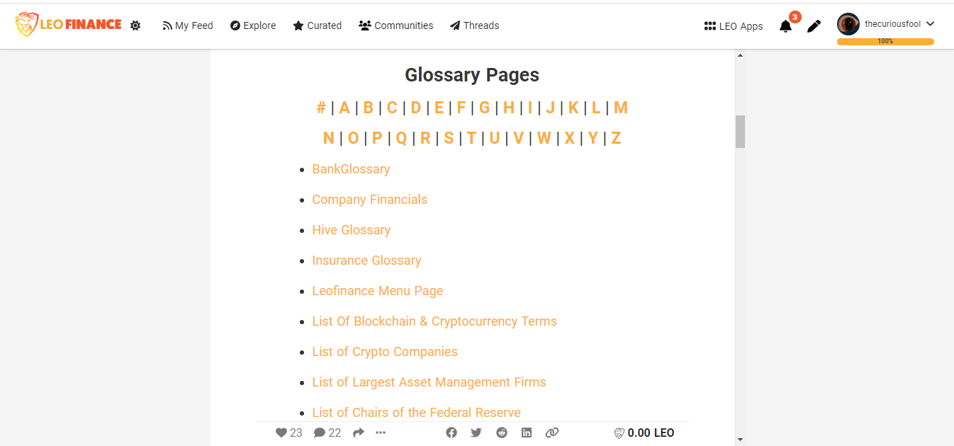 screenshot taken from here. | To be honest, I was not aware of this post until I read the article published by @lbi-token. I always wanted to incorporate the leoglossary in some of my previous posts before but I find it very difficult. From that, I realized leoglossary needs visibility. Leoglossary is a great tool but it's currently not being utilized. Some might not even know it existed. This is the main reason why I added a menu on my previous home page design for more users to see and access it easily. Design ConsiderationDuring the early stages of my design, I initially included the leoglossary as a page under the LeoFinance. But as I continue to put my design together, I find that there are a lot of menus flying around the screen. It’s cumbersome and I like my designs neat as they can be. That is why I decided to make it separate like the CUB Finance. This also made me thinking of how about leoglossary having it's own mobile app in the future? Leoglossary Main Page
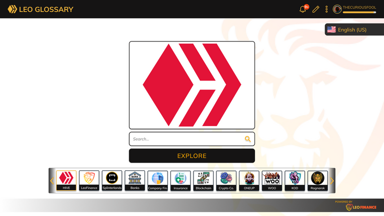
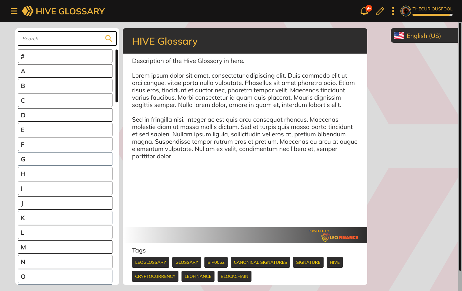
On the main screen or home page of leoglossary, I made the "explore" button the primary button. I want it to beg the user to click it. A good way to attract the user to explore the glossary if they are not looking for a specific term. Anyways, here is a more detailed description of what I did with the main page. 🙂
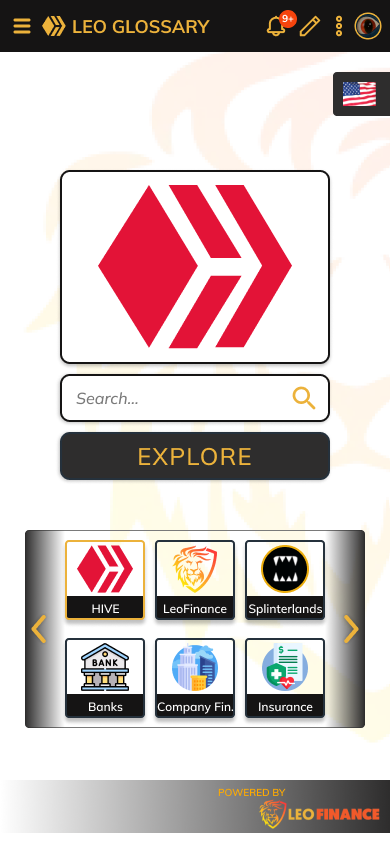
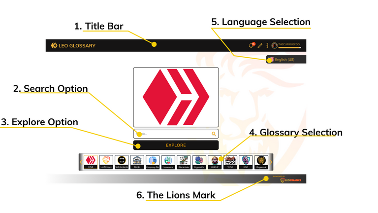
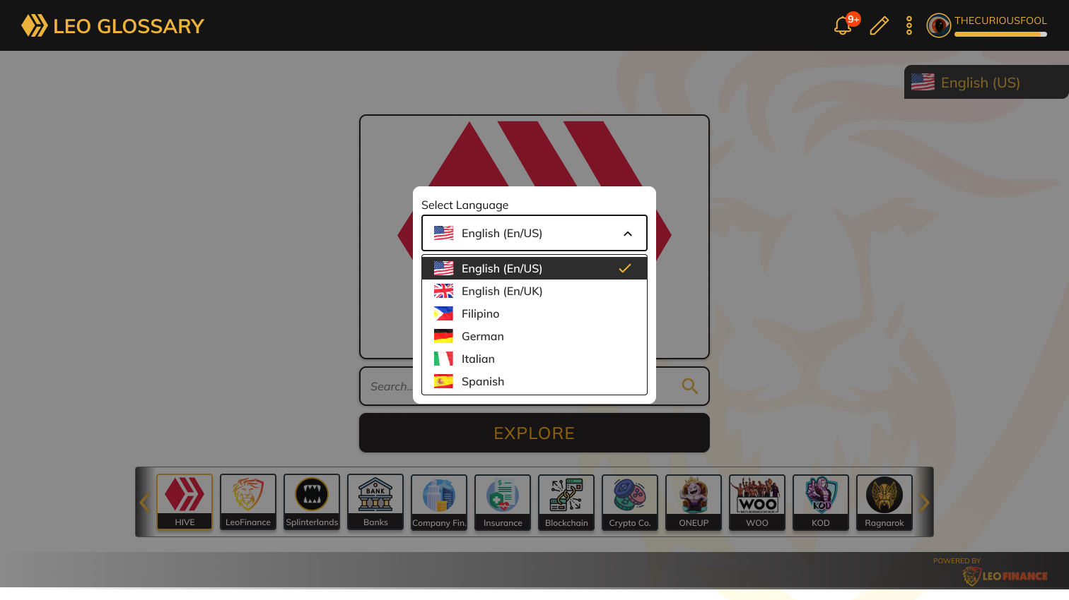
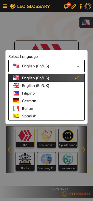
1. Title BarAs can be noticed, instead of having LeoFinance as the title, the glossary will have its own LEOGLOSSARY title. It would be an indication that the user is now within the leoglossary home page. This would change to the specific name of the glossary that the user will be selecting. I am just not sure if it would be appropriate to retain or add the user-specific option on the right part of the title bar. I just left it there to encourage some brainstorming. :) 2. Search OptionConsidering the number of terms already within the glossary and those that will be added, I believe that a search option would be a great feature to facilitate the user in finding the term they are looking for easily. 3. Explore OptionIf the user is not looking for a specific term, then an explore button would be a great option. This would allow them to explore or check the contents of the glossary. 4. Glossary SelectionAs the leoglossary is a glossary of glossaries, it would be nice if we present them as selections to the user. A distinguishing logo and text would be a perfect presentation. I added some items in here not currently under the leoglossary just to illustrate my idea. Who knows, we might really add them in the future. The left and right arrow buttons suggests the idea of more sections of the glossary. A selected glossary is indicated by the orange border. 5. Language SelectionOne of the things that I’ve noticed is that users are suggesting language support or selection other than English. I’ve seen Spanish being mentioned by @kolus290 and German from @solymi. Of course, I cannot also pass without suggesting the Philippines Filipino as a language option. 😊 I only added a few languages here but we can add more languages in the future as necessary. There are two ways I can think of how the language can be implemented. It can be a dropdown right where the language button is or as a popup on the center of the screen. In this case, I settled on the popup as a consideration both for the desktop and mobile web UI which can be seen below.
I am thinking of the possibility of implementing the language display/button as a floating view – it will stay in position even if the user scrolls the content. 6. The Lions MarkI added this mark as a way for a new user to also discover LeoFinance. We can either link the logo to the LeoFinance Hive community frontend or direct them to the part of the glossary about LeoFinance. 7. OthersI also added the LeoFinance logo as a background to the page as I find that it adds style to the page. 😉 The Explore Option
If the user chose to explore, they would be directed to the “index” page of the selected glossary. Within this page, we can add some description of the selected glossary. Perhaps we can also add some necessary links here.
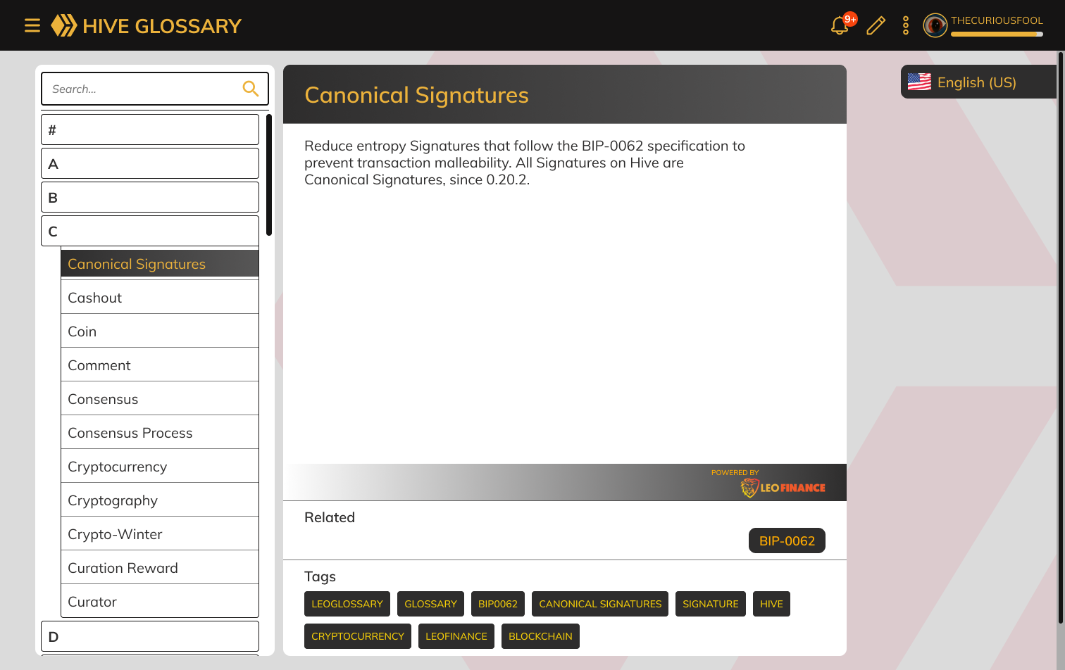
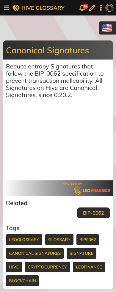
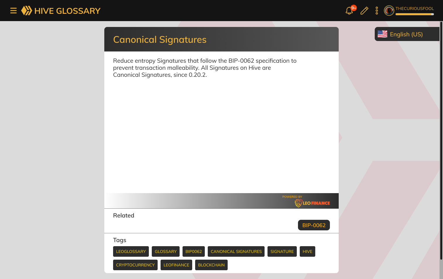
The user can then proceed to either search or scan the contents of the glossary on the left side menu. Term Description or DefinitionIf ever the user searches or selects a specific term on the left menu, then it will be displayed as the following:
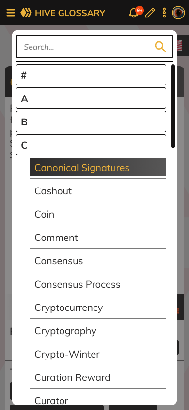
I settled on making the list of terms to be implemented as a drawer menu. I works perfectly when viewed on a mobile phone.
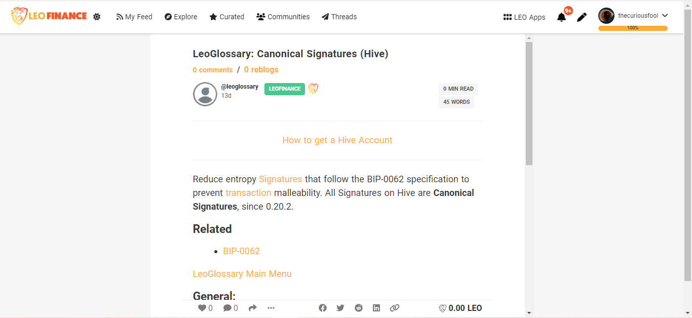
The ImplementationThe implementation would be very similar to how our frontends display our posts and articles. Hive would serve as a database by fetching the information from the content posted by the @leoglossary account. The purpose of the leoglossary page is for visibility and as an alternative way to present the information. Utilization of the HTML TagsThere might be certain information that is great when the content of the leoglossary is viewed as a post but not when presented on the UI that I am proposing. There are many ways to do this and one way is by using custom HTML tags. This way, we can only show what information we like or display them in a special way on the centralized UI. A great example of this would be this line of text that is linked to the index post:
This is good when it is being viewed as a post but may not be necessary if viewed on the centralized UI. We can enclose this line text with the “<hive-only> … </hive-only>” tags. We can then chose not to display this information on the front end. We can also do a similar thing with other information that needs to be treated in a special way. I would be glad to pitch in my thoughts on how this could be accomplished logically by code. 😊 Closing ThoughtsThat’s all for me now. Feel free to drop in your feedbacks and or questions on the comment section below. Thank you for reading and more power to LeoFinance team and to the whole Hive community. Let’s continue making Hive a great place for everyone. Sources:Images pertaining to the current leoglossary are screenshots as viewed from the LeoFinance frontend. Logos and Icons: Flags are from freeflagicons Designs are initially made with paper and then finalized on Figma. Posted Using LeoFinance Beta |
|---|
