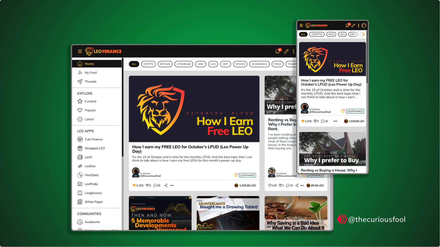
Here is my simple proposal for LeoFinance Redesign.
I consider LeoFinance as one of my home community and the upcoming full-scale rebuild gives me the perfect opportunity to showcase my design skills and pitch in my recommendations.
This is not a complete website design but rather focused on the home page. The home page plays a very important role as it is the face of the community. It can either make or break the user experience.
It is like our living room, as a community, it is where we present our ideas, findings, etc., to each other. It is also the first place we would ask our visitors to sit and present them with what we can offer. Thus, it is very important that much attention would be given to it.
I did make some changes but not to a point where it is unrecognizable from the current look of our home page.
I initially thought of presenting a Wireframe Diagram (UX) as I know that there would be iterations for sure, but finally decided on finishing the UI as most users would not appreciate a colorless presentation. 🙂
Note: All images are enlargeable. Right click on it and select 'Open in new tab' to fully inspect it.
What the heck did I do to the Home Page?
As can be seen already, I transferred the most of buttons from the title bar into one drawer menu.
I also made a space where we can advertise the LeoThreads on the home page itself.
| My Design Proposal |
|---|
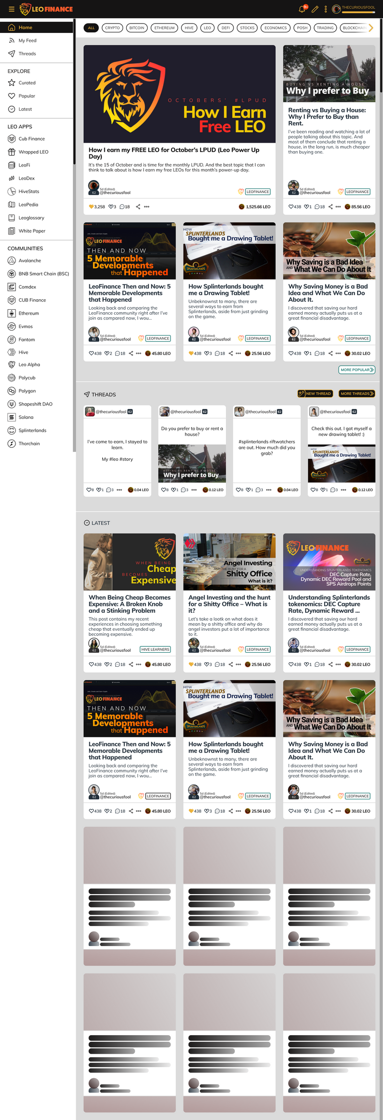 |
1. Brand Colors on the Title Bar
One thing that I wanted to be retained even if the user would switch to 'light/day mode' is the branding colors on the title bar. (see my design above)
| Current : Title Bar on light mode |
|---|
 |
2. Re-arranging How Posts are Displayed
I re-arranged how the popular posts and latest posts are being displayed. Instead of the current version where the popular posts and the recent posts are displayed side by side, I find it cleaner and easier for the eyes if we displayed them one after the other. This way, two post or more at the same time will not fight for the attention of the viewer. (see my design above)
| Current : Popular and Latest posts being displayed side by side |
|---|
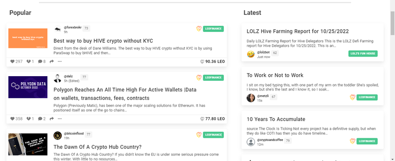 |
If you notice, I removed the curators pick from being displayed from the home page. I removed it from my design as we can find it anyway under the 'popular' category. But we can definitely put those back. 😊
3. The Drawer Menu
All menu buttons that will take the user to another page are placed on a left drawer menu. These are the buttons that will immediately take the user on a click or a tap.
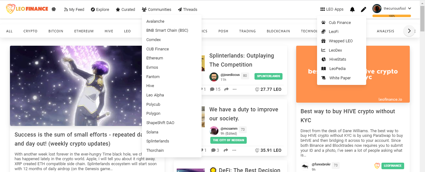
I also made it a way that the list of Leo Apps and Community Pages are visible to the user. In my experience, it took me time to find these out as they are wrapped (hidden) on a drop-down menu. (see my design above)
| Current : Drop Down menus for Leo Apps and Community Pages |
|---|
 |
Other menu buttons that are user-specific and settings are right on the title bar. This includes the notification and the ‘create a post’ buttons/icons.
4. A Loading Post/Article Icon
I find it nice if we have a loading post/article icon for posts that are still being loaded to the page. This would be a good indication that a series of post is currently being loaded as we scroll down the page. (See the most bottom part of my design proposal)
5. The Mobile Version
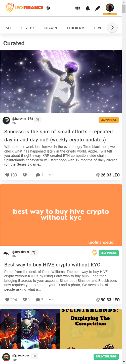
The mobile version of the homepage will have the drawer menu closed by default to give space for the list of posts/threads.
| Current : A screenshot of the mobile version |
|---|
 |
Proposed Mobile Design
| Default - Drawer Closed | Drawer Opened |
|---|---|
 |  |
5. Threads on Home Page
I initially thought of not adding this on the homepage but after attending one of the AMAs’ on @leofinance, I realized that it is better to integrate it into the home page.
In a way, LeoThreads is similar to YouTube shorts and Facebook stories/messenger. I believe that it would be great for LeoThreads to have its own separate mobile app but we cannot separate it from the main app. (see my design above)
Note: There are 3 ways to access the Threads page from the home page. These are from the 'create post' from the title bar, from the threads section within the body, and from the drawer.
The placement of LeoThreads on my design is inspired by YouTube shorts. I placed it after the top 5 most popular posts but we can also place the threads section on top.
I would love to hear your thoughts about it.
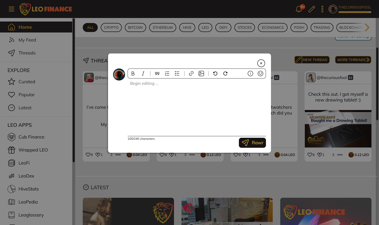
7. Compose Thread on Home Page
Another functionality that I added to my proposed design is the ability of the user to create a thread within the home page itself. I thought that it would be cool if we have that option. 😊
| A thread can be started by clicking on the 'New Thread' button |
|---|
 |
8. Notification Popup Menu
One of the things I wanted to be implemented is the ability to check the notifications without leaving the page. The current notification button, when clicked, makes you leave the current page you are viewing.
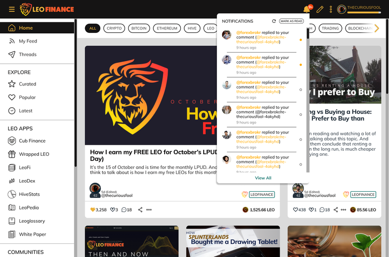 |
For me, there are times that I just wanted to check my notifications while scrolling content on the home page or reading content. From then, I would decide if I would read the notification immediately or later.
There are also notifications where the purpose is to simply notify you – like @leo.voter giving your post a juicy upvote or if your post has been re-blogged. We normally don’t want to visit the notification page for that.
The notification style I adapted is from PeakD.
9. Create a Post/Thread Popup Menu
For consistencies sake, the ‘compose’ or ‘create a post’ menu can also be implemented as a popup menu. This is a good option if we wanted to put a ‘create a thread’ under it.
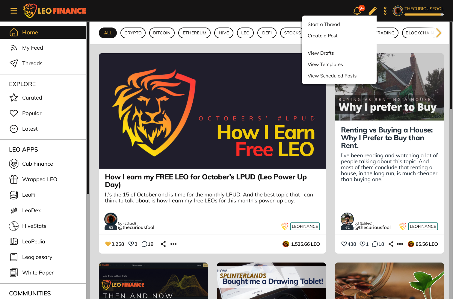
Aside from consistency, every time a user would create a post, he/she will be prompted to start a thread and vice-versa.
Again, this was inspired by PeakD.
Closing Thoughts
Most of the design consideration that I implemented on my home page design is limited by my personal experience using the different Hive community front-ends or sites. This includes my personal experience with other popular social media sites.
Thus, I would love to hear your thoughts on my output. Any feedback or input from you would be gladly appreciated.
I will be working next on the other pages such as threads, creating a post and leoglossary. Any support from you would inspire me more to give my best on my next work.
Thank you and more power.
Have a great day ahead.
Logo/Images/Icons/Screenshot Sources:
Community pages logos and icons were taken from the LeoFinance community pages. I had to redraw some of them for consistency sake. I was not able to redraw them all as my redrawing skill is currently limited.
All other icons were taken from Leo apps pages and from free icons within the Figma community.
- Universal Icon Set – V1.1 (Community) by FTDesign - Fintech UIkit
- Huge Icon Pack | 3,000+ Icons Set by FTDesign - Fintech UIkit
Profile Photos where also provided by the Content Reel plugin from Figma.
The LeoFinance logo is taken directly from LeoFinance.
Accompanying screenshots were also taken from LeoFinance.
Posted Using LeoFinance Beta


