Hello dear Hivers.
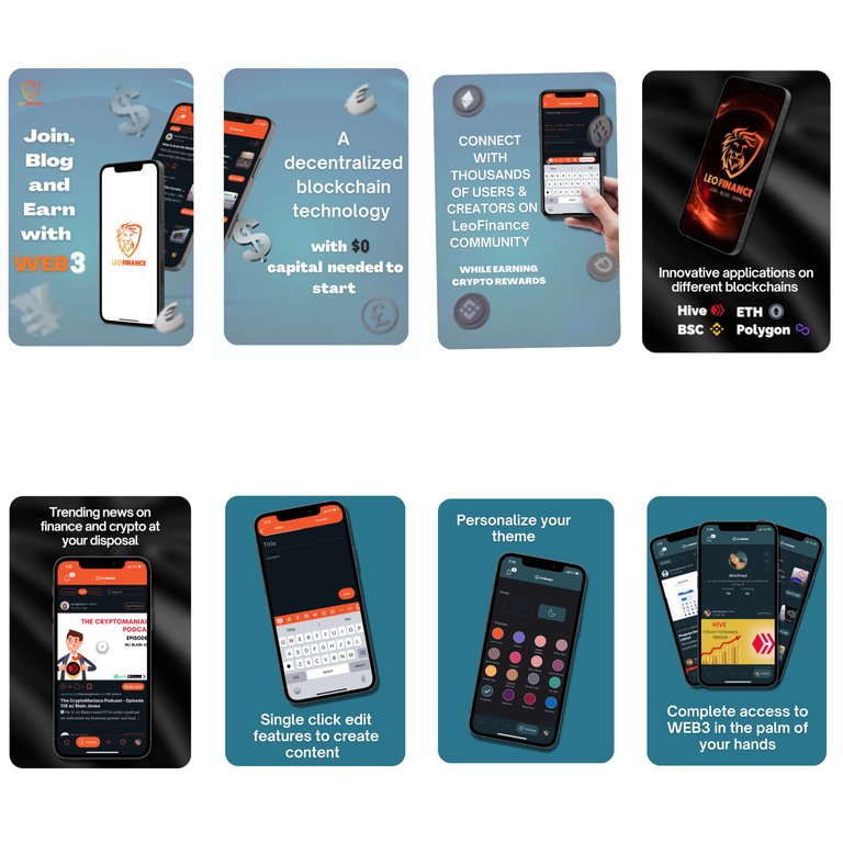
This is my entry to the LeoMobile App Store image layout contest.
As we all know the Leofinance community just launched their own App which to me is such an impressive step.
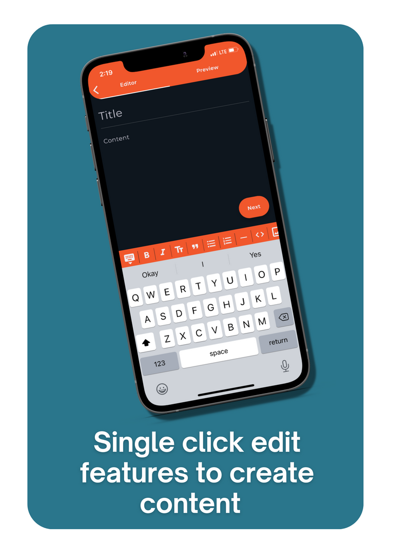
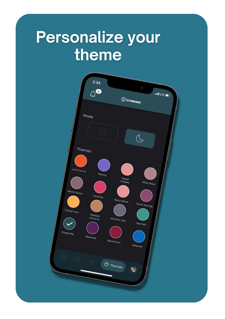
I started using the app only two days ago and it definitely exceeded my expectations. From the beautiful themes, swift clicks, diverse options in my feed, visible search button, multiple edit features for content creation and so on. I’m obsessed!
I studied the app and mastered it in just a day, which helped massively and also made it much more easier to create my designs for the image designs.
I took a few inspo from Leofinance instructions and tips for my layout. And also from the FTX app front on apple store as requested by the contest to generate my designs below.
CLOSE UP:
Pic 1, 2 & 3; Briefly explaining what WEB3 is all about.

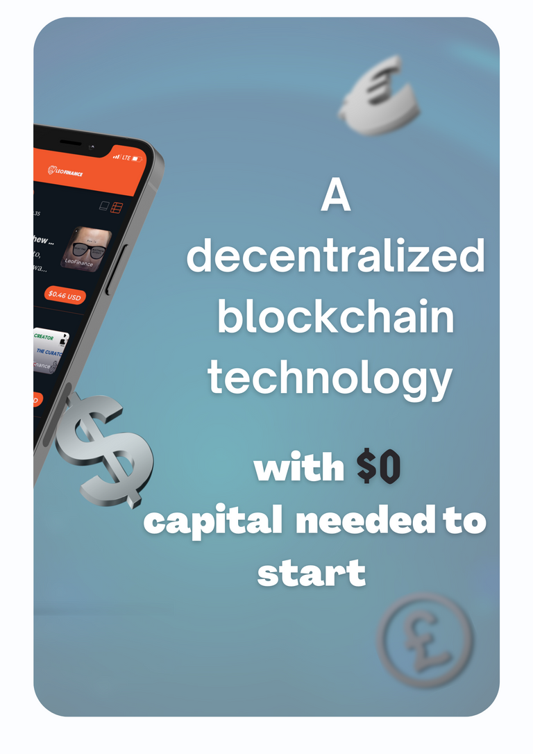

Pic 4 & 5: Listing a few advantages amongst others of the LeoMobile App.
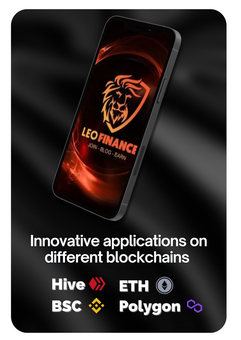
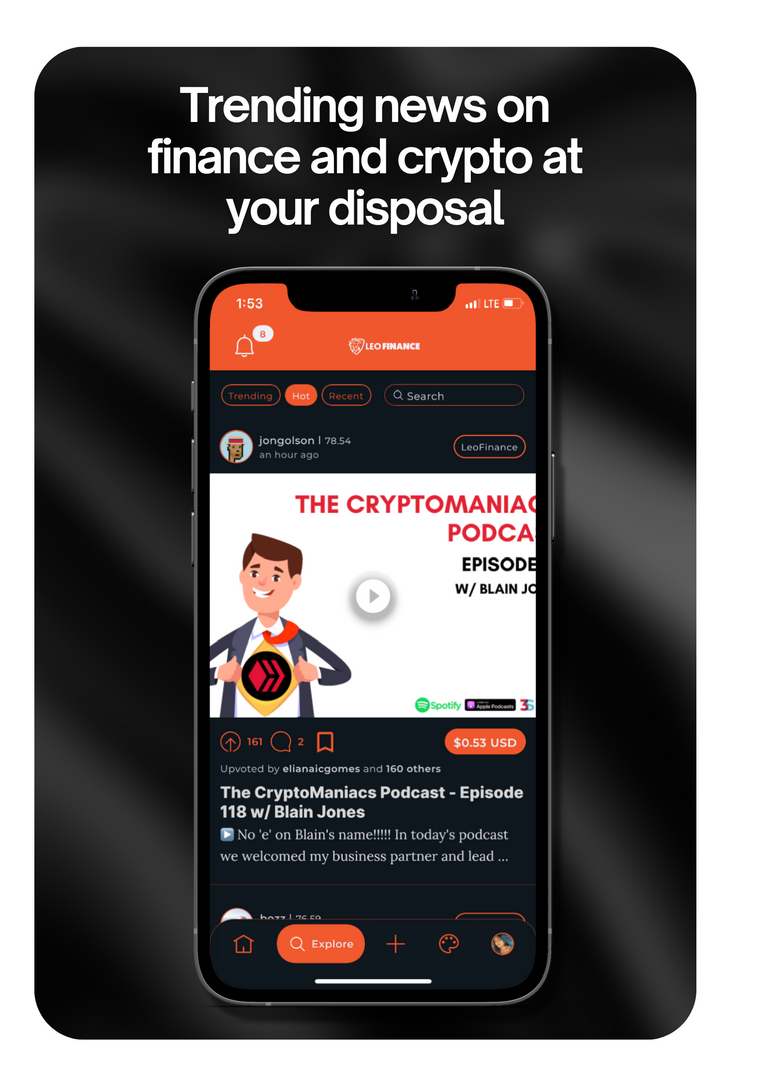
Pic 6 & 7: Exploring the LeoMobile app.
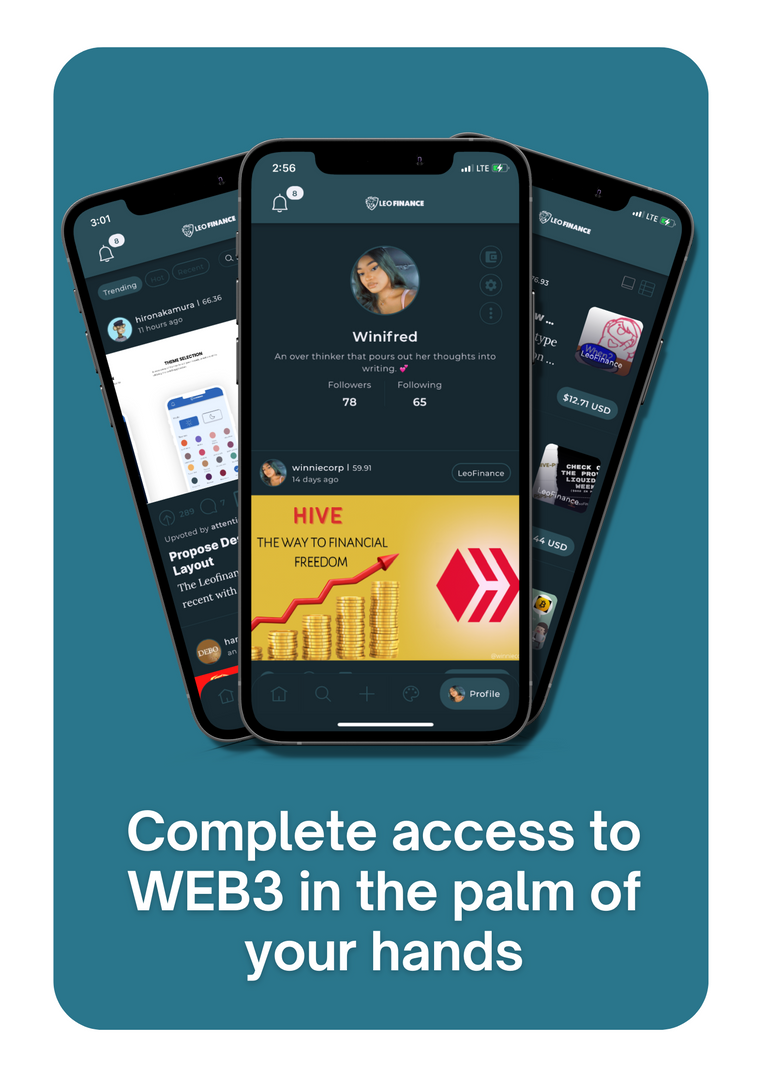
Pic 8; Conclusion.
Thanks for reading!
Here is the link to the rules for anyone else interested.
Hey T! @tengolotodo how did I do?
I created all images using canva.
All screenshots were taken while using the LeoMobile app.
Posted Using LeoFinance Beta
