Hello devs!👋
Just a few months ago, I kicked off my journey into the coding world with HTML and CSS. I guess I can't say I've completely mastered them but I got to understand the basic concepts of front end development which then encouraged me to delve into JavaScript.
Recently, I realized that I haven't really worked on much projects to put my front end knowledge into practice, so I decided to search online for some simple projects to work on , that's when I stumbled upon Fronted Mentor which is a site with challenges that help to improve your coding skills by building simple projects. Then I searched through some of the available free challenges and I decided to work on this one...
The challenge:
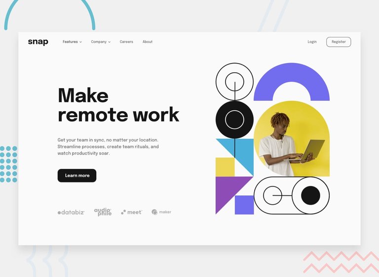
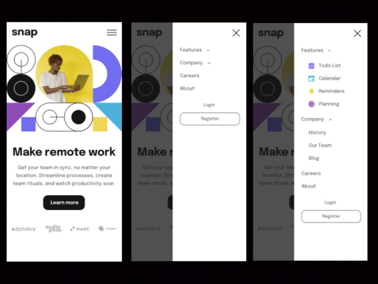
Your challenge is to build out this intro section with dropdown navigation and get it looking as close to the design as possible.
You can use any tools you like to help you complete the challenge. So if you've got something you'd like to practice, feel free to give it a go.
Your users should be able to:
- View the relevant dropdown menus on desktop and mobile when interacting with the navigation links.
- View the optimal layout for the content depending on their device's screen size.
- See hover states for all interactive elements on the page.
But in this challenge, I decided to work on only the mobile view because I was really interested in learning to build drop-down menus like the one displayed in the mobile design and I knew I'd have to apply some JavaScript inorder to open and close the navigation menu and the drop-downs too.
So I download the starter file from the website which contained the necessary assets for the challenge like the images, SVG icons, style guide etc.
Then I got to work!
The HTML
This part was not much of a problem, I just created the main page layout, the menu and the drop-downs which are to be hidden.
And I included all the required images and icons in their right positions.
<!DOCTYPE html>
<html lang="en">
<head>
  <meta charset="UTF-8">
  <meta name="viewport" content="width=device-width, initial-scale=1.0">

  <link rel="icon" type="image/png" sizes="32x32" href="./images/favicon-32x32.png">
  <link href='https://fonts.googleapis.com/css?family=Epilogue' rel='stylesheet'>

  <title>Frontend Mentor | Intro section with dropdown navigation</title>
</head>
<body>

<div class="top" >
<img src="images/logo.svg" width="80px" >
<img src="images/icon-menu.svg" width="30px" id="menu" >
</div>

<img src="images/image-hero-mobile.png" width="100%" >

<div class="text" >
<h1>Make remote work</h1>

<p> Get your team in sync, no matter your
location. Streamline process, create <br>team
rituals and watch productivity sour.<br>


<button>Learn more</button>

</div>

<div class="logos" >
<img src="images/client-databiz.svg" width="80px"  >
<img src="images/client-audiophile.svg" width="50px"  >
<img src="images/client-meet.svg" width="70px"  >
<img src="images/client-maker.svg" width="70px"  >
</div>

<div id="nav" >
<div class="rel" >
<div class="close" >
<img src="images/icon-close-menu.svg" id="close" >
</div>
<ul>
<li id="features" >Features
<img src="images/icon-arrow-down.svg" id="f-arrow"  >
<div id="f-drop" class="drop" >
<div><img src="images/icon-todo.svg" >Todo List</div>
<div><img src="images/icon-calendar.svg" >Calender</div>
<div><img src="images/icon-reminders.svg" >Remimders</div>
<div><img src="images/icon-planning.svg" >Planning</div>
</div>
</li>

<li id="company" >Company
<img src="images/icon-arrow-down.svg" id="c-arrow"  >
<div id="c-drop" class="drop"  >
<div>History</div>
<div>Our Team</div>
<div>Blog</div>
</div>
</li>
<li>Careers</li>
<li>About</li>

</ul>
<span>
<li >Login</li>
<li><button> Register</button>
 </li>
</span>
</div>
</div>

<div id="blur" >
</div>

</body>
</html>
The CSS
This part was actually what took most of my time as I tried my best to give my design the exact same look as the one specified in the challenge. I also got position the menu in a fixed position and I used the display property to hide it together with the inner drop-downs.
body {
  margin:0;
  padding:0;
  box-sizing:border-box;
  font-family:'Epilogue';
  font-weight:600;
}

.top {
display:flex;
justify-content:space-between;
padding:20px 15px;
}

.text h1{
text-align:center;
font-size:2.3rem;
color:hsl(0, 0%, 8%);
}
.text p {
text-align:center;
font-size:18px;
color:hsl(0, 0%, 41%);
line-height:28px;
width:90%;
margin:auto;
}

.text button {
margin:25px auto;
font-family:'Epilogue';
font-size:18px;
font-weight:700;
color:hsl(0, 0%, 98%);
background-color:hsl(0, 0%, 8%);
border:none;
padding:15px 20px;
border-radius:15px;
}

.logos {
margin:10px auto 100px ;
display:flex;
justify-content:space-around;
align-items:center;
}

#nav {
position:fixed;
right:0;
top:0;
width:60%;
height:100vh;
background-color:white;
color:hsl(0, 0%, 41%);
font-size:18px;
overflow-y:scroll;
overflow-x:hidden;
z-index:2;
display:none;
}

#nav  .close {
display:flex;
justify-content:flex-end;
padding:20px 20px 0;
}

#nav ul{
list-style-type:none;
width:100%;
padding:0 12%;
}

#nav li {
padding:12px 0;

}
#nav li img{
padding:0 7px;
}

#nav span {
list-style-type:none;
text-align:center;
}

span button {
padding:10px;
width:80%;
background-color:transparent;
border:1.5px solid hsl(0,0%,41%);
border-radius:15px;
font-size:18px;
font-family:'Epilogue';
color:hsl(0,0%,41%);
}

.drop  {
padding: 20px 5% 0;
display:none;
}

.drop div {
padding:10px;
display:flex;
align-items:center;
gap:5px;
}

#blur {
position:fixed;
top:0;
width:100%;
height:100vh;
background-color:black;
opacity:0.6;
display:none;
z-index:1;
}
The JavaScript
I haven't learnt much JavaScript but I decided to push myself towards completing this task.
Thankfully, I got to know a bit about DOM manipulations while I was learning HTML and I did put that to good use here. If-else statements also came in handy for creating toggles.
I used JavaScript to achieve the following:
Opening and closing of the menu when the right icons are clicked. I also did something very similar for the drop-downs.
Displaying the background blur which I had earlier created with a div element when the menu is opened.
Changing the arrow images when the drop-downs are opened and when they are closed.
I know I may not have used the best approach here and there would have been a much easier way to achieve this but I'm just glad I got things to work with the little JavaScript I know.
//My variables

let openMenu = document.getElementById("menu");
let closeMenu = document.getElementById("close");
let nav = document.getElementById("nav");
let features = document.getElementById("features");
let company = document.getElementById("company");
let fDrop = document.getElementById("f-drop");
let cDrop = document.getElementById("c-drop");
let fArrow = document.getElementById("f-arrow");
let cArrow = document.getElementById("c-arrow");
let blur = document.getElementById("blur");

// My actions

openMenu.onclick = function open(){nav.style.display = "block";
blur.style.display = "block";
} ;

closeMenu.onclick = function close(){nav.style.display = "none";
blur.style.display = "none";
} ;

features.onclick = function fdrop(){

if( fDrop.style.display != "block"){
fDrop.style.display = "block";
fArrow.setAttribute("src","images/icon-arrow-up.svg")
}
else{
fDrop.style.display = "none";
fArrow.setAttribute("src","images/icon-arrow-down.svg")
}

};

company.onclick = function cdrop(){

if(cDrop.style.display != "block"){
cDrop.style.display = "block";
cArrow.setAttribute("src","images/icon-arrow-up.svg");
}
else{
cDrop.style.display = "none";
cArrow.setAttribute("src","images/icon-arrow-down.svg");
}
};
The Outcome
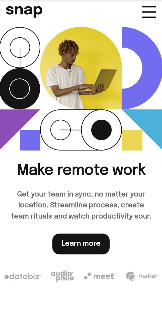
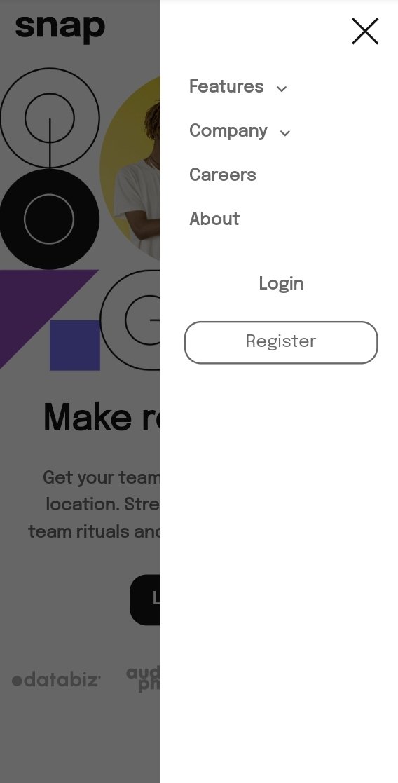
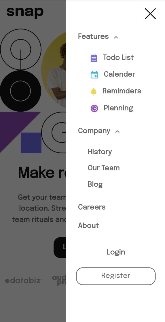
My codes may not appear very neat or professional but I certainly do look forward to improving on that and I'm sure that with time I'd definitely get a hang of it.
I really enjoyed working on this project because I've always loved using CSS.
I'd love to know what you guys think 😊...
Thanks for your time!

