Hello everyone! This is actually my first time making a post here🙂.
I started learning frontend development some months ago, and since then I've been trying out several designs I come across, since they say "practice makes perfect. "
Well, just yesterday, I came across this grid design on Google,

and tried to attempt a grid for the first time after reading to an extent about the topic (grid).
So I would like you to take a look at the steps I took, to conquer each stage of the grid development. And would really like to hear your view, and correction if any, to make me a better front end developer.

A) I employed the pre code for html, which can be seen below. I actually learnt that most programming languages, and mark-up languages have pre code, which helps define and probably tell more about the programming language in question.
Here is the pre -code for HTML;
<!DOCTYPE html>
<html lang="en">
<head>
<meta charset="UTF -8">
<meta name="viewport" content="width=device -width, initial -scale=1.0">
<title>Document</title>
</head>
<body>

</body>
</html>
B) Next, I created a css style sheet, with the name "stylesheet.css", and linked it to my html, in the head section, so as to reflect any design I make on my style sheet, I also gave the web page a name too!
NB; This is what the link for the css will look like👇
<link rel="stylesheet" href="./STYLESHEET.CSS">
I inserted the above code, into the <head> section:
<head>
<meta charset="UTF -8">
<meta name="viewport" content="width=device -width, initial -scale=1.0">
<link rel="stylesheet" href=". /STYLESHEET.CSS">
<title>@timix648| GRID -PRACTICE </title>
</head>
The output/display;
From the above picture, we can see just very little detail on the Web page, with the content majorly around the head section, which is the title.
C) I created a section inside the body (the body, just like the name implies carries the body of the screen that is the part displaying a white blank page);
<body>
<section>
</section>
</body>
</html>
D) Inside this section, which I believe functions like a <div>, I created several <div>, which was just enough for the designing of the grid;
9      <body>
10    <section>
11    <div class= "div -1">  </div>
12    <div class="div -2">  </div>
13    <div class="div -3">  </div>
14    <div class="div -4"> </div>
15    <div class="div -5"> </div>
16    <div class="div -6"> </div>
17    <div class="div -7"> </div>
18    <div class="div -8"> </div>
19    </section>
20  </body>
21  </html>
My full html code after the process?👇
1     <!DOCTYPE html>
2     <html lang="en">
3     <head>
4     <meta charset= " UTF -8">
5     <meta name="viewport" content="width=device -width, initial -scale=1.0">
6     <link rel=" stylesheet" href=". /STYLESHEET.CSS">
7     <title>@timix648| GRID -PRACTICE </title>
8     </head>
9     <body>
10   <section>
11   <div class="div -1">  </div>
12   <div class="div -2">  </div>
13   <div class="div -3">  </div>
14   <div class="div -4">  </div>
15   <div class="div -5">  </div>
16   <div class="div -6">  </div>
17   <div class="div -7">  </div>
18   <div class="div -8">  </div>
19   </section>
20   </body>
21   </html>
E) After adding divs to the section, I went over to the css, to begin styling the divs…in my css, I once again started with a pre code;
1    *{
2        padding: 0;
3        margin: 8;
4        box -sizing: border -box;
5        }
F) Next, I called the section, which housed all the divs, and gave it some properties, such as the size, the color, And even the number of rows and columns;
1   *{

2        padding: 0;

3        margin: 8;

4      box -sizing: border -box;

5     }

6  section{

7          width: 600px;

8          height: 300px;

9          background -color:hsl(233, 47%, 7%);

10        display: grid;

11        grid -template -columns: repeat(4, 1fr);
12        grid - template -rows: repeat(3, 1fr);

13        grid - gap: 8px;

         }
Implementing this above code, gave me just a plane rectangular box,
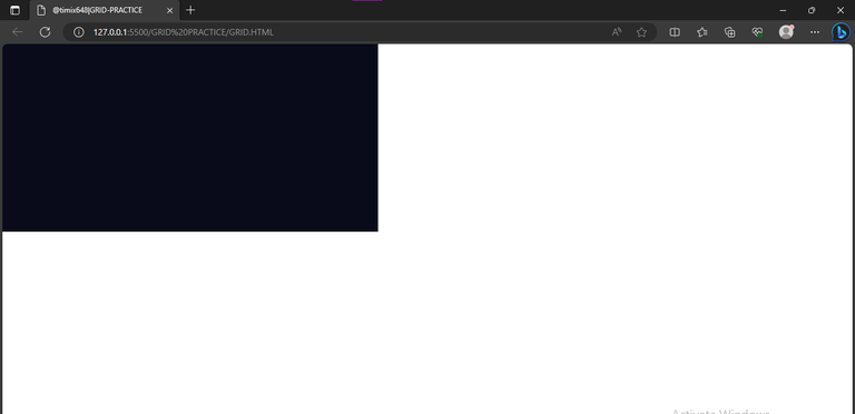
which is clearly far from home lol....So I continued.
G) I went over, to giving each of the divs a color to match the design I saw, and so I started with the first div "div -1";
        .div-1{
    background -color: rgb(52, 126,  2);

    grid -column: 1/2;

    grid-row: 1/4;

       }
In the above code, the aim is just to position the first div and give it a green color. Which can be seen below

I was able to properly position the div, with the help of the browsers, inbuilt developer's tool. I first clicked on inspect, which brought up the developer section, thereafter, I selected the layout option,

which then took me to this part where I clicked on "section",

which now easily highlights the grid box with the numbers I can use to navigate easily;

H) The rest were more like repetition with little adjustments...so basically, I positioned every other div, and gave them colors that could differentiate them from each other;
26.   .div -3{
27.         background -color: rgb(211, 191, 13);
28.         grid - column: 2/3;
29.         grid -row: 2/3;
30.   }
31.   .div -4{
32.         background -color:rgb(233, 29, 29);
33.         grid - column: 2/3;
34.         grid -row: 3/4;
35.  }
36.          .div -5{
37.         background -color: rgb(233, 29, 29);
38.         grid column: 3/4;
39.         grid -row: 2/3;
40.  }
41.   .div -6{
42.         background -color: rgb(211, 191, 13);
43.         grid - column: 3/4;
44.         grid -row: 3/4;
45.   }
46.    .div -7{
47.         background -color: rgb(233, 29, 29);
48.         grid - column: 4/5;
49.         grid -row: 1/2;
50.   }
51.    .div -8{
52.          background -color: rgb(52, 126, 2);
53.          grid - column: 4/5;
54.          grid -row: 2/4;
55.   }
After doing this, it gave me this as output;

I) I proceeded to giving the webpage body a background -color, similar to what I saw in the example grid, with the code;
body{
    background -color: hsl(233, 47%, 7%);
}
And below was the output
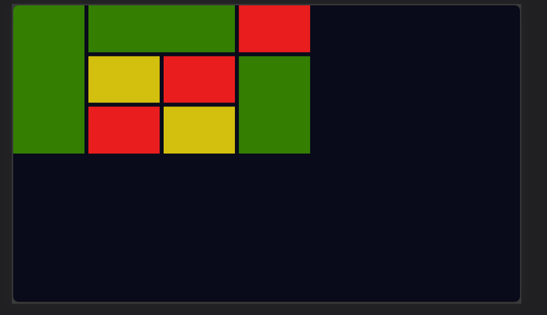
Looking at this, there's only one thing left, which is to place my design at the center and to do this, I made use of the code below;
 body{
          display: flex;
          background -color: hsl(233, 47%, 7%);
          justify -content: center;
          align - items: center;
          height: 100vh;
             }
Which in turn gave a satisfying output;


All images used here are mine, except stated otherwise.
Thanks for reading.
