Earlier this year I painted a mural on the wall at my place of work and realised how much I enjoyed doing it. I wanted to paint another at home on canvas relevant to hobbies and interests of mine, namely crypto.
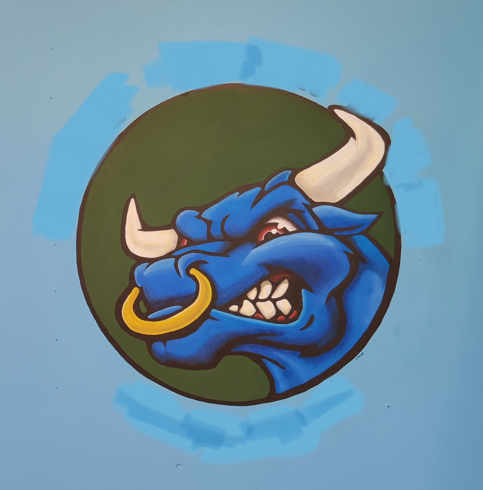
I've smudged around the outside to hide where I work for privacy reasons
The first time I painted this mural was in April 2022 when noise.cash was still a thing. I considered monetizing it by painting a green BCH bull onto canvas, turning it into an NFT and posting the original canvas to whomever won the auction with their username painted underneath.
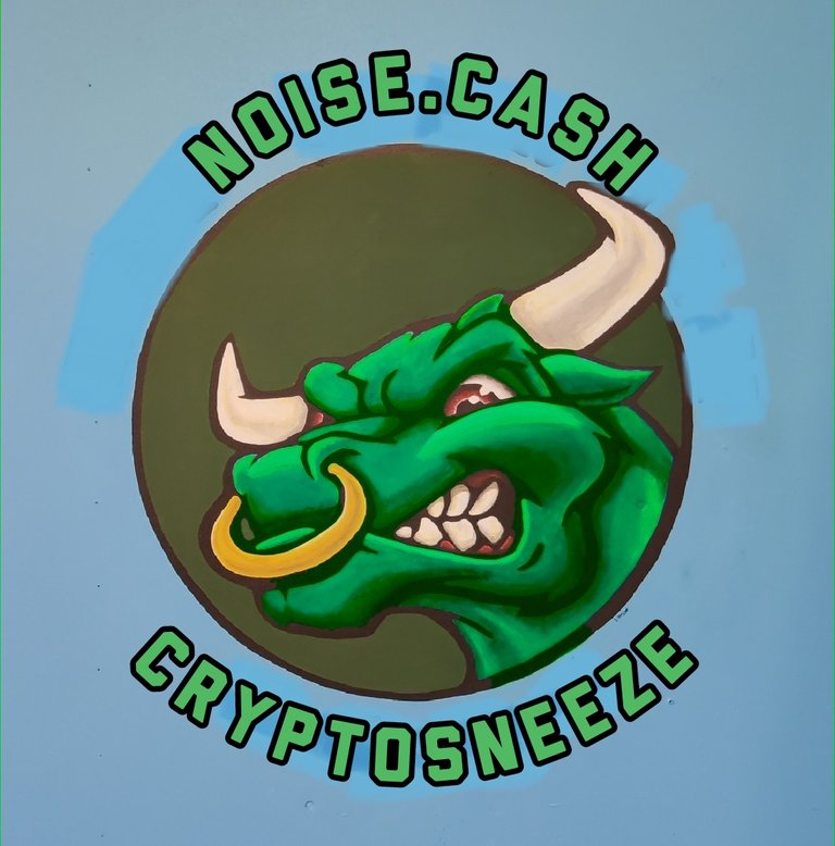
Something like this
Sadly I had to go away for work for several months and noise.cash died not long after I returned. Not only that but I managed to find the original artwork of the bull and found that it wasn't royalty free, so monetizing it would be morally wrong and potentially illegal.
More recently I started playing with the idea of drawing a Lion in a similar style and gauging interest on Leofinance.
Now I do not consider myself a good artist. I can draw/paint from reference very well but I am terrible at creating original material so I knew this was going to be a huge challenge for me.
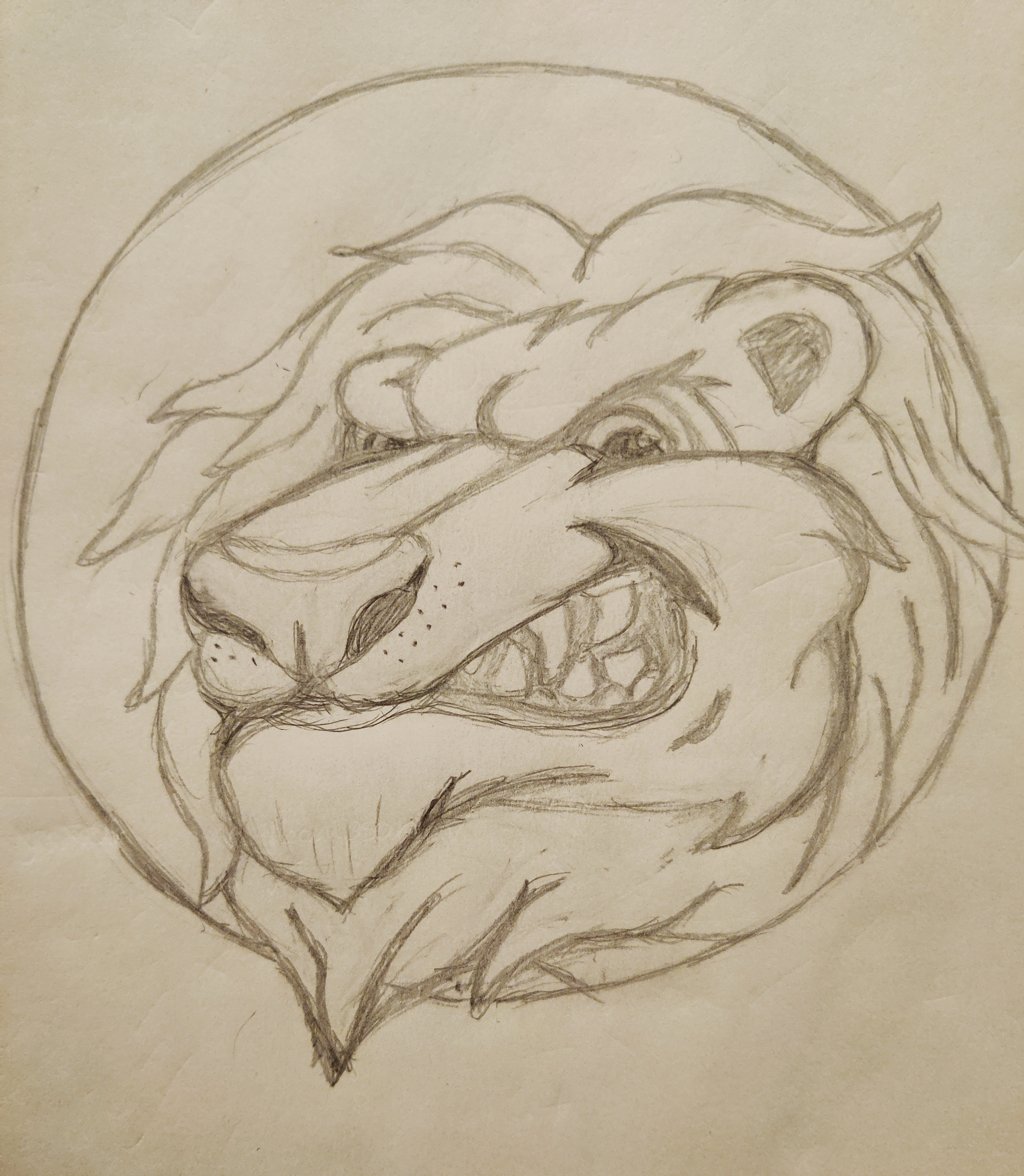
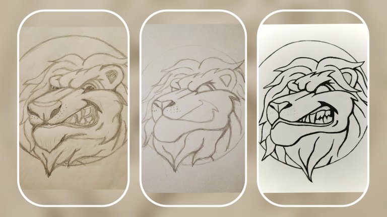
First draft
After finishing the first draft I was relieved that it resembled a Lion and didn't look too bad.
I wasn't happy with the nose, the mouth proportions, teeth, and the mane was too busy.
I bought myself a sketchbook with nicer paper and had a second attempt. This time after speaking to a friend who suggested I find a picture of a Lion sitting 45 degrees away from the camera and using the nose as reference for mine.
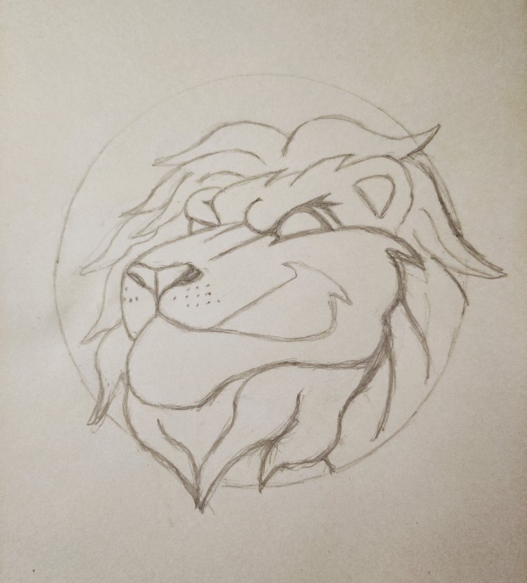
Second draft
Bingo! I was much happier with the nose and I fixed the mouth proportions.
I had left the eyes blank as I hadn't decided what sort of pupil I was going to draw.
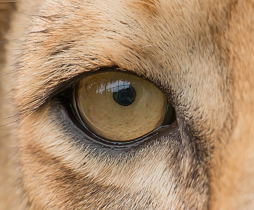
Real lions have very small pupils and I quickly realised this might look odd on my cartoonized sketch. This was the first point that I considered leaving the eyes blank on the finished design.
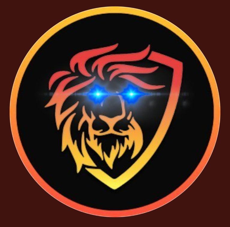
Especially considering the Leofinance twitter account icon has glowing blue eyes!
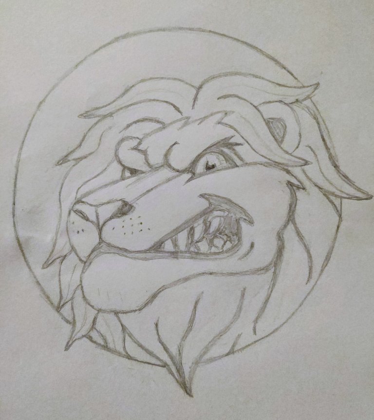
Third draft
I was immediately happy with moving the mane under his chin further right. Also moving some mane infront of his ear makes it look less like a head "stuck" infront of a mane.
However the eyes and teeth made him look a little too maniacal.
The aesthetic I am looking for with this piece is a little more professional so I took out my rollerball pen and focused on less gappy teeth for the next draft.
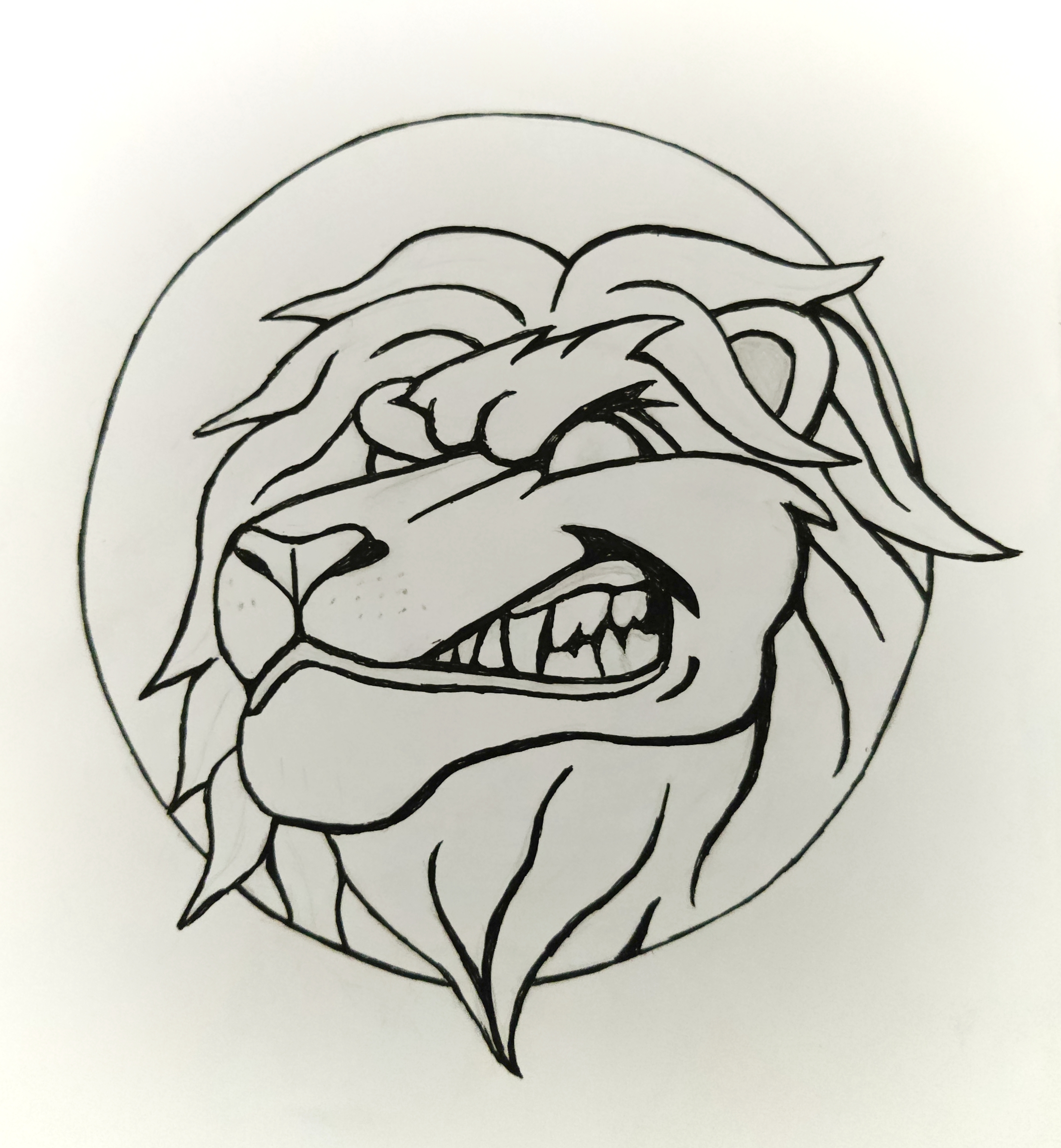
Fourth draft
And this is the point that I'm at now. I plan on photocopying this so that I can try several different colour schemes.
I'm still not happy with the teeth but I can paint over the line art to try other combinations until I get it right. My concern is too much gum on the upper teeth, none on the bottom.
What colour scheme do you think I should try? Fiery colours? Realistic browns/yellows?
And do you think anyone would pay for personalised, hand painted, poster sized canvas's?
