Omegapolis Devlog #0 - The plan, history and goals of the project.

Welcome back! Thought I would show some real work on the game and what better way than to talk about my process in designing the characters? The game itself is not going to be done in the most flattering artistic angle, I must admit. And I am certainly not the greatest artist in the world. But I do love the world and characters I have planned, so I don't want them to seem like they don't really matter and were just slapped together for the game.
My first major milestone will be a demo that will mostly be driven by 4 characters. I will make future posts detailing their stories and final art as I finish them but I thought it would be cool to show how I go from thought to game art.
Initial Idea
Everything of course starts with an initial idea. In this case, the four characters I am preparing for the game were meant for a comic book idea I had. I was more focused on the motives and story at the time than what they would look like. Eventually that had to change so I started doing sketches.
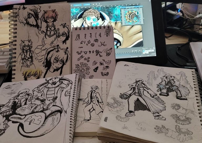
Sketchbook
As you can see I have a lot of sketchbooks. 😅 I really prefer drawing on paper over digital. So I don't do much on the computer until I flesh out every piece of the design I can think of.
As an example for Wade Watson, his original idea was a detective that happens to be friends with a black market technology dealer, rivals with a gang leader, but on the case of a serial killer. The initial sketches looked most like the one in the center of the above picture with the fedora and trench coat.
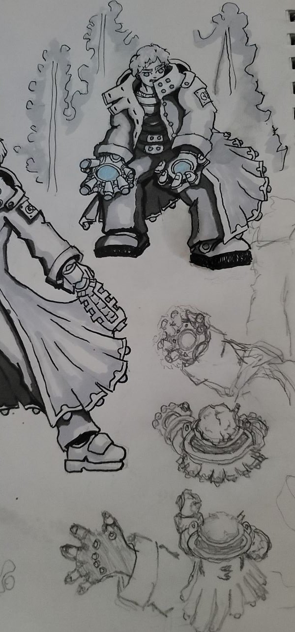
Eventually I draw the character enough that I start noticing the parts that seem to change every time and focus on those. The coat went through a few iterations. The hands changed a lot, even adapting to a cyborg right arm. I lost the curliness of the hair for a while but brought it back. Along the way I also started thinking of things he could do. This changed more aspects of his design. He has certain magnetic abilities thanks to his cyborg hand, eyes, and the electromagnetic devices that his adopted sister designed for him. This ended up being the focus of how he would fight and so he lost the gun. When I was fully satisfied with the design it ended up look like this.

With everything how I liked it, I started trying to visualize what he'd do and look like in the game. It is not easy to really make a person stand out from a dead on top angle. So I decided to make his focus be his hands and coat.
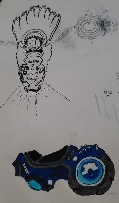
One of the things about each character in the game is also going to be a vehicle or other major upgrade. In his case he will be getting what I call that Magnabike. Essentially a one wheeled motorcycle propelled by his magnet abilities. This will make him much faster, slightly change his ability set, and give his movement a bit of a different feel. So I also started designing this.

The game angle actually will make this much easier to portray I think. 😁 With his giant coat flapping in the wind most of it will be covered.
Going Digital
Sketching and designing is all well and good but eventually we have to jump over to digital. I use Krita for this, both doing more concept art and illustrations as well as doing the in game animations and such.
I'm not quite ready to show the final concept art yet but you can kind of see it being worked on in the first picture. All this step really is is taking all the previous design work and putting the character in a cool pose and spending a lot more time rendering out details. Some of it is quite tedious to be honest. 😥 It does look pretty cool in the end though. In addition to trying to make some high quality art to use for posts and other things, this is also where the colors get worked out. I usually have an idea what the colors will be and sometimes I play around with colored pencils or markers in the sketches but here is where I really try to finalize it.
In Game
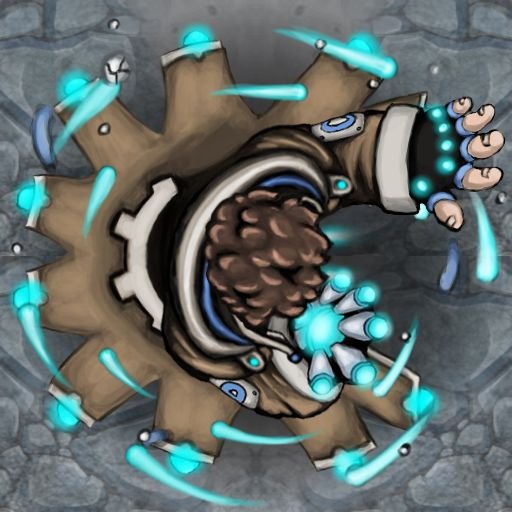
Last but not least I start working on the final aniamtions for the game. When I do the spot light on Wade as a whole I will probably try to put together some cool animated gifs but for now here is a shot of him in his attack pose.

Honestly, I probably spend way more time than I should on this. It ends up being a decent amount smaller in game and many details get lost. But I enjoy doing it.
A note on the art style. It was originally my plan to do a sort of cel shaded, anime, cartoon look. There is a reason that is typically used for animations. It is relatively easy to keep it clean and make the motion fluid looking. In the end I chose to do this sort of painterly style because I just really thought it looked cool. 😎 Haha. That is pretty much it. In the long run it will probably take a lot more time and I will probably have to keep animations relatively simple but I don't really regret it (yet!)
Conclusion
That's all I have for today! There is still a lot I want to share but writing these blog posts is somewhat time consuming. 😰 So I thought it'd be good to break out topics a little at a time until I'm fully caught up and just giving updates on progress. If you are liking the style and have any interest, follow me! More is coming. Feel free to comment as well, I will definitely respond and upvote. 😉